As every year, February is the month for Valentine's day and for MWC - the biggest phone trade show in Europe. Once again, we are here to bring you the hottest news about the mobile industry. As we are reporting Live, this article is updated a few times each day, so please refresh it and check out the updates tracker table below to see what is new.
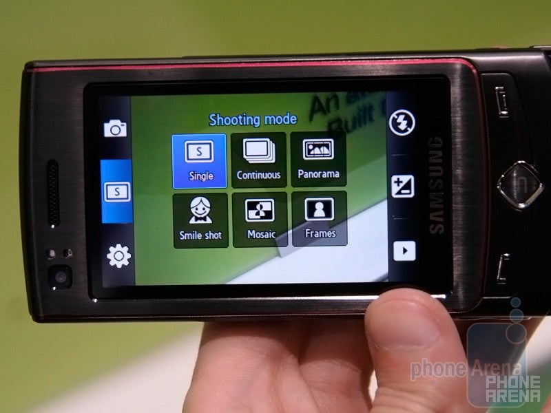
The code-named Idou (read it “I do”) is Sony Ericsson’s first phone following the slogan “entertainment unlimited”. Are you wondering what this means? Well, this is what we call an “all-in-one” device and what rivaling manufacturers (Samsung, LG) have already offered last year. Until now, Sony Ericsson had either good camera or good music features – respectively in the top Cyber-shot and top Walkman phones. It seems that they have now realized the customers want it all and Idou is the first all-in-one model. Although looking as a C905 on steroids, it is a really new phone, so check the following lines.
Recommended For You
Idou
It will do it all, but will it do it fine? If we read its specs - definitely yes! The camera is top-notch, with 12-megapixel resolution and a xenon flash. The display is also really impressive – it is a 3.5” touch sensitive unit with 360x640 pixels resolution for 16:9 ratio, suitable for movie watching. There is no information if it will support DivX, Xvid or if it will play HD movies (as the OMNIA HD), but the TV in the Media menu gives us hope that the final unit will have a tuner – DVB-T will be great! By the way, the Media menu is almost identical to the one found on every other Sony Ericsson phone and the gallery and music player also look very similar, but upgraded in order to take advantage of the touch screen. This made us think the Idou is not a smartphone during its announcement, but we were wrong – it is the first announced device to run the new open-source version of the Symbian OS. Of course “regular” stuff like GPS, 3G and Wi-Fi are present and supported.
So overall, it really seems that it has it all, and the “entertainment unlimited” slogan doesn’t look out of place. However, the performance and the software will be what will make or break it. What we see is nice, but we’ll keep our final judgment for our review. It is expected to launch in the second half of the year and additional details, including its real model name will be revealed later. Don’t worry, we’ll update you on each of them!
Idou
Sony Ericsson W995
The second big announcement SE made at the MWC is the new top of the line Walkman phone – the W995. Previously known from leaked (we just love those) information as the Hikaru, the W995 will not only pack the standard Walkman functionality, but 8.1 mega pixel camera as well, to “offer the ultimate in multimedia experience”.
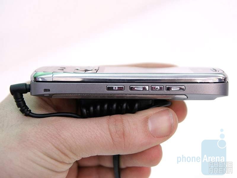
Keep in mind the units present here at the expo as all pre-production, so their performance in terms of keyboard, screen etc. might change. The phone is comparably small with very good in-hand feel. The front is dominated by the untypically large for Sony Ericsson 2.6” display. The quality is good, but we actually expected something with even greater quality, given this top of the line device. Here is our personal message to Sony Ericsson: it is about time you forget about the 320x240 resolution and move up… at least on the high-end models.
W995
The keys on the front were quite good, given its pre-release status. Some of us were quite happy with the d-pad, while others found it kind of small for larger fingers. No doubt, even a legally blind person will see the humongous OK button located in the middle of the d-pad (this is not a complaint!). The keys on the keypad were really hard to press, which is something we are confident will be fixed before it ships out.
The right side has three music dedicated buttons, the camera shutter and the … hmm… what do you call something that is hard to see, hard to fell and hard to press? SE calls it the volume rocker. They should follow their own example from the IV-835 headset, where they just completely removed the volume keys after struggling to make them user-friendly. Now on more serious note, hopefully at least the tactile feedback is improved on the volume rocker.
The back side has the 8.1 mega-pixel camera module with photo flash and a metal semi-ellipse used to either as a stand to prop the phone on a flat surface for watching videos, or to wear it on your neck. Making it stay upright on the table is not easy, unless stand is not exactly at 90 degrees to your phone.
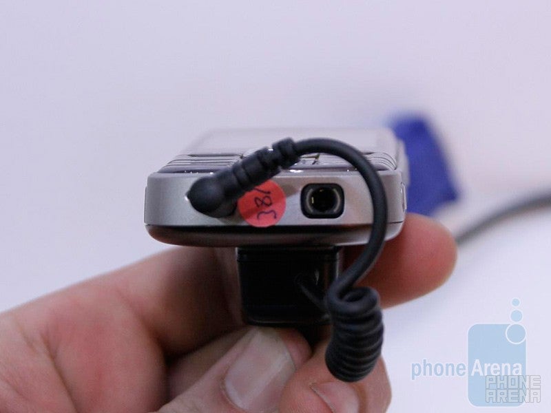
After bashing SE for the volume-rocker, we have to congratulate them for finally including the standard 3.5mm head-phones jack in a Walkman-series device! Another nifty feature is the DLNA compatibility, allowing the user to view content from the W995 on other DLNA certified devices, such as Play Station 3.
W995
Sony Ericsson C903
From the first look, the C903 seems like just another Sony Ericsson handset and indeed it is. However, if it comes at a good price it may become pretty decent camera phone. It is a mid-level device and wouldn’t wow you with its specs, but wouldn’t disappoint either – it has 2.4” QVGA display, 5MP camera, 3G, GPS, you name it, all packed into decently sized and designed slider phone. What we love about it is the sliding lens cover that is as long as the phone itself and moves very easy, without any effort. This is a great improvement compared to previous models and some may like it even more than the automatic covers, as it allows you to easily start the camera without using the buttons. Mentioning the keys, the design of the numeric keypad reminds us of the C905, and it seems to be flat, but actually is not. Also as the high-end Cyber-shot, the d-pad illuminates its camera functionality once the camera interface turns on. Typically for SE, the navigation keys are well spaced and with well expressed relief, so feeling them by touch is extra easy. Overall, as we started, the C903 may become a nice slider camera phone and the only things we don’t like about it are the d-pad design and the color solution – white, chrome and purple?!
C903
Sony Ericsson W395
The W395 was announced a few days ago and is what SE touts as the Walkman “bringing great music to the masses”. The newest Walkman slider is part of the lower end of the family, but still packs decent feature-set. Design-wise, it is a standard slider with 2.0 inch display on the front. The screen is nothing to brag about but still offers very decent brightness and details given it is a low-end device. All the keys and the d-pad located below the display were with good feedback and did not cause any issues. The same can be said about the main keypad. One of the more interesting features is the stereo speakers located on its back. Unfortunately, the room was way too loud to test them out properly, so expect an update on this soon.
Feature-wise, the device is a quad-band with EDGE only data and 2-megapixel camera. Similar to the other Sony Ericsson device, it runs their generic UI. The expected availability is the first quarter of this year.
W395
Touch screen phones are cool, aren’t they? It seems that Samsung thinks so and all of its five new interesting models are equipped with a touch sensitive display. Yes, all of them, not only the multimedia centric OMNIA HD but also the flagship UltraTOUCH, the music BEAT Edition handsets and even the eco friendly Blue Earth. Sounds interesting, so let’s check them out in details.
Samsung OMNIA HD
The first generation OMNIA was announced as Samsung’s all-in-one smartphone, trying to be both a powerful business handset and a multimedia beast that has great camera and multimedia features. Was it successful – we definitely think so. However, it is based on the Windows Mobile operating system, with all of its cons – slow at times and with tiny buttons once you get deeper into the system. How do you think Samsung avoids this in the second generation OMNIA – easy, by using another OS, the Symbian S60.
Greet the OMNIA HD – the second generation multimedia smartphone beast of Samsung. Its key feature is mentioned in its name – unlike the Touch HD from HTC, the OMNIA HD is really a high-definition phone. It is actually the World’s first that can capture HD video with its 8-megapixel camera but it will also play such files. Supporting DivX, Xvid, MPEG4 with various codecs, you name it, the OMNIA HD should be able to play almost any video clip you throw in it, as long as it is up to 1280x720 pixels in resolution and with 24 frames per second. The display it is equipped with is also rather high-def, with 3.7” diagonal size and 360x640 pixels resolution, resulting in a 16:9 ratio, suitable for movies. It is a capacitive screen but we are not impressed by its sensitivity – let’s hope this will be fixed with the final units. Although it is AMOLED, its image quality isn’t really impressive as well – don’t get us wrong, it looks really nice, but didn’t take our breath out.
Same goes for the 8-megapixel camera. It has the great interface we’ve seen in the previous OMNIA and the Pixon, but its flash is once again an LED, instead of Xenon – we wish it will be better than the previous models when it comes to shooting indoors. What is great about it is the video capturing, taking 1280x720 pixels clips – good enough resolution for previewing them even on a large HD screen. However, once again this is only specifications, so keep in mind that the quality may be not as good as we’d like it to be.
As we’ve mentioned, the OMNIA HD is a Symbian S60 smartphone. This is the same OS that is used in Nokia’s 5800 Xpress Music and N97, but personalized by Samsung in order to be similar to the rest of the manufacturer’s phones. On the homescreen there is the Widgets bar, now updated to feature three pages of widgets – for example you can put the multimedia apps on the first, and the organizers on the second. Swiping a finger from left to right leads you into a screen with shortcuts, for even more options for fast access. Enter in the menu and you’ll see what seems like a typical TouchWiz Samsung phone – the colorful icons of the manufacturer are also found in the OMNIA HD. However, go deeper into the menus (for example in the phonebook) and you’ll meet the Symbian OS. That isn’t as bad as it was with the first OMNIA and the user interface looks complete.
Overall, we are pleased with what we see. The size is rather large, but its either a huge screen or a small phone, not both. We are looking forward to reviewing a final OMNIA HD – it is expected to launch in the end of April or the beginning of May - cross your fingers it will not be delayed.
Samsung UltraTOUCH
In our humble opinion, the OMNIA HD is the most interesting phone of the manufacturer, but if you are not keen on handsets that big, you definitely should check the UltraTOUCH out, the 2009’s flagship model. Part of the Ultra line, it is designed not to pack the best features, but to offer great ones into a well looking body. Unlike the HD, it feels well both in the hand and in the pocket.
The front looks really nice with the brushed aluminum pattern and the uniquely shaped back button, and sliding the phone open doesn’t break its image – the red keypad looks fantastic. Unfortunately, the back uses a rather cheap grey plastic that not only looks bad, but feels so as well. This is definitely something Samsung must fix.
The screen of the prototypes at the show are not as responsive as we’d like them to be, but being capacitive, we hope they will be better with commercial units. The 2.8” size is pretty good for such device, and as it is AMOLED it may deliver some amazing image quality.
Running on the latest version of the TouchWiz interface it also packs decent software. It isn’t a smartphone, but is feature rich and easy to use. The widgets are only one page, unlike the OMNIA HD, but there is a widget for downloading additional ones – it gives you shortcuts to the catalog, with option for latest, greatest and search – choose what you like and download it in a few clicks. The music player looks fine but we are not impressed by the camera interface – it reminds us of the F480’s one instead of the better one used in the OMNIA/Pixon.
As a whole, the UltraTOUCH seems like a decent device, but it lacks WOW effect. As always, we’ll give us our final opinion in our future review.
Samsung BEAT DJ
If music is your life but you don’t want to carry a separate music player, get a good music centric phone. The BEAT DJ is Samsung’s new top offer in this class, packing a 2.8” AMOLED screen and the updated TouchWiz interface, as in the UltraTOUCH. What we first noticed is how light weight it is – as a toy! The design is rather unique (although reminding of the Helio Ocean) with the oval shapes and definitely makes it stand out of the crowd. In addition, the combination of silver and purple make the BEAT DJ really an attractively looking handset for the youth. On the top and bottom it has stereo speakers and a Bang & Olufsen ICE Power amplifier should help for great sound quality.
As with the UltraTOUCH, the DJ has a very nice software as a whole. The music player interface has been personalized though, packing some unique features such as “5.1 surround mode” effect (works only with headphones). What is unique about this model is the DJ software – you start a song and then can change it with different samples, slowing, etc. We’ve no idea who will use their phone to produce music, but is a cool feature for wasting time. Packing lots of features, BEATDJ is definitely a music phone to consider.
Samsung BEAT DISC
BEAT DISC is not that good though – it is a lower class phone and doesn’t have a full touch screen, but a “half touch screen” – only the lower part of the display is touch sensitive, used as a navigation area. This means that it will only look cool but wouldn’t really be of help when using the phone. Luckily, unlike the Soul, the rest of the navigation keys are also touch sensitive and one would get used to the phone relatively easy. The prototype unit we tested was not very sensitive though, and we found ourselves using the numeric keypad (yes, this is a slider with one) for jumping in the menu fields instead of using the virtual d-pad.
The DISC doesn’t use the TouchWiz UI but a simple software, found in lower class Samsung phones. Feature wise it is nothing incredible but is the first to bring a new music feature – one that suggests you similar songs. Choose a song in your play list, ask the phone to show you similar and it will connect with an internet server, send a sample of the song, recognize it and return you suggestions. Sounds fun.
Samsung Memoir (T-Mobile USA)
Most of the phones at the MWC are not designed for the U.S. carriers, but Samsung America had a nice surprise for us – together with T-Mobile USA they announced that the Samsung Memoir will be available February 25th for $250 after rebates and a contract. We got our hands on the phone to see what T-Mobile customers will get and frankly, we are impressed. Although it is based on the Pixon we reviewed earlier, the Memoir surprised us with its superb built quality – not only its metal sides, but also the plastic and the fake leather feel top notch. The large wide screen looks fine and responds well. The few hardware keys are also very good.
Feature-wise, the Memoir is not a WOW phone compared to the rest of the high-end phones announced at the expo, but it isn’t bad at all. T-Mobile USA will advertise its 8-megapixel camera, which has Xenon flash and lots of features. After a few indoor photos we are not impressed by the flash, but in real life it may perform well – we’ll see once we review it. Focusing and saving speeds are just average – about 2-3 seconds each which is fine for an 8MP photo but is not as impressive as the 1-second saving of the Pixon. Memoir runs the older version of the TouchWiz interface (found in Pixon, Behold) and not the one that comes with the new phones (UltraTOUCH, BEATDJ). Its widgets are not much, but there are a few nice ones. We personally like the camera one, which once chosen opens a list of shortcuts to different imaging features. Other functions are also similar to the Pixon, turning the Memoir into a nice all-in-one device and a powerful weapon for T-Mobile USA. Expect our review soon!
Samsung Blue Earth
And so here we are with one of thestrangest phones at the MWC 2009. The Samsung Blue Earth does not relyon a two-digit number of megapixels, HD capabilities or a revolutionaryoperating system, but it does manage to attract the attention of thecommon user, because it aims at saving the planet.
Unfortunately, we didn’t have a chance to touch the prototype of thedevice (maybe because it should be kept clean), but we still managed toexamine it close enough through the glass-case and we dare say that itlooks really cute. The solar panel on the back suits wonderfully to itsoverall appearance and we hope that it would not get too hot whenrecharging. Moreover, in spite of being made of recycled materials, itlooks rather good so using such materials may even become common forother models of the manufacturer (especially if this is cheaper). Theinterface will not be something impressing, but its features (like acounter of saved trees as you are walking) seem fun to us.
We are eager to check out this ecological phone and be useful to nature, as we’re writing our detailed review.
Samsung C6625
If you’ve been thinking that after Samsung has chosen Symbian for the second OMNIA, it has abandoned the Windows Mobile OS, you’ve been wrong. The C6625 is its latest product to use the Microsoft operating system, the Windows Mobile 6.1 Standard. Samsung has personalized the home screen with a few tabs, so you have quick access to favorite contacts, music, photos and apps shortcuts. It touts the GPS which is enhanced with location server assistance for robust position fix even in poor signal environments. The C6625 is a slim candybar phone with a 4-row QWERTY; its keys are rather small and it is not the best we’ve used but is good.
Samsung I7410
Samsung, as you may guess, has presented yet another high-tech gadget at the event. This time, we didn’t get to see the next smartphone with a giant touchsreen, or a cameraphone, equipped with a number of megapixels that no one has ever dreamed of. Instead, the manufacturer has shown us something different – a projector phone. The I7410 has a built-in pico projector, which utilizes Texas Instruments’ DLP technology. It allows the device to project an image over an area size from 5 to 50 inches with resolution of 480x320 pixels. This feature-packed, yet compact handset offers also a large 3.2-inch touch-sensitive display with WQVGA resolution and a 5-megapixel camera.
For now, Samsung has announced that it intends to release the i7410 projector phone on the European and Asian markets only.
Nokia E55
According to Nokia, the new E55 just announced today will be their thinnest smartphone, or even the thinnest smartphone in the World. It sports the standard candy-bar design, but instead of the full QWERTY found in all E-series phones, this one combines two letter per key, making it as Nokia calls it a “compact QWERTY”. This of course saves space, making the device lighter and smaller. The short testing we did with it left us overall happy but still will require some time to get used to it. Still, looks like very good compromise if you want to keep the size down. The rest of the keys on the front are flush, but still easy to press. Interesting were the embossed edges of the d-pad, which make it very easy to distinguish without having to look at it.
The E55 will utilize noise-cancellation technology, which should improve the voice quality. We couldn’t test this at the show, but will definitely rigorously examine this when we get our review unit. The new technology utilized dual microphone design and special algorithms to surprises ambient noises. During the CES expo, Motorola demoed their Crystal Talk noise-cancellation technology and it really impressed us. Hopefully Nokia’s solution comes close or better to that.
The E55 and E75 will be the first devices to have updated messaging application. Most notably, it now supports HTML viewing of email. By default, messages are opened in text mode, but you have a link at the top of each message to view it in HTML with formatting and images. Those of us (nowadays most of us) who have several different email accounts, will definitely appreciate the tweak Nokia did to move the switching of the different email boxes directly into the reading panel. So instead of selecting your personal email, reading the messaging, going into the main messaging menu, selecting the next email, you can directly switch between the different accounts.
If you are well organized (not like us), you probably have several different folders in your e-mail mailbox, such as important, to do later, not to answer ever etc. Accessing the stored messages in those folders was not possible up until now. This is one of the other important updates of the new messaging client.
A new feature is the sliding subject field when a message is highlighted. It is nothing major, but should help when you have emails with long subjects.
Sorting emails is nothing that most people do every day, but now and then it always comes handy. The new e-mail client just a few more sorting options – flag, priority, unread, attachment and size.
Nokia E75
Nokia E75 is the other new member of the E-family. Even though the device does not bear the Communicator name, it is considered to be part of that line. Nokia claims this is the best messaging device they have ever done. This is not only because of the particular hardware configuration, but because of the added services such as the first device to ship with Nokia Messaging (for those of you not familiar with this, please check out our Nokia World coverage).
Because of the full side-sliding keyboard, allowing it to be a lot narrower compared to the rest of the E-series, it really looks a lot like the E55. For the same reason, it is a lot ticker as well.
The front keypad seems just OK – there is no separation between the different keys on each row. Once used to it, this probably will not be a problem. The d-pad is very comfortable and easy to use.
Sliding the bottom part reveals the full keyboard. The keys are very large, with little space between them. They offered slightly less tactile feedback than what we’ve used to have.
Just looking at the E75’s display, you can guess correctly that it is high-end device. The colors are very vivid with great contrast. We always want to give you our final judgment after we use a device for a while, but the E75 is definitely something that attracted out attention. If you want S60 based phone with full keyboard and not huge dimensions, the E75 will probably be one of the best choices.
Nokia 6710 Navigator
Nokia 6710 is the 3rd device from the Navigator line. As the name implies, the main aim is navigation. The first Navigator was introduced back in 2007, and a new one announced at the MWC. As all other members of the same family, the new 6710 keep the slider design, but the keypad part creates a slight arc. The actual keys design is pretty much the same.
Other than this, it is pretty much very similar to the 6210 Navigator. Of course, each year the specifications are upgraded and now the screen is 2.6” from the 2.4” on the 6210. As Navigation is what is it made for, battery life is really important if it is going to be used in pedestrian mode (or you don’t want to plug it into the charger every time you use it in your car). That’s why the battery life has been generously upgraded to 19 days of stand-by and around 7.5 hours of talk time (almost doubling the 6210 times). The camera resolution has also gone up and it is now 5 mega-pixels with autofocus.
The new 6710 will come preloaded with the new 3.0 version of Nokia Maps. The software is currently in Beta testing and was originally announced during the Nokia World event, which we covered several months ago.
Depending on the region you live in, if you purchase the 6710 it will come preloaded with different maps set. For example, if you get it in Spain, you might end up having also France and Italy. Purchasing it in the US, might result in having Canada and Mexico for example. Nokia has not worked up the details on that yet. The main point it that by purchasing it, you will get all the premium feature of Nokia maps, plus car charger and holder.
Nokia 6720 classic
The 6720 classic is pretty much mid-range device in candy-bar design. It has nothing to brag about, as it is nether part of the multimedia, nor the E or any other series. Still it packs very decent feature set including 5-megapixel camera, a 3.5mm jack and aGPS. When it launches in Q2, it will come preloaded with Nokia Maps 3.0 software, but without the extra features enabled as on the 6710 Navigator.
Its build-quality is seems solid. The keypad performed decently with the last row of keys being slightly harder to press. The display offered about average quality. Given the 245 Euro price tag before subsidies, the device is really something to consider in the mid-range segment.
Nokia N86 8MP
The N95 was one of Nokia’s revolutionary products – it was not only one of the first all-in-one smart phones, but also one of the first truly powerful camera phones, with a 5-megapixel resolution and VGA video recording. At that time, the rest of the manufacturers offered only 3-megapixel phones – Nokia was definitely with the first place in the megapixel race.
However, we are already in the 2009 and 8-megapixel phones have been available for more than a half year. We’ve compared the models from Samsung, LG, Sony Ericsson and … that’s all. Nokia didn’t have an 8-megapixel camera phone until now. Meet the N86 8MP - as its name says, it is the first Nokia to capture 8MP photos.
Do you remember Nokia’s first S60 touch phone, the 5800 Xpress Music? It was rather strange that their first entry into the touch segment was not a high-end model but a mid-tier device, but it seems that this is Nokia’s strategy now. The same happens today, with the N86 8MP – as it is not part of the 9x family, it we could expect a higher-end 8MP(or maybe 12MP?) camera phone from Nokia soon. However, let’s check the N86 out:
A single look is enough to say that this is a Nokia phone – its design is absolutely typical for the manufacturer. Think of it as a cross between the N85 and the N97. It is a dual-slider with decently sized numeric keypad with the slide up and multimedia keys when slide open down. Kudos to Nokia for the new design of the multimedia shortcuts: they are big enough, slightly protruding and give feedback when pressed, so overall they are much better when compared to previous models. The 2.6” OLED display looks similar to what we’ve seen in the N85 and we hope it will be better when it comes to reading it outdoors in bright light.
The camera is of course on the back, with a little cover over it. Although the small size, it was very easy to open and close even with the prototypes here at the show. The cover has a label mentioning these are Carl Zeiss lens (as of any other high-class Nokia) with 2.4-4.8/4.6 aperture – this shows that the N86 is the first phone with variable aperture. This should allow it to keep the aperture opened for low-light photos but close it when there is plenty of light, resulting in a larger depth of the focus, thus “sharper” photos. Above is the dual-led flash, which we may say will be mediocre as it is not Xenon. However, Nokia claims that it is of “3rd generation” and will illuminate the objects at up to 3.5 meters – we’ll definitely test it when we review it! Below the lens is the “kick stand”, as in the N96. It is a nice feature for putting the phone on a flat surface with the display facing you for watching a movie for example, but it is not easy to pull out. We hope this will be fixed with the final units.
The N86 8MP is running on the same OS as the N85 and the N96, the Symbian 9.3 S60 Feature Pack 3. However, its interface is slightly personalized with newer transitions and icons reminding of the ones in the Symbian 9.5 touch phones. Overall, we like what we see.
*Note that the prototype on the pictures is labeled as N85 8MP, but the final model will be N86 8MP.
Nokia 5630 XpressMusic
The 5630 is the latest entry into the XpressMusic series. It is a half inch thick and pretty light candybar phone running on Symbian S60 3rd Edition Feature Pack 2. In order to keep its price low, Nokia has made compromise with the display – it is 2.2” QVGA unit, but we are disappointed by its image quality. It will do the job but won’t excite you with its quality. We are fine with the mid-sized keys below and like the music shortcuts on the left, as they are protruding enough to be easily felt and pressed. The microSD slot and the 3.5mm jack are located on the top, so it is more convenient to listen to music with the phone in a pocket. The 5630 takes 5800’s Contacts Bar feature and brings it to the next level; the touch phone allowed for up to 4 favorite contacts to be added to the home screen and the new XpressMusic handset offers up to 20. The Nokia 5630 XpressMusic is expected to appear on the market during the second quarter of the year for about 199 Euro ($260) before taxes and subsidies.
Nokia 6700 classic
HTC, the most successfulmanufacturer of Windows Mobile based phones announced and showcased twonew devices. The TouchPro2 and Diamond2 are both successors of two very popularphones and thanks god HTC have not decided to use superscript similarto how Samsung names their products.
Both deviceswill initially be available with Windows Mobile 6.1 and then freeupgrade to WM 6.5 will be offered to those you have purchased it. Bothdevices have several commons design characteristics – gone are thed-pads and the only buttons are the send, end, back and the Windowsone. Also, the area below the screen is touch sensitive and used tozoom in/out in various applications such as during Internet browsing,e-mail and picture viewing.
HTC TouchPro2
The designlanguage of the new TouchPro2 is new. The corners are rounded, with a metal trimaround them. The display size is increased to the whopping 3.6 inches.The four keys are very near the phone’s edge so, it might beinconvenient for some people to hold the phone and press them with onehand at the same time.
Increasing the screen sizeof course requires larger resolution, which is now 480x800 pixels.Unfortunately, the extra features have let do increased weight andsize. Still the device can be comfortably held in hand.
Somefolks were slightly disappointed with Touch Pro not featuring screentilting as on the Tytn. We are happy to report the screen tilting isback on the Pro2! The whole sliding action of the keyboard was not verysmooth, but this should be because of the early prototype status of thedevice we tested.
The actual keyboard left us withvery positive feelings. The keys are well spaced out, with good tactilefeedback.
A new feature, called Crystal Talk isincorporated into the Touch Pro2. In an essence it is an integratedemail, voice and speakerphone experience. For better voicequality, the phone is equipped with dual-microphones. For corporateusers, the transition from e-mail to conference call is made very easywith a single push of a button.
Turning the TouchPro2 over reveals large speaker, situated on its back. The idea here isagain to offer superb (we’ll see how really good it is when we have ourhands on it) speaker-phone performance. Niftily situated on the back isthe microphone mute button.
Despite of the largerdisplay, the battery talk/stand-by times are kept almost exactly thesame as on the first Pro.
HTC TouchDiamond2
Theoriginal Diamond was a huge seller for HTC and it was just a matter oftime before its successor is introduced. The keys are the same as onthe Pro2 – send/end, back and the Windows, but are not positioned soclose to the phone’s edge, so is easier to hold the phone and pressthem.
The screen size has grown to 3.2”, has increased resolution of 480x800pixels and now features ambient light sensor, for automaticallyadjusting its brightness. Even though the device still bears theDiamond name, its back lacks the diamond facets and is flush.
When it comes to features, the new Diamond2will boost 5-megapixelcamera and will feature microSD memory slot, which was missing in thefirst one.
Softwarechanges:
The new phonesalso come with upgraded version of the TouchFLO 3D personalized interface, making iteven better than before. Here are the changes/newfeatures:
• A new Calendar tab on the home screen,allowing you to view either the while month or a separateday.
• The People tab is slightly updated, now withfour shortcut icons below the picture of the person – call mobile, callwork, write message, write email.
• The in-callscreen is slightly changed and unlocking it for additional options isdone with a vertical swipe.
• The Start menu isreplaced with a list of shortcuts to applications.
•The onscreen keyboard has been redesigned, for better performance.
• The fields in the contacts list are now largerand caller ID photos are displayed. Selecting a contact will show apersonalized screen with their information, and additional tabscontaining threaded messaging history (with option to reply directly),emails and call history.
• Adding/Editing a contactis also done via an optimized interface. It shows the most commonlyused fields in large size and if you want to see all options, you’llget back into the original Windows Mobileinterface.
HTC Magic(Vodafone)
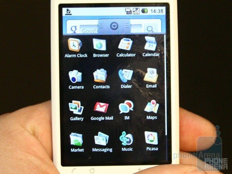
We went to the show, secretly hopingthat we will finally get a chance to see the much-anticipated successorof the legendary G1,which has been the first phone to incorporate Google’s open-sourceoperating system, Android. And indeed, a little surprise had beenwaiting for us at the Mobile World Congress, but, sadly, it wasn’t theG2. However, passing by HTC’s booth, we spotted a device, incorporatinga pretty familiar design - thoroughly white. We can even describe itas… snow white? That’s it! HTC has indeed come to introduce thesuccessor of the G1. Ladies and gentlemen, please meet the HTCMagic…
What you see on the pictures is aprototype device that was available at the MWC event. The Magic isHTC’s second phone to run Google’s Android OS, but it also comes with anumber of improvements over the original handset. We can’t help butnotice the great changes that have been made to the design. It is now alot thinner, which is due to the lack of a hardware QWERTY keyboard.One very significant improvement has been made to the body and itrefers to its build quality, which is now much higher. When in one’shand, the device doesn’t feel cheap at all, which used to be a featureof the G1. As you may have noticed, we have avoided shooting thehardware buttons on the front side, since HTC representatives told usthat changes in the design of these elements are still to be made. Thescreen size, however, will stay the same – 3.2 inches with resolutionof 320x480 pixels.
Some of you mayremember that one of the main drawbacks of G1’s camera was the totallack of video capturing, which is somewhat strange for such a device.This issue has been fixed, and now the Magic is proud to have a3.2-megapixel camera plus video capturing capabilities. Well, thehardware side-sliding keyboard may have not made it outside the drawingboard (if it has been a subject of discussion at all), but this willsurely be well compensated by the newly added on-screen QWERTY keyboard(such has not yet been developed for the G1). In addition, users willnow get features like MMS attachments and A2DP profile forBluetooth.
When it comes to availability, the HTCMagic will be a quad-band GSM and a dual-band 3G device, which will beoffered by Vodafone in Europe, starting this April. At what price?Remains a mystery for now.
LGARENA
Here in Barcelona it is obvious that there is a worldeconomic crisis – last year the city was covered with advertisementsfrom all major phone manufacturers while this year, there are almostnone. However, if you are in the capital of Catalonia, you havedefinitely seen the ad of the LGARENA, either at the airport, on a bus, or at a billboard. LGis platinum sponsor of the show and is probably the only manufacturerwith a massive advertising campaign. Curiously, it advertises only theARENA, but it seems that it is the really flagship model, so let’scheck it out.
Its design is not a masterpiece, butit definitely looks nice – brushed aluminum, rounded shapes, largescreen combine well into one piece. However, neither the design, northe high-res 480x800 pixels display are the key features of the ARENA –it is the software. ARENA uses LG’s new S-Class user interface which definitelycatches the eye. The software in previous touch phones of the Koreanmanufacturer was not bad, but it was rather mediocre. Thisone looks top notch. Even though the demo units are prototypes,transitions and other effects are silky smooth and remind us of theiPhone a few years ago.
The ARENA has a fewdifferent home screen pages: one is stressing on multimedia withshortcuts to the audio, video and imaging content, the second one hasshortcuts (favorite apps), third one houses widgets and the last oneshows pictures of your favorite contacts. Moving from one tothe other can be done by swiping a finger horizontally, but analternative is the “cube mode” which is activated by pressing thecentral hardware button. It visualizes the pages as the sides of a cubeand is designed to make moving to a particular pagefaster.
The main menu structure is ratherinteresting as well – it separates the large icons in four categories(communication, multimedia, utilities, settings). As all category itemscannot be shown in a single row, you can scroll it horizontally byswiping a finger. It’s rather strange, but seems easy to use. Still,rotating the phone horizontally will show you more (but smaller)icons.
Multimedia is what the ARENA is designed forand as the Renoir, it comes with support for various video formats.We’ll wait to review it, but hope that it will play well high-resmoves, taking advantage of this nice display. ARENA is said to come outnext month and we are eager to see the final product. What aboutyou?
LGGM730
LGproudly announced that the LGGM730 will be the first Windows Mobile6.5 smart phone. It will be customized with the S-Class user interfaceand thus will share lots of features with the ARENA. However, as weknow from our experience, it is very important how the custom interfaceis combined with the WindowsMobile OS – the final product must delivercomplete experience, not the felling that there are a few patches ontop of some OS. Here at the MWC, LG didn’t have an actual GM730 phonebut a “smart dummy” – a test unit which displays a few of the S-Classscreens. They definitely look nice, so LG, send us one of these whenthey are ready!
LGKT770
AlthoughLG announced its plans to release lots of Windows Mobile phones in thefollowing years, the Korean manufacturer will also continue to developSymbian smart phones. The KT770is one of them, running on the S60 3rd edition interface for non-touchdevices.
It seems that LG tried to make it astylish slider and have given it a glossy front side that is a truefingerprint magnet. In addition, its back is exactly as the one of theSecret and has carbon fiber battery cover. However, the bulky size andmediocre overall design are obstacles for calling the KT770 a fashionphone.
LG decided to use untraditional navigation keys – as in theSecret, they are touch sensitive. We don’t like them as they appear tobe unresponsive. This may change with the final units, but as Secrethad the same problem, we guess it will not. In addition, the small sendand end keys (which are physical and not touch sensitive) are not easyto press. A uniquesolution is the 9-way joystick – it is designed to makebrowsing the internet easier but the diagonal movement can also be usedin the main menu. We did a few mistakes while testing the phone, but inthe long term usage it may appear to be a small positive side,alternative to the optical joysticks other phones have. We only wish itwas slightly more raised from the front surface, so it will be easierto control it.
The KT770 is yet another Symbianphone, only that LG has changed the look of the home screen and themain menu. Features include 2.8” WQVGA display, 5-megapixel camera, 3Gsupport (there are a couple of version, but not one suitable for theUS), WI-Fi and a-GPS. Overall it packs lots of features into a so-sodesign, so we are positive aboutit.
LGCrystal
Thought you have seen everything?Then, what about a transparent phone? We thought so… LG has shown thelatest fashion sensation, or in other words, the world’s firsttransparent phone, the LGGD900, bearing the name of Crystal. The device will utilize the sliderform-factor and according to the manufacturer, it will not be just afashion accessory, but will also incorporate high-tech features andwill come with a Bluetooth headset. The key feature here seems to bethe transparent keyboard, which gets illuminated by a soft light oncethe phone is opened.
Sadly, we didn’t have a chanceto take a closer look at the handset, since LG has only shown aprototype unit here, which could only be examined behind the glass.Still, we managed to take some pictures of this enigmatic device foryou.
We’ve been covering and reviewing the ETEN products for several years now, so were pretty excited to see how their products will evolve after the Acer acquisition.
Total of eight new phones were officially announced at the MWC, all running Windows Mobile. The F900, M900, X960 will all be originally released with WM 6.1 with the company’s new Acer Shell 2.0 which we’ll discuss later on. The DX900 will be the only device that will launch with the old ETEN’s personalization. Four additional phones, code named L1, C1, E1 and F1 will launch the second half of the year and will be running Windows Mobile 6.5.
Acer F900
The F900 and M900 are going to be Acer’s new high-end models. Very similar to the HTC Pro2 and the Diamond2, the F900has a total of 4 touch sensitive keys on the front – send/receive, backand the Windows key. The front is dominated by the now trendy 3.8display with XVGA (800x480) resolution. No complains there, expect forwhat seems to be very reflective surface, which might make viewing indirect sunlight very difficult. The overall build-quality seems verygood.
Acer M900
The M900 is very similar in design, and is going to be their top of the line model. The display is again 3.8”, still very reflective, but the keys are real, not touch-sensitive. We could definitely live without the finger-print sensor, as we do not see any real use for it, except to show off. The major difference with the F900 is the presence of full QWERTY keyboard. The sliding mechanism still needs some tweaking, as it is not very smooth and needs some extra force to be opened. The actual keyboard is excellent – the keys are arranged very well with decent size and space between them.
Cramping all that technology has taken its toll on the size and the M900 is 17mm (0.67inches) thick and weights almost 190 grams (6.63 oz) which is going to be a definite turn-down for some people.
Acer DX900
The DX900 is a mid-range phone with dual-sim support. Being able to carry around one device with two phone number associated with it is not popular in the US, but a lot of people are doing it in Europe and Asia. The DX900 was actually the first Windows Mobile phone in the world with dual-sim support and is just rebranded ETEN DX900. Unlike the other devices announced at the MWC 2009, the DX900 will not run the new Acer Shell, but will feature the latest ETEN’s one.
Acer X960
The X960 is just a mid-range Windows Mobile based device, with every feature we expect to see in such device – 2.8 inch VGA screen, 3.2 mega-pixel camera and so one. There is nothing really exciting about it – decent size with decent design.
Acer Shell
Meet the Acer Shell – Acer’s personalization for Windows Mobile OS. Like the Touch Flo (HTC) and TouchWiz (Samsung) it tries to do the operating system both finger-friendly and more intuitive. What we saw at the show were prototypes and the transitions were not smooth at all, but we still manage to like the idea. Currently, it is Acer Shell 2.0 and future versions will respectively increase the number.
Let’s start with the home screen – it shows you a virtual 3D desk with different objects (widgets) over it. It is wider than the display and by scrolling left or right you’ll see the items that are positioned on it. The cool thing is that you can rearrange them - in 3D. For example we took the Calendar and put it behind the messaging – as it goes deeper into the desk, the icon becomes smaller – really cool effect of virtual space. Most of the icons have information, for example the email has a number of new mails, the picture frame shows the last viewed image, the music player shows the last track you’ve listened to, etc. There are lots of widgets and we hope Acer will allow additional ones to be installed.
However, if people want a simpler interface, swiping a finger vertically shows the alternative home screen – a grid of icons with pages (by the way, they are marked as in the iPhone). It seems that Acer want to keep it as simple as possible, and you won’t be able to rearrange the icons here. However, once you install new applications they will appear in this list. In addition, there is a link to the Quick Menu app, which houses shortcuts to your favorite functions.
Other custom applications include favorite contacts, images gallery, music player, weather. The first one has nice thumbnails of the people but isn’t really space-friendly, showing only 4 on a page. If you have lots of friends in this list, prepare to scroll a lot. In addition there is a speed dial app which shows 10 people at a time. The Images gallery is what you’d expect it to be – large thumbnails with 3D effects, when you swipe a finger images will move so the next is shown, etc. Once you select a photo and want to zoom, do not search for pinching or some gestures – you’ll have to press zoom buttons to change the size. The music player seems fine although its design is rather old school. It displays the album art covers as separate CDs and once you lay the song, the disc increases its size showing progress bar, volume and other controls. Oh, and on your virtual desktop, click on the Windows and you’ll open the Weather app – it can show the current situation in a few cities but we are wondering why Acer has given it such an old-school look.
Overall, the interface looks nice – it isn’t revolutionary, isn’t really sleek but is definitely good. We hope Acer will add additional personalization, for example in the phone book and the messaging menus (in addition to the Easy Keyboard) that are some of the most commonly used apps.
Acer F1
The second batch of four device will be released the 2nd half of the year and will run Windows Mobile 6.5. The F1 will be a high-end model and it can be seen by its design, it looks sleek. It is also very slim (12mm) but that doesn’t come at the price of functionality. It has 5-megapixel camera and is powered by Qualcomm’s Snapdragon processor, running at 1GHz!
In contrast, the other three are designed to be budget smart phones. Acer will try to make them friendlier to the Average Joe and will offer some untypical features. The one is a slider with numeric keypad, so people will dial numbers or write message as on a normal phone. The other two are identical (one is 2G only, the other is 3G) and will be with exchangeable covers, so people can personalize their look. We’re told each will come with a few different covers in the box. Acer’s aim is to make their phone as affordable as possible, with prices starting from $199 and going up to $299 before subsidies.
Acer L1
Acer C1
Acer E1
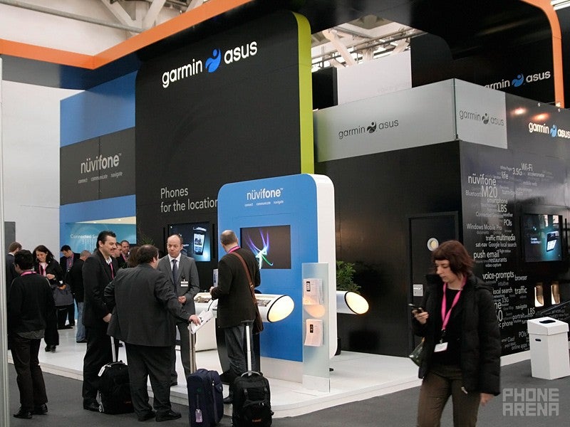
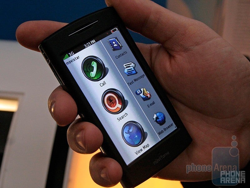
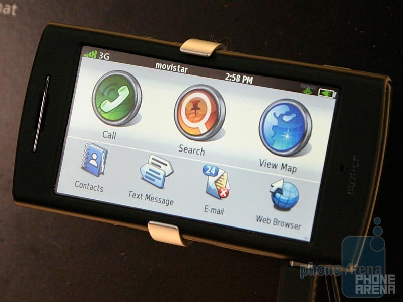
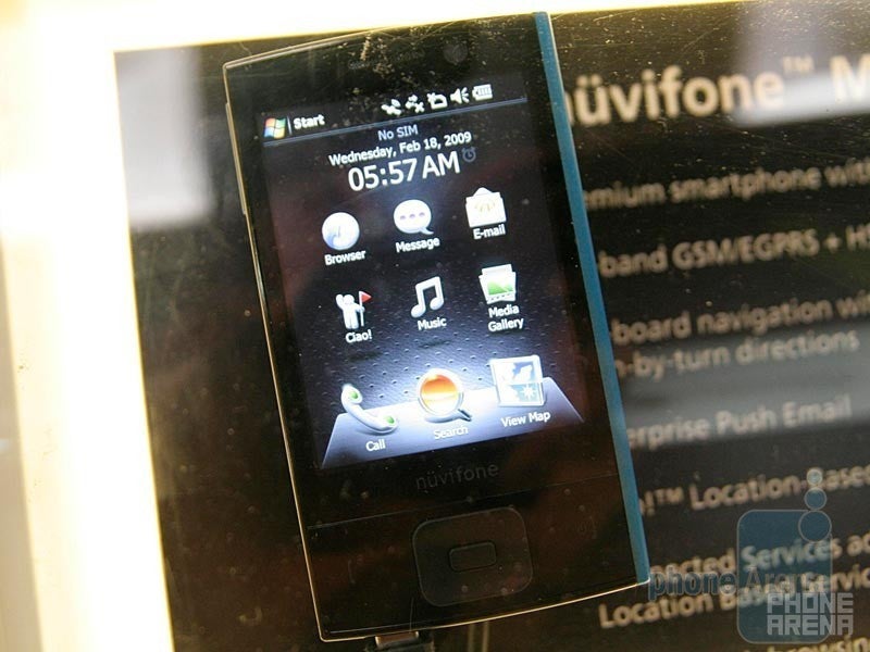
Garmin-Asus nuvifone G60
Oh my gosh, we’re excited! We’re just coming back from the Garmin-Asus booth at the MWC 2009, where we checked their phone, the nuvifone G60. It was showcased last year as well, but all Garmin had at the time was a dummy. Now, they have a fully working unit.
Let us check it out. It is running Garmin’s proprietary OS based on Linux, which is really nice! It’s rarely that we are excited by some product, but the nuvifone managed to shake something in us. The hardware is fine, the display is good and the OS, oh the OS. It is smooth, intuitive, pretty, it’s definitely one of our favorites now. Icons are large in size and with good resolution, lots of details. It is easy to press them and to find the things you are searching for. It is also very intuitive and after a couple of minutes we felt as if we’ve used it for long. One very great feature is that the whole OS is optimized for both portrait and landscape mode. We’ve used it horizontally, as it is more unique and we wanted to make sure it will work fine in such mode.
Are you eager to hear a few details? Well, here they are. There is no homescreen, as in the iPhone, you start with the menu – there are large icons for Calls, Search and Maps and carousel with the rest of the features. Calls allows gives you access to contacts, dial pad and call history. Search allows you to perform various searches – for contact, address, local search (using Google to find points of interest (POI) around you), POI, routes, etc – do not forget this is a Garmin GPS phone! Once you choose what you want to see on the Map, the next big icon will be what you’ll need, leading you into the GPS navigation screen. Garmin told us the experience will be as good as of their stand alone GPS devices, however, do not forget that there is Internet connection, so it may be even better!
What about the rest of the functionality, is it a good all-in-one phone? As we’ve said, the carousel with the smaller icons is used for the rest of the features. Here again you can go into the Contacts – they are displayed well, it is easy to scroll and you can filter by first letter. If you have lots of people in your address book – do not forget that there is option to search in the Search menu. Messaging is also well done and intuitive. Text is entered view the on-screen keyboard; it is a QWERTY in landscape mode and ABCDE when in portrait. The Music player is rather ugly, but is easy to use with large buttons and filtering options (by artist, album, etc). The video player on the other hand is ... missing. It is not because these are prototypes, Garmin has decided not to include video player in the phone at all. Garmin employee told us that they are LBS (location based services) centric company and do not target the nuvifone as a multimedia device. The calendar also cached our attention with its integration of the weather app (it is available as a separate item as well). You see your schedule but also each day has an icon with the weather forecast – nice.
Overall, we really like what we see. It is easy to use, looks well and will probably become the best phone for navigation. However, there are a few great drawbacks – the lack of video and the fact that this is not a smart phone. Probably this problem will be solved with the second nuvifone, the M20. It is Windows Mobile 6.5 based and Garmin-Asus told us that exactly the same interface will be on top of the core OS. However, currently they have only early versions behind the glass, so we’d like to see how it will perform to make sure we like it. The G60 is expected to launch in the first half of the year, while currently there is no exact information when the M20 will be available.
Garmin-Asus nivifone M20
Toshiba TG01
After the G500 and G900 which we reviewed in the middle of 2007, the electronic giant Toshiba didn’t release any interesting phones. This changes now, after the TG01 was announced. It is a powerful Windows Mobile smartphone, the World’s first to use Qualcomm Snapdragon chipset, with 1GHz fast processor. Yeah, now that is a fast WM phone! Opening the start menu, the programs, the contacts, messaging – everything happens instantly! However, the first thing that one notices in the phone is not how fast it reacts, but how big it is. Big is diminutive, it is huge but is very slim (0.39”/9.9mm) and light weight. In addition we do not really blame it for its size, as its display is huge as well – 4.1” unit with WVGA (480x800 pixels) resolution. It has very good sensitivity, pressing and swiping is great.
Toshiba didn’t really give their best to personalize the interface. What is added is a custom home screen and that’s all. Honestly, we are not impressed by it: it doesn’t look easy to use, isn’t pretty and unlike the rest of the system, doesn’t run smooth. So what is good in it? Check out our video hands-on to see what we mean. We like that the Core Player is added though – it is the best video player for Windows Mobile and although it looks ugly, we really like it because it can play DivX, Xvid, MKV and other video files. We really want to test TG01, it has good display and with such processor we guess it may be able to play HD videos! Another key feature is the presence of Flash in the Internet Explorer. We loaded our page and were able to play YouTube videos directly. Unfortunately, the browser lagged, but we guess this will change with final units.
We like how powerful the TG01 is. We hope Toshiba will improve its interface before it comes out and it may turn out to be a great, although big, smart phone.
Back in 2007, Gigabyte, better known as computer hardware manufacturer, enter the phone market. Since then they’ve been releasing about six devices each year, most of them going by unnoticed by the media. The only Gigabyte device we have had change to review was the T600, which was model from 2007. At the MWC, Gigabyte showcased two new devices, part of their 2009 line.
GIGA-BYTE GSmart S1200
The S1200 is the more interesting one as is personalized with AdobeFlash user interface. The device will originally launch with WindowsMobile 6.1 but is capable to support 6.5 as well. The home screen showsa large clock with the current weather information, the number ofmissed call, SMS messages and new e-mails at the bottom, plus the “?”which shows you a diagram of the functionality. The problem here isthat it is shown for a very short period of time and cannot serve itsprimary role, which is to help the user find where the functionality hewants is located.
Keep in mind again, that the software is really early alpha release, and a lot of the things we tried did not work properly or at all.
So think about the home screen as the center of the UI. Swiping finger from right to left will bring up the menu which stands to the right of the center, which is the Programs. Swiping finger from top to the bottom will bring My Favorites menu, which is situated to the north of the center. So, all the menus are positioned around the center home screen and are – Programs (east of the center), Smart Viewer (north-east), My Favorites (north), Smart Player (northwest), Setting (west), Smart Calendar (southwest), Phone (south) and Smart Browser (southeast).
The main issue here will be the large learning curve associated withmemorizing where each menu is. Most owners of BMW have very similarexperience with the company’s iDrive control system, which takes peoplea while to get used to, but once they learn it, it is extremely easy touse. We feel the same way about the Smart Zone UI – once accustomed toit; it should be a breeze to use.
Once the Phone menu is opened, displayed are the several options available – Speed Dial, Call History, Contacts and Call Settings. Each option has a very beautiful icon which is completely black and white. We really would have liked to see some colors in here. A small arrow at the top of the screen shows to which direction to swipe your finger to return back to the main menu.
It seems Gigabyte’s strategy will be to fully personalize the whole WM interface. As this is not a small task (not even HTC has done it so far), they will start releasing devices with whatever they have done so far, and continue to develop their Smart Zone UI along the way. So far, it seems like Gigabyte has slightly deeper level of personalization compared to HTC’s TouchFlo 3D. Still a lot of menus still rely on the standard WM UI – music player and calendar to name a few. A very cool is the image viewer, where the images seem like flowing in the space and tapping on one zooms it in.
The first device to run the new Smart Zone UI will be the S1200. Aquick glimpse reveals its complete departure from the designs we areused to see from Gigabyte. It is very light, with a metal trim aroundthe corners and is considerable smaller compared to for example theSamsung Omnia. The construction seems very good with really nice andbright display. As it is WM 6.5 capable, the minimum three buttons arepresent here. Smaller does not mean with less features – Gigabytemanaged to jam in 3.1 inch display with WVGA (800x480) pixelsresolution, quad-band GSM with only single band Euopean/Asian 3G and3-megapixel camera.
Our overall impressions from the flash based UI are positive. Even though the menu structure seems somewhat confusing at first, after a few days of usage should be enough to get accustomed to it. We hope the next level of the Smart Zone UI will offer even deeper customization.
GIGA-BYTE GSmart MS820
The second new device showcased at the MWC is the GSmart MS820 and unlike the S1200, it will run Gigabyte’s older UI. In is widget-like based menu, with limited customization. The home screen can either show a calendar, an image viewer, a music player or a phonebook plug-in. At the boom of the screen are positioned several shortcuts to other functionality.
The design language is similar to the older Gigabyte models with not so rounded corners. The size is larger compared to the S1200, but still decent for such a device with OK build-quality.
i-mate, once the almighty HTC distributor, finally have realized thatmaking one very marginal device in four different form factors (liketheir 2008 line) will not bring any sales. This year, they announcedone new unique product and showcased two other ones.
i-mate 810-F
The new i-mate 810-F is the only device that we know of which will be offered with life-time warranty. Of course there is a slight catch here (or let’s say their terms are): you have to send your 810-F in to i-mate EVERY year for a check-up. If you have not temped with the screws, or left evidence for intentional attempts to break the device, you will get your warranty extended for another year. This of course needs to be done every year. Of course, the cost for sending the device in will be out of the consumer’s pocket. The price tag seems very hefty – about 700 to 800 Euros (880 to 1,000 USD). For that you get a phone which can withstand against extreme temperatures (ranging between -10 and +60 degrees centigrade), hard hitting and steeping into water. For this purpose, its body is covered by waterproof rubber coating, attached with overt screws. As you may see from the picture, the device is anything but beautiful. However, this is completely understandable, having in mind that endurance is what’s important here.
The device will come with 2 GB of internal memory, which cannot be expanded, as i-mate wanted to have the least possible number of openings to ensure the phone is really water-proof.
i-mate Centurion
The Centurion is another unique product, which i-mate is hoping to boost their sales. The device is really tiny Windows Mobile 6.1 Standard (no touch-screen) phone with full QWERTY keyboard. The prototype we tried out was so early, that it kept falling apart. The main issue will of course be the size of the keyboard, which seemed usable, but the keys were very hard to press. i-mate did not reveal the price or when it will hit the market. The device will not probably have GPS, as there will be no space inside for the antenna.
i-mate Legionaire
Another new unannounced product we spotted at their booth is something called the legionnaire. i-mate did not want to reveal a lot of info about it. Pretty much all we know is it will be Windows Mobile 6.1-6.5 with touch support and expect to be something similar in specs to the Centurion.
modu
Huawei Android Phone
Windows Mobile 6.5 and My Phone
Get Visible as low as $20/mo for 1 year. Limited time offer with code: FRESHSTART
$20
/mo
$25
$5 off (20%)
Offer Ends 6.1.2026 at 11.59pm ET. New members get $5/mo off the $25/mg Visible plan, $35/mo Visible+ plan, or $45/mo Visible+ Pro plan for the first 12 months. Promo code FRESHSTART required at checkout.
A discussion is a place, where people can voice their opinion, no matter if it
is positive, neutral or negative. However, when posting, one must stay true to the topic, and not just share some
random thoughts, which are not directly related to the matter.
Things that are NOT allowed:
Off-topic talk - you must stick to the subject of discussion
Offensive, hate speech - if you want to say something, say it politely
Spam/Advertisements - these posts are deleted
Multiple accounts - one person can have only one account
Impersonations and offensive nicknames - these accounts get banned
To help keep our community safe and free from spam, we apply temporary limits to newly created accounts:
New accounts created within the last 24 hours may experience restrictions on how frequently they can
post or comment.
These limits are in place as a precaution and will automatically lift.
Moderation is done by humans. We try to be as objective as possible and moderate with zero bias. If you think a
post should be moderated - please, report it.
Have a question about the rules or why you have been moderated/limited/banned? Please,
contact us.


Things that are NOT allowed:
To help keep our community safe and free from spam, we apply temporary limits to newly created accounts: