
Check out the easier to read Google Assistant Updates tab being tested
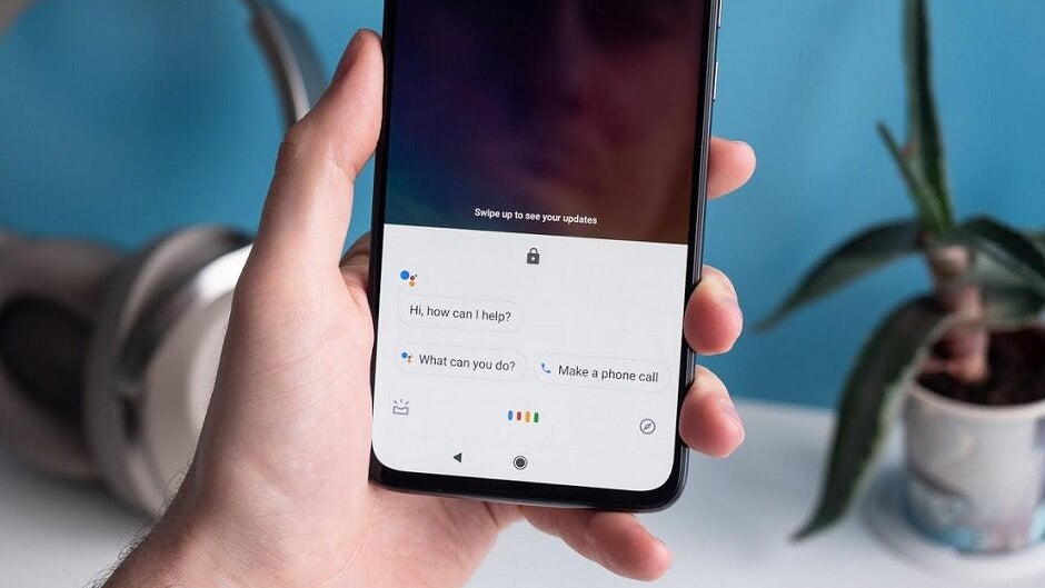
Google made a number of important changes to Assistant this year, especially on the Pixel 4 series. For the first time, the virtual digital helper does its thing on-device leading to faster responses. In addition, Google Assistant's UI has been changed on the new Pixel models so that it doesn't cover as much of the screen as it does on older Pixel units. But one thing that didn't change is the Updates tab. This can be viewed by opening Assistant and tapping on the "in box" icon on the lower left corner of the screen.
The Google Assistant's Updates tab has always contained plenty of information including a greeting at the top of the page, the current weather, calendar appointments and more. A tweet from a Twitter member named Eduardo Pratti (via Android Police) reveals that a test is being run for a revamped UI. The new look tones down the huge greeting at the top and provides a more detailed look at the weather and and easier to read cards listing upcoming appointments. The cards that appear can be tapped on to reveal other actions users can take and include a three-button overflow menu icon that features additional options.
The new design is certainly less crowded and more streamlined. That makes it easier to read, which in turn makes it more helpful to users.
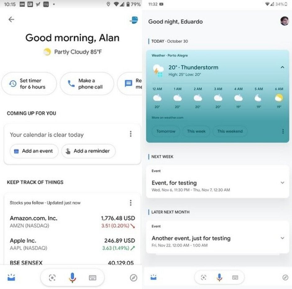
The current UI is on the left, the UI being tested on the right
The source of this screenshot, Eduardo Pratti, happens to be a UI designer himself. He also disseminated a tweet showing the tested UI in action which you can view below.
This is how the cards behave. pic.twitter.com/GvC06VoOOT
— Eduardo Pratti (@edpratti) October 31, 2019

Popular stories


Latest News


Things that are NOT allowed:
To help keep our community safe and free from spam, we apply temporary limits to newly created accounts: