
LG G3 vs LG G2 user interfaces compared: what has changed?
You've probably heard the news: LG has a brand new flagship smartphone. It is called the LG G3 and it brings along a plethora of minor and major hardware improvements over its predecessor, including a screen with a jaw-dropping resolution, a super-fast SoC, and an improved main camera.
But that's not all – LG's latest high-end ships with a fresh, new user interface. Gone is the sparkly, cartoonish UI that the LG G2 came with. In its place we find an experience that's a lot more toned down, more consistent, and more mature.
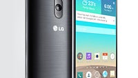
How do the old and the new LG interfaces look side by side, however? What's so new about the latter anyway? Well, to help answer these questions, we've put together a brief visual comparison between the two. As you can see, the G3's UI has been polished well. Clutter has been minimized, and the flat overall look brings a welcome modern feel. Many of the boxy icons have been replaced with circular ones, drawing inspiration from the company's logo. Plus, the camera menus now don't hide the viewfinder when opened, and the on-screen menu key has been removed in favor of one for our recent apps.
How do you find the new UI experience on the LG G3 so far? Let us know in the comments!
Note: The LG G3 UI is on the left/top, and the LG G2 interface is on the right/bottom.
Follow us on Google News


Things that are NOT allowed:
To help keep our community safe and free from spam, we apply temporary limits to newly created accounts: