Google is carrying on with the redesign of its apps and icons, Android Authority reports. After refreshing most of its Workspace app icons, now the company is giving the Pixel Buds app a redesign in and out. It's part of a much bigger shift, with Google parting with its old graphics ways and embracing a new visual identity.
A fresh "gradient" icon for your home screen
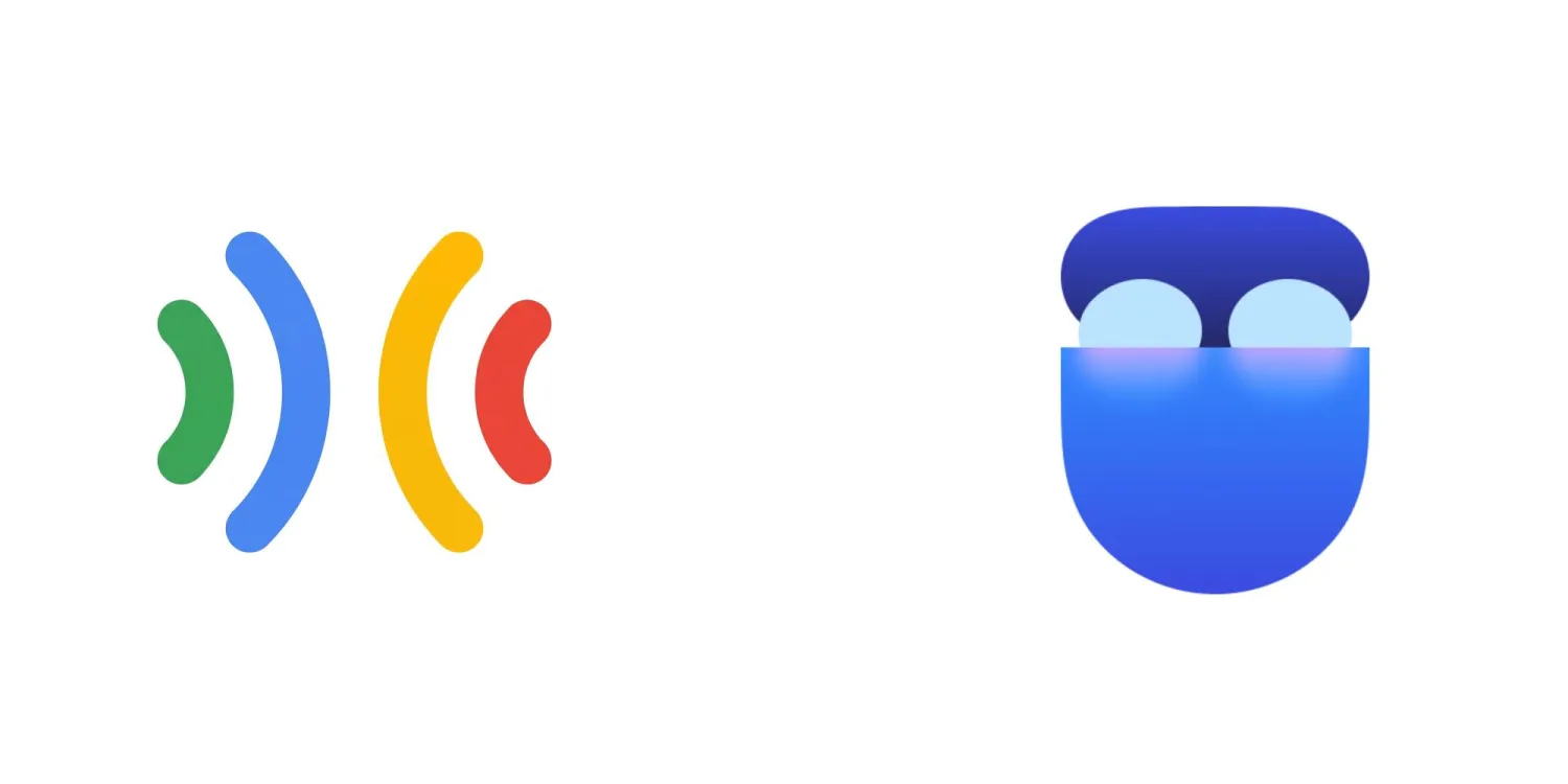
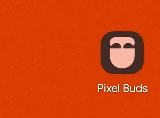
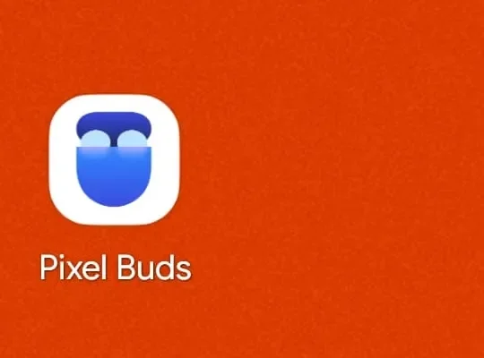
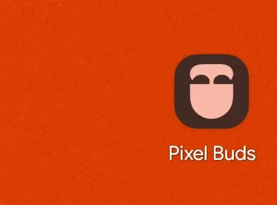
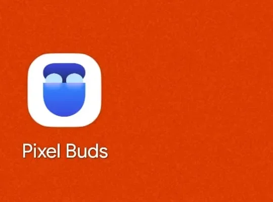
The new Pixel Buds home icon vs the old one | Image by 9to5Google
The Pixel Buds icon is the first and most immediate change. The app icon now features the same modern look as the other refreshed "gradient" icons and won't stick out on your Pixel's home screen like a sore thumb.
The icon in question, which you can see above, now sports a very stylized look with three tones of blue and a touch of purple. The lines are curved, and I personally think it looks better than the old one, which was just four curves in four different colors.
But the Pixel Buds app overhaul extends beyond a simple app icon redesign.
What do you think about the new Pixel Buds app update?
52 Votes
A new Landing Page
Another change, and a quality-of-life update, is the new Landing Page inside the app. It's designed to help people owning multiple pairs of Pixel Buds to easily switch between them and manage the different paired buds.
Google also went the extra mile and made the colors of the icons on the Landing Page match the actual hues of your physical set of Pixel Buds. If you have the Porcelain color option and the Hazel one, for example, you will be able to easily recognize them and tell them apart at a glance.
Our users wanted a dedicated, personal entry point for a true Pixel Buds experience—and this is it. We aim to continually improve our products and address the feedback from our Android community.
The update is rolling out now
According to the official press release, the new Pixel Buds app overhaul is rolling out as you read this. It carries version number 1.0.915175631, and it already landed on some Pixel phones, but in typical Google fashion, it is a timed rollout, so keep an eye on the Play Store.
Have you already received the update, and do you like the new look and Landing Page? Share your thoughts in the comments below.
PhoneArena's take
Google is trying to shift away from the previous minimalistic icon design, and the company is apparently doing it in chunks.
I think it would've been better if Google just rolled out the whole new design in one big update. Now people are getting new icons from time to time and have to adjust to the change each time a new app receives this new "gradient" look.
As for the update itself, it's nice for people with more than one pair, but it's a niche case. I would've preferred more EQ settings or new AI features for the buds. But hey, a modest update, bringing new features, is still better than no update at all.
Mint Mobile's 6-month plans now cost $10/mo
$10
/mo
$35
$25 off (71%)
Mint Mobile is celebrating its 10-year anniversary with a special offer on its six-month subscription plans. For a limited time, you can get your preferred tier (6GB, 17GB, 23GB or unlimited) for just $10/mo. That saves you between 50% and 71% on the carrier's mobile plans, making it way easier to recommend.
Mariyan, a tech enthusiast with a background in Nuclear Physics and Journalism, brings a unique perspective to PhoneArena. His childhood curiosity for gadgets evolved into a professional passion for technology, leading him to the role of Editor-in-Chief at PCWorld Bulgaria before joining PhoneArena. Mariyan's interests range from mainstream Android and iPhone debates to fringe technologies like graphene batteries and nanotechnology. Off-duty, he enjoys playing his electric guitar, practicing Japanese, and revisiting his love for video games and Haruki Murakami's works.
A discussion is a place, where people can voice their opinion, no matter if it
is positive, neutral or negative. However, when posting, one must stay true to the topic, and not just share some
random thoughts, which are not directly related to the matter.
Things that are NOT allowed:
Off-topic talk - you must stick to the subject of discussion
Offensive, hate speech - if you want to say something, say it politely
Spam/Advertisements - these posts are deleted
Multiple accounts - one person can have only one account
Impersonations and offensive nicknames - these accounts get banned
To help keep our community safe and free from spam, we apply temporary limits to newly created accounts:
New accounts created within the last 24 hours may experience restrictions on how frequently they can
post or comment.
These limits are in place as a precaution and will automatically lift.
Moderation is done by humans. We try to be as objective as possible and moderate with zero bias. If you think a
post should be moderated - please, report it.
Have a question about the rules or why you have been moderated/limited/banned? Please,
contact us.





Things that are NOT allowed:
To help keep our community safe and free from spam, we apply temporary limits to newly created accounts: