iPadOS 26: dismantling the iPad experience while looking good
iPadOS 26 is the biggest thing that happened to the iPad since the iPad Pro. It redefines the entire experience, but that'll require some getting used to
This article may contain personal views and opinion from the author.
iPadOS 26 finally came with the updates we’ve been begging for, the ones that were supposed to turn the iPad into a true laptop replacement. For years, we’ve been shouting: “Just make iPads run macOS, will you?” Turns out that we may not really want that. Or, Apple just fumbled the ball, again.
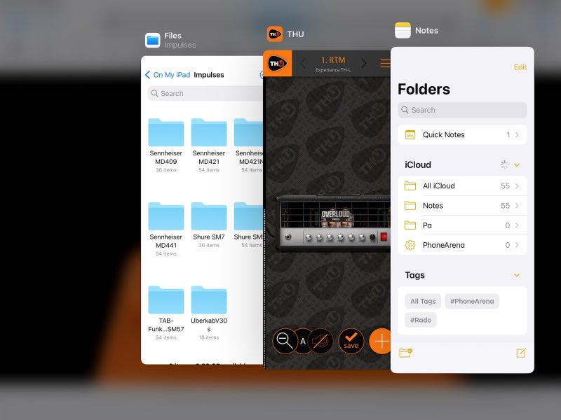
The new iPadOS 26 can finally handle multiple windows in a more natural, desktop-like way. You no longer need to learn to use the dizzyingly clunky Stage Manager. The Files app has been reworked to finally be useful. And the Preview app from macOS came in to finally let us — imagine that — preview files without having to download and juggle through multiple apps.
It all sounds fantastic. Until you use it.
Some of the features feel clunky on a touchscreen. Other features that defined the iPad experience for years now have just been scrapped. So what happened? Let’s dive into how iPadOS 26 might have made the iPad more capable, but less iPad than ever.
Recommended For You
Apple backtracking — and somehow, backwards is the right direction
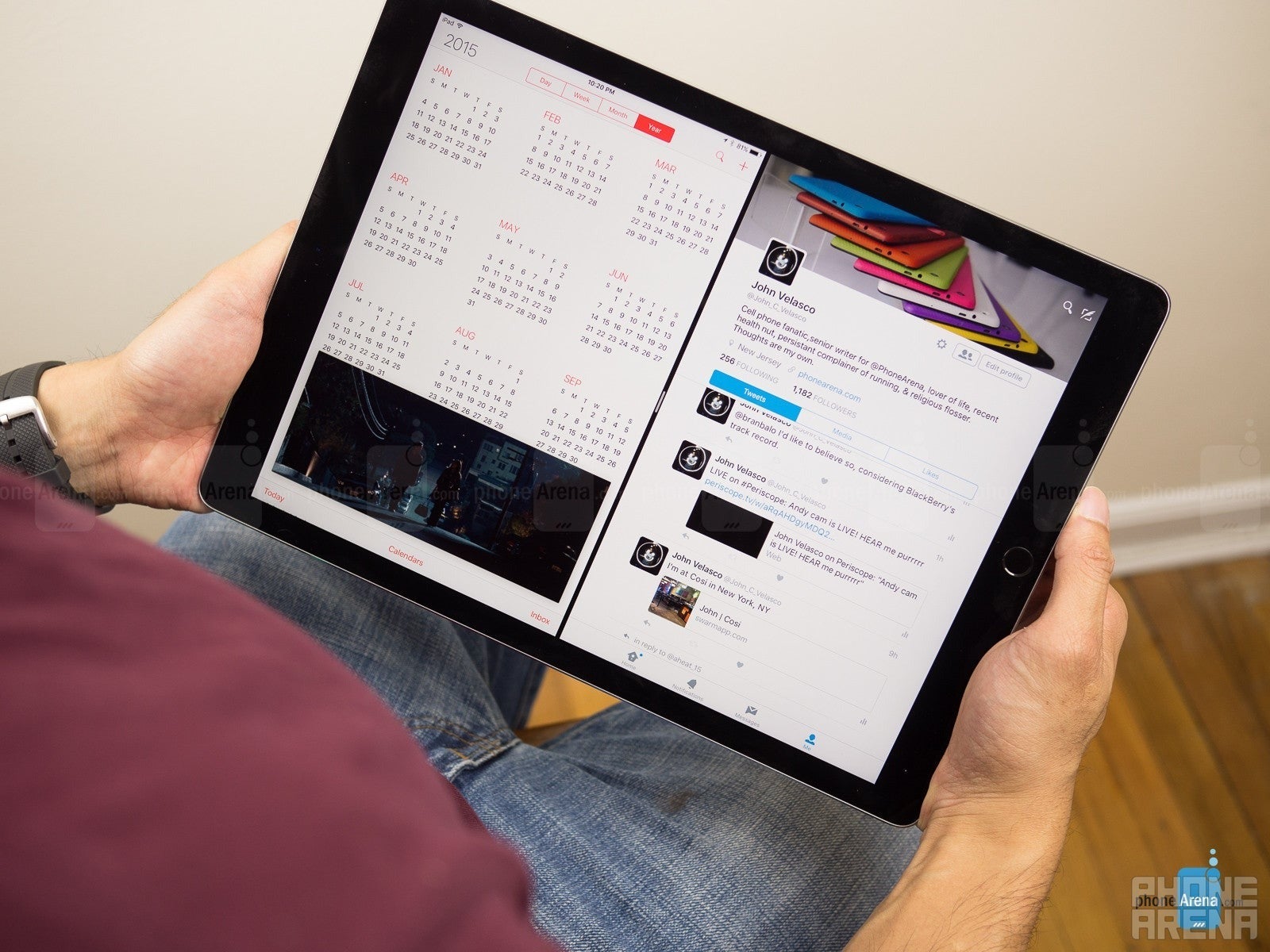
The OG humongo-Pad (Image credit - PhoneArena
Let’s rewind for a second. The iPad has always done “its own thing”. Apple never wanted it to step on MacBook’s toes. After all, why sell one product when you can sell two?
Even when the giant 12.9-inch iPad Pro model launched in 2015, the only bit of multi-tasking you could do was Split View and Slide Over.
We made it work, sure, but it was still kind of ridiculous that a huge, 13-inch tablet was so limited.
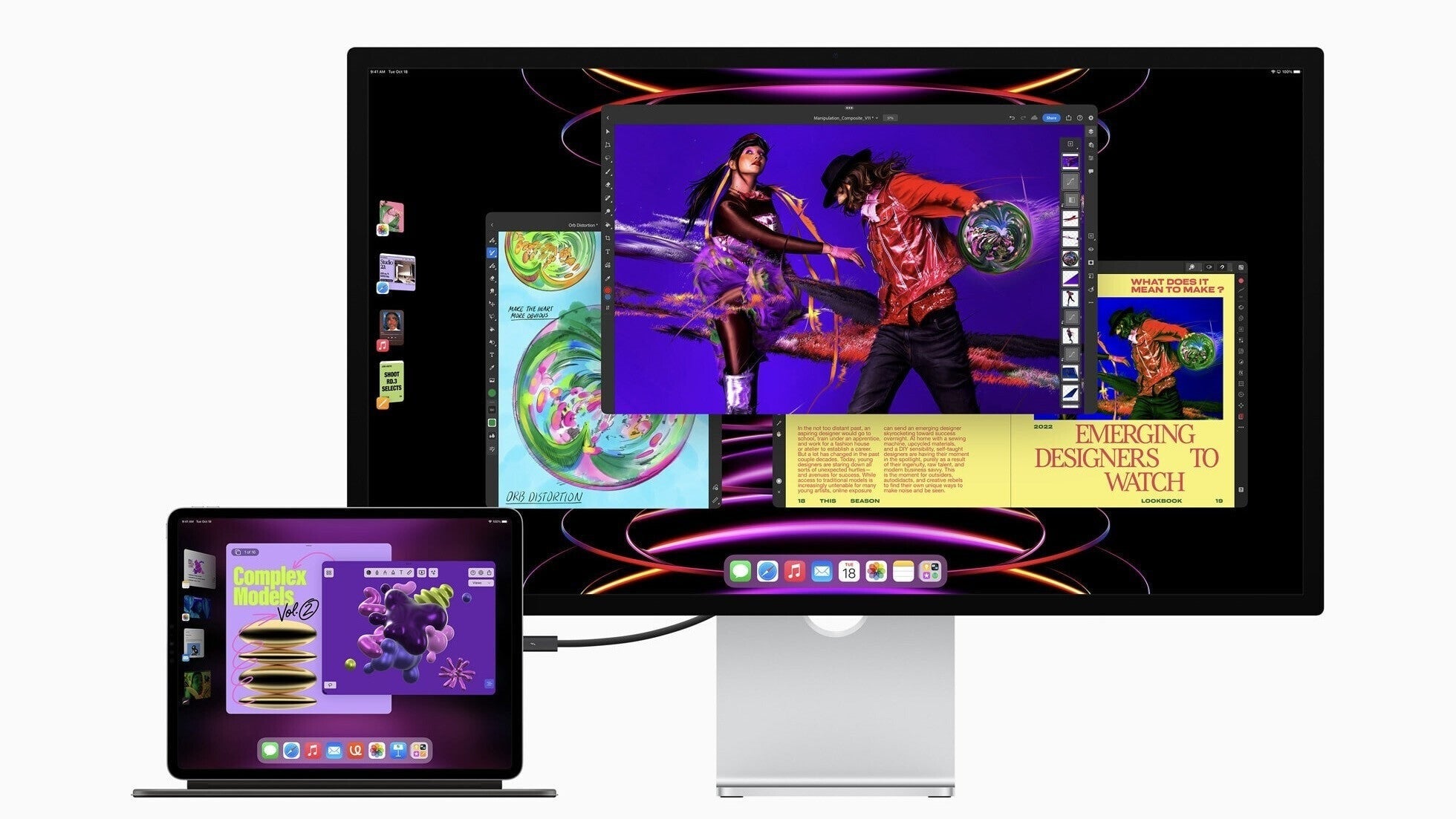
In 2022, Apple introduced Stage Manager, its first attempt at serious multitasking via a slide-in menu from the left side of the interface.
Image credit - Apple
It was first shown off as a macOS feature to everyone’s confusion — why add this when the Mac already has multi-desktop mode? Then, it was revealed that Stage Manager would be coming to the iPad Pros as well.
Ahh, lightbulb moment: Stage Manager was intended as the iPad’s multi-tasking platform. Apple just demoed it on Mac fist, so that we would think the iPad is getting Mac-level features.
What’s even funnier is that, on launch, Stage Manager was limited to M-class chip iPads. It required too much power, apparently. Fast-forward to today, and it’s available on even the lowest-tier iPad. Scratch that, it’s available on the lowest-tier iPad from 2020 — the iPad 8th gen (with A12 Bionic chip).
Well… that’s awkward. The good news is that Stage Manager was never that good, which is why Apple finally added the new Windowed Apps system — also available on iPad 8th gen and anything newer than that.
The new window system is great - on paper
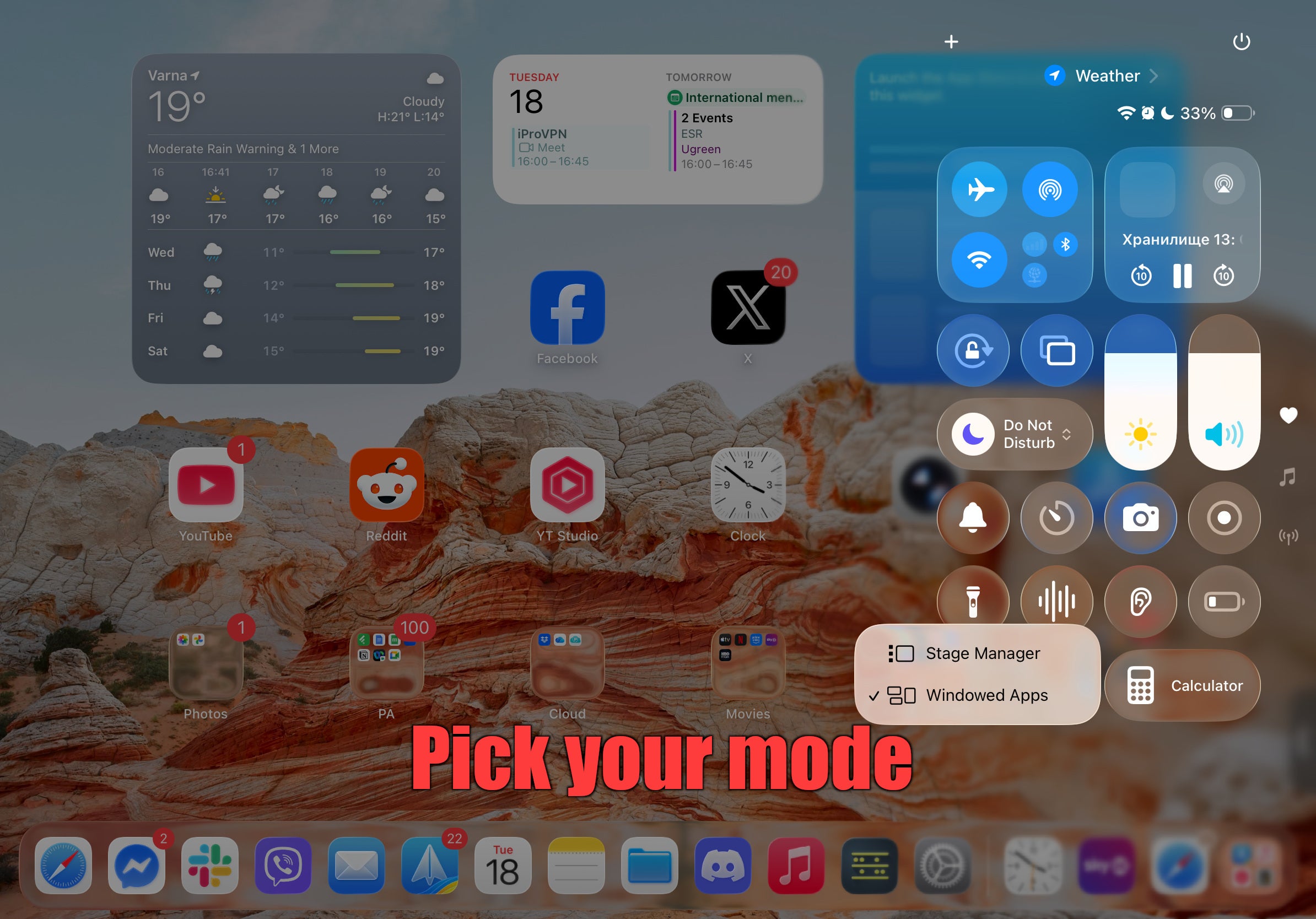
OK, within Settings, or in the Control Center, you can now toggle between three operating modes. Full-screen apps for the classic one-app-at-a-time experience, Stage Manager if you fancy a little bit of headache in your lovely afternoon, or Windowed Apps mode if you want to actually multi-task on your iPad.
For all intents and purposes, you can run Windowed Apps and keep using your iPad as usual. A new app will open in full screen. Swiping horizontally over the bottom of the screen will swap between recent apps. And swiping up is still “home”.
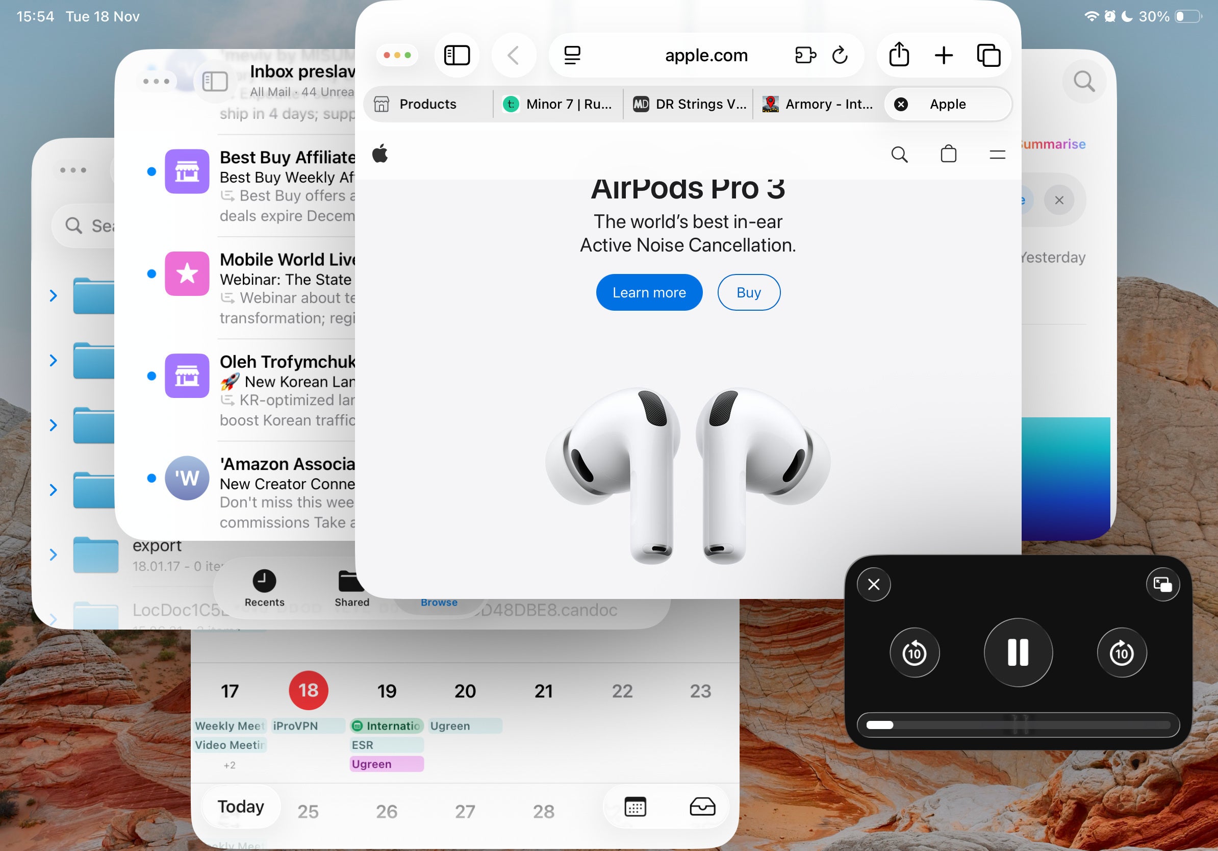
But, swiping in diagonally from the lower-right corner of the screen will instantly resize the app into a window, which you can freely manipulate. Then, you can open another app from the dock and so on. The amount of windows you can have is limited by your iPad’s model and RAM, but you won’t be using more than three anyway — it is still an iPad, after all.
Added benefits of the Windowed Apps system
iPhone-only apps no longer open in fullscreen, while being tiny little letterboxed windows in the middle. Instead, they open in floating windows automatically. While that doesn’t make them more useful on a large iPad screen, it certainly makes them look less ridiculous and take up too much space.
Working in the background
The main issue people were having with the super-powered, super-expensive iPad Pros was that you couldn’t even think about multi-tasking. Rendering a 4K video? Better not even think about checking your email or switching over to Safari — your export will instantly fail.
Well, in the year 2025, we got background tasks in iPadOS. Even if you choose to use the simplified Full Screen Apps mode, it’s still on. Plus, the background work API is available to developers, so your favorite pro apps should already be able to work in the background (or be getting an update very, very soon).
So, what’s bad about Windowed Apps?
It turns out that it’s still a bit hard to set up and arrange your windows for a nice, fluid workflow. Especially if you are not using an external keyboard and trackpad — manipulating the windows with a finger on a touchscreen interface is a bit of a chore in its own right.
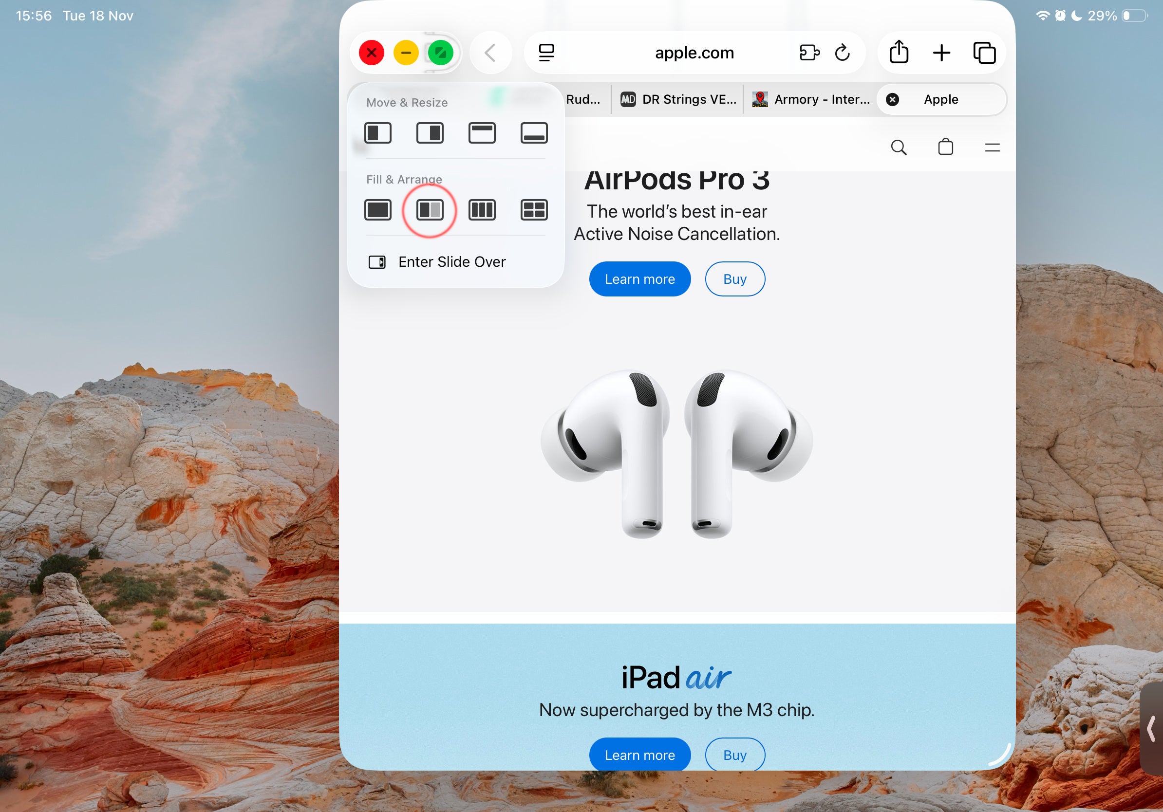
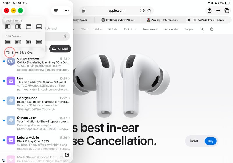
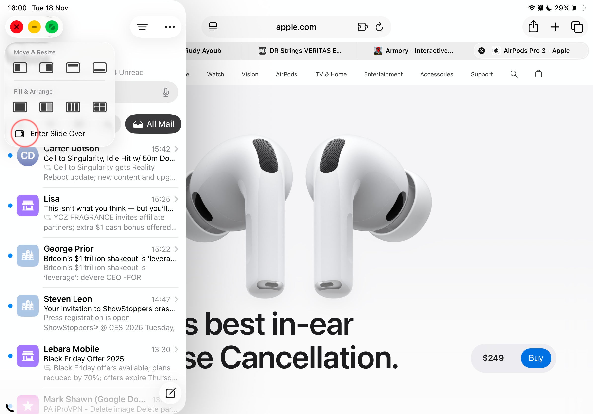
Apple seems to have realized this, which is why if you tap and hold on the “traffic light dots” in the upper-left of an app’s window, you will get the option to quickly place it in one half of the screen or the other, split it vertically or horizontally.
But it still requires too many taps, too many holds, and at least one swipe.
The issue is further compounded by the fact that whenever you split a window to the left, you no longer get a view of your apps in the background. Instead, you now have to pull up the secondary app from your dock. So, that’ll require you to re-learn some actions, and rearrange your favorite apps in your dock — possibly even in folders down there.
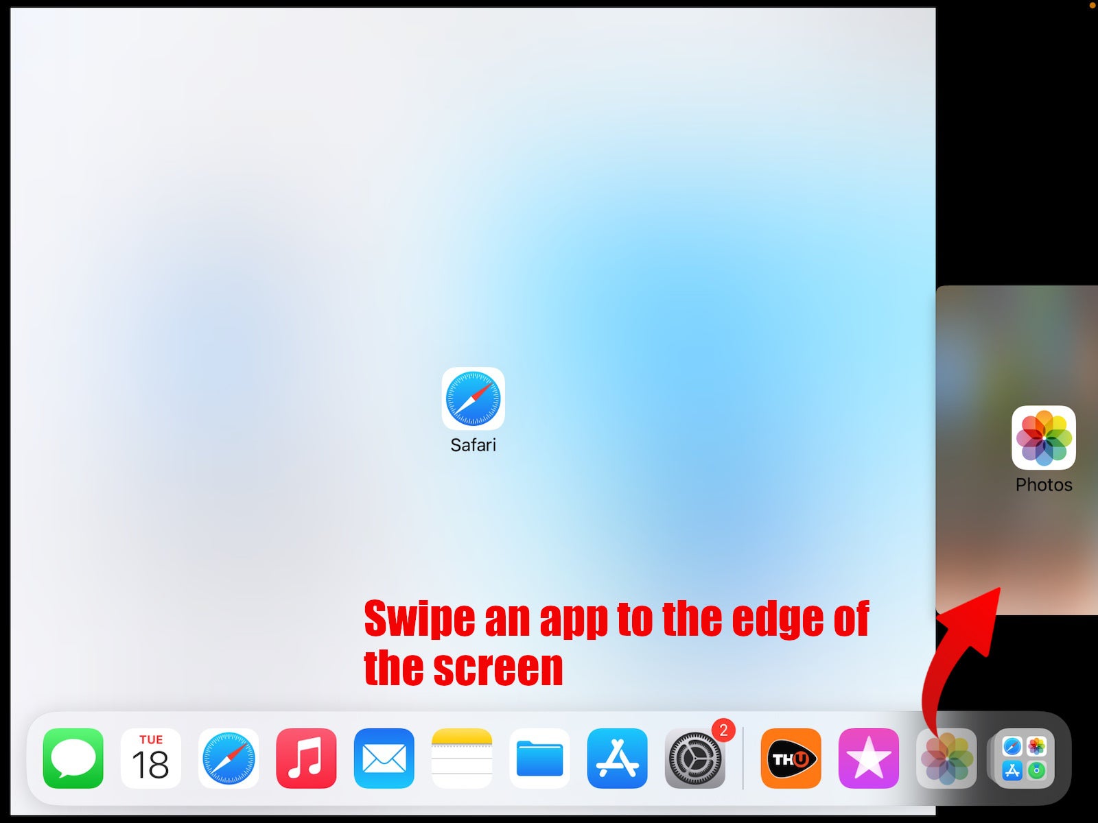
A eulogy for Slide Over and Split View
As previously mentioned, Slide Over and Split View were the previous humble multi-tasking tools on the iPads. And while they had their limitations, their simplicity is what made them great.
Slide Over let you stack apps in small window “cards” on the right side of the screen. Imagine having your Slack, Messenger, and Email tucked away in a Slide Over stack. You pull it in, respond to a message, swipe it back out — you are ready to keep watching that YouTube video working on your important project.
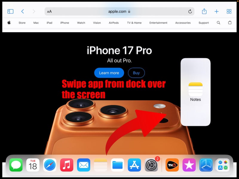
Split View, was even simpler. Just swipe in an app from the dock over your already active app and you instantly split them. A middle bar let you resize the apps however you want.
In iPadOS 26, Split View still technically exists in Windowed mode. You just access it with a lot more taps, as outlined above. Tap and hold on the traffic light dots, from Fill and Arrange choose your secondary app from the dock. Kind of a backwards way of doing it compared to before, but OK.
Note: the latest iPadOS 26.2 betas show that Apple is experimenting with returning the "old" way of accessing Split View. That's good news, let's hope it's not a nerfed version of it, like what happened with Slide Over:
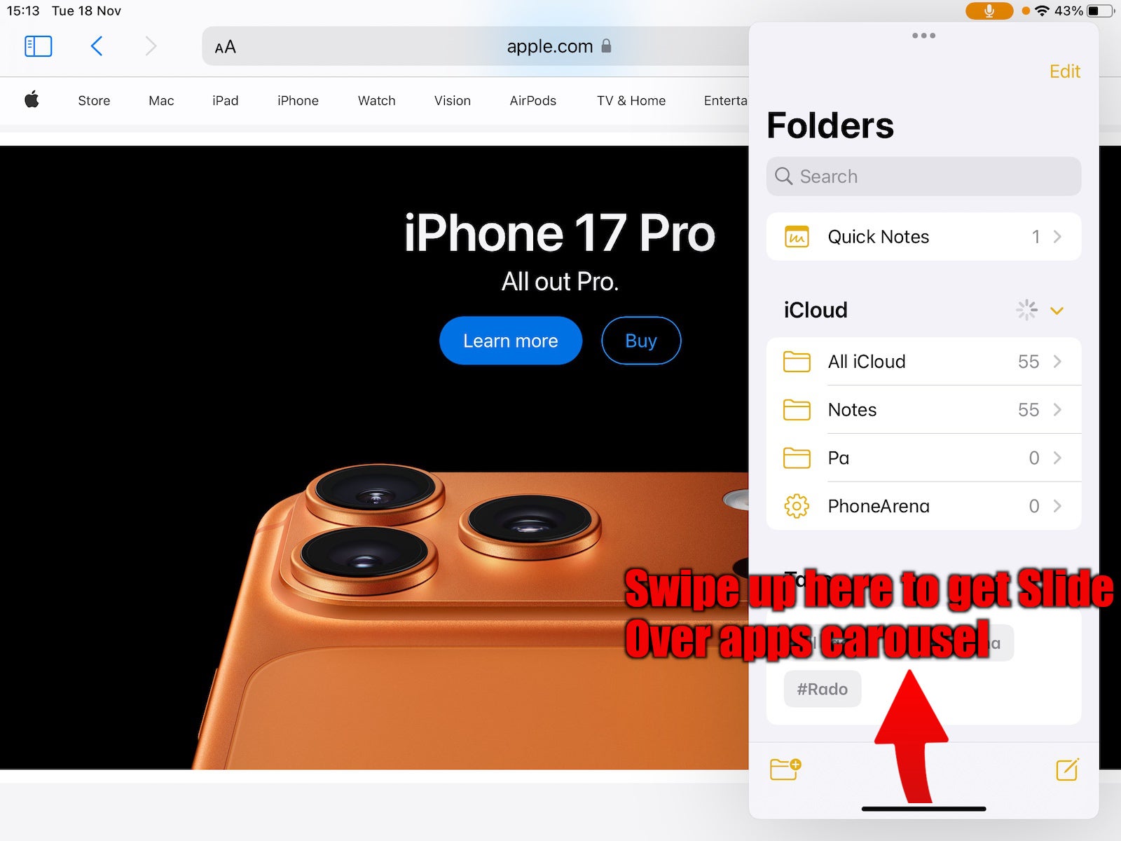
Slide Over died with iPadOS 26, only to return with the 26.1 update. It’s just that it’s much more hampered right now.
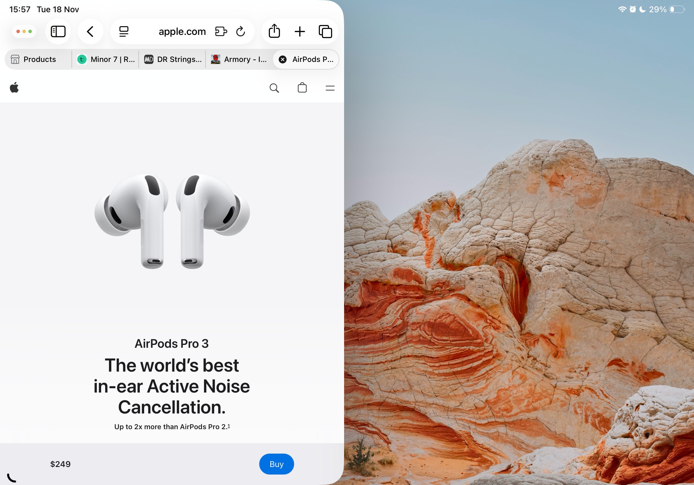
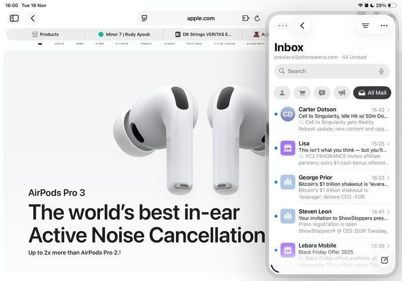
To get an app to Slide Over — tap and hold on the traffic light dots, then choose Enter Slide Over. This app will always stay afloat on the side of the screen. You can swipe it out when you don’t need it, swipe it back in when you do.
So yes, it’s perfect for things like your work chat, for example. But you can only have one single app in Slide Over — the stacking option and separate carousel is gone. And, again, it takes too many taps and fiddling where before you just had to drag an app to the right side of the screen. We are evolving! Just… backwards.
Apple kept the wrong thing - why is Stage Manager still here?
Many people liked and used Slide Over and Split View. Not many were in love with Stage Manager. The thing is clunky, has a steeper learning curve than an extraction shooter, and at the end of the day doesn’t give you back a value in workflow proportional to the amount of effort you put into trying to keep it tidy.
Again, on paper — not such a bad idea. Stage Manager takes the approach of having multiple - gasp - stages to work in. One screen with a few of your chat apps in windows, one screen with your web research and notes, one screen with your tasks, reminders, and such.
Image credit - Apple
The issue is how we get there. When you are looking at a certain stage and open an app from the dock, said app will auto-create a new stage, instead of automatically being added to your current one. You have to — you guessed it — hold, drag, and drop an app within the stage.
Then, when trying to manipulate your stages in the side dock, you will find you can’t do much with them.
For example, you can not toss an app from your current stage to another stage. You can not use the overview to drag an app from one stage to another. And you can’t drag an app from the bottom dock to the stages overview. You can only pull an app in your current, active stage and that’s it.
You can have multiple instances of one app in different stages, but only if said app supports the “New window” feature — meaning mostly the stock iPadOS apps. But even then, that means you can’t have one version of Safari, with the exact same webpage and browsing history, in multiple stages. Which kind of half-defeats the purpose of trying to multi-task in this manner in the first place.
An ode to the homescreen
Unless Apple changes course, you will need to get out of the habit of having your favorite apps on your homescreen. The way it used to work before — when you swipe an active app away so you could go into Split View, you’d be presented with your familiar homescreen, so you’d be able to quickly choose what you needed.
Now, if you try to get into split-view the old-fashioned way, you will be met with a wallpaper, but not your homescreen app arrangement.
Only when you are already in multi-window, with windows open, you can swipe in from the bottom center — the windows will temporarily clear off to the sides and let you pick another app to stack from your homescreen.
Apps off to the side, waiting for me to pick a new buddy
You will find yourself using the dock more regularly. Maybe it’s a good time to arrange your favorite apps in there, maybe even clear up your homescreen entirely. Put all your favorite widgets on home, all the apps you need in the dock, pray for the best results.
In the end of the day — it’ll probably be fine. We learned to work with Slide Over and Split View for so many years. This new system may actually turn out for the better.
What, you thought there really was an ode here? Fine… here it is:
O homescreen, familiar visage, how simple it was to traverse you. A swipe, a tap — my apps appeared, my world in neat little rows. One day you’re here, the next you are gone, Now a wallpaper, cold and blank. Apple says “Use the Dock” So I obey, rearrange, and adjust. Quietly I’ll miss your steady grid, My chosen order, your glow. Fare thee well, as you are now obsolete And the chaos of “Recent apps” ever so bleak.
Get Visible as low as $20/mo for 1 year. Limited time offer with code: FRESHSTART
$20
/mo
$25
$5 off (20%)
Offer Ends 6.1.2026 at 11.59pm ET. New members get $5/mo off the $25/mg Visible plan, $35/mo Visible+ plan, or $45/mo Visible+ Pro plan for the first 12 months. Promo code FRESHSTART required at checkout.
Preslav, a member of the PhoneArena team since 2014, is a mobile technology enthusiast with a penchant for integrating tech into his hobbies and work. Whether it's writing articles on an iPad Pro, recording band rehearsals with multiple phones, or exploring the potential of mobile gaming through services like GeForce Now and Steam Link, Preslav's approach is hands-on and innovative. His balanced perspective allows him to appreciate both Android and iOS ecosystems, focusing on performance, camera quality, and user experience over brand loyalty.
A discussion is a place, where people can voice their opinion, no matter if it
is positive, neutral or negative. However, when posting, one must stay true to the topic, and not just share some
random thoughts, which are not directly related to the matter.
Things that are NOT allowed:
Off-topic talk - you must stick to the subject of discussion
Offensive, hate speech - if you want to say something, say it politely
Spam/Advertisements - these posts are deleted
Multiple accounts - one person can have only one account
Impersonations and offensive nicknames - these accounts get banned
To help keep our community safe and free from spam, we apply temporary limits to newly created accounts:
New accounts created within the last 24 hours may experience restrictions on how frequently they can
post or comment.
These limits are in place as a precaution and will automatically lift.
Moderation is done by humans. We try to be as objective as possible and moderate with zero bias. If you think a
post should be moderated - please, report it.
Have a question about the rules or why you have been moderated/limited/banned? Please,
contact us.


![T-Mobile will hire from India after layoffs in the US [UPDATED]](https://m-cdn.phonearena.com/images/article/180876-wide-two_350/T-Mobile-will-hire-from-India-after-layoffs-in-the-US-UPDATED.webp)


Things that are NOT allowed:
To help keep our community safe and free from spam, we apply temporary limits to newly created accounts: