For the first time in many years, Waze is getting a major visual overhaul. In fact, the changes are so deep that it warranted Waze to advertise it as a “new brand identity.” Everything you see in the app now is brightly colored and .. more funnier.
Each Waze icon has been redesign to reflect not just simplicity and optimism, but also joy. Even the angry emoticons now look kind of joyful due to the color palette and design. No less than 30 emoticons that are used to express your mood have been completely redone to come in line with the new design language.
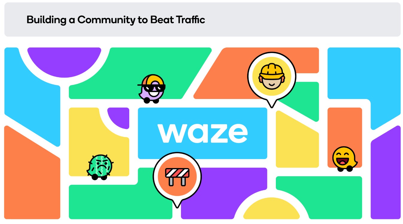
The main elements of the new brand are based on a grid system, enabling Waze to provide users with more consistency across the board, “from product icons to social posts to email templates.” Waze is calling this “block-by-block system” and you can see in the picture below.
Recommended For You
The main reason Waze opted for this system is that it wanted to bring its map built by the community into its designs. Since these blocks come in different shapes and sizes, it offers the best of both worlds: functionality and entertainment. More than 13,000 community members helped shape up Waze's new brand identity, so it looks like this is a true win for the end-users.
Get Visible as low as $20/mo for 1 year. Limited time offer with code: FRESHSTART
$20
/mo
$25
$5 off (20%)
Offer Ends 6.1.2026 at 11.59pm ET. New members get $5/mo off the $25/mg Visible plan, $35/mo Visible+ plan, or $45/mo Visible+ Pro plan for the first 12 months. Promo code FRESHSTART required at checkout.
Cosmin, a tech journalist with a career spanning over a decade, brought a wealth of experience to PhoneArena. His expertise lies in brands like Samsung and Nokia, and he has a keen interest in innovative technologies. After a brief stint in PR, Cosmin returned to tech journalism in 2016, committed to delivering clear and objective news. When he's not writing or appearing as a guest on TV and radio shows, Cosmin enjoys playing RPGs, watching Netflix, and nurturing his passion for history and travel.
Recommended For You
COMMENTS (1)
COMMENTS (1)
All comments need to comply with our
Community Guidelines
PhoneArena Community Rules
A discussion is a place, where people can voice their opinion, no matter if it
is positive, neutral or negative. However, when posting, one must stay true to the topic, and not just share some
random thoughts, which are not directly related to the matter.
Things that are NOT allowed:
Off-topic talk - you must stick to the subject of discussion
Offensive, hate speech - if you want to say something, say it politely
Spam/Advertisements - these posts are deleted
Multiple accounts - one person can have only one account
Impersonations and offensive nicknames - these accounts get banned
To help keep our community safe and free from spam, we apply temporary limits to newly created accounts:
New accounts created within the last 24 hours may experience restrictions on how frequently they can
post or comment.
These limits are in place as a precaution and will automatically lift.
Moderation is done by humans. We try to be as objective as possible and moderate with zero bias. If you think a
post should be moderated - please, report it.
Have a question about the rules or why you have been moderated/limited/banned? Please,
contact us.


Things that are NOT allowed:
To help keep our community safe and free from spam, we apply temporary limits to newly created accounts: