This article may contain personal views and opinion from the author.
Samsung has inadvertently leaked the design of its upcoming Galaxy S26 lineup via One UI 8.5 code, revealing a unified look across the board. While some critics are calling it "boring," I think this move toward a cohesive brand identity is exactly what Samsung needs.
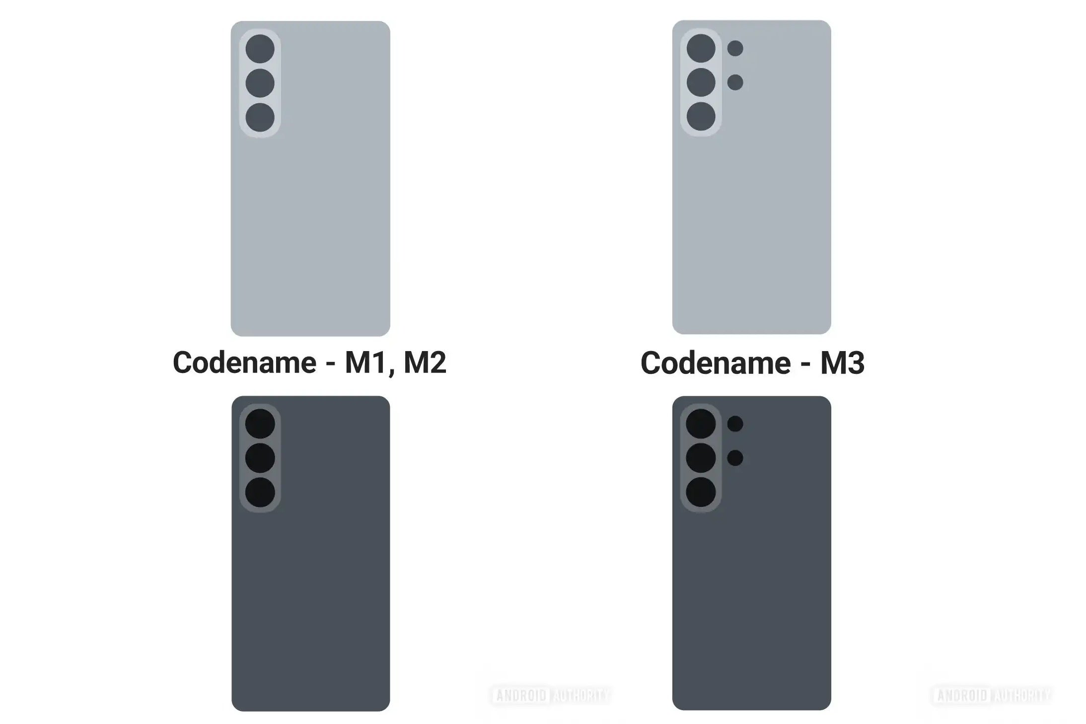
These images reportedly show that Samsung is ditching the mismatched aesthetics of previous years. Historically, the "Ultra" model has been the odd one out, often retaining the sharp corners and floating camera lenses of the defunct Galaxy Note line, while the standard S and Plus models adopted softer curves and dedicated camera islands.
Recommended For You
According to these new renders, that era is over. The Galaxy S26 Ultra now sports a vertical camera island that mirrors its smaller siblings, just with a few extra sensors tucked to the side. It’s a subtle shift, but it signifies a major philosophy change: the entire S26 family finally looks like it belongs to the same parents.
A shared design language
The Galaxy S26, S26 Plus, and S26 Ultra redesigns. | Image credit — Android Authority.
Design consistency is a tricky beast in the smartphone world. On one hand, you want your $1,200 "Ultra" phone to stand out from the $300 budget option. On the other, you want a recognizable "face" for your brand that anyone can spot from across the room.
For years, Samsung’s strategy felt a bit disjointed. You had the S24 and S24 Plus looking like one species, and the S24 Ultra looking like a distant cousin visiting from the Note dimension. By unifying the camera island design across the S26, S26 Plus, and S26 Ultra, Samsung is taking a page out of the Apple and Google playbooks—but with its own twist.
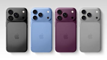
Competitors like Apple have long maintained a shared design language. Even though the iPhone 17 Pro has a massive "camera plateau" compared to the standard model's smaller bump, they are undeniably cut from the same cloth. Google does similar work with the Pixel 10 series, where the signature camera bar (or visor) makes a Pixel instantly a Pixel, whether it's the Pro or the budget 9a.
The risk here, of course, is the "Galaxy A-ification" of the flagship line. If the S26 Ultra looks too much like a Galaxy A55, does it lose its premium allure? That's the fear driving the negative reactions to this leak. However, the flip side is stronger brand equity. When every phone you sell shares a distinct look, you build a visual identity that is stronger than any single model’s spec sheet.
What do you think about the Galaxy S26 design?
I like it, Samsung is making a good choice
29.92%
It’s okay, I don’t mind it
37.21%
I don’t like it, it looks cheap
32.88%
1317 Votes
Consistency is important
This might be an unpopular opinion, especially among hardcore enthusiasts who loved the unique "Note" look of the Ultra, but I really dig this change. I’ve always found it a bit messy when a manufacturer’s flagship lineup looks like a hodgepodge of different design teams’ homework.
There is something satisfying about a product family that actually looks like a family. When you place the S26, Plus, and Ultra side-by-side, they should look like small, medium, and large versions of the same vision, not three strangers sharing a shelf. This unified vertical island design brings a cleanliness to the lineup that has been missing.
Sure, I get the complaint that it might make the Ultra feel less "special" or distinct. But distinctiveness shouldn't come from looking completely unrelated to the rest of the brand. Distinctiveness should come from build materials, screen tech, and the raw capability of the device. If the S26 Ultra is made of titanium and glass while the A-series uses plastic, you’re going to feel the difference the second you pick it up, regardless of the camera shape.
Ultimately, a cohesive design language signals confidence. It says, "This is what a Samsung phone looks like." And frankly, after years of the Ultra feeling like a lingering ghost of the Note series, it’s about time it fully joined the Galaxy S family.
Get Visible as low as $20/mo for 1 year. Limited time offer with code: FRESHSTART
$20
/mo
$25
$5 off (20%)
Offer Ends 6.1.2026 at 11.59pm ET. New members get $5/mo off the $25/mg Visible plan, $35/mo Visible+ plan, or $45/mo Visible+ Pro plan for the first 12 months. Promo code FRESHSTART required at checkout.
Johanna Romero is a Senior News Writer at PhoneArena, covering mobile technology news across Android, iOS, wearables, and the Google ecosystem she knows best. Drawing on 15 years in IT and tech support from 2007 to 2022, she brings a user-friendly eye for the practical features and lesser-known tricks readers care about. Google named her an official #TeamPixel member in 2022, and she also reviews the latest devices on her YouTube channel, JoJo the Techie.
A discussion is a place, where people can voice their opinion, no matter if it
is positive, neutral or negative. However, when posting, one must stay true to the topic, and not just share some
random thoughts, which are not directly related to the matter.
Things that are NOT allowed:
Off-topic talk - you must stick to the subject of discussion
Offensive, hate speech - if you want to say something, say it politely
Spam/Advertisements - these posts are deleted
Multiple accounts - one person can have only one account
Impersonations and offensive nicknames - these accounts get banned
To help keep our community safe and free from spam, we apply temporary limits to newly created accounts:
New accounts created within the last 24 hours may experience restrictions on how frequently they can
post or comment.
These limits are in place as a precaution and will automatically lift.
Moderation is done by humans. We try to be as objective as possible and moderate with zero bias. If you think a
post should be moderated - please, report it.
Have a question about the rules or why you have been moderated/limited/banned? Please,
contact us.


Things that are NOT allowed:
To help keep our community safe and free from spam, we apply temporary limits to newly created accounts: