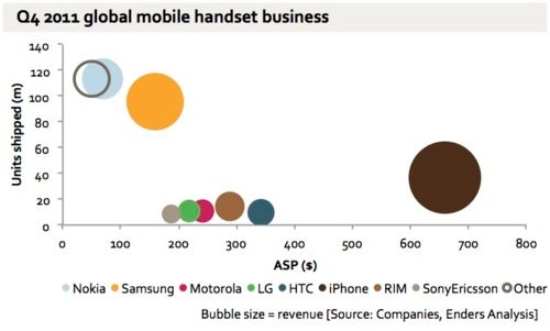
Phone makers' revenues explained in one chart

If you’ve looked at the state of the industry recently, you’d know that Nokia is still the market leader in terms of phone shipment volume, but it’s ceded the smartphone throne to Apple and Samsung. This has resulted in huge losses for the Finns, but just how do they compare to Apple and Samsung’s revenues? And what about the rest of the big phone makers? The chart below combines two criteria - the number of units shipped and the average selling price (ASP) - to draw a pretty accurate picture of who’s who in mobile.
The first thing you’d notice is the huge bubble representing Apple revenues - the company is furthest to the right which indicates that its ASP is the highest and it’s also elevated above all phone makers except for Samsung and Nokia in terms of unit shipments.
The second biggest player Samsung offers much more affordable handsets, but what’s particularly striking is the fact that Nokia sells the cheapest phone of them all. The ASP for Nokia has been dropping significantly with the demise of Symbian, driving margins down. Check out the rest of the players and their revenue in this self-explanatory chart.
source: Ben-Evans

Popular stories

![T-Mobile is down for many users across the nation right now [UPDATED]](https://m-cdn.phonearena.com/images/article/181747-wide-two_350/T-Mobile-is-down-for-many-users-across-the-nation-right-now-UPDATED.webp)


Latest News


Things that are NOT allowed:
To help keep our community safe and free from spam, we apply temporary limits to newly created accounts: