Editorials · Insider Reaction
Has Google Messages become too cluttered in its mission to become the best messaging app?
Another app tweak is on its way, and it has us wondering if Google is losing sight of simplicity.
This article may contain personal views and opinion from the author.
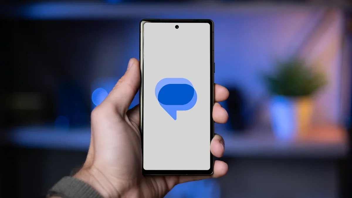
A new report shows Google Messages is testing yet another user interface tweak, this time for the text field. It’s just the latest in a long line of changes that has us wondering if Google's quest for features is making its main messaging app a bit of a mess.
What happened with Google Messages?
It seems like every other week, we're seeing a new feature or UI change being tested for Google Messages. This time around, a new report highlights that Google is ready to swap the famous hamburger menu for a context menu when selecting a message.
This might seem like a tiny, insignificant change, but it’s part of a much larger, more important story: the slow and steady "feature creep" that is transforming Google Messages from a simple texting app into a complex, all-in-one communication hub.
To understand why this is happening, you have to look at all the other features Google has been stuffing into the app recently.
A quick rundown of recent Messages updates
It’s not just one thing; it's the combination of many small additions that are making the app feel crowded. In the last year or so alone, we've seen:
This new context menu UI is, ironically, an attempt to fix the clutter that all these new features have created. The old bar was getting too busy, so Google is trying to rearrange the furniture. The problem is, the room is just getting fuller.
- New user profiles: A feature that lets you set a profile picture and name that's separate from your Google account or your phone's contact list.
- Photomoji: The ability to create custom emoji from your photos.
- Screen effects: Full-screen animated effects.
- Custom bubbles: Ability to customize the bubble color and backgrounds of individual conversations
- Reaction effects: Ability to react to a message with a thumbs up emoji, and animated hands pop up and dance around the message.
- Animated emoji: Emoji that is...animated.
- Voice moods: Adds personality to voice messages by incorporating nine different emotions.
- Gemini AI integration: Building a full-fledged AI chatbot directly into the app, which also powers "Magic Compose" suggestions.
This new context menu UI is, ironically, an attempt to fix the clutter that all these new features have created. The old bar was getting too busy, so Google is trying to rearrange the furniture. The problem is, the room is just getting fuller.
Why is this feature-creep a big deal?
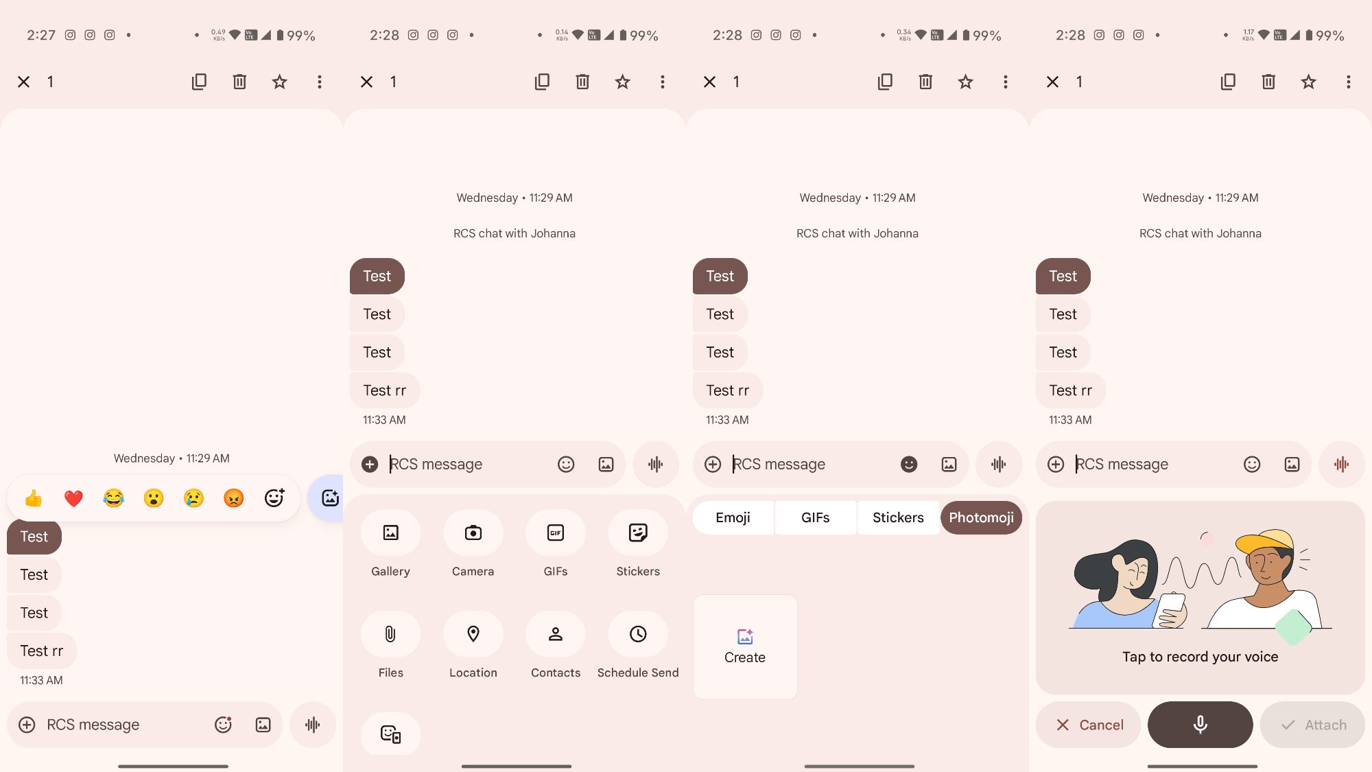
Google Messages has grown to have too many features, all accessed from different places within the app. | Image credit — PhoneArena
This all boils down to a central identity crisis for Google Messages. What is this app supposed to be?
For years, it was the clean, simple, stock-Android default. It was the "iMessage for Android" in spirit—a straightforward app that handled your SMS and its modern successor, RCS, without any fuss. It was reliable, clean, and fast.
But Google isn't just competing with iMessage, which remains a locked-down, (mostly) simple experience on Apple devices. Google's real global competitor, if we're talking Android, is WhatsApp.
WhatsApp is the king of features. It's a "super-app" in many countries, handling not just messages but also video calls, status updates (like Instagram Stories), business payments, and massive community "Channels." It is, by every definition, a very crowded app. But it's also what hundreds of millions of users are accustomed to.
Google is in a tough spot. To make RCS a viable competitor to iMessage and WhatsApp, it needs feature parity. It needs profiles, it needs better attachment options, it needs fun reactions, and it needs AI bells and whistles. The "good" side of this is that Google is actively developing its platform and giving users more tools.
The "bad" side is that in chasing this goal, Google Messages is losing its own identity. It's becoming heavy. You can see the complaints online: the app feels slower, settings are buried, and simple actions now require more taps. Many users just want an app that sends and receives texts quickly, not one that asks them to set up a profile or gets in the way with AI suggestions.
By trying to be both the simple, invisible default messaging app for carriers and a feature-rich, over-the-top messenger, Google Messages is becoming a jack of all trades and a master of none.
Do you feel that Google Messages is losing its way by adding too much to the UI?
Yes
40.82%
No
59.18%
Is Google Messages losing its way?
So, to answer the initial question: no, it’s not just you. Google Messages is absolutely becoming crowded, and it often feels confusing.
Look, as someone who uses this app every single day, I appreciate the new tools and I actually like them, but I'd be lying if I didn't find it confusing sometimes, especially when —because of Google's staged rollouts — many features roll out to some users sometimes a whole month before everyone else gets them. It's confusing when not everyone has the same feature set available at the same time.
I use RCS constantly, I like the improved typing indicators, and I even use the text formatting on occasion. But there's a lot that has been added to the app that I will never use because their implementation feels clunky.
The new "Profiles" feature is a perfect example of this confusion. Why do I need a separate "Messages Profile" when I already have a Google Account profile and a contact card on my phone? It's just one more thing to set up and one more source of confusion when a contact's picture doesn't look right.
To be fair, Google's ambitions are huge. They are trying to single-handedly replace the aging SMS standard across the entire globe with RCS, and that's a monumental task. To do that, they have to convince not just users, but carriers and manufacturers, that their platform is the future. And "the future," in their minds, means features. Lots of features.
What I'd love to see is a "simple mode" or a "Lite" version of the app. As a techie, I make it my business to check all these new features and learn what they do. However, for non-techies and the elderly (for example, my own mother), this is just too much to handle. There's no way that she can keep up with all the changes that app has undergone. Let me turn off the AI, the profiles, and the effects, and just give me a clean, fast RCS/SMS client.
Ultimately, Google needs to decide what this app truly is. Right now, it feels stuck in the middle. It's not as elegantly simple as iMessage, and it's nowhere near as universally adopted as WhatsApp. It's an app with a serious identity crisis, and the UI is just reflecting that internal confusion.

Popular stories


Latest News


Things that are NOT allowed:
To help keep our community safe and free from spam, we apply temporary limits to newly created accounts: