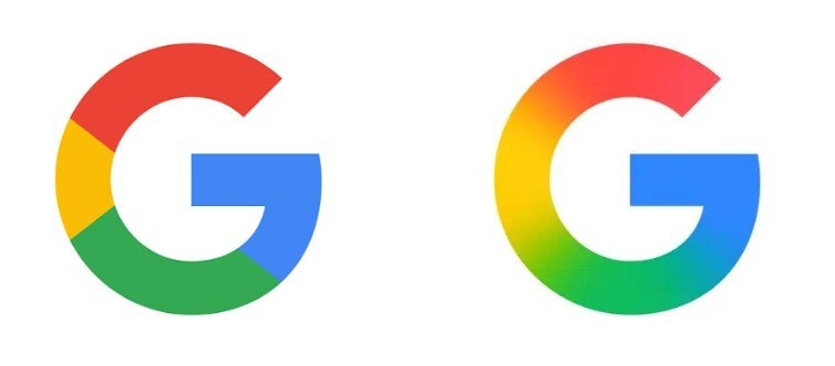
Earlier this year Google changed the icon for the Google app that replaced the four defined sections of the "G" (red, yellow, green, blue) with a gradient look that has red blend into yellow, which then blends into green, and then green blends into blue. Google made that move in May and two months later it changed the Gemini "sparkle" icon from blue/purple to the same four colors once again in a gradient design.
Google cites AI for the reason it made changes to its app icons
A couple of months ago, back in September, Google explained the reason for this change by stating, "While staying true to Google’s iconic four colors, the brighter hues and gradient design symbolize the surge of AI-driven innovation and creative energy across our products and technology." Google has decided to use the gradient look to represent "all of Google." The Alphabet subsidiary will "continue this update across more products, platforms and services over the coming months."
During the spring, Google announced its change to the icon for the Google app. | Image credit-9to5Google
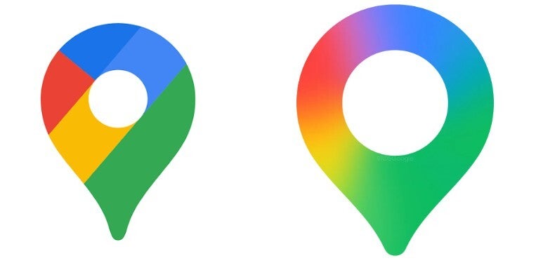
For example, last week Google made similar changes to the icons for two widely used and popular apps: Google Photos and the versatile Google Maps app. The new, gradient design looks so much better than the old look for the Google Maps icon. The latter is still a pin, but besides the gradient replacing the ugly looking color sections, the icon is thinner, larger in size, and the hole in the middle is also bigger. While the soon to be retired Google Maps icon also employed two different shades of blue, that is no longer the case with the new look.
The old Google Maps icon on the left, and the new one coming soon. | Image credit-9to5Google
Recommended For You
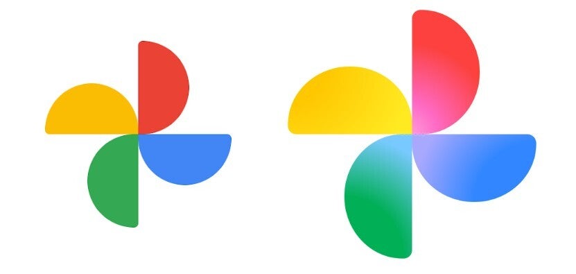
The Google Photos icon keeps four distinct sections, one for each color. The difference is that each of the four blades making up the pinwheel now uses a gradient design from the inside of each blade to the outside. The new icon is also larger.
On the left, the old Google Photos icon with the updated con on the right. | Image credit-9to5Google
These Google apps could be next
While it isn't clear when the new Photos and Maps icons will launch, my Pixel 6 Pro still shows the older non-gradient designs for those two apps. For the Google app, my phone has the new gradient design for the icon, and the new gradient design also appears for the Gemini app's icon.
Do you prefer the old, sectioned look or the new gradient design?
I prefer the new gradient design.
54.55%
I like the sectioned look better.
20.45%
I like both the same.
12.5%
I hate both designs the same.
12.5%
88 Votes
Other icons that could soon get changed include the Play Store, Chrome, and the Calendar apps. Those three still have the four colors (red, yellow, green, blue) divided into four sections, each filled with one solid color. If you ask me, the gradient look appears to be a nice improvement and all of Google's apps will sport better looking icons once this process is completely finished.
Get Visible as low as $20/mo for 1 year. Limited time offer with code: FRESHSTART
$20
/mo
$25
$5 off (20%)
Offer Ends 6.1.2026 at 11.59pm ET. New members get $5/mo off the $25/mg Visible plan, $35/mo Visible+ plan, or $45/mo Visible+ Pro plan for the first 12 months. Promo code FRESHSTART required at checkout.
Alan, an ardent smartphone enthusiast and a veteran writer at PhoneArena since 2009, has witnessed and chronicled the transformative years of mobile technology. Owning iconic phones from the original iPhone to the iPhone 15 Pro Max, he has seen smartphones evolve into a global phenomenon. Beyond smartphones, Alan has covered the emergence of tablets, smartwatches, and smart speakers.
A discussion is a place, where people can voice their opinion, no matter if it
is positive, neutral or negative. However, when posting, one must stay true to the topic, and not just share some
random thoughts, which are not directly related to the matter.
Things that are NOT allowed:
Off-topic talk - you must stick to the subject of discussion
Offensive, hate speech - if you want to say something, say it politely
Spam/Advertisements - these posts are deleted
Multiple accounts - one person can have only one account
Impersonations and offensive nicknames - these accounts get banned
To help keep our community safe and free from spam, we apply temporary limits to newly created accounts:
New accounts created within the last 24 hours may experience restrictions on how frequently they can
post or comment.
These limits are in place as a precaution and will automatically lift.
Moderation is done by humans. We try to be as objective as possible and moderate with zero bias. If you think a
post should be moderated - please, report it.
Have a question about the rules or why you have been moderated/limited/banned? Please,
contact us.


Things that are NOT allowed:
To help keep our community safe and free from spam, we apply temporary limits to newly created accounts: