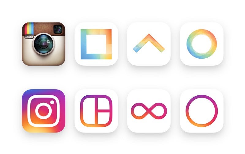
We've known that Instagram was working on an
updated UI for its app, but a bit of a surprise came today as Instagram announced it would be changing its well-known logo to something much more modern and simplified. The company showed off its new logo today along with an interesting video that gives a brief overview of the design process for that new icon.
The final icon is a simplified version of the camera image and the four color stripes has become a kind of sunrise gradient that ties together the new logos for Instagram and its companion apps -- Layout (photo grid app), Boomerang (gif maker) and Hyperlapse (time lapse). We have to say that the new logos for the companion apps look all right. Layout's icon looks like a mouse, but otherwise, they're fine. The odd thing is that because of the video going through the design process for the Instagram icon, we saw a few in there that looked better than what was the eventual winner. The final icon is a bit too simplified for our tastes.
And, it looks like the logo has sucked the color from the Instagram app UI, because the new layout is basic black and white. That's not really a bad thing, because it pushes focus onto the image content, as it should. The new versions of the apps are rolling out now. They should be available for iOS, rolling out now for Android users, and coming later this week for Windows 10 mobile.


Things that are NOT allowed:
To help keep our community safe and free from spam, we apply temporary limits to newly created accounts: