
HTC Rhyme first press shots leak: flaunts cleaner, prettier HTC Sense 3.5

The HTC Bliss has been circulating headlines all over in the last week or so, gearing for a possible September 20th launch, and now the first press images have leaked, hinting that the device is right on track to arrvial. The HTC Bliss appears as the HTC Rhyme in these press shots obtained by German tech blog HTCInside, and flaunts an all-new cleaner and intriguing HTC Sense 3.5 on top of Android 2.3.4 Gingerbread. What you’re looking at on the press shot seems to be the home screen, which you can populate with quick access icons on the side.
Judging by this latest leak, the handset might after all launch under the HTC Rhyme moniker, or that could be its European nickname. In either case, we’re talking about the same 3.7-inch phone running on a 1GHz Qualcomm MSM8255 chip and featuring a 5-megapixel auto-focus camera capable of recording 720p video.
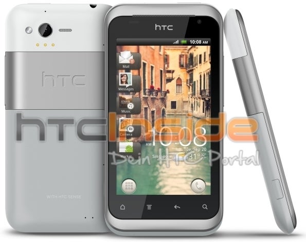
With so many leaks pointing at the upcoming Rhyme, its arrival at HTC’s September 20th event seems nearly certain, so stay tuned.
source: HTCInside via Thisismynext

Popular stories


Latest News


Things that are NOT allowed:
To help keep our community safe and free from spam, we apply temporary limits to newly created accounts: