Find Apple's liquid glass design a bit much? A new toggle is here to help on iPhone, iPad, and Mac
Apple is responding to user feedback and adding a new, more opaque look for its liquid glass design.

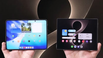
Apple's "Liquid Glass" redesign in iOS 26 has been... divisive. However, it looks like the company is finally listening to feedback and giving its users a choice to tone it down.
Apple is letting you finally add some 'tint' to that glass
You know that new "Liquid Glass" design Apple rolled out with iOS 26? The one that made everything super transparent and fluid across your iPhone, iPad, and Mac? Well, if you weren't a fan of living in a see-through world, you're in luck. The latest developer beta (that's 26.1 beta 4) just dropped, and it includes a new option to make the whole look more opaque. This means it will likely make it to the 26.1 public release when it launches later this month, hopefully.
How to find the new Liquid Glass setting
- On iPhone/iPad: Go to Settings > Display & Brightness > Liquid Glass.
- On Mac: Go to System Settings > Appearance > Liquid Glass.
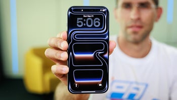
In that new menu, you'll see two simple choices: "Clear" and "Tinted." "Clear" is the default transparent look we've had since iOS 26 launched. "Tinted," as Apple explains, "increases opacity and adds more contrast." It's a simple switch, not a slider, but it applies everywhere.
Apple's apps, third-party apps that use Liquid Glass, and even your Lock Screen notifications get this look. Apple says it's adding this because users (loudly, I'd imagine) asked for a way to manage the opaqueness.
Why this is more than just a settings toggle
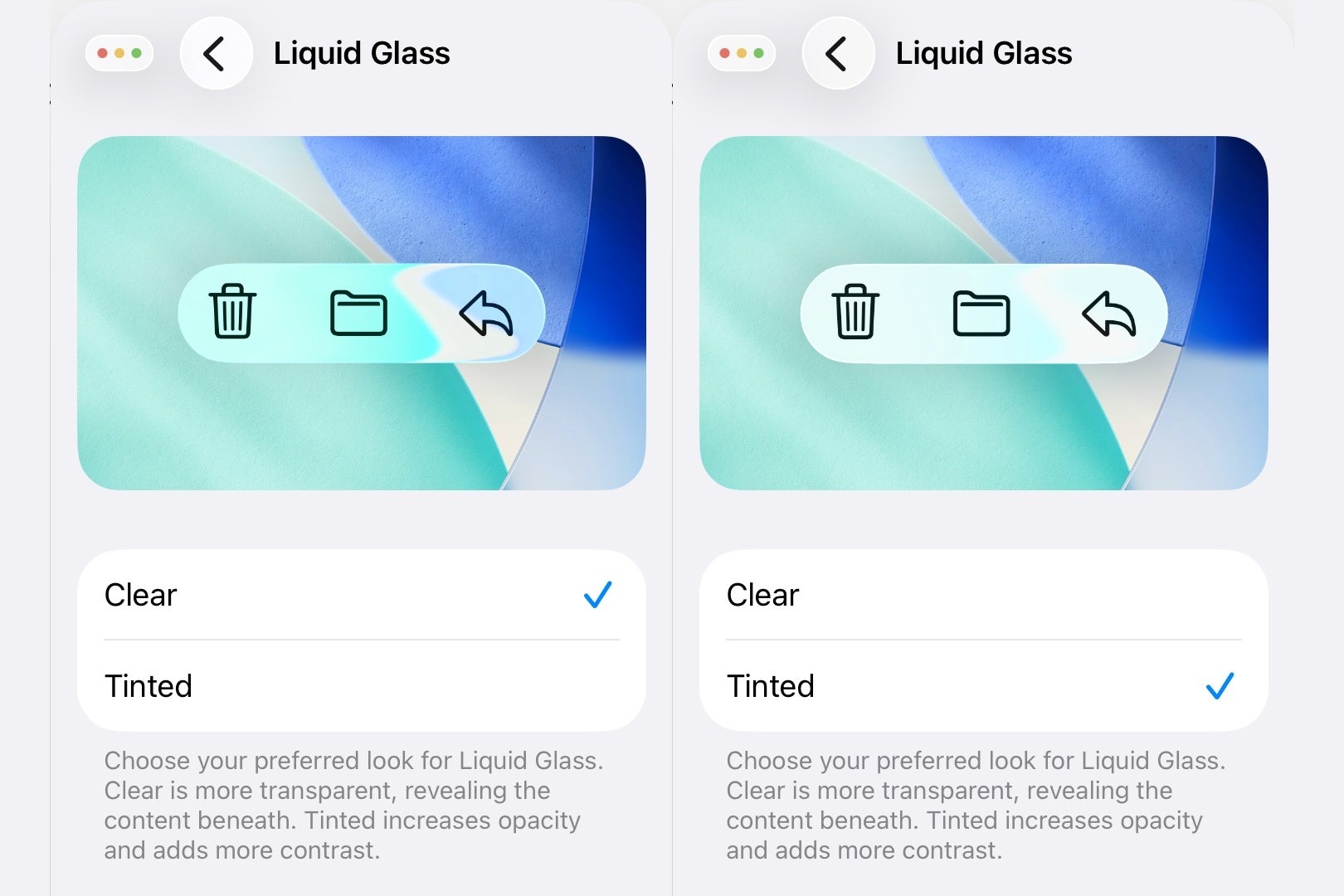
iOS 26.1 Liquid Glass transparency toggle. | Image credit — PhoneArena
While Apple went all-in on this new transparent aesthetic, it turned out it wasn't great for everyone. If you have a busy wallpaper or just value readability over a "cool" design, the default look can be incredibly distracting.
It's an interesting contrast to Google's approach with Material You on Android. Google is all about color customization, pulling hues from your wallpaper to theme your entire UI.
It’s personal, but it’s not really about transparency. Apple, on the other hand, tried to push a specific aesthetic (the glass) and is now having to walk it back by adding options. This isn't Apple catching up; it's more like them cleaning up their own design mess after realizing a one-size-fits-all transparent look doesn't actually fit all.
Are you a fan of the transparency in iOS/iPadOS/MacOS 26?
Yes
37%
No
63%
"Tinted" is probably the setting you actually want
Personally, I'm flipping on "Tinted" the second I get this update. The full-on "Clear" version of Liquid Glass is beautiful in screenshots and marketing, but in daily use, it can be a readability nightmare. This new "Tinted" option sounds a lot like what Apple had in an earlier iOS 26 beta before they reversed course and went with the hyper-transparent look for the final release.
It's great they're bringing it back as an option. Choice is always good, especially for accessibility and simple user preference. "Clear" feels like the 'demo mode' you show off to friends, while "Tinted" is the one you'll actually want to live with every day.

Popular stories

Latest News
Things that are NOT allowed:
To help keep our community safe and free from spam, we apply temporary limits to newly created accounts: