This article may contain personal views and opinion from the author.
Nothing may be a small brand, but its “out of the box” thinking is showing us that there are things about the smartphone experience that can still be explored and improved. And big brands seem to be listening.
Today, we are going to talk about monochrome icons and how they’ve been adopted by the major brands, but is a trend that seemingly started with the Nothing Phone (2).
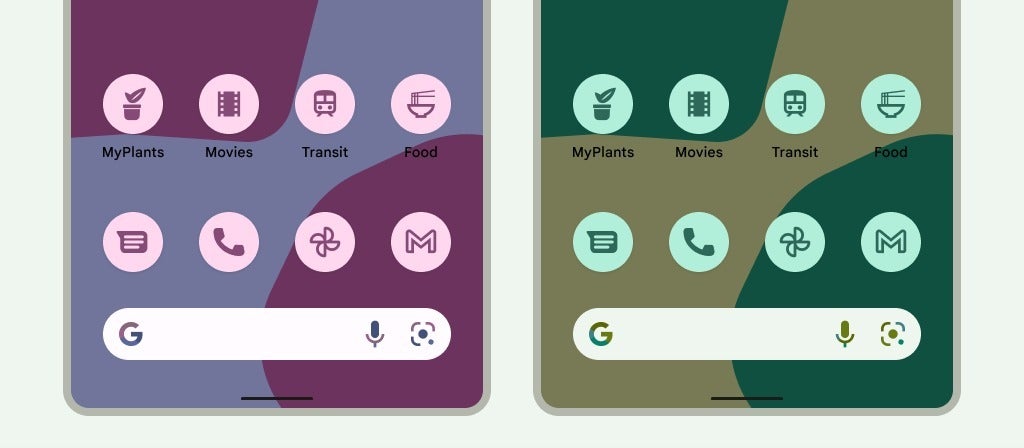
Yes, technically, Google was “first” to do this. In 2022, Android 12 launched with the first Material You design theme, which had Themed Icons. Basically, you could have the app icons turn into flat-colored versions of themselves, usually synced to the color palette of your wallpaper.
One problem, though — it only worked for some apps, mostly the stock Android ones or very popular ones. So, you ended up with a homescreen that looked like an unfinished mess — some icons had the unified color and look, others popped out with their original design. Needless to say, users preferred to stick to icon packs or not bother at all.
Nothing achieved with Android what Google couldn’t (in a timely fashion)
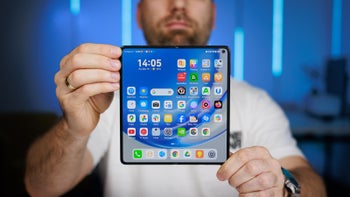
Full monochrome homescreen in 2023
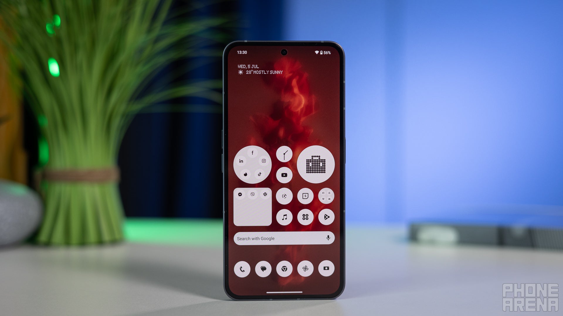
When the Nothing Phone (2) launched, Nothing came out with a mission — remove “branding” from your homescreen and make it truly yours. For that reason, it ventured to make a true monochrome icon pack.
Recommended For You
Well, technically it’s not a pack at all. The Nothing launcher somehow miraculously forces any and all apps to go black and white. Even if it’s the most obscure app that has 100 downloads and will never make it into an icon pack, it will still look uniform with the rest of the icons on your Nothing homescreen.
In late 2025, Google Android 16 finally introduced forced theming and moved Themed Icons out of beta. For what I’ve tested — they finally work for all apps.
Google got there eventually
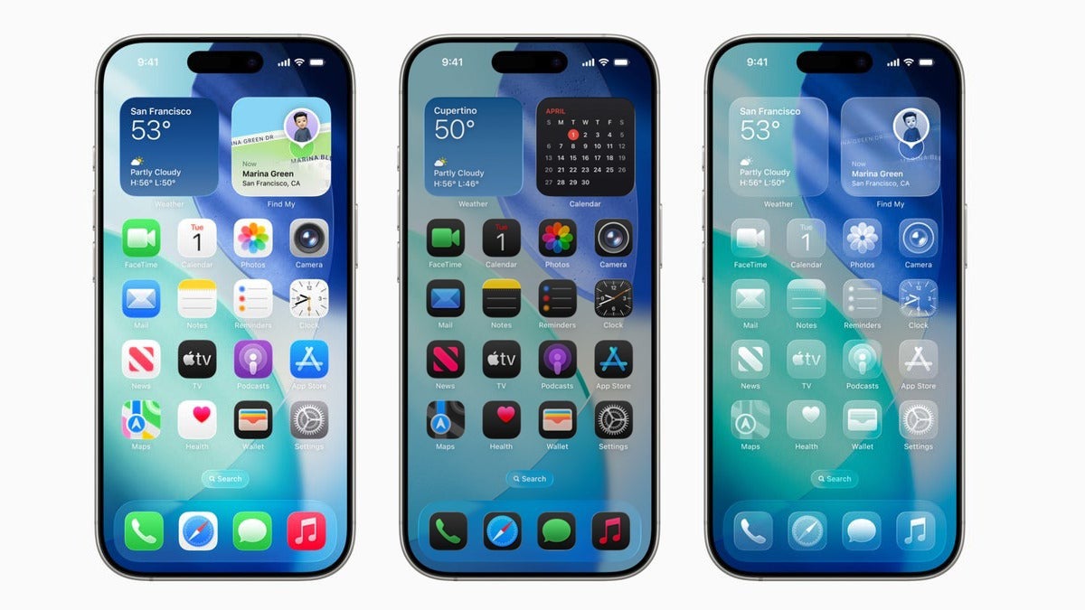
Apple’s iOS 26 also came with the new Liquid Glass design, which allows you to either force apps to all be in one solid color, or up to fully translucent.
Let’s be fair - it’s disorienting. So, what’s the benefit?
You may be among the people who have tried monochrome icons once — be it with Liquid Glass, Material You, or an icon pack — and found it to be disorienting. We are super-used to finding apps by the color of their icon, and that becomes immediately apparent when you try to live the monochrome life for a day.
So, what are the benefits of color-less homescreens? Why do some people use them, and why did brands introduce them?
Digital minimalism and intentionality
Nothing’s original message was clear — brands are “hijacking” our homescreens and in turn our attention with their distinct colors and designs. Forcing all icons to go black and white makes your smartphone experience much “cleaner” and intentional. Your attention isn’t pulled by the purple Instagram logo or the red Facebook notification. The Amazon app doesn’t work as an ever-present billboard that pops up every time you unlock your phone.
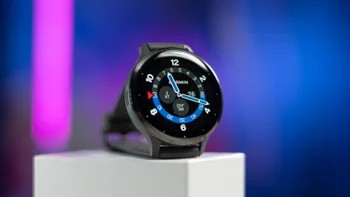
Nothing — the only phone that doesn't want you to look at its display all the time
Of course, it’s not the one solution to all problems, but it’s a part of it. Secondary, Nothing had the Glyph Interface that encouraged you to keep your phone face-down on the table and trust the Glyph to let you know if there’s something that actually requires your attention.
But there’s more to it.
Reducing Dopamine Hooks
This does feed a bit into the previous point, but does bear mention nonetheless. App icons and widgets are designed to pull at your attention. You’ve probably fallen victim to this more than once — unlock your phone to check your email, end up doomscrolling Insta Reels. How does this happen?
A nice soft color with a red notification badge is usually the culprit.
By removing the eye candy and making everything dull and drab, you are much more focused on the task at hand. The fact that it’s a bit harder to find your email app also helps, believe it or not. Since you can’t just look for the blue color and tap that, your attention is engaged with “Email, email, where’s the email app?” and less with drifting around the pretty colors on the screen.
In fact, it’s so effective that I almost missed an important family event yesterday because I ignored the calendar all day. Thankfully, iOS 26’s AI put a Priority Notification up for me just in time, and crisis was averted. Personal note — make sure to check my daily agenda every morning, just like the good old days.
Out with the Rainbow Look
Light to Dark to Liquid Glass
I feel like there’s a lot of fatigue over the multi-colored, super-vibrant homescreens. It’s not a new thing, to be fair. Tech enthusiasts have been modelling their Android homescreens to be super clean and uniform since at least 2016.
But, nowadays, it feels like this fatigue has permeated into the mainstream. Gen Z seems to be pushing against it as the multi-color look of yesteryear is now considered to be a “boomer look”.
To be clear, the younglings do like bright, bold, and vibrant colors. But prefer them to be dynamic and adapting to the phone’s style, maybe even to the time of day, and to be mostly uniform.
So, in that sense, the new Material Design 3 does score points. The iPhone’s Liquid Glass seems to be limiting and a bit drab, so Apple may need to go back to the drawing board on that. And Nothing’s black-and-white icons are more like Millennial Gray — sorry to say, that’s becoming less modern.
Should you try a monochrome look?
You may have tested the look once and immediately averted your eyes. It does require some getting used to, I concur. But, in the end, I feel like it’s improved my smartphone experience. Well, minus the small Calendar mishap I almost had the other day.
So, if you’ve tried it and hated it, I would suggest you do so again and give it a few days, see how you feel about it afterwards. That said, your phone is your own and the beauty of customization that we have in 2025/2026 is that we can pick whatever we please.
If you have been on monochrome for a while now and would like to preach its benefits — sound off in the comments!
Six-month unlimited plan is now 57% off
$90
$210
$120 off (57%)
Mint Mobile is now allowing you to get whichever plan you like for either three, six, or 12 months for just $15/mo. If you go for the six-month unlimited service, for instance, you'll now have to pay just $90 upfront instead of $210.
Preslav, a member of the PhoneArena team since 2014, is a mobile technology enthusiast with a penchant for integrating tech into his hobbies and work. Whether it's writing articles on an iPad Pro, recording band rehearsals with multiple phones, or exploring the potential of mobile gaming through services like GeForce Now and Steam Link, Preslav's approach is hands-on and innovative. His balanced perspective allows him to appreciate both Android and iOS ecosystems, focusing on performance, camera quality, and user experience over brand loyalty.
A discussion is a place, where people can voice their opinion, no matter if it
is positive, neutral or negative. However, when posting, one must stay true to the topic, and not just share some
random thoughts, which are not directly related to the matter.
Things that are NOT allowed:
Off-topic talk - you must stick to the subject of discussion
Offensive, hate speech - if you want to say something, say it politely
Spam/Advertisements - these posts are deleted
Multiple accounts - one person can have only one account
Impersonations and offensive nicknames - these accounts get banned
To help keep our community safe and free from spam, we apply temporary limits to newly created accounts:
New accounts created within the last 24 hours may experience restrictions on how frequently they can
post or comment.
These limits are in place as a precaution and will automatically lift.
Moderation is done by humans. We try to be as objective as possible and moderate with zero bias. If you think a
post should be moderated - please, report it.
Have a question about the rules or why you have been moderated/limited/banned? Please,
contact us.


Things that are NOT allowed:
To help keep our community safe and free from spam, we apply temporary limits to newly created accounts: