Android Auto's dashboard could be getting a serious glow-up
A leaked redesign hints at a cleaner media player, and not every car gets the full treatment.
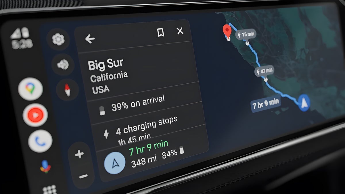
Android Auto dashboard with Google Maps EV routing. | Image by Google
Google appears to be quietly reworking the Android Auto media card. A fresh APK teardown revealed a redesigned dashboard layout with centered album art, a blurred background, and extra playback controls, depending on your head unit. It's not live yet, but if you're driving a Pixel 10 Pro or a Galaxy S26 Ultra, this one's worth watching.
Right now, Android Auto's dashboard media card uses your album art as a full-bleed background, with song info and controls layered on top. A new APK teardown, digging through unreleased code in a recent version of the app, found a reworked layout in testing. Album art moves to a smaller, centered spot, and the background turns into a soft blur pulled from those same colors.
Depending on the music app and your head unit's screen, the card can also gain extra buttons like like, shuffle, and repeat, with play and pause shifting to the middle. None of it touches the full-screen player, this is dashboard card only.
I'll be honest, I like the direction here. The current media card can look busy, especially when album art clashes with a bright dashboard background, and centering everything with a blurred backdrop should read as calmer at a glance while driving.
It also lines up with the bigger Android Auto makeover Google detailed at I/O 2026, so this feels like one more piece of that promise actually showing up in testing rather than staying a slide in a keynote.
Here's the catch, though. Whether you actually get like, shuffle, and repeat back depends on your head unit's display density, so two people running the same phone and app could still end up with two different experiences.
Google has heard this complaint before, when a past redesign left some drivers with a flatter, less personal-feeling player. It's the kind of inconsistency Android Auto has otherwise tried to avoid, since a big part of its appeal has always been a layout that stays the same no matter which car you're in.
For now, this is buried in test code, so there's nothing to toggle on your end yet. If and when it ships, expect it to arrive quietly through a regular update rather than as a headline feature, the same way the app's squiggly progress bar and refreshed buttons rolled out earlier this year.
Given how APK teardowns work, Google could also change the layout again before anyone outside testing ever sees it, or shelve it entirely.
I've watched Google chip away at Android Auto in small pieces for a while now, a wavy progress bar here, an autoplay tweak there, and this redesign fits that same quiet pattern. I'd still rather see the extra controls available everywhere instead of gated behind head unit specs.
I'm glad Google keeps sanding down the rough edges of a service so many of us stare at every single drive. Here's hoping this one reaches everyone's dashboard sooner rather than later.
What's actually changing on your dashboard
Right now, Android Auto's dashboard media card uses your album art as a full-bleed background, with song info and controls layered on top. A new APK teardown, digging through unreleased code in a recent version of the app, found a reworked layout in testing. Album art moves to a smaller, centered spot, and the background turns into a soft blur pulled from those same colors.
Depending on the music app and your head unit's screen, the card can also gain extra buttons like like, shuffle, and repeat, with play and pause shifting to the middle. None of it touches the full-screen player, this is dashboard card only.
Google's Android Auto media card, tested here in several new looks with centered art and extra playback controls. | Images by AssembleDebug / Android Authority
What's your take on Android Auto's leaked redesign?
21 Votes
I love the cleaner, centered look
52.38%
I just want the extra controls everywhere
23.81%
I'd rather Google fix bigger AA bugs first
14.29%
My head unit probably won't get any of it
9.52%
A welcome cleanup, with one nagging catch
I'll be honest, I like the direction here. The current media card can look busy, especially when album art clashes with a bright dashboard background, and centering everything with a blurred backdrop should read as calmer at a glance while driving.
It also lines up with the bigger Android Auto makeover Google detailed at I/O 2026, so this feels like one more piece of that promise actually showing up in testing rather than staying a slide in a keynote.
Google has heard this complaint before, when a past redesign left some drivers with a flatter, less personal-feeling player. It's the kind of inconsistency Android Auto has otherwise tried to avoid, since a big part of its appeal has always been a layout that stays the same no matter which car you're in.
Who actually sees this, and when
For now, this is buried in test code, so there's nothing to toggle on your end yet. If and when it ships, expect it to arrive quietly through a regular update rather than as a headline feature, the same way the app's squiggly progress bar and refreshed buttons rolled out earlier this year.
Why I'm cautiously into this one
I've watched Google chip away at Android Auto in small pieces for a while now, a wavy progress bar here, an autoplay tweak there, and this redesign fits that same quiet pattern. I'd still rather see the extra controls available everywhere instead of gated behind head unit specs.
I'm glad Google keeps sanding down the rough edges of a service so many of us stare at every single drive. Here's hoping this one reaches everyone's dashboard sooner rather than later.


Popular stories

Latest News
Things that are NOT allowed:
To help keep our community safe and free from spam, we apply temporary limits to newly created accounts: