Android Auto just got a rare design update, but not everyone is happy about it.
As part of a recent rollout, Google applied its Material You interface to Android Auto’s music player, creating a more unified look that matches your phone’s wallpaper. The problem is that it replaces the dynamic album art backgrounds, and some users are calling it a visual downgrade.
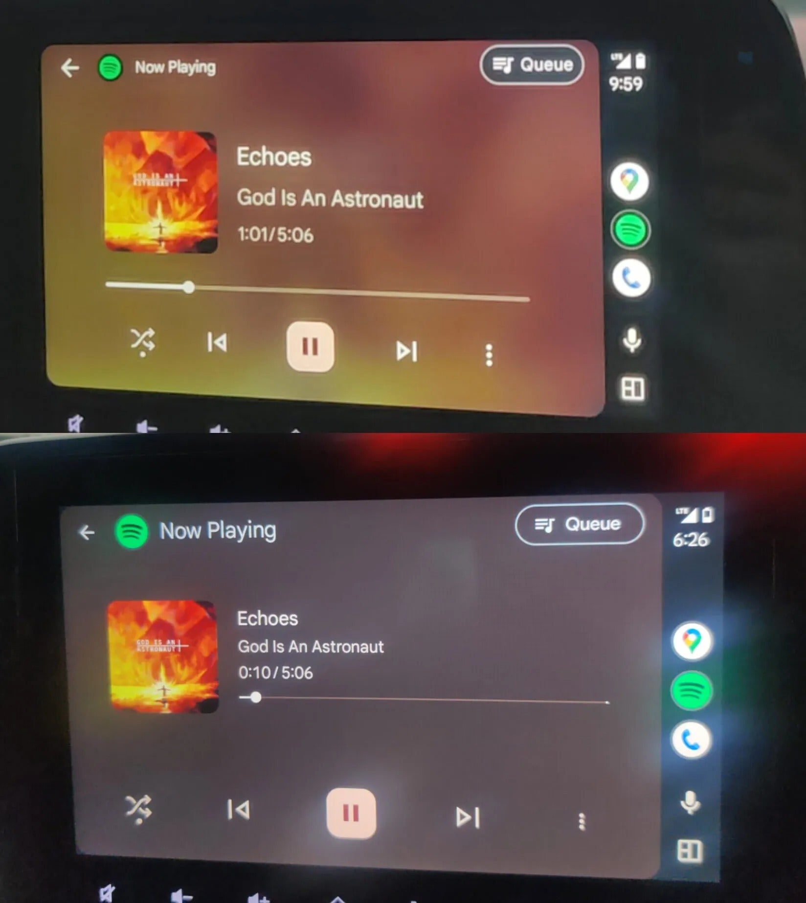
Album art background replaced with wallpaper color
Top is before and bottom is after. | Image credit — @Adil15101
The music player now pulls background colors from your Android wallpaper instead of using the currently playing track’s album art. This change was meant to bring consistency across the interface, but it’s also flattened the look and stripped away one of the music player’s most distinctive visual elements.
Reddit user Adil15101 shared a side-by-side image comparing the old and new layouts. The older interface displayed vibrant backgrounds tied to the music, while the new one opts for blander, wallpaper-based palettes that don’t always fit the vibe of what you’re listening to.
This design decision follows a broader update we recently covered, where Android Auto officially adopted Material You theming. The update allows your car's display to match your Android phone’s wallpaper color palette, bringing a more cohesive visual identity across screens. While some users appreciate the polish, it’s clear the music player changes have proven controversial.
Recommended For You
Android Auto music player redesign — upgrade or downgrade?
I hate it — bring back the bold album art backgrounds
47.69%
It looks cleaner, but feels too bland for music
10.42%
I’m okay with the new layout, but the album art is too sma
11.92%
I actually like the consistent Material You theming
5.99%
I don’t care — I’m just here for the music controls
23.97%
1535 Votes
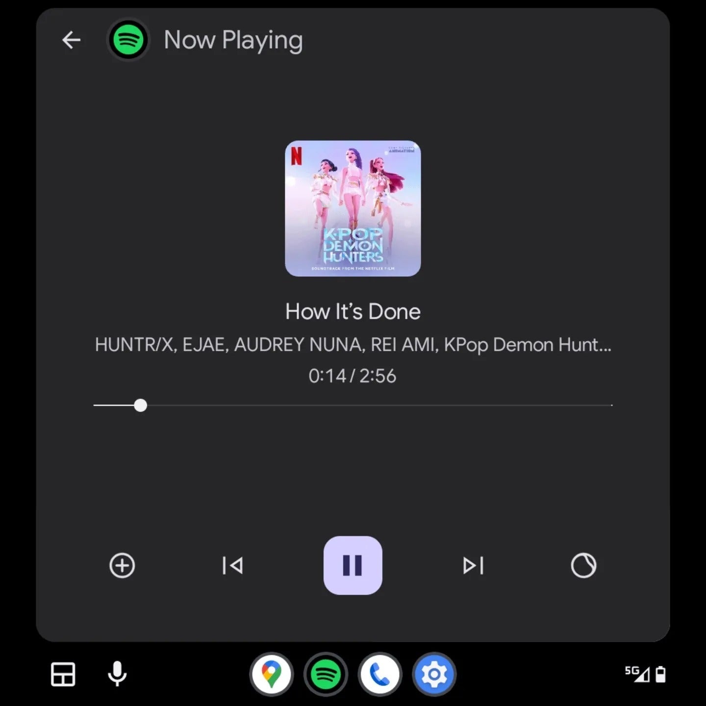
Smaller album art and a disjointed layout
So much unused space... | Image credit — @flcinusa
The update also tweaks the layout. The seekbar has been moved below the timestamp, and the album art is now smaller, creating what many are calling a cluttered-yet-empty feel — particularly on cars with portrait-oriented displays.
Reddit user flcinusa noted that the already-reduced album art looks “comically tiny” on their display. While the repositioned seekbar may reduce accidental touches, it creates odd spacing and visual imbalance, making better use of the space feel like an afterthought.
A redesign users didn’t ask for
To be fair, Material You is a big UI leap for Android Auto, which has traditionally been more utilitarian and function-focused. Google has also confirmed it’s also working on a light theme, climate control integration, and Gemini AI voice features — all part of a broader push to modernize the platform.
But for now, this refresh seems to be the decision based on the users' feedback. And for music lovers used to bold, dynamic album art backgrounds, this latest change might feel more like a step backward than forward.
Get Visible as low as $20/mo for 1 year. Limited time offer with code: FRESHSTART
$20
/mo
$25
$5 off (20%)
Offer Ends 6.1.2026 at 11.59pm ET. New members get $5/mo off the $25/mg Visible plan, $35/mo Visible+ plan, or $45/mo Visible+ Pro plan for the first 12 months. Promo code FRESHSTART required at checkout.
Aleksandar is a tech enthusiast with a broad range of interests, from smartphones to space exploration. His curiosity extends to hands-on DIY experiments with his gadgets, and he enjoys switching between different brands to experience the latest innovations. Prior to joining PhoneArena, Aleksandar worked on the Google Art Project, digitizing valuable artworks and gaining diverse perspectives on technology. When he's not immersed in tech, Aleksandar is an outdoorsman who enjoys mountain hikes, wildlife photography, and nature conservation. His interests also extend to martial arts, running, and snowboarding, reflecting his dynamic approach to life and technology.
Recommended For You
COMMENTS (5)
COMMENTS (5)
All comments need to comply with our
Community Guidelines
PhoneArena Community Rules
A discussion is a place, where people can voice their opinion, no matter if it
is positive, neutral or negative. However, when posting, one must stay true to the topic, and not just share some
random thoughts, which are not directly related to the matter.
Things that are NOT allowed:
Off-topic talk - you must stick to the subject of discussion
Offensive, hate speech - if you want to say something, say it politely
Spam/Advertisements - these posts are deleted
Multiple accounts - one person can have only one account
Impersonations and offensive nicknames - these accounts get banned
To help keep our community safe and free from spam, we apply temporary limits to newly created accounts:
New accounts created within the last 24 hours may experience restrictions on how frequently they can
post or comment.
These limits are in place as a precaution and will automatically lift.
Moderation is done by humans. We try to be as objective as possible and moderate with zero bias. If you think a
post should be moderated - please, report it.
Have a question about the rules or why you have been moderated/limited/banned? Please,
contact us.


Things that are NOT allowed:
To help keep our community safe and free from spam, we apply temporary limits to newly created accounts: