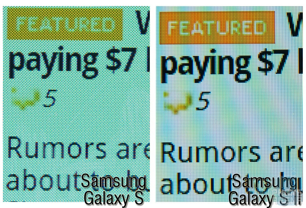
With the second generation of the Samsung Galaxy S, Samsung Galaxy S II, the company introduced the next version of its screen technology, too. The 4.3" Super AMOLED Plus display is supposedly brighter, 18% more energy-efficient and comes in a thinner package than its predecessor.
What's more, Samsung gave up on the PenTile matrix arrangement that made some observers note that the Super AMOLED display in use with the original Galaxy S, rings in 392x653 pixels of actual versus the 480x800 pixels of claimed perceived resolution.
From Samsung Mobile Display were quick to note that this move brought a 50% increase in subpixel count, making the images, and especially text on Super AMOLED Plus screens much more distinct. In fact, they just replaced the PenTile matrix with a normal RGB stripe one, and called it Real Stripe.
Let's see if the Super AMOLED Plus Real Stripe technology made a difference for the screen on the Samsung Galaxy S II, and also, if the overbearing blue OLEDs still bring that annoying cold hue to the image in the newest generation of the AMOLED technology:
Resolution and readability
The PenTile matrix, in its AMOLED layout, uses green subpixels as base, since the human eye is most sensitive to that color when bright, high-res images are involved, and then alternates between blue and red ones, the so-called RG-BG arrangement.
The normal matrix uses RGB-RGB arrangement, thus having 50% more subpixels per one dot of screen estate. Samsung bought the patents for the PenTile arrangement in 2008, and used it in the Super AMOLED display, but trying to fool the human eye in its own game experiment didn't pan out completely. An interesting fact is that the qHD display on the Motorola ATRIX 4G also uses the PenTile matrix, in its LCD RGBW version, but at least the resolution claimed is 540x960, so even if there is some loss of detail, there is an ample amount of pixels to compensate.
As you can easily spot in the 100% crop above, the image from the Samsung Galaxy S II looks much less “grainy” than the one from the Galaxy S with the PenTile arrangement. Text is easier to discern, and small details don't come jagged or lacking, even though we have a slightly larger diagonal size with the same quoted resolution on the Samsung Galaxy S II.
Recommended For You
Winner: Super AMOLED Plus
Brightness
Contrary to Samsung's official Super AMOLED Plus characteristics, Super AMOLED on our Galaxy S unit looks brighter. Samsung Galaxy S has been measured to have 365 nits of brightness, lower than the best LCD screens, but its reflectance is the outstanding 4% only, which is as important for sunlight legibility, as brightness.
Since the Samsung Galaxy S II has this coating too, we can't say that the difference is due to the reflectance ratio – the display on the Galaxy S just appears brighter. Both phones were on maximum brightness, and the separate brightness setting in the browser was maxed out for these sample photos as well.
Winner: Super AMOLED
Contrast
Definitely a tie here – both AMOLED-based displays share extremely high contrast levels that only the OLED technology can produce, so if there are any differences, they have to be measured by a calibration device, we can't visibly perceive one screen being more “contrasty” than the other. That goes both for the comparison photos, and when we stare at them in reality.
Color gamut and saturation
The Super AMOLED display on the Samsung Galaxy S was measured to reproduce way more than the standard color gamut – 140% of it, to be precise, and the colors look rather overblown, which most users find very appealing. Samsung Mobile Display has supposedly toned down the gamut span and color saturation with Super AMOLED Plus, but from the looks of it the difference, while there, is minimal.
Moreover, the blue OLEDs seem to be even more overbearing in our Samsung Galaxy S II unit, bringing a visible blue tint to the display. And that's with the Galaxy S already measured to sport 9688 degrees Kelvin, way too blue and colder than the “reference” D65 color temperature, which, as the name suggests, is supposed to be 6500 degrees Kelvin.
Winner: Super AMOLED Plus, barely
Viewing angles
We can call another tie here – both displays sport the typical for an AMOLED screen very wide viewing field, with only slight degradation in brightness and color saturation, even when looked at from an angle.
Power consumption and display packaging
We can't compare directly the displays' power consumption, since both screens have different size, and the phones have different chipsets and batteries. We managed to obtain about 62 hours of light usage with the Samsung Galaxy S II, and a similar achievement can be had with the Galaxy S as well, so it's hard to judge if the Super AMOLED Plus is really 18% more efficient, we'll take Samsung's word for that. The company says, however, that Super AMOLED Plus comes in a thinner package than Super AMOLED due to an optimized production process, and, looking at the thinnest Android phone with 4.3” display that is the Galaxy S II, we can easily buy that claim.
Winner: Super AMOLED Plus
In the end, it is evident that Super AMOLED Plus is superior to Super AMOLED in more than one way, just as Samsung meant it to be, with brightness being the only eyebrow-raiser. We especially appreciate going back to a normal matrix, which brings “true” 480x800 pixels of resolution to the display on the Samsung Galaxy S II, and makes text and finer details easier on the eyes, especially when browsing.
For more information about the various mobile display technologies you can read our in-depth article here.
Samsung Galaxy S color temperature and brightness measurements courtesy of DisplayMate.
Daniel, a devoted tech writer at PhoneArena from 2010 to 2025, has been engrossed in mobile technology since the Windows Mobile era. His expertise spans mobile hardware, software, and carrier networks, and he's keenly interested in the future of digital health, car connectivity, and 5G. Beyond his professional pursuits, Daniel finds balance in travel, reading, and exploring new tech innovations, while contemplating the ethical and privacy implications of our digital future.
COMMENTS (13)
COMMENTS (13)
All comments need to comply with our
Community Guidelines
PhoneArena Community Rules
A discussion is a place, where people can voice their opinion, no matter if it
is positive, neutral or negative. However, when posting, one must stay true to the topic, and not just share some
random thoughts, which are not directly related to the matter.
Things that are NOT allowed:
Off-topic talk - you must stick to the subject of discussion
Offensive, hate speech - if you want to say something, say it politely
Spam/Advertisements - these posts are deleted
Multiple accounts - one person can have only one account
Impersonations and offensive nicknames - these accounts get banned
To help keep our community safe and free from spam, we apply temporary limits to newly created accounts:
New accounts created within the last 24 hours may experience restrictions on how frequently they can
post or comment.
These limits are in place as a precaution and will automatically lift.
Moderation is done by humans. We try to be as objective as possible and moderate with zero bias. If you think a
post should be moderated - please, report it.
Have a question about the rules or why you have been moderated/limited/banned? Please,
contact us.


Things that are NOT allowed:
To help keep our community safe and free from spam, we apply temporary limits to newly created accounts: