Samsung TouchWiz UX for tablets overview

Samsung has a new version of its Android overlay, called TouchWiz 4.0. It found its way in the Samsung Galaxy S II for the first time, you can check out our thorough review of this overlay in its phone format.
With the launch of the Samsung Galaxy Tab 10.1 and Galaxy Tab 8.9, however, TouchWiz 4.0 has been given a revamp making it more suited for the larger screen real estate on tablets. Samsung has borrowed the best features from the phone version, like the connectivity switches in the notification area, as well as the resizable widgets, but has added a few novelties that it deemed worthy of a tablet screen.
First off, there is a Live Panel menu, which allows you to freely move and resize widgets on the homescreen. Instead of just lighting up grid cells to guide you where and how you can place the widgets, like in the Galaxy S II, in the tablet version we have a blueish trace that shows you where you can drop it, which is a Honeycomb treat. Then upon long press on the widget itself, the yellow grid appears that marks the directions and extent to which you can resize the widget any way you please. The cool Weather and Date/Time widgets from the Galaxy S II have now moved to Samsung's tablets as well, with a much larger footprint, of course.
Android Honeycomb's navigation bar has received a tiny little arrow in the middle, from where you draw up the so-called Mini Apps tray of Samsung, essentially shortcuts to some functions you are likely to need quick access to, like Calculator, or PenMemo for note taking. Pressing those shortcuts evokes a mini version of the application itself, for quickly jotting down or calculating something. These mini apps appear on top of the existing widgets or the app you are running, and can be moved around as well. Serves a good purpose when you are in a hurry - you can, of course, just as well place shortcuts on the homescreen for the full apps, but the mini versions allow you to still see the screen if you have something going on there that you wish to be able to see, and eerily reminds us of a desktop interface.
Besides their icons given a colorful TouchWiz paint job, most other apps, like Contact, Calendar, Email or MyFiles, have been tailored for the tablet realities, with a navigation pane on the left, and a bigger space on the right for the actual content, like in stock Honeycomb, but with reworked visuals to be consistent with the rest of the UI. The browser color scheme has also been brought in line with the TouchWiz paint.
The Settings menu has the Power saving mode, which we first met in the Samsung Galaxy S II, that allows you to tell the tablet which connectivity chips or interval syncing application to turn off when the battery falls under a predetermined level, and to what level to set the screen brightness then. We also found a dedicated Firewall setting, a tribute to the enterprise capabilities of Samsung's new tablets, which sport hardware encryption, and collaboration with companies like Cisco and Sybase for easier corporate IT management of your slate.
As with most TouchWiz-ed devices, Samsung includes its file browser, called MyFiles, the Polaris Office document viewer, and Pulse news reaser, as well as an eBook app. Two of the four Samsung Hubs were present on our non-final unit – the Music Hub, powered by 7digital, and the Social Hub. Of notable absence are the photo and video editors we had in the Galaxy S II, but the unit we had was a prototype, and we'll keep an eye if Samsung will include them in the final version. The camera interface is also the one we found in the Galaxy S II, with minimalistic font and transparent background in the menu, allowing you to see more of the subject you are framing, while fiddling with the camera settings.
Overall, we found the TouchWiz interface on Samsung's new Honeycomb tablets pretty inobtrusive and pleasant to use.
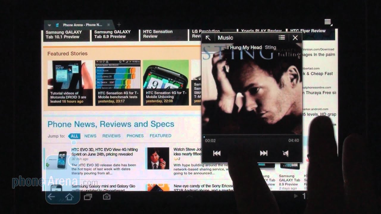
The best feature that came from the phone version, is the quick-access connectivity toggles in the notification area, and the best new feature we found useful is the Mini Apps tray, which allows you to work on two things at once, firing up mini versions of the most used applications wherever you are in the interface. What we are not very fond of is replacing the Honeycomb music player with the TouchWiz version, which, albeit functional, is visually worse than the cool album cover carousel of the stock music player.
Bear in mind that there could be interface changes in the final retail units of the Samsung Galaxy Tab 10.1 and 8.9, but we like what we are seeing so far. We also overheard that the TouchWiz interface will be an optional download once you get your stock Honeycomb tablet from Samsung, but it's not yet clear if you will be able to turn it on and off at will. If you can't turn it off, we hope it won't hinder the performance, or get in the way of timely Android updates on Samsung's tablets. Have a look at a video preview of the tablet TouchWiz interface below:
With the launch of the Samsung Galaxy Tab 10.1 and Galaxy Tab 8.9, however, TouchWiz 4.0 has been given a revamp making it more suited for the larger screen real estate on tablets. Samsung has borrowed the best features from the phone version, like the connectivity switches in the notification area, as well as the resizable widgets, but has added a few novelties that it deemed worthy of a tablet screen.
First off, there is a Live Panel menu, which allows you to freely move and resize widgets on the homescreen. Instead of just lighting up grid cells to guide you where and how you can place the widgets, like in the Galaxy S II, in the tablet version we have a blueish trace that shows you where you can drop it, which is a Honeycomb treat. Then upon long press on the widget itself, the yellow grid appears that marks the directions and extent to which you can resize the widget any way you please. The cool Weather and Date/Time widgets from the Galaxy S II have now moved to Samsung's tablets as well, with a much larger footprint, of course.
Android Honeycomb's navigation bar has received a tiny little arrow in the middle, from where you draw up the so-called Mini Apps tray of Samsung, essentially shortcuts to some functions you are likely to need quick access to, like Calculator, or PenMemo for note taking. Pressing those shortcuts evokes a mini version of the application itself, for quickly jotting down or calculating something. These mini apps appear on top of the existing widgets or the app you are running, and can be moved around as well. Serves a good purpose when you are in a hurry - you can, of course, just as well place shortcuts on the homescreen for the full apps, but the mini versions allow you to still see the screen if you have something going on there that you wish to be able to see, and eerily reminds us of a desktop interface.
Besides their icons given a colorful TouchWiz paint job, most other apps, like Contact, Calendar, Email or MyFiles, have been tailored for the tablet realities, with a navigation pane on the left, and a bigger space on the right for the actual content, like in stock Honeycomb, but with reworked visuals to be consistent with the rest of the UI. The browser color scheme has also been brought in line with the TouchWiz paint.
The Settings menu has the Power saving mode, which we first met in the Samsung Galaxy S II, that allows you to tell the tablet which connectivity chips or interval syncing application to turn off when the battery falls under a predetermined level, and to what level to set the screen brightness then. We also found a dedicated Firewall setting, a tribute to the enterprise capabilities of Samsung's new tablets, which sport hardware encryption, and collaboration with companies like Cisco and Sybase for easier corporate IT management of your slate.
The best feature that came from the phone version, is the quick-access connectivity toggles in the notification area, and the best new feature we found useful is the Mini Apps tray, which allows you to work on two things at once, firing up mini versions of the most used applications wherever you are in the interface. What we are not very fond of is replacing the Honeycomb music player with the TouchWiz version, which, albeit functional, is visually worse than the cool album cover carousel of the stock music player.
Bear in mind that there could be interface changes in the final retail units of the Samsung Galaxy Tab 10.1 and 8.9, but we like what we are seeing so far. We also overheard that the TouchWiz interface will be an optional download once you get your stock Honeycomb tablet from Samsung, but it's not yet clear if you will be able to turn it on and off at will. If you can't turn it off, we hope it won't hinder the performance, or get in the way of timely Android updates on Samsung's tablets. Have a look at a video preview of the tablet TouchWiz interface below:

Popular stories


Latest News
Things that are NOT allowed:
To help keep our community safe and free from spam, we apply temporary limits to newly created accounts: