Google overhauls Android Design website – more guides and articles to tell you what it's all about
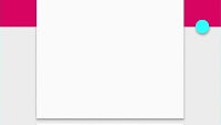
Material Design is still a fairly fresh concept. Introduced last year, with Android Lollipop, the design language strives to offer a simple, “flat” user interface, which employs shadows and colorful elements in ways that aim to help us intuitively “get” the functions of the app that is presently loaded up on-screen.
Google seems pretty proud of the concept and has, more than once, expressed its desire that app developers and partners follow the language for their own products, making the Androidverse a seamless one for users to surf through. In order to help software makers, Google put up a set of design guidelines and a website – called Google Design – which was to provide the information needed for developers to create apps that look “natively” Android 5.
Well, let's be honest – the last few months have been a bit hectic, and while some “Material Design” apps really look good, others seemed to fall short. Obviously, the point and ideology behind the framework was still not going across. We suppose that is why Google has now updated the Google Design web site with a lot more information, articles, and even videos, which aim to inform anyone interested on what the Material look is all about.
Still feeling confused? Check out the videos below and get the answers you've been looking for.
Still feeling confused? Check out the videos below and get the answers you've been looking for.
Google's Material Design videos
source: Google Design via Android Police








Things that are NOT allowed:
To help keep our community safe and free from spam, we apply temporary limits to newly created accounts: