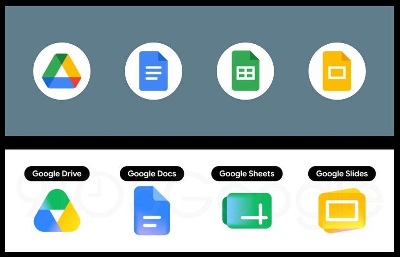
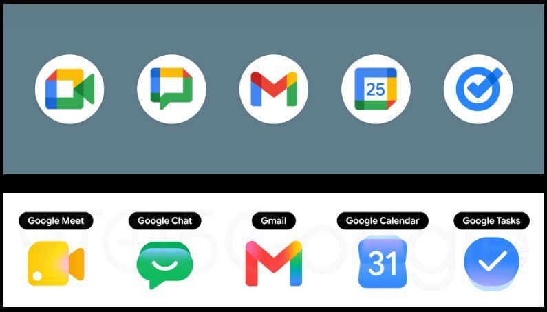
Google has started rolling out a new look for its Workspace app icons. These include all the popular Google apps people have been using over the years, such as Gmail, Docs, Sheets, Keep, Google Drive, Calendar, Google Meet, and many more.
The change is quite substantial and bold, with a departure from the mandate to include all Google's iconic blue, red, yellow, and green colors in the app icons, as well as other design tweaks.
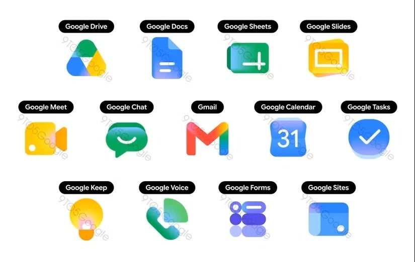
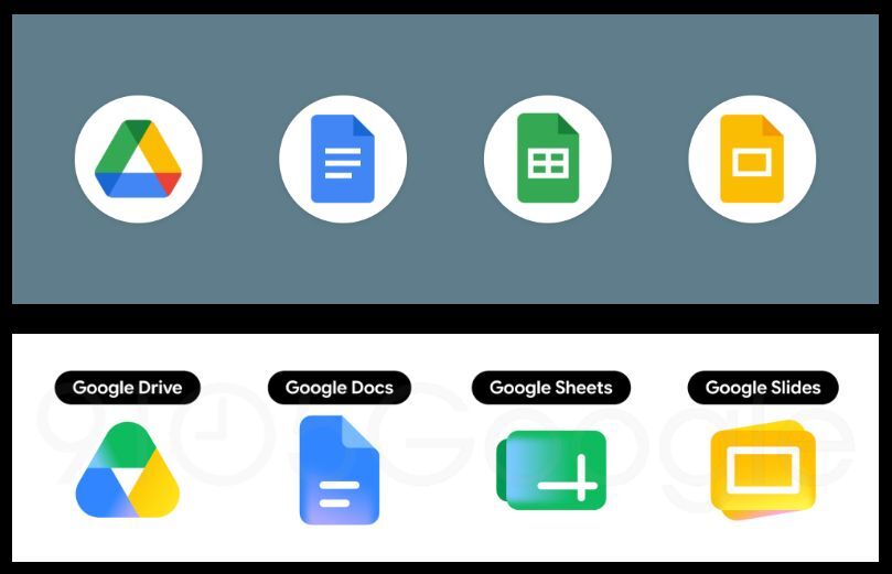
The new Google app icons' look was leaked last month
The new Google app icons' look | Image by 9to5Google
We kind of saw that change coming. The redesigned Google app icons were first spotted in a leak late last month and reported by 9to5Google. The leaked images showed a completely different look for the apps we've been so used to through the years and were met with mixed feelings.
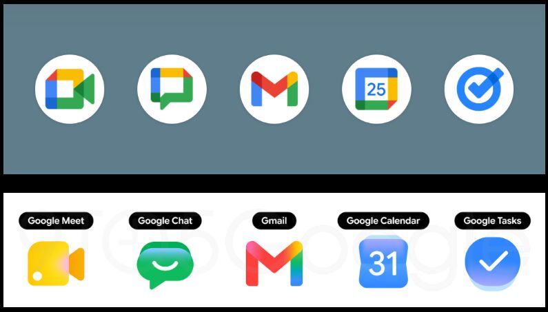
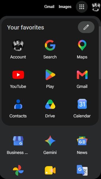
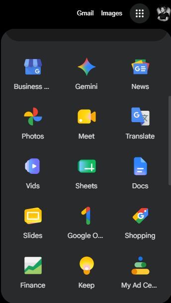
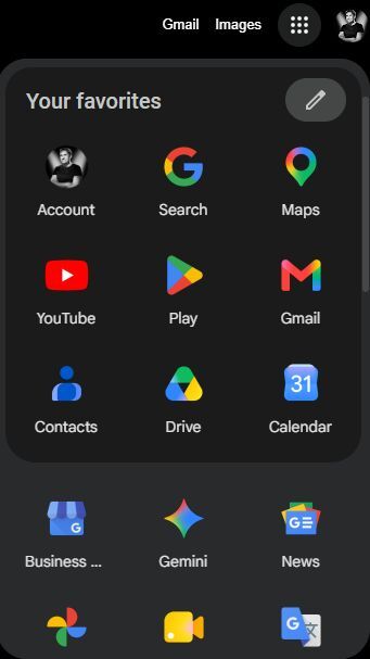
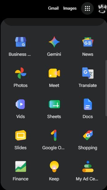
Now it seems that the design overhaul is starting to roll out officially, as Android Authority reported the new look popping up in the grid app menu in the Chrome browser.
What do you think about the new Google Workspace app icons design?
316 Votes
What's changed?
The redesign is quite dramatic, actually. As mentioned earlier, there's apparently no requirement to use the four colors in the app icons, though some of the new ones still got them. Gmail is one example, but most of the others have dropped a color or two.
The shape and overall design have also changed substantially. The new icons are much more rounded and use gradients rather than clear borders between the colors. The look is also much more stylized, some might say modern.
Recommended For You
Why is Google changing the look of its Workspace app icons?
This change is part of a big transition to Google's Material 3 "Expressive" Design Language, and it also fixes a big issue.
The boxy look of the previous icons (Google called it "perfect minimalism" back in 2020 when it first launched), along with the mandatory requirement for the use of all four Google colors, made some of the apps indistinguishable from one another, especially on busy phone screens.
Google is also trying to organize its whole ecosystem around AI (AI-first aesthetics), and the new icons' design stems from Gemini.
The new redesign has been polarizing
When the first leaked images popped up back in April, the reception was mixed. Some people loved the new, modern look, while others found it cheap and disorienting.
I personally love the change, even though as a veteran Android user I'm quite accustomed to the way these icons look.
It will take some adjustment time, but in the end I think the change is a positive one. The rollout is far from over; some of the apps rock the old look, while others use the new gradient design, creating kind of a mess at the moment.
What do you think about the new icons? Do you like them or do you prefer the old "minimalistic" look?
Six-month unlimited plan is now 57% off
$90
$210
$120 off (57%)
Mint Mobile is now allowing you to get whichever plan you like for either three, six, or 12 months for just $15/mo. If you go for the six-month unlimited service, for instance, you'll now have to pay just $90 upfront instead of $210.
Mariyan, a tech enthusiast with a background in Nuclear Physics and Journalism, brings a unique perspective to PhoneArena. His childhood curiosity for gadgets evolved into a professional passion for technology, leading him to the role of Editor-in-Chief at PCWorld Bulgaria before joining PhoneArena. Mariyan's interests range from mainstream Android and iPhone debates to fringe technologies like graphene batteries and nanotechnology. Off-duty, he enjoys playing his electric guitar, practicing Japanese, and revisiting his love for video games and Haruki Murakami's works.
A discussion is a place, where people can voice their opinion, no matter if it
is positive, neutral or negative. However, when posting, one must stay true to the topic, and not just share some
random thoughts, which are not directly related to the matter.
Things that are NOT allowed:
Off-topic talk - you must stick to the subject of discussion
Offensive, hate speech - if you want to say something, say it politely
Spam/Advertisements - these posts are deleted
Multiple accounts - one person can have only one account
Impersonations and offensive nicknames - these accounts get banned
To help keep our community safe and free from spam, we apply temporary limits to newly created accounts:
New accounts created within the last 24 hours may experience restrictions on how frequently they can
post or comment.
These limits are in place as a precaution and will automatically lift.
Moderation is done by humans. We try to be as objective as possible and moderate with zero bias. If you think a
post should be moderated - please, report it.
Have a question about the rules or why you have been moderated/limited/banned? Please,
contact us.





Things that are NOT allowed:
To help keep our community safe and free from spam, we apply temporary limits to newly created accounts: