Apple vs Samsung vs LG vs Pixel and more notification shades: visual comparison
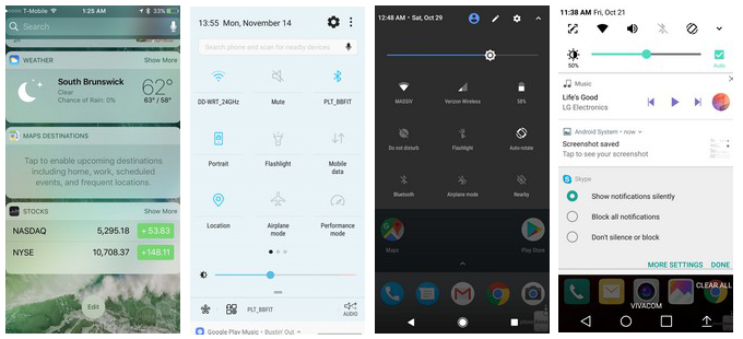
Apple vs Samsung vs stock vs LG notification shades - can you spot the differences?
This interface element is usually tucked away from plain sight, and only visible when you pull up or down to preview a message or turn on, say, Bluetooth. The way you access the shade, however, and its layout, could make interaction with your device easier, or an exercise in frustration, that is why we wanted to do a brief listing of who does it how, so you can gauge what you are missing, or where the toggle panel of your phone maker excels compared to the rest. Check them out and tell us whose approach is your fav in the poll below.
Whose notification/toggles shade solution you like most?
Samsung
25.44%
Apple
18.07%
LG
10.27%
Stock (Pixel, HTC, Moto, Sony)
41.53%
EMUI (honor, Huawei)
2.96%
Other
1.72%
Follow us on Google News


Things that are NOT allowed:
To help keep our community safe and free from spam, we apply temporary limits to newly created accounts: