HTC Sense 6 vs Samsung TouchWiz vs Sony Xperia: UI comparison

Despite major changes like the addition of the Duo Camera to the new One, HTC is pretty obviously trying to stick to the things that made the previous One a success -- a stylish, aluminum body, beautiful display, and a sleek-looking skin on top of Android. It feels like HTC is iterating with the new One, and while the essence is the same, a lot has also changed or has gone through streamlining process.
This notion is perfectly applicable if you take a look at something like the updated Sense 6 skin that HTC is launching the new One with. It's still Sense at its core, but it now even flatter, and has gone for a new approach when it comes to choice of a color scheme. The new UI is very bright and colorful, unlike the almost metallic look and feel of the previous overlay. But how does HTC's skin stack against that of the competition? Is Samsung's controversial TouchWiz a worthy competitor (the still current version, and not the one on the Galaxy S5), and can Sony's timid Xperia UI light a candle to the design powerhouse that HTC has become? Compiled below are almost three dozen of side-by-sides that will both give you a taste of the design philosophy language that each of the three companies adheres to, and, not at all coincidentally, allow you to pick your favorite.
Take a look.
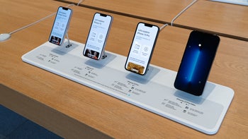
Note: Sense 6 UI always on the left (portrait) or top (landscape), TouchWiz is always in the middle, while the Xperia UI is always at the right (portrait) or bottom (landscape).
HTC Sense 6 (left) vs Samsung TouchWiz (middle) vs Sony Xperia (right) - UI Comparison

Popular stories

Latest News
Things that are NOT allowed:
To help keep our community safe and free from spam, we apply temporary limits to newly created accounts: