iOS 9 vs Android M: early visual comparison
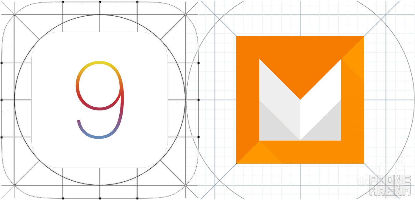
With Google and Apple already having released the developer previews of their upcoming software products, it is, naturally, time to put them against each other and compare them, just like we will do once the final releases are out. Google's I/O 2015 gave us a pretty extensive sneak peek at the features that Android M will introduce later this year; meanwhile, Cupertino showed us some of the additions that will arrive with iOS 9.
Still, being as curious as we are, we decided to devise a quick visual comparison between the two soon-to-be-polished rivals. All set? Okay, let's go!
Lockscreen, homescreen, notifications
Just as we said, there are very few changes in the UI section. First things first, we should mention that iOS 9 has scored a new system-wide font, San Francisco, which will replace Helvetica Neue, while Android M is still relying on the good ol' Roboto. This is one of the more striking differences, but it mostly concerns longtime iOS users who will probably be in for a surprise later this year.
Both the lockscreens and the homescreens of iOS 9 and are very much like you'd expect them, with a few small, but not so minor changes. For example, unlike Android Lollipop, Android M Developer Preview doesn't come with a dialer shortcut on the lockscreen; instead, we get a shortcut to Voice Search. iOS 9 will also score a more "proactive" Siri that will put a shortcut on your iOS lockscreen.
Search - Siri vs Google Now
"Search" was one of the keywords during both Google's and Apple's events, as the upcoming features of Google Now and Siri got demoed extensively on stage. Most of them are not out yet, because we're dealing with early developer previews here, but from the looks of it, fans of Google Now and Siri will have a lot of reasons to rejoice later this year.
In Android M's camp, we currently have an improved search functionality. Tapping on the search widget straight on your homescreen now also provides you with four recently-used apps, just like in the iOS 9 beta preview. Apart from this new feature, there aren't other additions to Android's search functionality. We should also mention that Google Now On Tap is not yet available in the beta release, but once it arrives, it will most certainly greatly improve the user experience of those users that swear by Google Now.
Task switchers
With Android Lollipop, Google introduced a much more visually-appealing, carousel-styled recent apps switcher that overhauled the previous one. Well, it's now time for iOS to receive some love in this department. Unfortunately, iPhones won't get the split-screen mutli-tasking feature at this point (it's iPad-exclusive as of now), but at least the iOS switcher has been revamped.
In iOS 9, we get a revamped task switcher that ditches the favorite contacts displayed on top(seriously, does anyone use these?) and employs a bit more blur than before. The new app switcher now displays the app cards in an overlapping fashion; scrolling around also seems a bit faster, but this might be your usual "placebo" effect.
Settings
There's a lot happening in the settings menu of Android M - the upcoming Android release will score a dark UI theme, customizable tiles, improved RAM usage screen, as well as an ever-so slightly revamped menu hierarchy. In the meantime, Apple will also improve the arsenal of iOS. Apart from a handy search feature in the Settings app, iOS 9 will come with a revamped menu hierarchy - among the new features that got introduced are a dedicated battery menu (which is also home to the newly-introduced Low-power mode for iOS), better notification control, and many, many others, which are detailed in our official preview of iOS 9.
Permissions are yet another aspect in which both platforms are getting more alike. iOS has required users to grant certain app permission immediately they're used for the first time, but Android's solution has just recently gone down this road. It's also scored a similar app permissions screen that allows you to explore what apps have access to what components of your device.
Camera
Whereas the stock Android camera app has not been updated recently, it looks like iOS 9 will bring some visual changes to the standard iOS one. They are pretty minor, mind you, but we still tend to like them due to their improvement of the user experience. Now, when you disable certain features, like flash or HDR, the iOS camera will strike them through for you, hinting you that they're disabled; turning on auto mode will make them go white, whereas forcing them to remain always on will paint them yellow, providing you with a easy way to tell what's going on. Alas, certain features like the fps selector in slow-motion mode has been nixed, but here's to hoping that they'll get re-introduced with the final release of iOS 9.
Follow us on Google News







Things that are NOT allowed:
To help keep our community safe and free from spam, we apply temporary limits to newly created accounts: