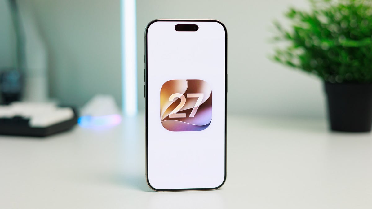
Apple's iOS 27 beta is already reworking a gesture that's stuck around since 2011. Enable Siri AI on an Apple Intelligence device like the iPhone 17 Pro Max, and the swipe down from the top center of the screen, the same motion that's always opened Notification Center on iOS 27, now launches Siri's new "Search or Ask" panel instead.
Apple hands Siri the swipe you've used since 2011
Notification Center's default behavior on iOS 27 hasn't changed. But once you switch on Siri AI, still gated behind a waitlist in Settings, the top-center swipe gets reassigned to the new conversational Siri panel instead.
That's the exact gesture Apple introduced with iOS 5 back in 2011, and it's the one most iPhone owners have used every day since. Notification Center hasn't gone anywhere, it just moved exclusively to a swipe from the top-left corner, and incoming alerts now slide in from that side too, nudging muscle memory toward the new spot.
According to a hands-on breakdown of the beta software, the swap only hits Apple Intelligence-capable iPhones (15 Pro and up). Older or non-Pro models keep the old gesture untouched.
Where do you stand on Apple handing Siri that swipe?
13 Votes
I'll retrain my thumb, Siri needs the spotlight
30.77%
Give me back my one-swipe notifications
61.54%
My iPhone isn't supported, so it's moot for me
7.69%
I'm holding off on Siri AI until this settles
0%
Why this barely touches Android and what Google should watch
Android's notification shade has never had to fight an on-device assistant for its swipe. Pulling down near the top still opens your shade on a Galaxy or Pixel phone, and Gemini lives behind its own trigger rather than sharing that motion.
Recommended For You
Still, Google keeps pushing Gemini deeper into system-level surfaces, so a similar squeeze isn't impossible down the line. For now though, this muscle memory reset is an iPhone-only problem.
What actually shifts on your screen
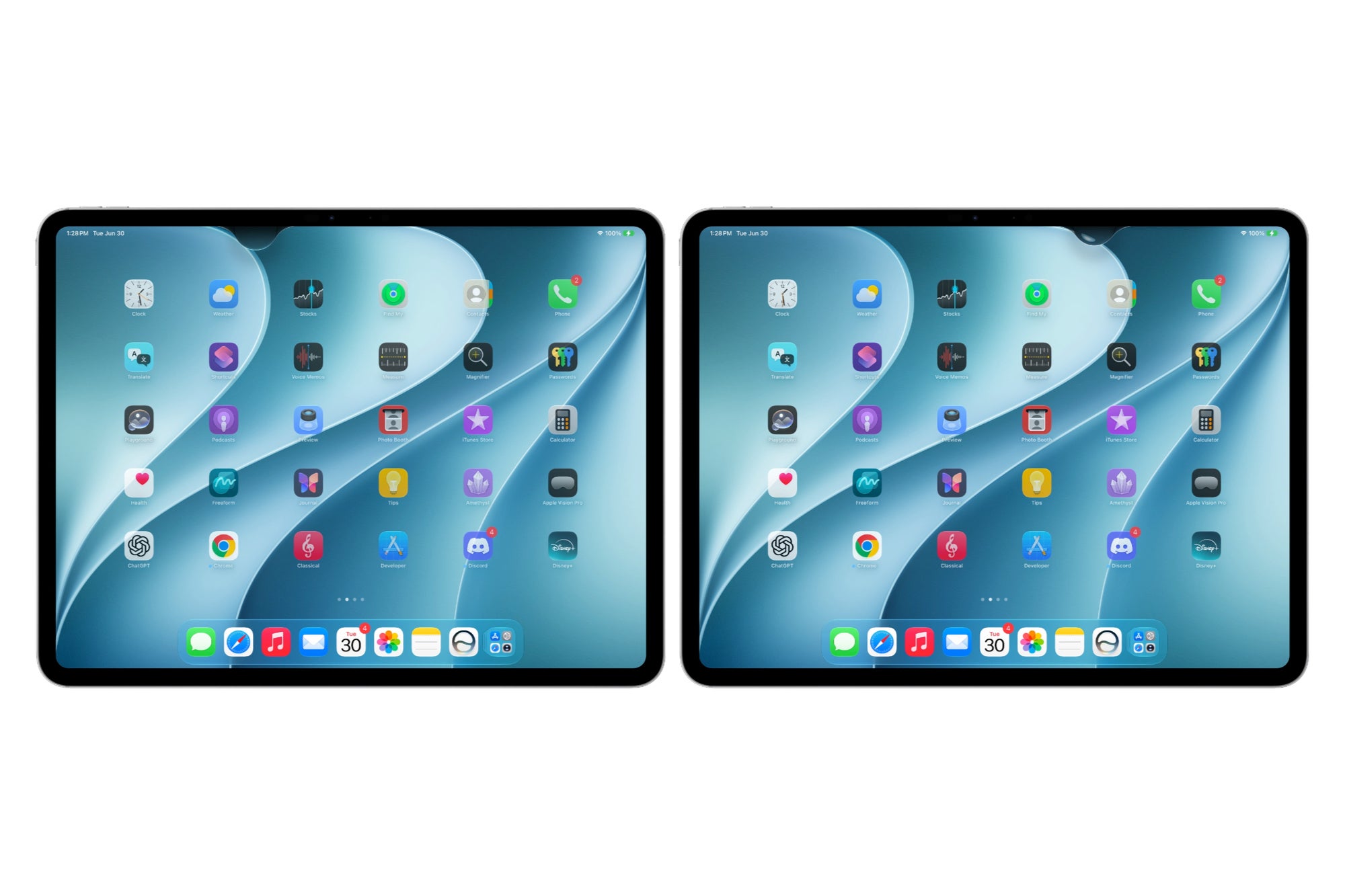
iPadOS 27 beta 2's revamped top-edge layout, splitting Notification Center, Siri AI and Control Center into separate zones. | Image by 9to5Mac
The layout already changed once mid-beta. Beta 1 handed most of the top edge to Siri AI, shrinking the Notification Center zone even further if you'd disabled showing the date or AM/PM.
Beta 2 evened things out. Notification Center and Control Center now get roughly matching zones on either side, about two app columns wide each, with Siri AI filling the middle. None of it touches older or non-Pro iPhones, since Siri AI isn't available there yet.
Is retraining 15 years of habit worth it?
Apple's pulled a version of this before. When the iPhone X dropped the home button in 2017, Control Center moved from a swipe up from the bottom to a swipe down from the top-right corner, and that eventually became just as automatic as the old way.
Still, that adjustment took a few months, and Siri AI has to earn the same reflexive spot the old gesture held for 15 years. iOS 27 remains in beta, so I wouldn't be surprised if this layout shifts again before the fall release. Hopefully Apple leaves a way back to the old swipe for anyone who'd rather keep their thumbs on autopilot, though nothing so far suggests that's coming.
And if you're tracking iOS 27 closely, also check out:
Everything Apple confirmed for iOS 27, Siri AI included, in our full WWDC recap
The rumored iOS 27 features that never made the keynote, in this breakdown
Follow me, @jojothetechie, on X and Threads for more hot takes and behind-the-scenes iOS coverage
Trade in your old phone for cash at ecoATM!
Recycle your used phone and get instant cash. Find out how at ecoATM!
Johanna Romero is a Senior News Writer at PhoneArena, covering mobile technology news across Android, iOS, wearables, and the Google ecosystem she knows best. Drawing on 15 years in IT and tech support from 2007 to 2022, she brings a user-friendly eye for the practical features and lesser-known tricks readers care about. Google named her an official #TeamPixel member in 2022, and she also reviews the latest devices on her YouTube channel, JoJo the Techie.
A discussion is a place, where people can voice their opinion, no matter if it
is positive, neutral or negative. However, when posting, one must stay true to the topic, and not just share some
random thoughts, which are not directly related to the matter.
Things that are NOT allowed:
Off-topic talk - you must stick to the subject of discussion
Offensive, hate speech - if you want to say something, say it politely
Spam/Advertisements - these posts are deleted
Multiple accounts - one person can have only one account
Impersonations and offensive nicknames - these accounts get banned
To help keep our community safe and free from spam, we apply temporary limits to newly created accounts:
New accounts created within the last 24 hours may experience restrictions on how frequently they can
post or comment.
These limits are in place as a precaution and will automatically lift.
Moderation is done by humans. We try to be as objective as possible and moderate with zero bias. If you think a
post should be moderated - please, report it.
Have a question about the rules or why you have been moderated/limited/banned? Please,
contact us.











Things that are NOT allowed:
To help keep our community safe and free from spam, we apply temporary limits to newly created accounts: