Every product we review or recommend is thoroughly tested by our in-house experts in real-world conditions, following our
review methodology
and
ethics statement
to ensure honest, independent, and data-driven results.
Introduction:
As extensive as it is, the Android landscape does not offer many smartphones that boast the portrait QWERTY form factor. Fortunately, every once in a while, we do get introduced to such a BlackBerry look-alike, and the Motorola PRO+ is the latest handset to join the party.
As its name suggests, the Motorola PRO+ is a smartphone meant to suit the needs of business professionals, which is why its front is occupied by a full QWERTY keyboard. However, those who have an aversion for on-screen virtual keyboards might also be interested in it.
The package contains:
Wall charger
microUSB cable
Wired headset
Getting started guide
Design:
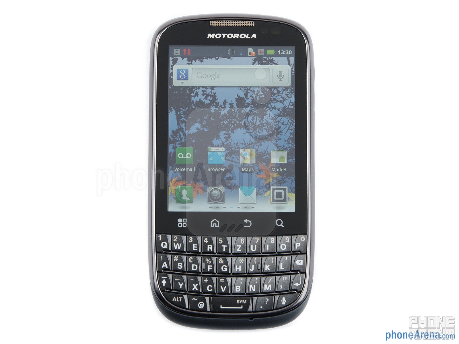
The Motorola PRO+ fits nicely in the hand thanks to its curved bottom side and rounded edges. Its weight is also commendable as it tips the scales at 113 grams. With a waistline of 11.65 millimeters, the smartphone is indeed on the thick side, yet it does not feel bulky or uncomfortable to carry around in any way.
Even though it is constructed out of plastic, it does not feel cheap or poorly built. Adding extra character to its look is the neat wave pattern that its back cover exhibits. Besides, the back side scores extra points for its soft touch finish, which both adds extra grip and keeps dust and fingerprints away.
The Motorola PRO+ fits nicely in the hand thanks to its curved bottom side and rounded edges
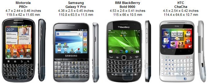
You can compare the Motorola PRO+ with many other phones using our Size Visualization Tool.
What shines in the smartphone's front is a 3.1-inch display with a resolution of 480 by 640 pixels. And it shines very bright indeed, which makes it easily usable on a sunny day. It represents colors quite naturally and offers some deep black tones. But what we really like about the display is how sharp and detailed everything looks thanks to its respectable 258ppi pixel density. The only downside is that anything more than a slight tilt to the side is enough to make colors look washed out.
The 3.1-inch display has a resolution of 480 by 640 pixels
Underneath the display we find a set of four Android buttons, and we are happy to see that they are quite responsive to the touch. We are also pleased with the well-shaped volume rocker, which you can find with your thumb even when blindfolded.
Recommended For You
The portrait QWERTY keyboard on the Motorola PRO+ feels awkward to use at first, but, of course, you get the hang of it eventually. After using the smartphone for a couple of days, we were able to type fairly quickly and accurately on it, so we think that business users will like it too. The keyboard's only major drawback is that it is inconvenient to use with a single hand due to the way the keys are shaped.
The portrait QWERTY keyboard on the Motorola PRO+
To wrap things up, the Motorola PRO+ is comfortable to use, its keyboard serves its purpose well, and its display is pleasing to the eye. On the other hand, it lacks visual appeal, so don't pick this one up if you have a taste for shiny things.
Motorola PRO+ 360-degrees View:
Drag the picture or use the keyboard arrows to rotate the phone. Double click or press keyboard
Space to zoom in/out.
Drag the picture in the desired orientation to rotate the phone.
Interface:
The Motorola PRO+ runs Android 2.3.5 Gingerbread with a custom interface on top of it, and underneath its hood we see a single-core MSM7230 chipset clocked at 1GHz. Sure, the hardware is rather modest, yet navigation is smooth and responsive even when there is a live wallpaper on the smartphone's home screen.
The interface as a whole is unobtrusive and gets the job done well. You get seven customizable home screens, and the dock accommodates four icons, three of them customizable and the fourth one being the application drawer. In terms of widgets, plenty of them are available out of the box and will cover the majority of your necessities, such as quick access to weather information, email or social networking.
The Motorola PRO+ runs Android 2.3.5 Gingerbread with a custom interface on top of it
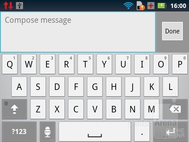
Despite having a physical QWERTY keyboard, the Motorola PRO+ offers a virtual on-screen one, which is available when the device is in landscape mode. And while it is not convenient for typing lengthy e-mails, it quite usable when you need to input a word or two really quick while using apps in landscape mode, the YouTube client or the web browser, for example. Speaking of typing, there is a really neat auto-correct feature that takes care of your typos and spelling mistakes on the fly.
On-screen keyboard
Software:
The Motorola PRO+ comes with a few neat apps pre-installed, among which is the 7digital music marketplace, which lets you purchase music straight from the smartphone. The Phone Portal app by Motorola is also quite useful as it lets you manage the device over Wi-Fi just like Kies Air does on Samsung devices. You also get Quickoffice, which can open and edit documents, including in PDF format, and a social networking hub that combines several social networks under one roof.
Internet Browser:
The Motorola PRO+ uses the stock Android internet browser, but its performance is far from perfect. It tends to lag a bit, and the pinch to zoom functionality is quite choppy. And while Adobe Flash support is a good thing on paper, having Flash content being rendered on the page takes a great toll on the browser's responsiveness. But even when Adobe Flash is off, the browser's performance is still not as fluid as it should be.
The Motorola PRO+ uses the stock Android internet browser
Connectivity:
The Motorola PRO+ offers all the connectivity features you would expect from a device of its rank, namely a 14.4Mbps HSDPA radio, Wi-Fi, Bluetooth, GPS, and an FM Radio with RDS. The GPS was rather slow at pin-pointing our location from a cold start as it took a little over two minutes to do it, but it worked fine afterwards.
Camera:
On the back of the Motorola PRO+ is located a 5-megapixel camera with a single LED flash. After taking some outdoor shots on a sunny day, we can say that its performance is rather average. There is lots of detail in the photos and the amount of digital noise is tolerable. The major drawback of the camera, however, is that it tends to overexpose the photos, and the colors look washed out. When shooting indoors, photos look fine, as long as you have a reliable light source, but when light is scarce, the camera has troubles focusing on objects and balancing the colors properly. It can also shoot videos in 720p, and their quality is not bad, but nothing impressive either. Something that is worth noting is that the video camera does not adjust the exposure levelquick enough, which may result in under- or overexposed footage.
Outdoor samples taken with the Motorola PRO+
Indoor samples
Motorola PRO+ Sample Video:
Motorola PRO+ Indoor Sample Video:
Multimedia:
What we were genuinely impressed by is the cool audio player that the Motorola PRO+ comes with as it offers plenty of neat features. Sure, its interface is rather plain, but the player allows you to listen to online radios, it provides access to music-oriented social services, it has SoundHound song recognition built-in, and it even automatically downloads and displays the lyrics of the song currently playing. When it comes to video playback, 720p is the biggest resolution videos can be played at, and DivX/Xvid file formats are supported out of the box.
Audio player
Performance:
We are quite satisfied with the in-call audio performance of the Motorola PRO+ as the earpiece produces loud and distinct tones even when its volume is not turned up all the way. There is a secondary microphone, which suppresses a great deal of background noise, and our voice sounded really distinct on the other side of the line, although slightly artificial. When it comes to battery life, the Motorola PRO+ can provide 8 hours of talk time or last for 312 hours in stand-by mode, which are both figures slightly above the average.
Conclusion:
In conclusion, the Motorola PRO+ could have been a good entry-level business-oriented device if it wasn't for the poor performance of its browser, but other than that, there is little for us to complain about. We find itvery suitable for people who simply prefer physical keyboards over virtual ones; people who like texting and spend a lot of time chatting with their buddies online. Besides, the smartphone is pretty strong in the multimedia department and packs an eye-pleasing display.
Of course, it would be a good idea to check out some of the alternatives. If you are a social freak, the HTC ChaCha is worth considering as it packs a physical keyboard as well, yet comes cheaper than the PRO+. Besides, the Samsung GALAXY Y Pro and the M Pro share the same form factor, and even though might not perform as well, both are considerably cheaper. But the best alternative in our opinion would be the Sony Ericsson mini pro, which offers both identical hardware and a physical keyboard, yet can be bought much cheaper.
A discussion is a place, where people can voice their opinion, no matter if it
is positive, neutral or negative. However, when posting, one must stay true to the topic, and not just share some
random thoughts, which are not directly related to the matter.
Things that are NOT allowed:
Off-topic talk - you must stick to the subject of discussion
Offensive, hate speech - if you want to say something, say it politely
Spam/Advertisements - these posts are deleted
Multiple accounts - one person can have only one account
Impersonations and offensive nicknames - these accounts get banned
To help keep our community safe and free from spam, we apply temporary limits to newly created accounts:
New accounts created within the last 24 hours may experience restrictions on how frequently they can
post or comment.
These limits are in place as a precaution and will automatically lift.
Moderation is done by humans. We try to be as objective as possible and moderate with zero bias. If you think a
post should be moderated - please, report it.
Have a question about the rules or why you have been moderated/limited/banned? Please,
contact us.


Things that are NOT allowed:
To help keep our community safe and free from spam, we apply temporary limits to newly created accounts: