This article may contain personal views and opinion from the author.
This is a story about… consistency.
We’ll divide it into two main parts - Pixels before the Pixel 6 and after the Pixel 6. So, in a way, we’ll take a brief look at the past, present, and future in a matter of minutes!
3,2,1…
Hocus pocus!
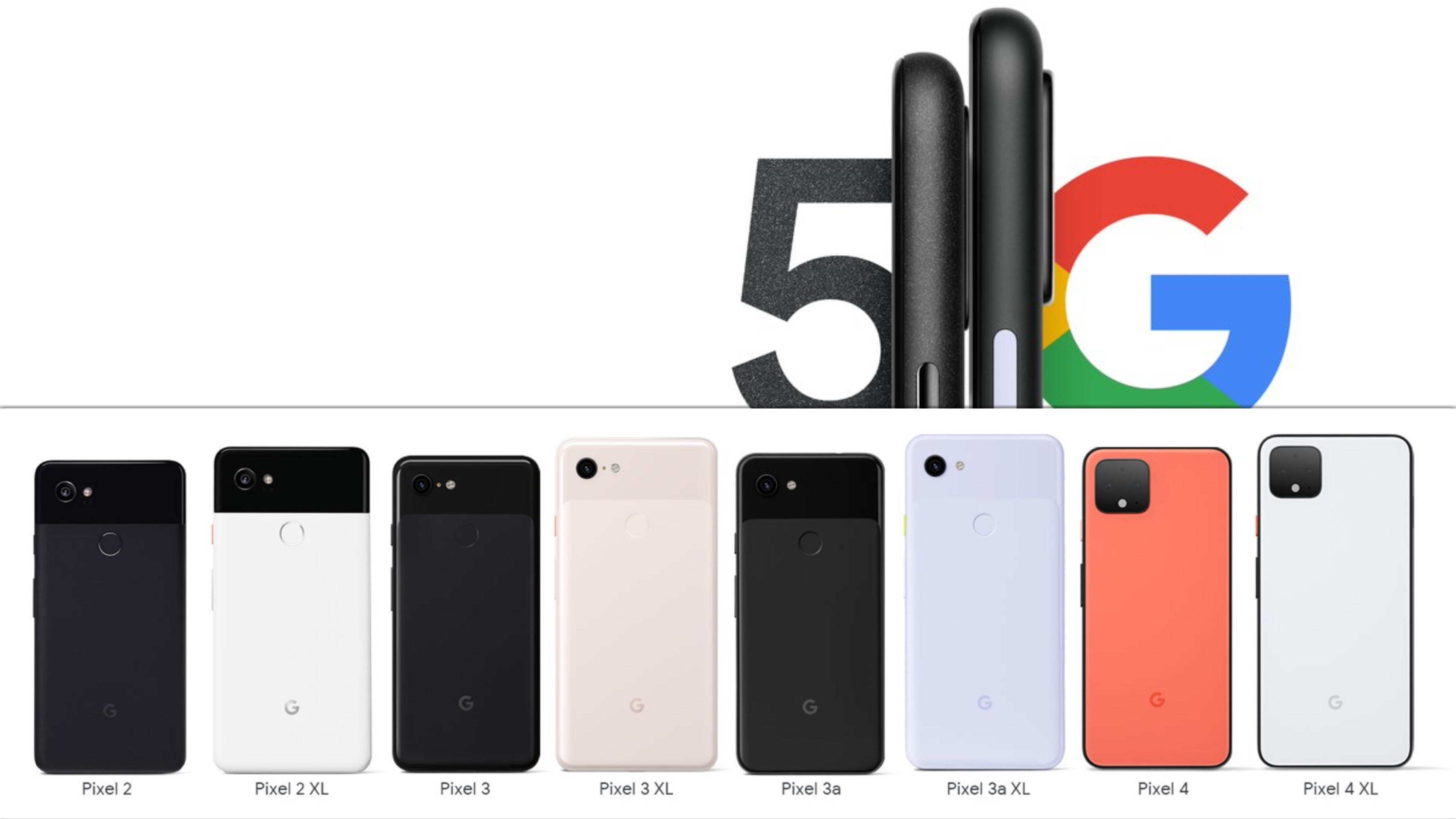
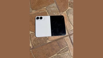
Google Pixel
And just like that, we’re back in 2016, when the first Pixel is being announced. It’s a very important year for Google. The company is finally ready to put an end to the one-night stands with Samsung, LG, Motorola, HTC, and Huawei, and proudly announce “the phone by Google”.
OK, back to reality! HTC still manufactured the phone, but this time Google had designed it - make out of this what you will. Regardless, the 2016 Pixel came with a distinct two-tone design, the Google assistant was ready to go out of the box, and it offered unlimited photo storage. But this design is what we are here for.
You’ve seen it - huge bezels on the front, no camera bump, a glass top bit on the rear, but mostly metal below and on the sides. Was it the prettiest phone around? Not really. But it stood out. In a good way. I remember being put off by that rear fingerprint scanner, as I never liked them, but other than that, I liked the Pixel’s character.
The first Pixel’s design was more important for Google as a brand than you might realize. Whether you hated the bezels or felt the glass bit on the back was weird - it was about giving people something to talk about and making the phone recognizable.
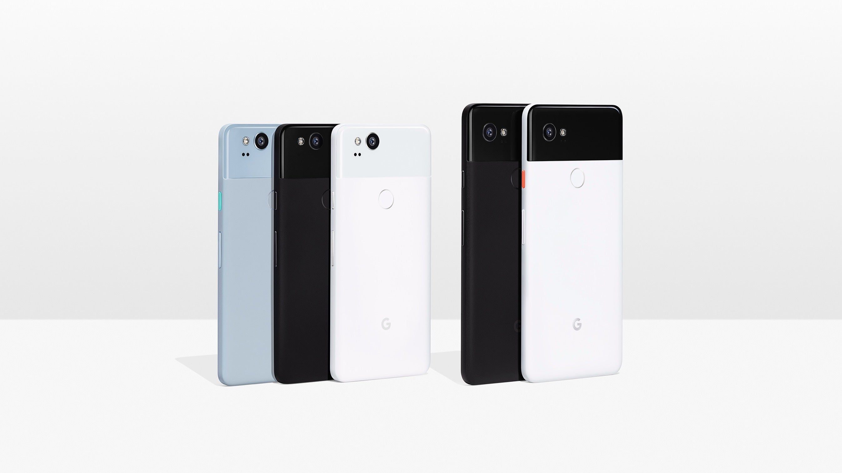
And then comes the Pixel 2, which builds on that design language with thinner bezels, especially on the Pixel 2 XL, but keeps the same “vibe” and character. The phone is (again) recognizable on its own but also an obvious successor to the previous Pixel. Sidenote: That Panda Pixel 2XL? Superstar!
You might notice that I don't have too much to say about the Pixel 2 series, and that's actually a great thing! Up until this day, the Pixel 2 and 2 XL remain the fan's favorite Pixels ever, and that's not a coincidence. Sure, the 2 XL had some display issues, but that wasn't enough to overwrite its incredible looks and camera.
Google Pixel 3 and 3 XL
The Pixel 3’s rear design looked identical to the Pixel 2's, which was a natural follow-up for the line. However, while the smaller Pixel 3 came with the familiar bezels, the 3XL model is where Google went… rockstar - but perhaps in the dawn of its career.
The Pixel 3 XL was bold, different, instantly recognizable, but mostly… My God, was it off-putting! But hey, what about Apple’s iPhone X from the year before - why am I not mad at that notch? We’ll get back to that. So, perhaps… maybe… probably the Pixel 3 XL’s notch was there to stay and give the phone even more individuality and make it recognizable from a mile away.
Google Pixel 4 and 4 XL
But no. It wasn’t. Because a year later came the Google Pixel 4 and 4XL. We waved goodbye to the boombox notch to welcome a nice, big... bezel on top. Yes, it had 3D face recognition like the iPhone, but it arguably looked just as bad as the Pixel 3 XL.
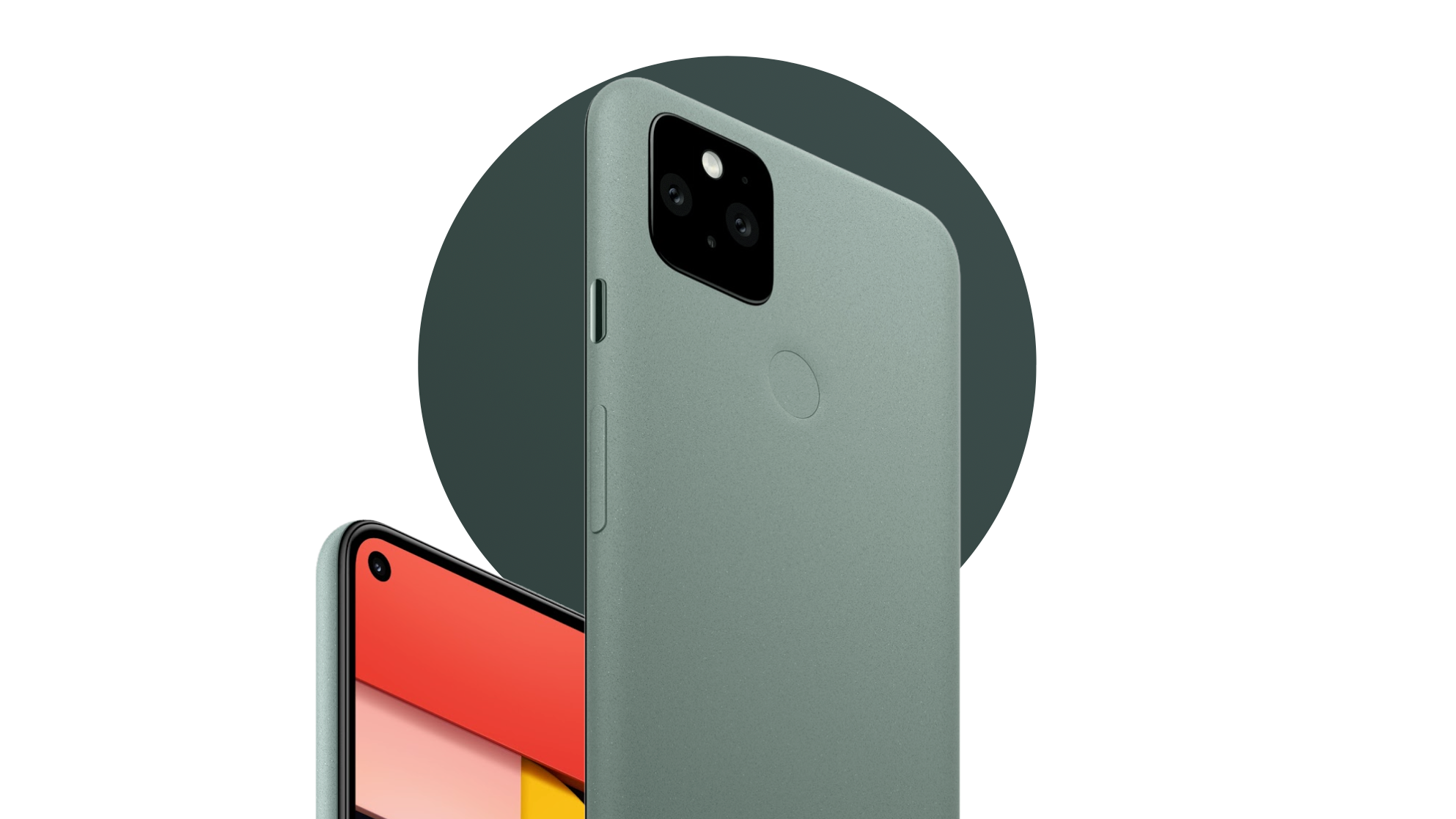
The phone’s rear design also took a sharp turn. The back was now just one color and one material - a smooth frosted glass back, instead of the classic two-tone Pixel design from the first three generations. The Pixel 4 acquired a square camera bump to add a telephoto shooter for the first time ever on a Pixel. Fine! Maybe they’ll stick with this style for the next 3-4 years.
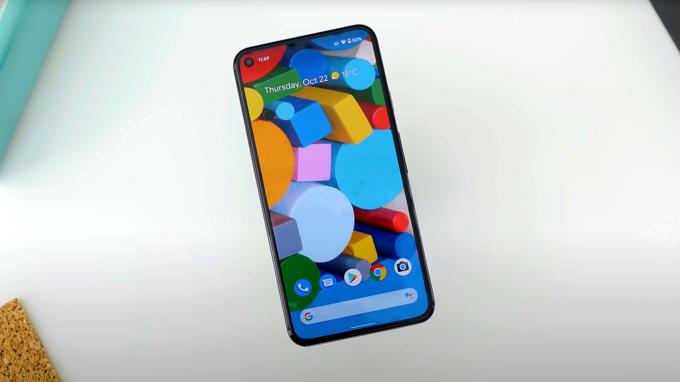
Google Pixel 5
Well, they did. Kinda. For just another year. The Pixel 5 dropped the appropriately named “Oh So Orange” color in favor of Sage Green, but it still had a smooth back, albeit made of metal and coated in plastic. The camera bump stayed the same. So the rear was just a much better version, but still a follow-up to the Pixel 4.
The front got a major, much-needed revamp! Thinner, but most importantly uniform (!) bezels all around that finally made an Android phone look symmetrical - three years after the iPhone X did it in 2017.
The Pixel 5 probably wasn’t the flagship of your dreams due to the mid-range specs, but this punch-hole design with unibezel was beau-ti-ful and so satisfying to look at. The size of the device was also consistent with Google’s attempts to push compact-ish devices.
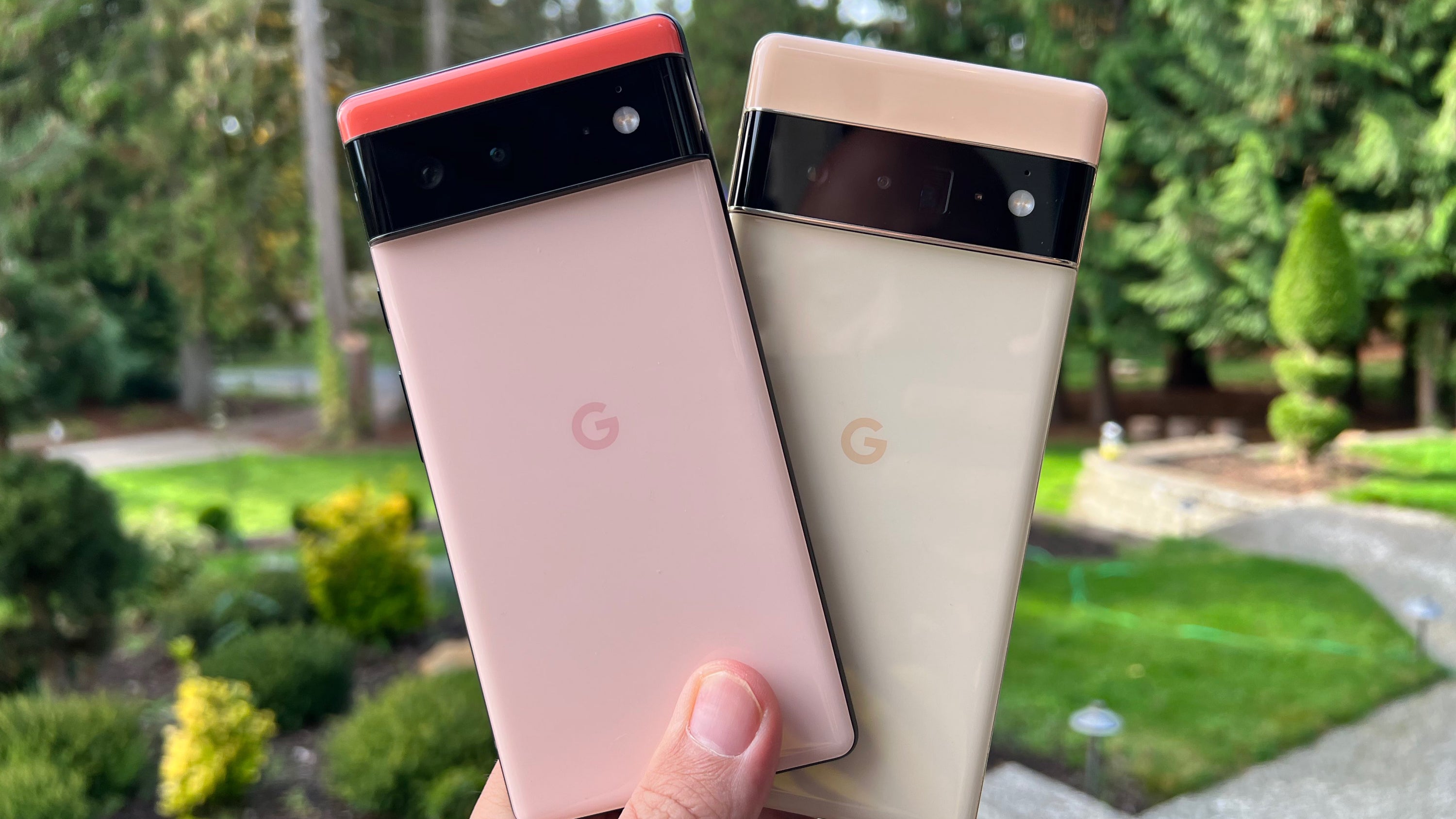
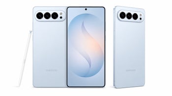
Google Pixel 6 and Pixel 6 Pro: Google's flagships are confusing, but the price is right
And of course, we get to the present day. The Pixel 6 and 6 Pro are out, and they look… different. As you can see, the past two years have been pretty inconsistent for Google when it comes to design and the overall direction they’re trying to take.
The Pixel 4 series were flagships on paper, while the Pixel 5 - not quite, but it looked much better. The company also released a bunch of mid-rangers. Not only do the Pixel 6 and 6 Pro look drastically different from the Pixel 5, on the front and back, but they:
Seem to have dropped the most appealing design features of this Pixel 5
Save for the rear, the Pixel 6 and 6 Pro look and feel drastically different from one another
Do you see the lack of consistency? In my opinion, keeping that Pixel 5 front look around would have been a chance for Google to set itself apart from the likes of Samsung and Apple while also keeping the symmetrical bezels around.
Furthermore, the plastic-coated metal rear was unheard of and made the Pixel unique and much more durable - no two opinions about it. Google had the chance to save you from having to worry about breaking the back of your phone. That’s an actual selling point in my book!
Pixel 6 and Pixel 6 Pro design - identity crisis?
Then when you look at the Pixel 6 and 6 Pro, you realize they are a Frankenstein of ideas - each in its own right. Almost as if Google is going through an identity crisis. As mentioned in previous stories, the Pixel 6 looks like a boxy Xperia, and the 6 Pro is like a Huawei flagship - pretty basic.
Of course, that’s until you turn the phones around. The rear camera bar and unique colors are a breath of fresh air in a landscape of more or less identical-looking Androids (foldables excluded). But is this worth anything if Google decides to drop this design next year like they’ve done for the past two? What if Google decides this wasn’t “the right” move… again?
Will Pixel 6 help Google build a brand identity that can stand up to Apple's?
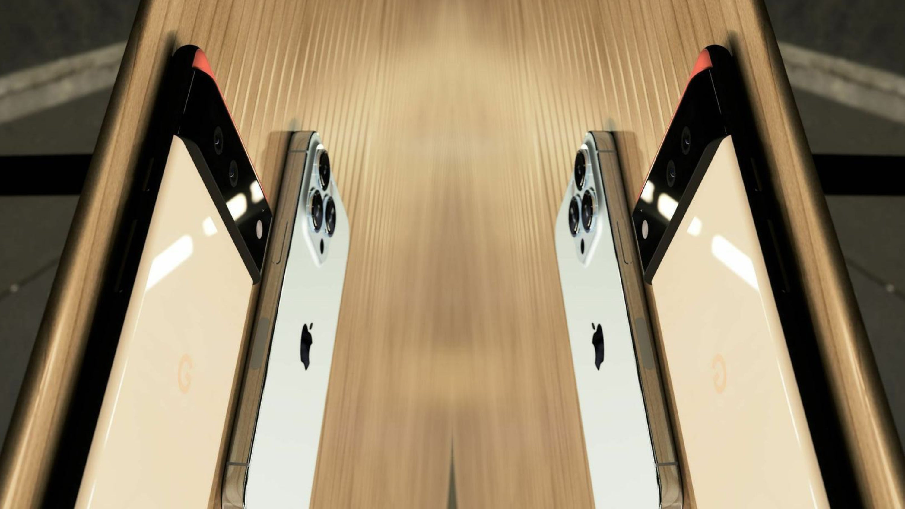
Take a look at Apple, which Google is certainly taking some inspiration from. Tim Cook and company have stuck with basically the same front look for four years on. Next year’s standard iPhone 14 and iPhone 14 Max are also expected to retain the notch. Love it or hate it, the cutout made the iPhone unique and recognizable.
Now, granted, Android phones probably can’t afford to stick to one design for too long, as the whole idea of Android seems to be “a custom experience”, but what about Google’s brand identity? Google isn’t just any Android manufacturer. They make Android! And they make some of the most-used apps that run on Android (and iOS)! And now they are also making their own chips and phones! So, where’s the brand identity? How do I know a Pixel is a Pixel and not a Huawei or a Sony?
Sure, on the flip side, if you get a Pixel 6 now, and Google does something drastically different next year, you might feel a little bit disappointed that you didn’t wait for the new phone. That will depend on whether you care. Really, the coin has two sides. Remember - consistency doesn’t (always) equal stagnation.
Of course, Apple can change up the iPhone’s design every year, but it’s not worth it from a business or brand perspective. And Apple users seem to be on board with that. I mean, there’s no other iPhone they can buy anyway...
Ultimately: Was the Pixel 6 design a mistake, and should Google go back to the Pixel 5's front look?
What I’m saying is that in my view, departing from that Pixel 5 front design and the metal back was a mistake. Not necessarily because the Pixel 6 and 6 Pro look bad, but because this was Google’s chance to set an example of leadership and consistency. Or simply set itself apart. I’m repeating myself, but it’s because I’m trying to emphasize my genuine disappointment. I’m rooting for Google!
Instead… We ended up with two flagships that not only look similar to other Android phones, at least from the front - which is the side you should care about most, but they don’t even look like they belong to the same line - again from the front.
Make up your mind, Google! If we are sticking to the camera bar, let’s do it! Next year you can make it out of one piece of glass, as it’s currently made out of three separate parts, and just take it from there…
Iterate, improve, shape up, listen to your customers. Just, please don’t pick the Pixel 7’s design with a blindfold on. Because it almost looks like that was the case when it comes to the front of the Pixel 6 and 6 Pro… Again, they don't necessarily look bad. They just look... confused. Don't be confused, Google. Come on, you can do it!
Six-month unlimited plan is now 57% off
$90
$210
$120 off (57%)
Mint Mobile is now allowing you to get whichever plan you like for either three, six, or 12 months for just $15/mo. If you go for the six-month unlimited service, for instance, you'll now have to pay just $90 upfront instead of $210.
Martin, a former tech journalist at PhoneArena, brings a unique blend of humor and insight to his work. His fascination with smartphones began with a Galaxy Young and evolved through a series of trades and upgrades, making him a self-proclaimed smartphone nerd. Martin's content often combines current analysis of market trends with historical references and future predictions. Whether it's a deep dive into technical issues or a first-person commentary on industry events, Martin's articles are designed to inform and engage. His critical perspective is driven by genuine curiosity and a desire to keep readers informed, not by any corporate sponsorship.
COMMENTS (50)
COMMENTS (50)
All comments need to comply with our
Community Guidelines
PhoneArena Community Rules
A discussion is a place, where people can voice their opinion, no matter if it
is positive, neutral or negative. However, when posting, one must stay true to the topic, and not just share some
random thoughts, which are not directly related to the matter.
Things that are NOT allowed:
Off-topic talk - you must stick to the subject of discussion
Offensive, hate speech - if you want to say something, say it politely
Spam/Advertisements - these posts are deleted
Multiple accounts - one person can have only one account
Impersonations and offensive nicknames - these accounts get banned
To help keep our community safe and free from spam, we apply temporary limits to newly created accounts:
New accounts created within the last 24 hours may experience restrictions on how frequently they can
post or comment.
These limits are in place as a precaution and will automatically lift.
Moderation is done by humans. We try to be as objective as possible and moderate with zero bias. If you think a
post should be moderated - please, report it.
Have a question about the rules or why you have been moderated/limited/banned? Please,
contact us.


Things that are NOT allowed:
To help keep our community safe and free from spam, we apply temporary limits to newly created accounts: