Samsung's own Android “skin”, the TouchWiz user interface, received a new version in the Samsung Galaxy S II. The phone features TouchWiz 4.0 over Android 2.3 Gingerbread, and while there are no drastic changes, some of the updates are worth mentioning.
Interface
First off, there are a number of visual improvements – the icon set has been redrawn anew, the widgets have been polished and more transparent backgrounds are abound. Everything looks much slicker now and, at times, reminds us of the HTC Sense UI graphics quality, which, of course, is still a much more comprehensive Android overlay than TouchWiz.
Having both Phone and Contacts icons in the dock strip at the bottom of the screen is a waste of space, if you ask us, since both lead you to the same phoning app. Good that you can replace the first three icons on the dock with any shortcut of your choosing from the main menu edit function.
The phone functions screen has four tabs at the top – Keypad, Logs, Contacts and Favorites – so you can easily switch from direct dialing to searching for one of your contact's details, for example. As usual, you can integrate your Facebook, Gmail and Twitter friends in the contacts list, as well as your corporate buddies from your company's Exchange server. Syncing all those allows you to view plenty of details without ever leaving the Contacts app; for example - Facebook status updates or uploaded picture albums.
Recommended For You
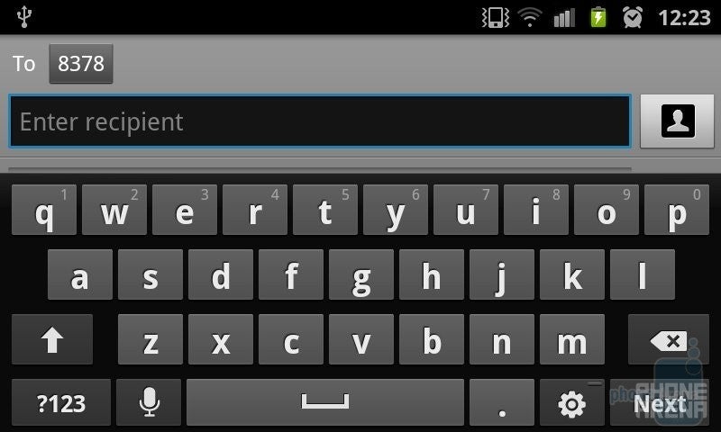
The Android 2.3 Gingerbread QWERTY keyboard has a TouchWiz skin over it, but the only difference in the layout is a microphone button left of the space bar, where there used to be a comma before – a tribute to the emphasis Samsung places on voice recognition. While in the browser, the mic key turns into a slash button, so it obviously adapts to the situation.
In the Messaging app the text or MMS messages appear in threaded view, and the keyboard doesn't eat up most of the screen estate in both portrait and landscape modes, so you can clearly see where you are typing. Speaking of MMS, you can attach almost anything to your message – picture, video, file, calendar appointment, and so on. The Calendar itself hasn't been revamped on the outside, but it's the same excellent tool for keeping track of appointments, and you can add an event quickly, syncing with your Google or Exchange calendars, too.
Gestures
Some novel functionalities are suspiciously tied up to the capable hardware on the Samsung Galaxy S II, so they might not appear in that form in less able handsets with TouchWiz 4.0. There are four gestures you can use in the interface, which are powered by the motion sensors inside the Galaxy S II. The Panning one lets you hold a widget or an app icon and move between homescreens or menu pages by tilting the phone left and right, until you reach the desired position to place them on. It skips a screen or two if you are not careful, and for going all the way back, you almost have to twist your arm.
Turn over lets you flip the phone to mute incoming calls or any other sound coming from the speaker, and works like a charm. Tilt lets you zoom in and out of photos and websites by having two fingers on the screen at once, and tilting the phone up and down. This one isn't particularly useful, as you can do the same with pinch-to-zoom as well. Finally, Double Tap is for when your hands are tied with, say, driving – so you can just tap the phone twice at the top, and you can give it voice commands. Works as advertised, see for yourself at 5:20 in the video review at the end of the article.
The article continues on the next page.
Apps and Settings
There _are also new settings for the general screen mode and some power saving _adjustments, which again can be attributed to the unique chipset and _display on the phone, and might not be present on the next Samsung _phones with this version of the UI.
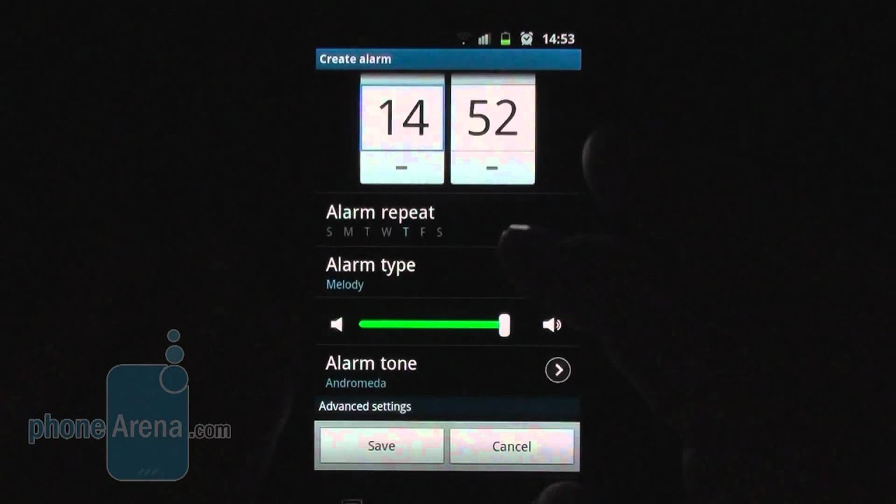
You have three modes for the screen, called “background effects” - Dynamic, Standard and Movie._ Dynamic bumps up contrast and smears a bit of detail, whereas Movie _brings a more subtle, darkened picture. Those three we also have on our _Samsung HDTV at home. You can opt to use a Power saving mode_ in Settings now, and it will turn off certain radios, or dim the _screen, whenever the battery falls under a predefined threshold.
We are pleased to see that apps like Kies Air_ are now an integral part of TouchWiz. It allows you to type in an IP _address in your computer's browser, and gain access to the phone's _storage memory and functions via a neat interface, provided both are on _the same Wi-Fi network. You can exchange files with the device, stream _movies or songs from it, update your contacts' details, and even send _text messages and email through the phone from your computer. Very _handy, if you don't have a microUSB cable lying around.
Camera and Multimedia
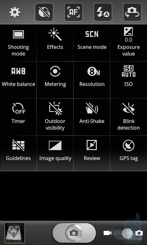
The camera interface in TouchWiz 4.0 now works in _portrait mode as well
The camera interface has been reworked to sport_ a minimalistic font on more transparent menu backgrounds, which allows you to still see the scene you are framing when you fire up the settings.
It_ is also swiftly alternating between landscape and portrait modes now, _allowing you to change settings easily no matter what position is the _phone at.
A very handy feature is the ability to manually place _shortcut icons to the functions you use most in five slots, which are _situated on the left of the screen in landscape mode, or at the top in _portrait.
The other two apps worth mentioning are the ones for photo and video editing. They got released for the Samsung Galaxy S_ in the beginning of the year, but come standard with TouchWiz 4.0 now. _The photo editor comes with tons of utilities, which will let you remove_ the hair from your nose on close-up shots, or apply cool _laughing-mirror effects to your ex’s photos. The video editing app is Video maker,_ and lets you trim and split the clips on your device, apply various _effects like Sharpen to them, or mix and match with pictures and music. _It works with video files with resolution of up to 720p, so you can't _edit 1080p video yet.
We'd be remiss not to mention the four Hubs Samsung is supplying with TouchWiz 4.0. The Social Hub _ integrates all your messaging and social networking updates at one _place, and you can also create something wise, and only afterwards _choose whether to shoot it in a text, email, or post in on Facebook or _Twitter.
We also have Music, Readers and Games Hubs, acting like Samsung's own multimedia stores. The Music Hub_ is powered by 7digital, and sells millions of songs for roughly $0.99 a_ pop, or whole albums. The same rich choice is present in the Readers Hub,_ which is categorized into newspapers (powered by PressDisplay), _magazines (powered by Zinio), and Kobo's books app. There are 7 trial _issues you can subscribe for in the newspaper section, and a bunch of _free classics to read on the book shelf, if that's your thing.
The Games Hub_ seems predominantly occupied by Gameloft titles in the Premium games _section, which you can't find in Android Market. All four Hubs have easy_ to navigate interfaces, and searching for music, books, games or _magazines is a snap, while the options to show you what's hot in each _category is pretty helpful.
On_ the whole, we don't mind the TouchWiz concept for an Android overlay of_ Samsung. It is not as deeply enthralled as HTC Sense, for instance, but_ it just works, and has some _very neat ideas like the radio switches in the notification bar, and _well-executed social networking integration in Contacts. With its latest_ version, TouchWiz 4.0, the overlay scores beautification points_ as well, with transparent backgrounds and transitional animations _galore. Well, video is worth millions of words, so have a brief look at _the new TouchWiz 4.0, as we found it on the Samsung Galaxy S II.
Try Noble Mobile for only $10
Get unlimited talk, text, & data on the T-Mobile 5G Network plus earn cash back for data you don’t use.
Daniel, a devoted tech writer at PhoneArena from 2010 to 2025, has been engrossed in mobile technology since the Windows Mobile era. His expertise spans mobile hardware, software, and carrier networks, and he's keenly interested in the future of digital health, car connectivity, and 5G. Beyond his professional pursuits, Daniel finds balance in travel, reading, and exploring new tech innovations, while contemplating the ethical and privacy implications of our digital future.
Recommended For You
COMMENTS (10)
COMMENTS (10)
All comments need to comply with our
Community Guidelines
PhoneArena Community Rules
A discussion is a place, where people can voice their opinion, no matter if it
is positive, neutral or negative. However, when posting, one must stay true to the topic, and not just share some
random thoughts, which are not directly related to the matter.
Things that are NOT allowed:
Off-topic talk - you must stick to the subject of discussion
Offensive, hate speech - if you want to say something, say it politely
Spam/Advertisements - these posts are deleted
Multiple accounts - one person can have only one account
Impersonations and offensive nicknames - these accounts get banned
To help keep our community safe and free from spam, we apply temporary limits to newly created accounts:
New accounts created within the last 24 hours may experience restrictions on how frequently they can
post or comment.
These limits are in place as a precaution and will automatically lift.
Moderation is done by humans. We try to be as objective as possible and moderate with zero bias. If you think a
post should be moderated - please, report it.
Have a question about the rules or why you have been moderated/limited/banned? Please,
contact us.


Things that are NOT allowed:
To help keep our community safe and free from spam, we apply temporary limits to newly created accounts: