This is why you will soon see new icons representing Google's apps
By using gradient color designs for its app icons, Google is promoting an important new feature for many of its apps.
Google is updating its app icons using gradient color schemes and rounded lines. | Image by 9to5Google
You might think that Google is just wasting its time by putting too much effort into redesigning the icons used for some of its apps. Recently, the Alphabet-owned company started moving from a flat design for its app icons to a more gradient look.
Google is changing the looks of some of its app icons
Google is updating the look of its icons to help promote the ever expanding use of AI within these apps. Previously, Google wanted to have all of its app icons include all four of the company's colors: blue, red, yellow, and green, with the icon.
Besides adding the gradient look to its app icons, Google has been trying to make these icons look different when it comes to their colors and shapes. Some of the new designs are slightly more rounded and the new Gmail icon is a good example of that.
Besides adding gradient coloring schemes, Google is replacing sharp-edges with more rounded ones
Google Tasks will keep the blue and white color scheme for its icon, but instead of a thick blue checkmark inside double circles, the checkmark is now thin and white. The checkmark is now inside a single blue gradient disc.
What do you think about Google's constant tinkering with its apps?
Enough is enough Google!
32.32%
Google needs to tinker some more.
43.43%
Stop with the tinkering now.
24.24%
Google Calendar is getting a huge change as its icon shifts from one using a box made up of all four Google colors with the current date in the middle (on Android, the number 31 on iOS) against a white background. The new Google Calendar icon resembles the numbers you'd see on an older digital flip-style alarm clock in blue with white numbers.
This is an example of skeuomorphism, used on the original iPhone. With this design, digital elements like icons look like their physical counterpart so that people know what to expect when they tap on an icon.
Some of these app icon changes are relatively huge
Other huge changes are coming to the app icons for Google Meet. Instead of using sharp-cornered shapes to create the look of a video camera in all four Google colors, the new Google Meet icon is a yellow video camera with rounded corners.
The icon for Google Chat might be getting the biggest change. Currently, a square text box like you would see in a comic strip in Google's four colors, the new icon looks more like a traditional text bubble in gradients of green with a big smile.
Some well-known icons are getting a less jarring change. For example, the versatile Google Keep app, known famously for its light bulb icon, will keep the bulb in its new app. But instead of a white bulb on a folded yellow background (designed to look like a sheet of paper), the new design is a larger yellow and white light bulb.
Some of the Google app icons are getting minor changes
Google Voice also will keep the basic look of a traditional phone handset in green with signal waves. However, the ear and voice pieces are more rounded and the phone and signal images are larger.
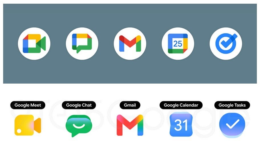
Some of the app icons getting huge changes which are shown on the bottom row. | Image by 9to5Google
Other Google app icons that will have minor changes include:
- Google Drive-still a triangular shape, the triangle will be made of rounded components and the color red will be removed.
- Google Docs-instead of three white lines representing written lines on a folded paper, the new design shows only two lines.
- Google Slides-a small rectangle on a yellow piece of paper shown length-wise is replaced by a larger rectangle on a yellow sheet of paper shown width-wise.
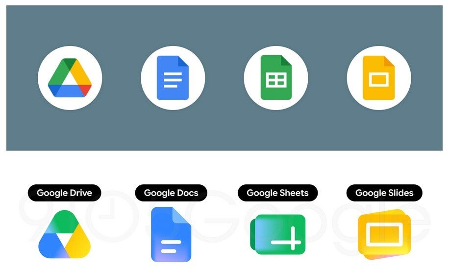
Some of the app icons getting the minor changes seen on the bottom row. | Image by 9to5Google
It isn't clear when we might see these new icon designs rollout. They have yet to show up on my Pixel 6 Pro running Android 17 Beta 3, or on my iPhone 15 Pro Max with iOS 26.5 Beta 4 installed.

Popular stories
Latest News
Things that are NOT allowed:
To help keep our community safe and free from spam, we apply temporary limits to newly created accounts: