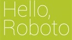
The world can be divided into two types of people: those who care deeply about type fonts and those who more or less take them for granted. Matias Duarte, Google’s head of the Android user experience, clearly is of the former opinion. Duarte took to Google+ to post an in depth look at the creation of Roboto, the new font that will be introduced in Android 4.0 (Ice Cream Sandwich), including the reasoning behind many of their decisions.
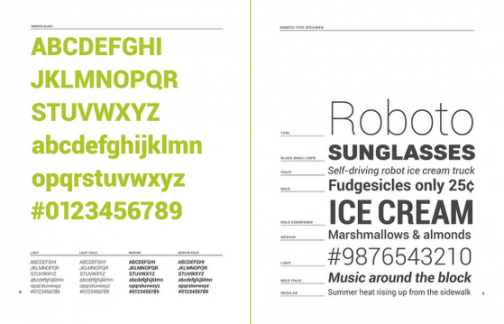
Google decided to retire Droid Sans, the humanist sans serif typeface that has adorned previous iterations of Android. The problem with the Droid font, according to Duarte, is that the font was created to work on lower resolution screens, and it lost much of its charm when scaled up to higher pixel-density screens. With the onslaught of 720p screens headed for future Android handsets, this was apparently a pressing issue.
Duarte highlighted several important attributes of Roboto, including making the font appear modern, crisp, and structured so that it would complement the rest of the Ice Cream Sandwich look. The design is intended to enhance readability by not appearing too monotonous when viewing full pages of text. They also tried to strike a balance between making the font visually stunning, but not to the point that it overwhelmed readers when looking at small strings of text.
Perhaps the most interesting part of Duarte’s post is that Roboto isn’t yet finished. In addition to what he terms “endless iterations” of small details in their quest for the perfect font, the team is still working to extend the character set to non-traditional characters, as well as providing the font hinting that is needed for display on the web and on low resolution screens.
Scott Hartman is a former tech news writer at PhoneArena. He contributed news posts actively between 2011 and 2012.
Recommended Stories
Loading Comments...
COMMENT
All comments need to comply with our
Community Guidelines
Phonearena comments rules
A discussion is a place, where people can voice their opinion, no matter if it
is positive, neutral or negative. However, when posting, one must stay true to the topic, and not just share some
random thoughts, which are not directly related to the matter.
Things that are NOT allowed:
Off-topic talk - you must stick to the subject of discussion
Offensive, hate speech - if you want to say something, say it politely
Spam/Advertisements - these posts are deleted
Multiple accounts - one person can have only one account
Impersonations and offensive nicknames - these accounts get banned
Moderation is done by humans. We try to be as objective as possible and moderate with zero bias. If you think a
post should be moderated - please, report it.
Have a question about the rules or why you have been moderated/limited/banned? Please,
contact us.


Things that are NOT allowed: