The boring looking iPhone 15 and iPhone 15 Pro: Apple doesn’t see color (and that’s the problem)
This article may contain personal views and opinion from the author.

I’ll have to start by saying that I realize muted, and somewhat “boring” smartphone colors aren’t exactly a new thing...
So, what happened to the bright, jolly smartphone colors of the past; what is the real reason Apple might be holding back on being “fun”, and… does it even matter?
iPhone 15 and iPhone 15 Pro colors: What is the real reason the iPhone 15 looks so bland? Maybe Apple doesn’t see color after all…
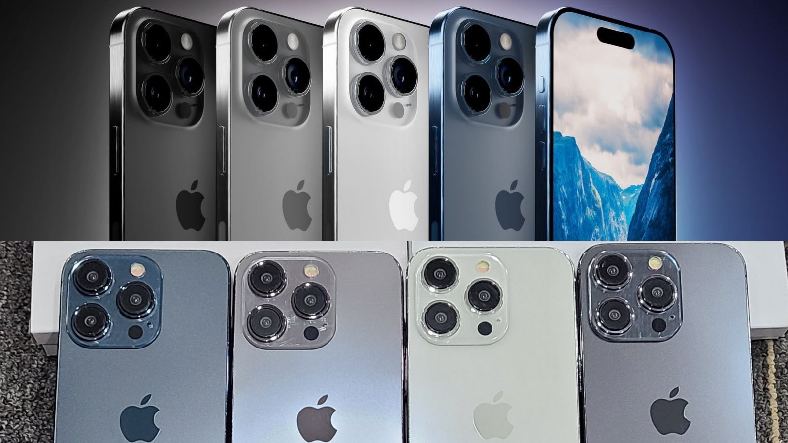
Yes, indeed! Apple doesn’t see color but (in this case) this might not necessarily be a good thing.
- Silver - this appears to be the same Silver we saw in last year’s iPhone 14 Pro; in other words, it’s a very bright gray and the closest thing to a white iPhone (Pro) if that’s what you’re after
- Space Black - this one also appears to be identical to last year’s Space Black on the iPhone 14 Pro - it’s a darker version of Apple’s beloved Space Gray color but one thing’s for sure - it’s more of a dark gray than a black
- Titan Gray - renders and leaked dummy units make this (new) color look silver (perhaps with a shimmer of gold but this might be an optical illusion)
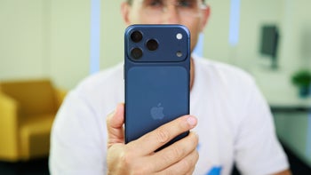
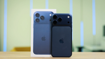
- Dark Blue - according to multiple leaks and rumors, this is supposed to be the iPhone 15 Pro’s “hero color”; at least on renders and the leaked dummies you’re looking at, it looks barely different to the Pacific Blue of the iPhone 12 Pro
It’s important to note that the frame of the iPhone 15 Pro and iPhone 15 Ultra is now expected to be made out of brushed titanium (instead of stainless steel), which should give the profile of the iPhone a slightly different look. According to the leaked renders you’re looking at, the frame should be color-matched to the back of the phone and (hopefully) result in less visible fingerprints (thanks to the brushed effect).
- White - about as white as it gets (doesn’t seem any different than the white iPhone 14)
- Black - unlike the Space Black expected with iPhone 15 Pro, this one’s truly black (just like iPhone 14)
- Blue - at least the dummy unit of this one looks like someone accidentally dropped a tiny bit of blue paint in the white color mixture
- Yellow - this might be the least yellow yellow iPhone ever (some people in our team will probably hate that considering they love yellow phones - you know who you are)
- Pink - surprisingly, this one might be the most saturated iPhone color in the entire iPhone 15 lineup (again, judging by the dummies) - although, let’s be honest, “saturated” is an overstatement
iPhone 15 and iPhone 15 Pro colors: What’s the real reason Apple doesn’t want to make fun, colorful iPhones anymore?
For the nerds in our audience (and I know you exist), perhaps it is a good idea to actually discuss the reason(s) iPhone 15 and iPhone 15 Pro might be lacking some color…
- Perhaps the iPhone 15 Pro’s new titaniumframe doesn’t look as good when painted; this might explain the reason behind the similar-looking, grayish iPhone 15 Pro color options; maybe Apple finds that brighter colors look a bit off when applied over brushed titanium?
- The carcolouranalogy - again, a legitimate (potential) explanation to why iPhone 15 and iPhone 15 Pro look like a gray parking lot might be that people (especially in Apple’s home market) like their phones like they like their cars; white, gray, darker gray, and black are the most popular car colors in the US, followed by blue; coincidence or not, these happen to be exactly the color options we expect to see with iPhone 15 Pro
- It’s possible that Apple (and other phone-makers) are trying to sell more accessories/cases; this is another one of my “conspiracy theories” but knowing Apple is a company that loves upselling accessories, I can’t ignore the possibility that Tim Cook & Co’s decision to make the iPhone 15 and iPhone 15 Pro almost color-less might be an attempt to push iPhone cases of all colors and varieties (which aren’t cheap at all, by the way)
- Maybe Apple is trying to extend the interest in the iPhone and has bigger plans for its annual spring color refresh that’s become a tradition now; as you might know, Apple likes adding a new color to the iPhone lineup every spring, so perhaps the plan going forward is multiple new colors? We heard of a red iPhone 15 Pro that Apple tested internally - perhaps this could come out in the spring of 2024?
Apple’s consolation prize for the bleaker looking iPhone 15 Pro and iPhone 15 colors might be color-matched charging cables in the box of your new iPhone 15. We’ll take something over nothing, I guess.
Should fun smartphone colors come back or is 50 shades of gray just fine for premium phones like the iPhone 15 Pro and Galaxy S23 Ultra?
Many tech enthusiasts on Twitter seem upset about the bleak colors expected with iPhone 15 Pro and iPhone 15 (admittedly, I’m one of them). But how important is the color of your iPhone or Galaxy if you’ll be keeping it in a case?
At the end of the day, no one is in a position to tell the likes of Apple and Samsung how to run their business, which is what the iPhone and Galaxy are. However, as someone who’s been following the industry for a while now, I also can’t help but recall times when smartphones (including the iPhone and Galaxy) looked more fun and colorful. Bear in mind, I’m not taking into account the overall design of the phone but only the color.
- Pixel 6 Pro in Sorta Sunny
- Pixel 2 XL in “Panda” (black-white)
- Galaxy S7 in Emerald Green
- Huawei P30 Pro in Amber Sunrise
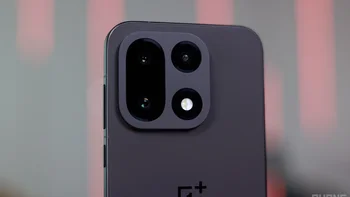
- OnePlus 11 (Jupiter Rock Edition)
In the case of the Pixel 6 Pro, the color of the phone is the main reason this also became my favorite smartphone design ever - at least from the phones I’ve owned and used. For example, the black variant of the same phone looks about as boring as a gray iPhone. But the Sorta Sunny colorway makes the Pixel 6 Pro look like it belongs in a museum. So, I guess smartphone colors (can) matter?
What are some of your favorite smartphone colors (phone, model), and do you think the likes of Apple and Samsung should bring fun colors back?
Follow us on Google News





Things that are NOT allowed:
To help keep our community safe and free from spam, we apply temporary limits to newly created accounts: