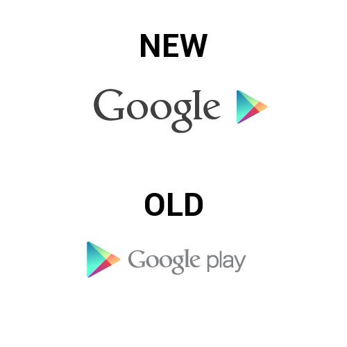
A couple days ago a slight redesign to the official Google logo was found in a Chrome Beta APK. Unfortunately, that didn't turn out to be something we'll see any time soon; but, that doesn't mean the Google design team isn't working on other projects. Today, Google started rolling out a change to the Google Play logo, which oddly chooses to remove the word "Play" completely.
Maybe Google thought it was a bit off as well because the change was only up for a few hours before being pulled for the old logo again. The new logo was interesting, and we get that the Play symbol was supposed to replace the word; and, the darker color of the word Google looked much nicer than the washed-out grey that is in the current logo.
We think it's probably best that the word "Play" stays in the logo for a bit longer, because we're not sure the name has enough traction with casual users yet. Play is a very important branding for Google, so to obfuscate that brand too soon is a risky idea. It's probably for the best that this rollout was pulled back, but we wouldn't be against seeing a tweak to the Play Logo.
Michael Heller is known for his clear and informative articles on mobile technology. He explores important topics such as the rollouts of 5G networks and the advancements in mobile payments, offering readers insights into the evolving tech landscape.
Recommended For You
COMMENTS (14)
COMMENTS (14)
All comments need to comply with our
Community Guidelines
PhoneArena Community Rules
A discussion is a place, where people can voice their opinion, no matter if it
is positive, neutral or negative. However, when posting, one must stay true to the topic, and not just share some
random thoughts, which are not directly related to the matter.
Things that are NOT allowed:
Off-topic talk - you must stick to the subject of discussion
Offensive, hate speech - if you want to say something, say it politely
Spam/Advertisements - these posts are deleted
Multiple accounts - one person can have only one account
Impersonations and offensive nicknames - these accounts get banned
To help keep our community safe and free from spam, we apply temporary limits to newly created accounts:
New accounts created within the last 24 hours may experience restrictions on how frequently they can
post or comment.
These limits are in place as a precaution and will automatically lift.
Moderation is done by humans. We try to be as objective as possible and moderate with zero bias. If you think a
post should be moderated - please, report it.
Have a question about the rules or why you have been moderated/limited/banned? Please,
contact us.


Things that are NOT allowed:
To help keep our community safe and free from spam, we apply temporary limits to newly created accounts: