This article may contain personal views and opinion from the author.
Apple is quite an interesting company, perhaps in part because of how controversial it can be due to its occasional odd choices. From the removal of the headphone jack, to introducing the concept of the smartphone notch – none of its bold moves has been met with universal cheers.
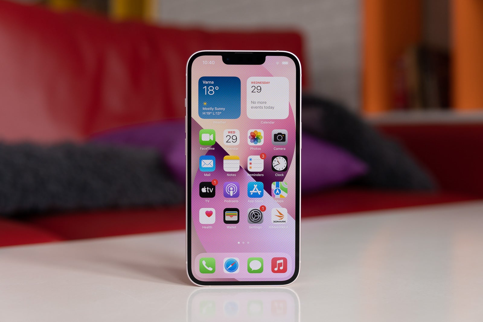
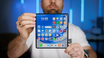
With the release of the 2017 iPhone X Apple finally moved away from the once-common smartphone design with big top and bottom bezels around the screen. The iPhone X introduced a phone look that we still see to this day on the 2021 iPhone 13, at least from the front – minimal bezels around the display, and a notch.
Why the iPhone notch exists
The iPhone notch holds a very important purpose, so it isn't just for show, or as some signature design thing Apple wants to keep around because it makes its phones recognizable from afar... Right?
The notch contains Apple's Face ID sensor array, Face ID being a quick and secure way for the iPhone to unlock as soon as it detects its user's face.
In my experience Face ID has been faster and more convenient than a fingerprint sensor, and it is definitely way safer than any run-of-the-mill Android face detection that utilizes just one camera.
Why I can't get used to the notch
I've learned to accept the notch, but that doesn't mean I'm used to it. When watching YouTube or Netflix in landscape and full screen you always get this eyesore in the corner. Granted, it's a bit smaller on the iPhone 13 than on prior models, but a notch is still way worse than a holepunch camera array would've been. The notch also hides a good chunk of the video content behind it.
Recommended For You
I've used phones like the Asus ROG Phone 5, which has more traditional, albeit small top and bottom bezels that hold huge, powerful speakers, and I'm more than okay with those. I've also used phones with holepunch cameras, which take much less of your screen real estate. But best of all, I've seen what "invisible" under-display cameras can be like, and particularly on the Galaxy Z Fold 3, they're infinitely better than a large, solid notch.
And since now the technology allows for these better options, I've begun asking myself whether Apple keeps the notch around precisely, as mentioned earlier, because it has become a signature design "feature" that makes iPhones recognizable and unmistakable.
"Would Apple really avoid evolving its iPhone design just because the notch is so recognizable? Surely not…"
But then, just a few weeks ago, Apple announces… laptops that also have a notch.
The new MacBook Pro notch is unnecessary, unless purely for brand recognition
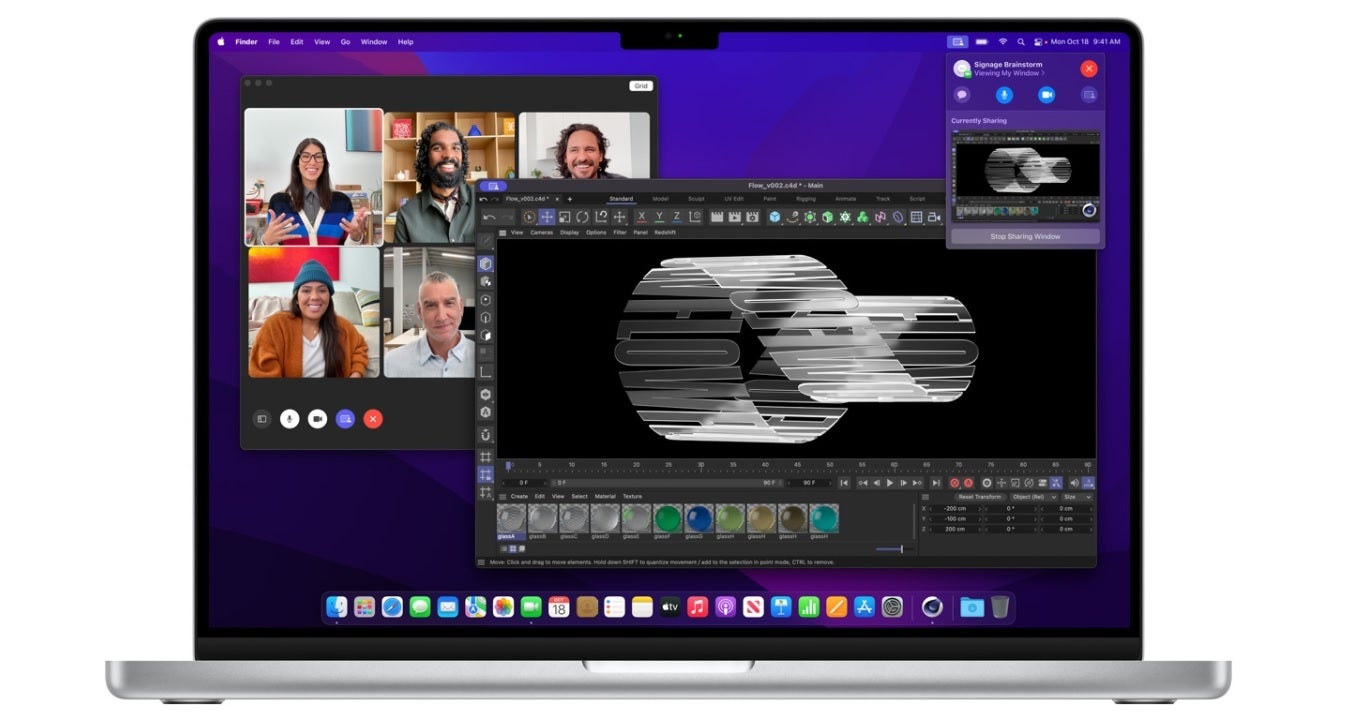
The new 2021 14-inch and 16-inch MacBook Pro models notably bring back a ton of commonly-needed ports, like an SD card slot and HDMI out. This was a surprising move by Apple, who had previously removed all of these ports from its MacBooks and released models with as few ports as just two, both Thunderbolt.
But what's just as surprising is the fact that those new MacBook Pro models now also have a very iPhone-like notch at the top center of their displays.
And like on the iPhone, that notch will be getting in the way. For example, when you're working the mouse cursor can hide behind it, and there have been reports of app menus going behind the notch too, while the menus of optimized apps just go around it.
The first question on everybody's mind is likely – why is the MacBook's notch so wide?
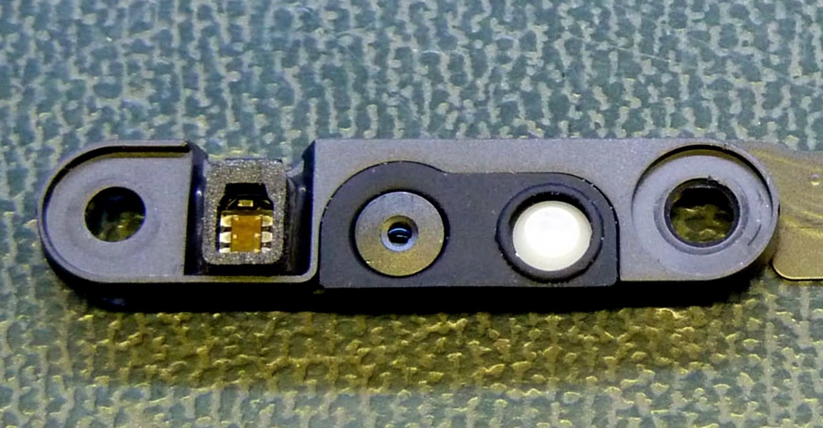
And there's the rational answer – because there's more than just a camera in it, but also an LED light that signifies when the camera is on, and an ambient light sensor that is used to automatically adjust the laptop's screen brightness, based on the user's surroundings.
The photo below, courtesy of David Pogue, shows us the insides of the MacBook Pro's notch, seemingly proving that there isn't any wasted space inside:
What's inside the MacBook Pro notch
But I also have a more cynical answer for why the notch looks like this – because Apple wanted to make its MacBooks even more recognizable as an Apple product, and what could be an easier way to do that, than to take the already infamous iPhone notch and slap it on a MacBook display?
I believe this was an unnecessary design move, because Apple could've easily gone a different route and reduced the bezels without needing a notch.
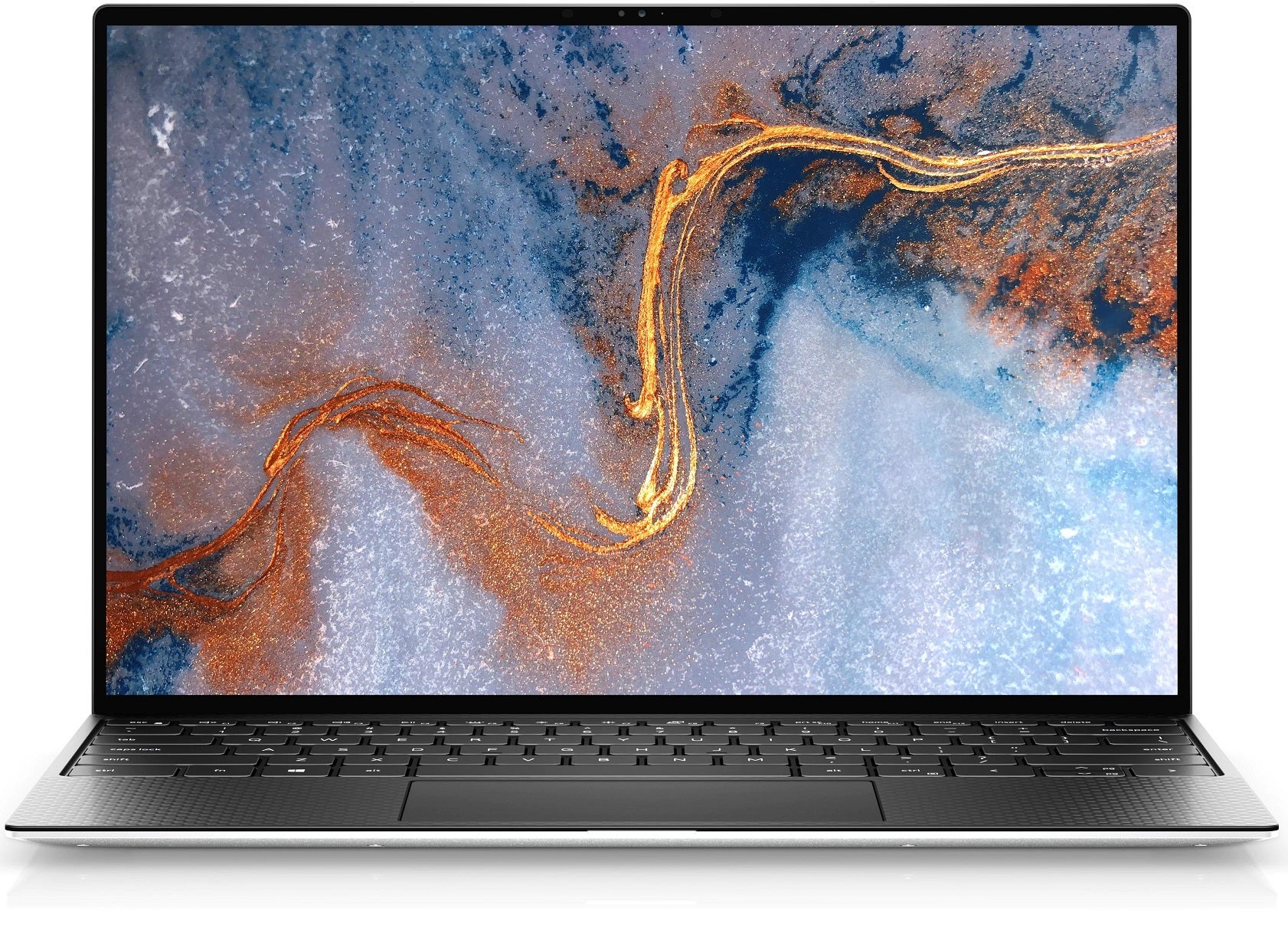
Laptops like the Dell XPS 13 don't need a notch to fit a webcam and other sensors in a thin top bezel
There are laptops out there, such as the LG Gram and Dell XPS 13, that have their webcam and other required sensors in a normal, thin top bezel. Other manufacturers have even designed laptops with a "reverse notch", a small raised area above the center of the display where the webcam is, so it won't cut into the user's screen real estate or cause an irregular screen aspect ratio like the MacBook Pro notch does. The Asus ZenBook S13 did the reverse notch back in early 2019.
There are many ways Apple could have tackled this engineering hurdle in its quest for smaller screen bezels without going "notch". But the trillion-dollar company decided to do what it often does and reduce the bezels in an unmistakably Apple way.
What do you think – is the MacBook Pro's notch just an awkward design choice with brand recognition in mind, or do you believe Apple genuinely figured this would be the best way to reduce the display bezels?
Six-month unlimited plan is now 57% off
$90
$210
$120 off (57%)
Mint Mobile is now allowing you to get whichever plan you like for either three, six, or 12 months for just $15/mo. If you go for the six-month unlimited service, for instance, you'll now have to pay just $90 upfront instead of $210.
Rado is a former tech writer for PhoneArena. His tech journey began with MP3 players and has evolved to include tinkering with Android tablets and iPads, even running Linux and Windows 95 on them. Beyond tech, Rado is a published author, music producer, and PC game developer. His professional work on iPads, from producing songs to editing videos, showcases his belief in their capabilities. Rado looks forward to the future of mobile tech, particularly in augmented reality and multi-screen smartphones.
COMMENTS (9)
COMMENTS (9)
All comments need to comply with our
Community Guidelines
PhoneArena Community Rules
A discussion is a place, where people can voice their opinion, no matter if it
is positive, neutral or negative. However, when posting, one must stay true to the topic, and not just share some
random thoughts, which are not directly related to the matter.
Things that are NOT allowed:
Off-topic talk - you must stick to the subject of discussion
Offensive, hate speech - if you want to say something, say it politely
Spam/Advertisements - these posts are deleted
Multiple accounts - one person can have only one account
Impersonations and offensive nicknames - these accounts get banned
To help keep our community safe and free from spam, we apply temporary limits to newly created accounts:
New accounts created within the last 24 hours may experience restrictions on how frequently they can
post or comment.
These limits are in place as a precaution and will automatically lift.
Moderation is done by humans. We try to be as objective as possible and moderate with zero bias. If you think a
post should be moderated - please, report it.
Have a question about the rules or why you have been moderated/limited/banned? Please,
contact us.


Things that are NOT allowed:
To help keep our community safe and free from spam, we apply temporary limits to newly created accounts: