Take a look at what the redesigned Google Phone app will look like
The Google Phone app is getting its Material 3 redesign and this is what it looks like.

Right at the beginning of this month, we passed along a look at an update for the Google Phone app that was found hidden in a beta version of that app. Now, a new report mentions that the app is getting a redesign based on the Material 3 Expressive design language. Users will be able to answer calls with a horizontal swipe or with a single tap. The bottom bar containing the four tabs (Favorites, Recents, Contacts, and Voicemail) appears to be the same albeit with a darker background; otherwise, this bar essentially remains the same.
However, press the Recents tab and you'll notice how all of the calls have been moved inside rectangular fields with rounded corners. Previously, Recent Calls was just one long list of names and avatars. The dial pad is also unchanged except for the background which has rounded corners on the top of the pad. The suggested phone numbers above the pad are inside rectangular fields with rounded corners after the redesign arrives.
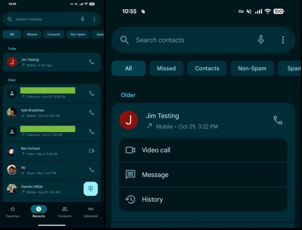
New Material 3 Expressive design for the Google Phone app. | Image credit-PhoneArena
The All, Missed, Contacts, Non-Spam, and Spam filters have changed and also use the rectangular fields to provide a shortcut allowing you to send a message to that person, or view your call history with that person. With the redesign, Google added a shortcut that places you one tap away from making a video call to a particular contact or someone you've recently been in touch with. The Settings menu for the Google Phone app also features the containers that are prevalent all over the redesigned app.
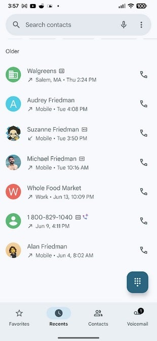
Current design for the Google Phone app. | Image credit-PhoneArena
When you get an incoming call, you can swipe left to decline the call or swipe right to accept it. The picture of the caller or his profile icon will rotate inside a scallop-shaped design until you accept or decline the call. The circular buttons turn into pill-shaped buttons that change into rounded rectangles when pressed. The "end call" button now stands out more, is wider, and is more prominent.
Images of the redesigned incoming call feature on the Google Phone app. | Images by Image credit-PhoneArena
The redesign requires beta version 180 of the Google Phone app and while I am running that version of the Phone app on my Pixel 6 Pro, it is a server-side update and I was unable to get the new look to surface. It is a more modern design of an overlooked app and looks great. When it does appear on my Pixel 6 Pro, I will update this story.

Popular stories

Latest News
Things that are NOT allowed:
To help keep our community safe and free from spam, we apply temporary limits to newly created accounts: