Check out how Google plans on improving the native Google Phone app for Android
A hidden code reveals how Google plans on improving the native Android Phone app.
Google's Phone app for Android is going to get a new look based on the Material 3 Expressive design for Android. The new look for the app was taken from the latest version of the Phone by Google app (version 177.0.763181107-publicbeta-pixel2024) and opened by Android Authority. You'll see the new design when there is an incoming call and with the in-call menus.
The first thing you might notice is that the name of the person who is calling you or you're calling appears larger on the top of the display (that person and his/her phone number need to be in your Contacts app) and the caller photos will also be larger. The keypad, mute, speaker, and more buttons are no longer round but are oval. When tapped, these buttons change shapes. The answer call button remains a circle.
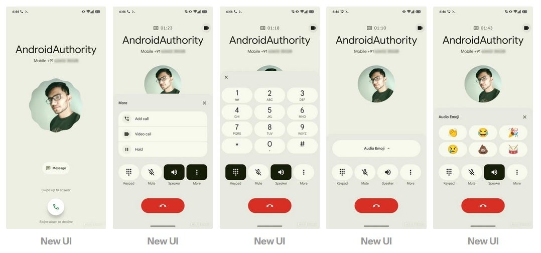
The new look for the Phone by Google Android app. | Image credit-Android Authority
Google has removed the "Call from" text that appears on the top of the screen when there is an incoming phone call. After you answer a call, the phone number of the other party will remain on the display, unlike the current design that shows the number replaced by the length of the call. With the redesign, the time of the call is moved to the top of the screen. Also added is a new animation showing the profile picture for the incoming caller.
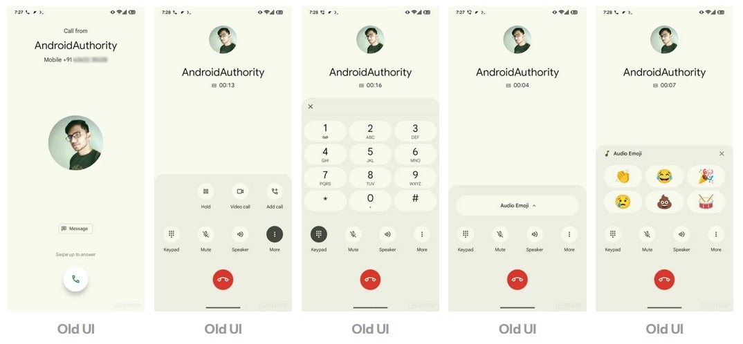
The current look for the Phone by Google Android app. | Image credit-Android Authority
You might not need Android 16 to see the new design for the Phone app. Since it is a separate app available in the Google Play Store, even phones running Android 15 should be able to install the new Phone by Google app when it is ready to be installed.
This new look shouldn't be surprising since Google loves making changes to its native Android apps every now and then. The changes made aren't earth-shattering but users might find it easier to read the name of the person calling them with the larger-sized text being used. The larger pill-shaped end button should be easier to press when your fingers are fumbling for the red end button and you're having trouble tapping it cleanly.
This is what Google is all about. Redesigns to apps that seem minor might actually improve an Android user's experience with the platform.

Popular stories


Latest News


Things that are NOT allowed:
To help keep our community safe and free from spam, we apply temporary limits to newly created accounts: