iOS 7 colors may have been inspired by the original Apple logo

57

There has been a lot of talk about the new color scheme of iOS 7. Some have called the colors a bit garish, and too candy-colored, and while that may be true, there may be a good reason for the color choices. There is a new theory rolling around Reddit that says the color scheme for iOS 7 may have been inspired by the original Apple logo.

Looking at the simple image put together on the right, the theory seems to hold some weight, but of course it can't really be verified, because it's pretty unlikely that anyone will get Jony Ive to talk on the subject. The stock iOS apps do seem to match up well with the rainbow of the original Apple logo, but we think the colors may match up even better with the new Apple logo that Tim Cook unveiled (as you can see in the title image above). 

Recommended For You
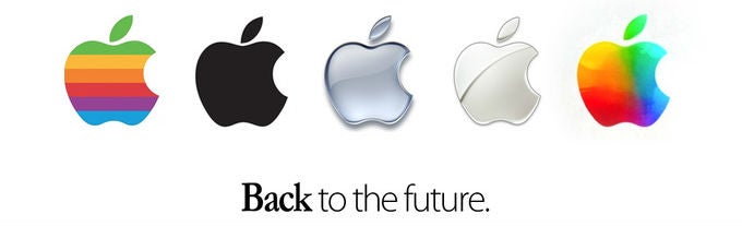
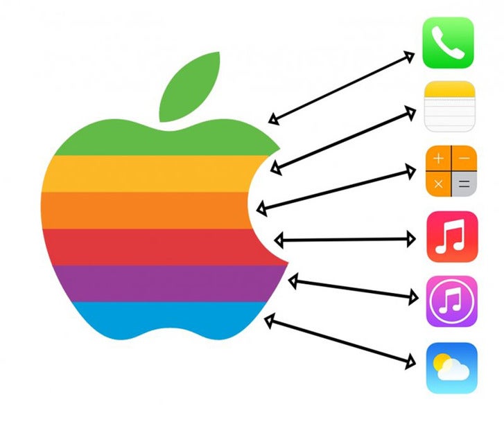
The new Apple logo has brighter hues in it that seems to match better with the iOS color scheme, and it contains the gradients used in the icons as well. Of course, since the new Apple logo is an homage to the original, we may simply be starting a Mobius strip argument here. 

What do you guys think?

source: Reddit via Pocket Lint

Get Visible as low as $20/mo for 1 year. Limited time offer with code: FRESHSTART

$20 /mo
$25
$5 off (20%)
Offer Ends 6.1.2026 at 11.59pm ET. New members get $5/mo off the $25/mg Visible plan, $35/mo Visible+ plan, or $45/mo Visible+ Pro plan for the first 12 months. Promo code FRESHSTART required at checkout.
Buy at Visible
Recommended For You
COMMENTS (57)
Latest Discussions
by readdriver •
by ECPirate37 • 1
by menooch18 • 2