Every product we review or recommend is thoroughly tested by our in-house experts in real-world conditions, following our
review methodology
and
ethics statement
to ensure honest, independent, and data-driven results.
Right off the bat, the Huawei P10 has some large shoes to fill. Ahead of the new flagship device of the major China-based manufacturer lies an arduous task – to show that the P9 was not just a one-off success but truly representative of Huawei's vision for what a smartphone should be.
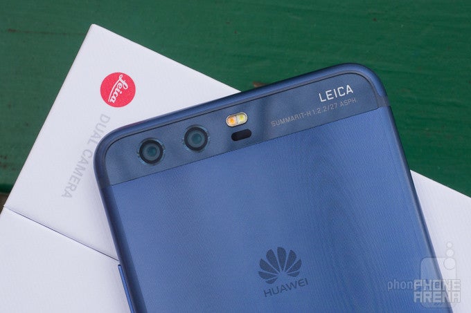
At first sight, the P10 is a meaningful albeit not drastic evolution over the P9 – it retains the overall design with just a couple of small, but important changes, has beefed up specs, and last but definitely not least, improves the winning dual, Leica-tuned camera setup.
Sounds like quite the winning list of enhancements on paper, but let's not put the cart ahead of the horse and explore Huawei's new flagship up close and personal. Let's dive right into it!
In the box:
Huawei P10
4.5A charger
USB Type-C cable
Protective case
In-ear headphones
Information leaflets
SIM ejector pin
Design
More of the same, but that's not a bad thing at all
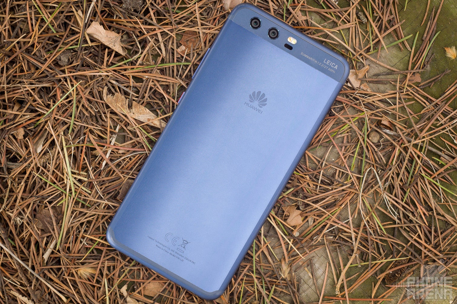
From a design standpoint, the P10 follows exactly in the P9's footsteps. Similarly sized and just a smidgen narrower, the P10 makes use of the very same all-metal design that Huawei used a year ago with only a few minor differences.
Most notably, the fingerprint scanner that used to be in the back is now positioned at the front of the device, embedded in a new multi-functional home button. This button has other noteworthy functions, but we will address these later on. Depending on your stance towards fingerprint sensor positioning, you might praise or condemn Huawei for doing this. We are on the fence, though we admit that having the sensor in the front makes unlocking the phone a bit easier, especially if it's laying on a flat surface.
If you like to use your phone with a single hand only, then the P10 scores a minor win over the P9 due to its narrower body. Both devices are rather slippery... unless you opt for the Shimmer Blue version of the P10, which is the only one that comes with an array of tiny diamond-shaped ridges in the phone's metal body. These not only refract light in eye-catching ways, but also add a bit of grip. That's neat, since the regular non-textured versions of the P10 are as slippery as the P9.
It would have been nice if Huawei had water-proofed the phone, given that all the major players in the industry are now doing just that. Probably with the P11, eh, Huawei?
The P10 proudly boasts a 5.1-inch, 1080p Full HD display at the front, which works out a pixel density of 431ppi. That's sharp enough for us. The P10 also shines when it comes to maximum brightness – it hits 545 nits, making it perfectly legible outside, even in direct sunlight. On the other hand, the minimum brightness of 2 nits won't burn your retinas when you use the phone at night.
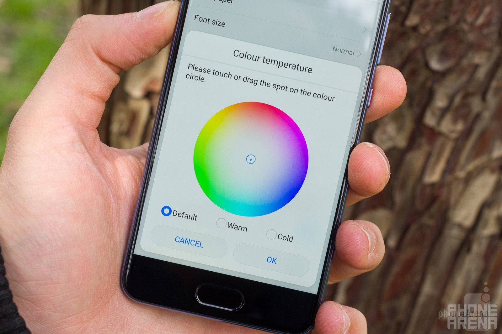
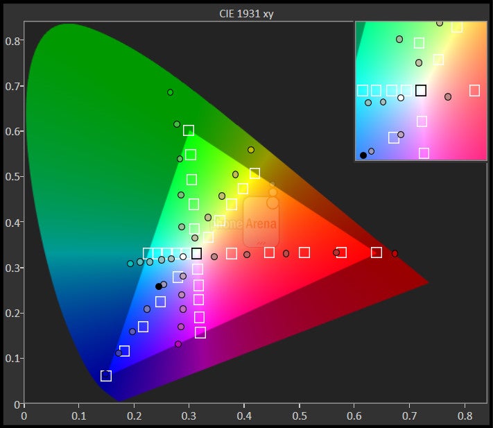
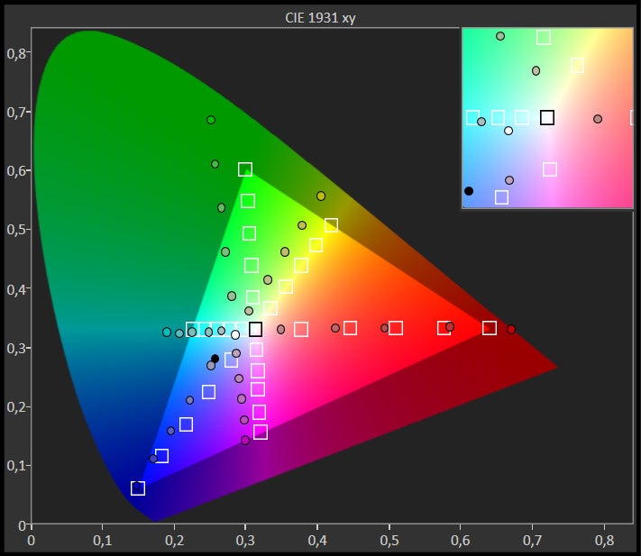
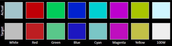
Unfortunately, the display's color rendition is underwhelming. With a color temperature of 8258K, the display is noticeably cold and makes white colors appear bluer than they're supposed to, which is not okay. Yes, you can tweak the color temperature in the Settings menu (go into Display > Color temperature, and select the Warm option if you want more balanced colors, or Cold if you want even bluer shades of white), but we can't imagine many people figuring out on their own how to do that manually. Furthermore, colors appear way oversaturated, with lots of added vibrancy that's pretty far away from their real-life targets. That's particularly visible with green, yellow, and red colors. To add up to the overall display disappointment, gamma is also pretty poor - bright tones appear darker while dark tones appear brighter than they are supposed to.
Clearly, display tweaking remains one of Huawei's Achilles heels.
The CIE 1931 xy color gamut chart represents the set(area)of colors that a display can reproduce,with the sRGB colorspace(the highlighted triangle)serving as reference.The chart also provides a visual representation of a display's color accuracy. The small squares across the boundaries of the triangle are the reference points for the various colors, while the small dots are the actual measurements. Ideally, each dot should be positioned on top of its respective square. The 'x:CIE31' and 'y:CIE31' values in the table below the chart indicate the position of each measurement on the chart. 'Y' shows the luminance (in nits) of each measured color, while 'Target Y' is the desired luminance level for that color. Finally, 'ΔE 2000' is the Delta E value of the measured color. Delta E values of below 2 are ideal.
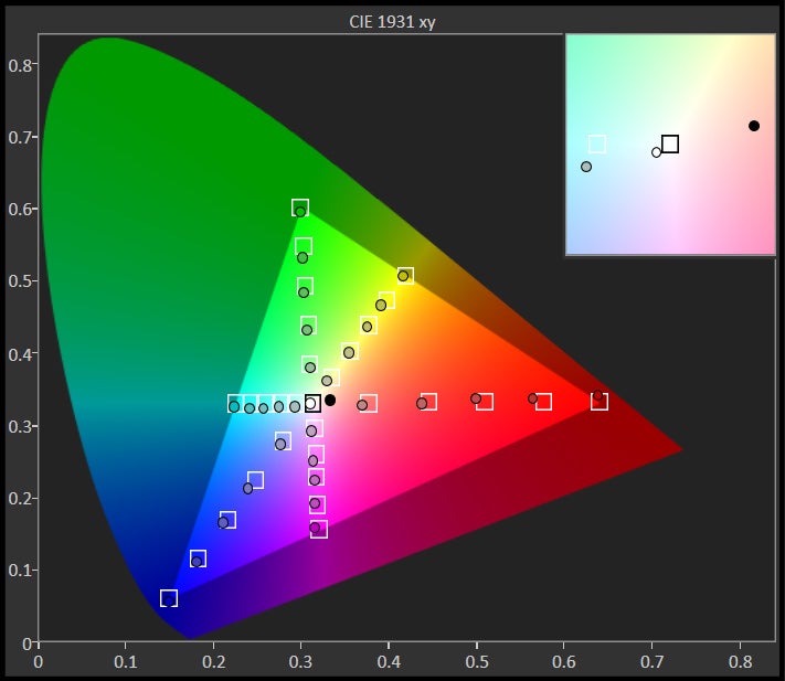
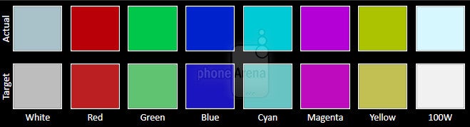
The Color accuracy chart gives an idea of how close a display's measured colors are to their referential values. The first line holds the measured (actual) colors, while the second line holds the reference (target) colors. The closer the actual colors are to the target ones, the better.
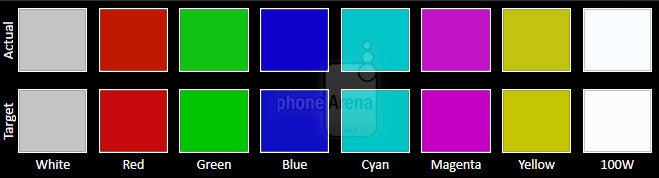
The Grayscale accuracy chart shows whether a display has a correct white balance(balance between red,green and blue)across different levels of grey(from dark to bright).The closer the Actual colors are to the Target ones,the better.
EMUI is the ugly duckling that does the job just right
The Huawei P10 comes with the company's in-house EMUI 5.1 software, which is based on Android 7.0 and by default comes with no app drawer (you can enable one later on, though). It's chock-full of features to the point where uninitiated users will find the interface a tad overwhelming and not intuitive at all. It would have been nice if the P10 had substituted most of its gimmicky features for actually useful ones, like different performance modes and equalizer settings. At least split-screen multi-tasking has made the cut, though bundled notifications have not.
As we mentioned, the front home button doubles as a fingerprint scanner and a multi-functional navigation key. You tap on that one to go back, press and hold it to go to your home screen, and swipe it sideways to open your recent apps menu. Can't say this approach grew on me - call me old school or whatnot, but I still prefer capacitive hardware buttons over anything else and Huawei simply couldn't convince me to rethink my preferences. Thankfully, the P10 allows you to forego the all-new home button and use an on-screen button setup if you feel like doing that. Sadly, you can't customize these gestures - you're left with what Huawei's decided to throw in.
Huawei is once again dropping the ball in the aesthetic department. EMUI's unsightly iconography feels terribly dated; as much as I tried, I couldn't force myself to like it. There are a bunch of themes to choose from, but these are somehow worse than the default one. In the end, I resorted to using a custom launcher and my favorite icon pack – Huawei should probably do the same with its next flagship phone.
The fingerprint scanner at the front is also quite fast and accurate. I've hardly encountered an instance where the phone would fail in reading my fingerprint. It's also worth noting that touching the sensor while the device is asleep unlocks it in an instance.
Processor and memory
Beware, the Kirin chipset will chew through anything you might throw at it
The P10 arrives with Huawei's HiSilicon Kirin 960 chipset as well as 4GB of RAM, an octa-core solution that comprises four 1.8GHz A53 cores and four 2.4GHz A73 ones. Boring technicalities aside, it takes one around 10 seconds or less to realize that the P10 is a nimble and snappy performer that has some serious power below the hood. It will hardly break a sweat no matter the task at hand. You will rarely experience choppy frame rate even with the heaviest of games available on the Play Store. Navigating the interface is also as agile as you'd expect from a contemporary flagship.
I had no problem with the P10 boasting “only” 4GB of RAM. The phone usually held all the apps I use daily as well as one or two heavier games in its memory and didn't need to reload these whenever I decided to use any of these. In my experience, that's perfectly acceptable. Same applies to the internal storage: 32GB of storage in the basic version is great news, while the 64 gigs in the top-tier one is even better. The on-board microSD card slot will likely appeal to data hoarders just as it did to me.
The P10 is a dual-SIM device (one of the SIM slots doubles as a microSD card reader) that supports all the major LTE bands: 1, 2, 3, 4, 5, 7, 8, 9, 12, 17, 18, 19, 20, 26, 28, 29, 38, 39, 40, and 41. This means it will work on most GSM networks just fine (but might not be compatible with CDMA networks like the ones used by Verizon or Sprint).
Recommended For You
There's also Bluetooth 4.2, Wi-Fi 802.11 a, b, g, n, ac, as well as dual-band Wi-Fi, GPS, A-GPS, Glonass, Beidou, and last but not least, a USB Type-C port.
Camera and image quality
The Leica-tuned camera setup remains the one true highlight of Huawei's flagship
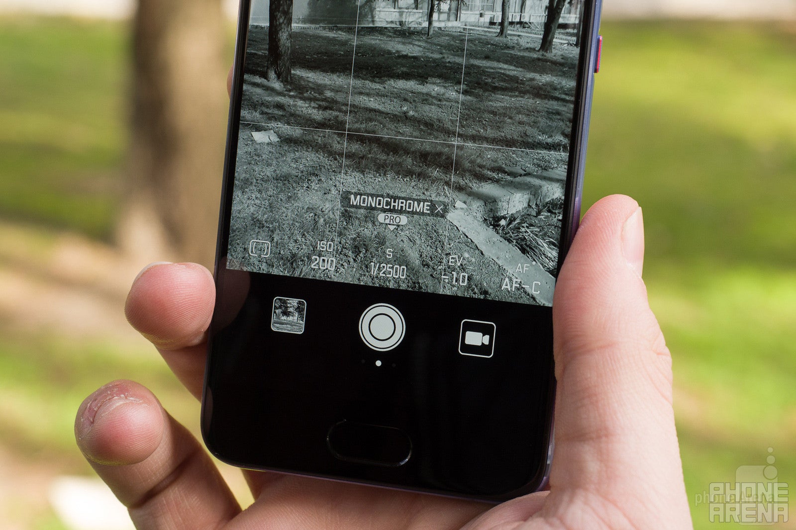
At the rear of the P10 we find the same Leica-tuned dual-camera setup that made the P9 the intriguing device it was. In terms of technicalities, the P10 comes with what Huawei calls Dual Camera 2.0, comprising a 20MP f/2.0 monochrome sensor that produces detailed images and a regular 12MP f/2.2 RGB module that shoots color. Just like the P9, the P10 merges the two images into one, combining the fine detail from the B&W module with the colors of the RGB sensor.
On the features and modes side, Huawei has included everything and the kitchen sink with the P10, and as a result, the camera app feels a bit overwhelming but at least it's intuitive. It has tons of features and options. Aside from the default Auto mode, you can also capture black-and-white images in Monochrome mode, take HDR pics, enhance skin and add tons of faux bokeh in Portrait mode, take noise-less images with Night Shot, unleash your creativity with Light Painting, capture time-lapses and slow-mo videos, and make your food Instagram-ready with the Good Food mode. Manual controls for the camera have also made the cut, which will appeal to photography enthusiasts. Aside from that, you can enable a separate wide aperture mode that simulates different depths of field and also adds tons of bokeh.
Enough with the boring theory, let's see how the P10 performs in the real world! First things first, it should be mentioned that you will only get 20MP pics if you shoot in Auto or Monochrome modes. With all other modes, you end up with 12MP stills. Of course, panoramas are an exception – the P10 captures very high-res panoramas, normally larger than 30MP.
As far as image quality goes, the P10 shoots excellent pictures. It produces well-exposed images with plenty of fine detail that easily passed our pixel-peeping tests with flying colors. There's not any oversharpening at all, just images with great amounts of detail. Speaking of colors, the rendition of these are mostly true to life though they sometimes end up on the oversaturated side of things, especially if you're shooting bright spring flowers. The P10 normally exposes scenes well and doesn't seem to underexpose things as much as the P9 did.
There's also a 2X hybrid zoom feature that lets you seamlessly zoom between the two cameras. It is not available when you shoot in 20MP auto mode, but can be used if you opt to shoot in a smaller resolution. It's wields neat results, but can't compare to a dedicated zoom camera module.
The rear's camera Portrait mode deserves its own paragraph. This one adds a bit of vignetting to draw attention on your face, smooths and brightens the skin, throws in some extra contrast, and finally, sprinkles lots of faux bokeh in the out-of-focus areas. Sounds great on paper, but said bokeh often gets applied over the subject's hair or leaves a halo of unprocessed background around the head. As a result, the person you're shooting often looks like they've been “photoshopped” in the picture later as the separation from the background is not seamless and ruins the picture. With good lighting, however, the P10's portrait mode wields perfectly acceptable pics. In general, I'd say that one in three photos taken with the P10's portrait mode looks great whereas the other two are unusable due to the excessive amounts of faux bokeh.
Huawei P10 Sample Videos
Front-facing camera
The 8MP auto-focusing front-facing camera is a decent one, too, with selfies turning out pretty detailed, well-exposed, and with appealing vibrant colors. However, they often tend to be on the colder side, which might not appeal to all selfie takers. The beautification feature turned out to be a pleasant surprise – it does its job pretty subtly and does not turn your face into a wax figure. Take note, LG and Samsung. The front-facing also has a Portrait mode, which has the same strengths and weaknesses as the rear cameras' one – it can produce a decent selfie, but watch out for that excessive bokeh!
On the video-recording front, the P10 records 4K video at 30fps and 1080p Full HD clips at 60fps. It's worth saying that you get a slew of manual controls in for video-recording either. As far as quality goes, the P10 produces some good-looking videos with plenty of detail and rich, appealing colors. Thanks to the OIS on board, no trembling is visible in the videos I recorded. The P10 also focuses quite fast thanks to the laser autofocusing system, and that's pretty important when shooting video. Overall, we are content with the phone's camera performance.
Selfies
Multimedia
For the most part, the P10 is an average device for multimedia consumption. As mentioned above, the 5.1-inch display is not that great in terms of sharpness and color rendition, thus watching YouTube videos or the occasional Netflix series is a largely forgettable experience.
However, the P10 is a decent performer in terms of audio reproduction. The single speaker on the bottom is loud enough, though audio quality from that one is average at best as it's lacking any depth and often sounds rather flat. At least there's a 3.5mm audio jack up there, so throwing а pair of neat headphones in the mix will wield better results for audiophiles. It would have been nicer to have a bunch of sound-related settings for the user to meddle with, but alas, these have not made the cut.
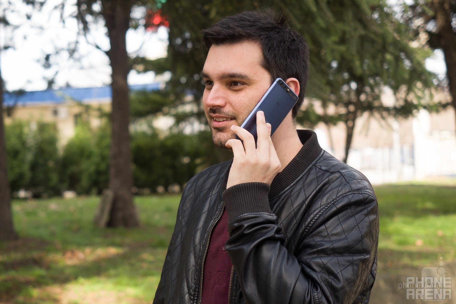
As far as call quality goes, the P10 is more than a decent performer. Regardless whether you're on the calling or receiving end of the line, you will have no issues with hearing the other party loud and clear. The noise-canceling mic on the top of the phone does a good job at filtering out any ambient noises that might interfere with the quality of your conversation. Overall, a flagship-grade performance.
Battery
Very good battery life in standby
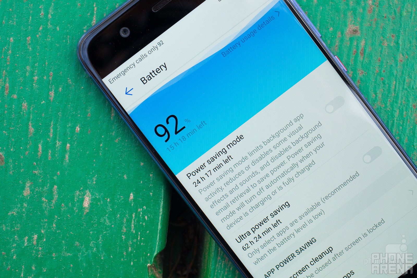
Huawei's top-end devices are known for their better-than-average battery life and thus we had high expectations for the P10. It boasts a 3,200mAh juicer under the hood, a decent 200mAh improvement more than what the P9 had in tow, and has a faster, newer chipset, so we had high expectations for the battery performance of the P10.
And it didn't disappoint – the handset clocked in at 7 hours and 42 minutes in our custom battery test. That's a good result, outclassing the Galaxy S7, the G5, and the Huawei P9 in the same discipline by a margin. Standby battery life is also good – the phone easily lasted me a whole day before it needs to be recharged.
Huawei has also introduced a few features that can further save you some energy: there is an ultra-power saving mode that makes only select apps available, as well as a a feature that allegedly lowers the display's resolution in order to save power, but I didn't notice a drastic increase in battery life.
The Huawei P10 takes exactly 100 minutes to go from 0 to 100%. That's quite the improvement in comparison with the P9, which had to be charged for roughly two and a half hours.
All things considered, the Huawei P10 is not a groundbreaking improvement over the P9. However, it does introduce a host of meaningful improvements and incremental tweaks over the already-decent P9 in order to offer a better overall experience to the user. Somehow, this “more of the same” formula works just fine for Huawei.
Yes, the P10 might not be the groundbreaking phone you've been looking for, but it won't be an overstatement to say that it's an excellent all-around device that's not flashy or as head-turning as other devices, but will get the job done without introducing any serious issues along the way. The camera is the one true highlight of the phone, and Huawei has done what's needed to keep this one fresh and comparable with almost any phone out there.
Is the Huawei P10 a neat device? It definitely is. Is it worth getting one? Sure, provided that you can stomach the price tag. In Europe, the phone will sell for €649 ($685), which is a bit higher than the initial pricing of $600-$650 for the P9. Seeing the improvements Huawei has thrown in, I'd say that this price hike is just, but it can't be argued that a cheaper price tag would have immediately made the P10 a way more appealing pick for the regular consumers out there and a prime candidate for one of the top phones of early 2017.
Peter is a skilled writer with over 13 years of experience at PhoneArena. He has published nearly 300 phone reviews and comparisons. This vast experience helps him navigate the mobile tech landscape with ease. He enjoys everything Android but relies on a MacBook Pro daily.
A discussion is a place, where people can voice their opinion, no matter if it
is positive, neutral or negative. However, when posting, one must stay true to the topic, and not just share some
random thoughts, which are not directly related to the matter.
Things that are NOT allowed:
Off-topic talk - you must stick to the subject of discussion
Offensive, hate speech - if you want to say something, say it politely
Spam/Advertisements - these posts are deleted
Multiple accounts - one person can have only one account
Impersonations and offensive nicknames - these accounts get banned
To help keep our community safe and free from spam, we apply temporary limits to newly created accounts:
New accounts created within the last 24 hours may experience restrictions on how frequently they can
post or comment.
These limits are in place as a precaution and will automatically lift.
Moderation is done by humans. We try to be as objective as possible and moderate with zero bias. If you think a
post should be moderated - please, report it.
Have a question about the rules or why you have been moderated/limited/banned? Please,
contact us.


Things that are NOT allowed:
To help keep our community safe and free from spam, we apply temporary limits to newly created accounts: