The Nothing Phone 4, expected to be the company’s next flagship, is rumored to launch next year along with at least five other Nothing phones. The current Nothing flagship, the Phone 3, famously ditched the original “glyph” design of the Phone 1 and Phone 2. And people on the Nothing forums overwhelmingly want that design back in the upcoming phone.
The public has spoken
A post on r/Nothingtech asked Nothing customers if they would buy the Phone 4 if it were to reuse the Nothing 2 design. The answer, it turns out, is an almost unanimous yes.
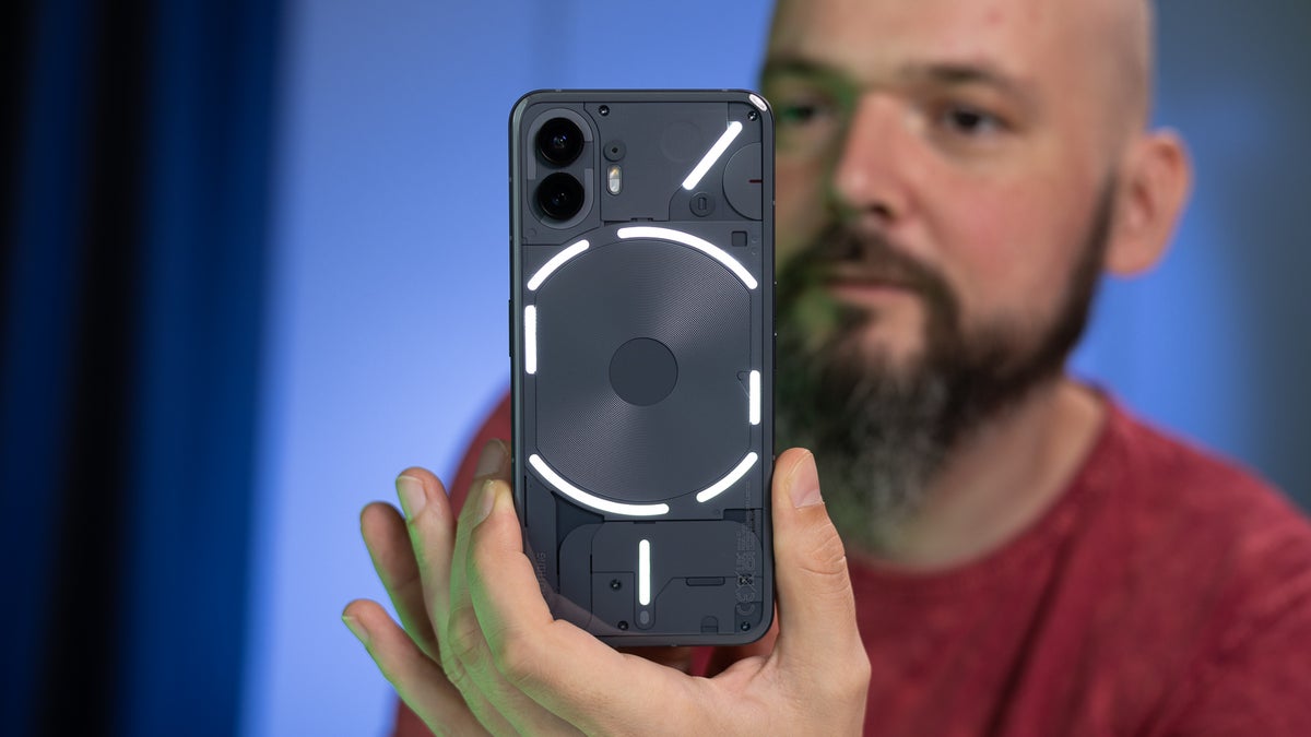
The Nothing Phone 2 had a translucent back, so you could see the phone’s components through it. It also had this array of LED strips called the “glyphs.” These glyphs lit up and animated the back of the phone based on notifications, charging status, volume, progress bars, and so on.
You could even customize how these glyphs operated in the phone settings.
The Nothing Phone 1 also had a similar backplate design but with fewer LEDs, so it was something of a signature style for the company from the start. The Nothing Phone 3 sanded down this signature style, replacing the glyph LED strips with a tiny circular screen in the corner. Even its backplate was mostly opaque, not semi-transparent.
Recommended For You
Many Nothing customers now want those classic glyphs back and will happily upgrade to the Nothing Phone 4 if it features those.
Poll
2 Votes
Which design features do you want to see in the Nothing Phone 4?
Customers are telling Nothing how to win them over
Pick any phone from the past decade, and there’s a decent chance it looks like a featureless slab from the back. Smartphones became bland, and we rarely ever see experimental designs anymore (folding phones being the expensive exception). The Nothing Phone 1 and 2, however, did try something new.
You might remember those tiny notification LEDs on old Android phones that lit up in different colors to indicate charging status, texts, or calls – early Galaxy S-series phones had those often. Nothing took that visual alert concept and built the entire glyph system around it.
I prefer seeing such notification alerts to hearing alerts, and so do Nothing fans who realize that these glyphs are more than a gimmick.
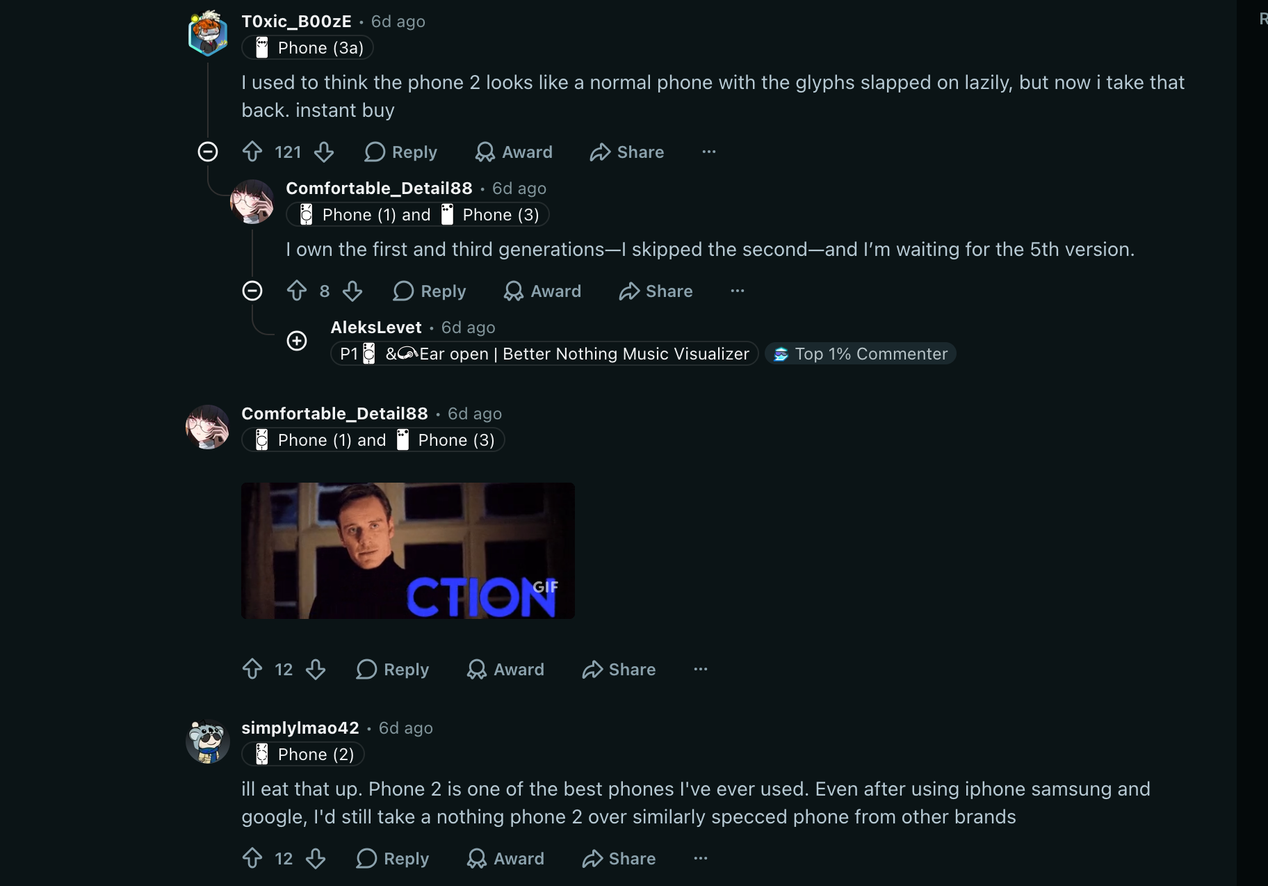
A discussion on r/Nothingtech about the Phone 2 glyphs. | Image by Reddit
The glyphs fit neatly into Nothing's “minimal but expressive” aesthetic, but it’s the see-through back that ties it all into one cohesive design. This cohesive aesthetic, I believe, made the Nothing Phone 2 an instant hit.
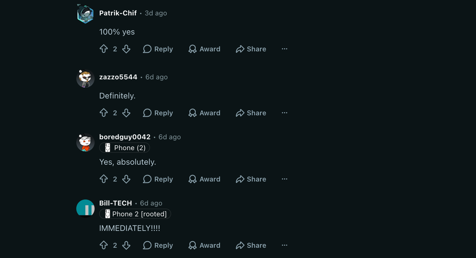
Nothing fans asked if they would buy Phone 4 with Phone 2's design. | Image by Reddit
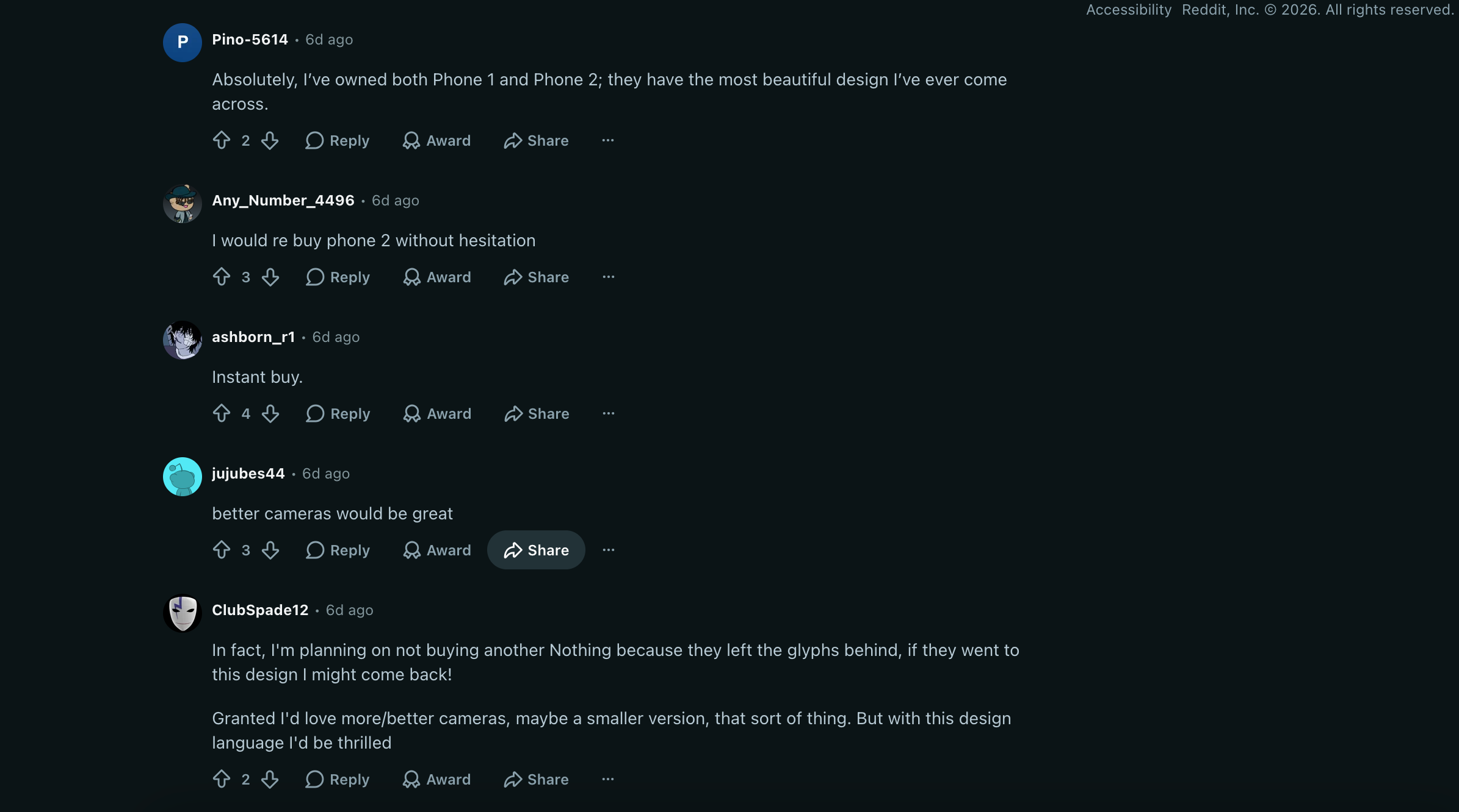
In fact, there are people who bought Nothing phones just for that design choice and refuse to return to Nothing unless the glyphs come back.
Customers say they'd buy Phone 2 again. | Image by Reddit
Nothing needs to go back to its roots if it wants to release another instant hit phone instead of a potentially boring slab – fans have made that much clear.
Faisal Rasool has been writing about mobile tech for the past ten years. His favorite cousin used to be a mobile technician and, as a kid, Faisal learned how to repair and tweak phones in his workshop. Faisal's first phone was the Samsung Galaxy Europa (released 2010). More Android smartphones followed it, including the Samsung Galaxy S4, the Galaxy S6, Huawei P8, and currently the Galaxy A56.
He's a life-long Android guy because he loves other open-source platforms. He's been covering such platforms for websites like How-To Geek, Android Headlines, Android Police, SlashGear, and now PhoneArena.
Faisal has a bachelor's in English literature and he likes to write stories and paint in his free time.
A discussion is a place, where people can voice their opinion, no matter if it
is positive, neutral or negative. However, when posting, one must stay true to the topic, and not just share some
random thoughts, which are not directly related to the matter.
Things that are NOT allowed:
Off-topic talk - you must stick to the subject of discussion
Offensive, hate speech - if you want to say something, say it politely
Spam/Advertisements - these posts are deleted
Multiple accounts - one person can have only one account
Impersonations and offensive nicknames - these accounts get banned
To help keep our community safe and free from spam, we apply temporary limits to newly created accounts:
New accounts created within the last 24 hours may experience restrictions on how frequently they can
post or comment.
These limits are in place as a precaution and will automatically lift.
Moderation is done by humans. We try to be as objective as possible and moderate with zero bias. If you think a
post should be moderated - please, report it.
Have a question about the rules or why you have been moderated/limited/banned? Please,
contact us.







Things that are NOT allowed:
To help keep our community safe and free from spam, we apply temporary limits to newly created accounts: