
Google begins roll out of the more modern redesign of its sign-in page

If you use Google services like Gmail, YouTube, or Google Drive, you'll soon notice a change in the appearance of the pages where you sign in. Google announced today that it is updating the look of its sign-in pages with a cleaner, more streamlined design.
This new aesthetic brings these pages in line with the Material Design language used across other Google products, such as Gmail and Search, creating a unified and familiar experience. Just as it previously teased, this redesign will roll out across the web and mobile devices.
The new look features the usual Material Design elements, such as emphasizing rounded corners and soft colors. There is now a pill-shaped button for "Next" and places the "Email or phone" field to the right of the Google logo and "Sign in" header. The all too familiar language switcher, Help, Privacy, and Terms links remain directly at the bottom just as they were before.
The key change is purely visual – think of it as a fresh coat of paint. You'll see a cleaner interface and a layout optimized for the screen you're using. More importantly, though, is to know that how you sign in remains the same, as you will continue to use your familiar email (or phone number) and password. It's a small change, but it's one that makes the sign-in process feel a bit more intuitive and user-friendly.
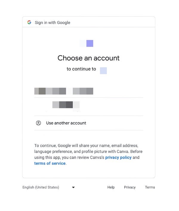
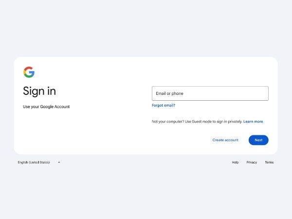
Old vs New Google sign-in page on the web
The redesign is gradually rolling out now for all personal Google Account and Workspace users and will apply to all devices – phones, tablets, and computers. The anticipated completion date for the rollout is March 4th, so expect to see this new sign-in page in less than two weeks. Both end users and workspace admins need not take any action as this is a simple visual refresh.

Popular stories

Latest News


Things that are NOT allowed:
To help keep our community safe and free from spam, we apply temporary limits to newly created accounts: