This article may contain personal views and opinion from the author.
Peter
FOR:
What’s not to like about gestures? They save tons of screen real estate and make navigating the large displays of today’s phones infinitely more manageable. That applies to both iOS and Android phones, but for the purposes of this article, I’ll be mostly referring to Android’s navigation system.
I love gestures on Android, but only when they are implemented correctly. Getting around your phone’s interface with swipes is quite handy and intuitive, especially when you’re using a larger phone. Once the bezel-less mania kicked in and devices started pushing past the 6-inch display size, the old three-button navigation system quickly became obsolete. Let’s admit it, they had a good run, but it’s time to make way for the new. Having to stretch your thumb all the way down to go back or to your home screen wasn’t the best experience, and as a result, gestures came to save the day.
In with the new, out with the old
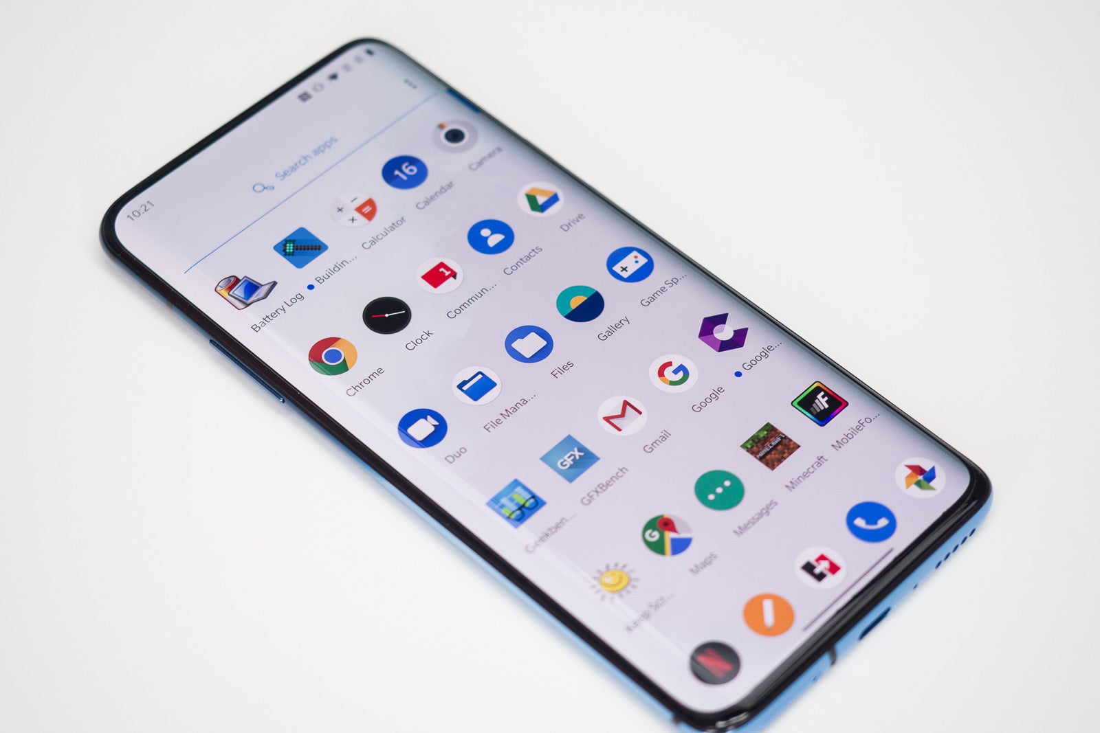
But are all gestures made equal? No. I agree that earlier gesture interpretations like the ones Samsung and OnePlus devices introduced were inferior. As a reminder, these “archaic” systems require you to swipe up from the bottom part of the screen to access the Google Assistant or go back, access your homescreen, and recent apps. This was just a stopgap solution just marginally better than the three-button gesture navigation as it still required you to stretch your fingers all the way to the bottom of your device for every interaction. The same applies to Google’s initial gesture pill — it was just bad. That’s why Android 10’s new gestures are the best ones so far — they feel intuitive and are very easy to grasp. It’s pretty good that Google put on its big boy pants and forced manufacturers to use its new gesture system in Android 10.
Recommended For You
Screen for days!
Are Android gestures perfect? Well, no, there’s still a lot to be desired. iOS gestures are certainly better as the whole operating system feels like it’s built around them, whereas Android 10’s current implementation system, while good, feels like it’s sewn with white thread. The back gesture, for example, is very similar to what you’d get from many third-party apps available on the Play Store, like Samsung’s One Hand Operation +, for example.
Despite these justified criticisms, I still love gestures and always enable them on any of the phones I happen to use in my line of work. They often feel clunky, often mess with the navigation within my favorite apps, and generally, have lots of room for progress, but gestures are the future that I’ve already welcomed.
Georgi
AGAINST:
The reason I’m against the push for gesture navigation is that there are hardly any clear benefits that come with it. Peter says gestures are more convenient and even intuitive, but are they really? I agree that the display does look a bit cleaner without the buttons, but is that worth the hassle? Let’s break down why I think gesture navigation sucks.
It’s not faster
Doing a gesture often takes more time and effort than pressing a button. The gesture for “home” is usually swiping from the bottom of the display. Well, if you’re already there, you might as well just tap in the middle and save yourself the swiping motion. Things are even worse with the switch between your current app and the previous one that you used, the gesture usually involves two motions, one upwards and one to the side, instead of simply tapping twice on the recent apps icon.
The comfort gains are questionable at best
If gestures somehow worked from the middle of your display where your thumb naturally rests, I’d be inclined to accept their superior ergonomics. That’s not the case, however. You still have to reach the bottom edge or do gymnastics with your thumb to swipe from one of the side edges. And while Peter is right about larger phones getting harder to navigate, I don't think that's affecting the reachability of the navigation buttons. Most people still hold their phone with their pinky finger under it to prevent dropping so the larger size mostly affects reaching the top corners of the display.
Additionally, some apps already have a specific functionality when you’re swiping from the side of the display. Usually, a swipe from the side will open a menu or a panel with additional information. But if you use gesture navigation that works with a side swipe for back, the edge is divided at an arbitrary point, one part serving one function, the other another. It's up to you to guess exactly how far up you have to swipe from to have the phone do what you want.
It saves marginal amount of screen real estate
One of the main purposes of gestures is to make your device’s screen look cleaner and give you a few more square inches for useful content. There’s nothing wrong with that; however, the days of small displays that would benefit significantly from that measure are long gone. Today, even budget phones come with screen ratios of 19:9 and some phones push that to as tall as 21:9. So in reality, having an extra third of an inch at the bottom of the display is barely noticeable. You’re sacrificing convenient navigation for almost zero benefits. To top it off, some gesture navigation implementations still have design elements at the bottom of the display that take up almost as much space as the buttons.
It's not standard
As with most things on the Android side of the smartphone market, with gestures as well, the different companies have their own vision of how things should work. Perhaps with time, there will be consolidation as the better solution prove themselves to be superior, but for now, it’s a mess of swiping from different directions, angles and sides of the display. And sure, most people don’t handle multiple different smartphones on a daily basis so that’s not such an issue for them. But when I pick up a phone at the office and see no buttons, there’s always a few moments of guessing what does what or trying to remember exactly what gestures this brand is using.
So, which camp are you in? Have you embraced gesture navigation as the future, or are you sticking to the old and familiar ways of the buttons? Tell us in the comments below!
Mint Mobile is now allowing you to get whichever plan you like for either three, six, or 12 months for just $15/mo. If you go for the six-month unlimited service, for instance, you'll now have to pay just $90 upfront instead of $210.
A discussion is a place, where people can voice their opinion, no matter if it
is positive, neutral or negative. However, when posting, one must stay true to the topic, and not just share some
random thoughts, which are not directly related to the matter.
Things that are NOT allowed:
Off-topic talk - you must stick to the subject of discussion
Offensive, hate speech - if you want to say something, say it politely
Spam/Advertisements - these posts are deleted
Multiple accounts - one person can have only one account
Impersonations and offensive nicknames - these accounts get banned
To help keep our community safe and free from spam, we apply temporary limits to newly created accounts:
New accounts created within the last 24 hours may experience restrictions on how frequently they can
post or comment.
These limits are in place as a precaution and will automatically lift.
Moderation is done by humans. We try to be as objective as possible and moderate with zero bias. If you think a
post should be moderated - please, report it.
Have a question about the rules or why you have been moderated/limited/banned? Please,
contact us.


Things that are NOT allowed:
To help keep our community safe and free from spam, we apply temporary limits to newly created accounts: