Verizon is next to have a logo change
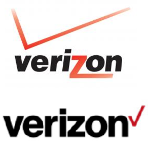
Old logo on top, new logo on bottom
More so than any other carrier, Verizon has been criticized in the past for plastering its logo all over the smartphone models that it sells to its customers. Recently though, certain handsets were offered to consumers without any trace of the check mark or logo. One model that comes to mind is the 64GB Motorola DROID Turbo, which doesn't have the Verizon name or logo on it at all.
The old logo was in need of some refreshing since it had been developed in 2000 when the merger of GTE and Bell Atlantic created Verizon. This past June, Verizon purchased AOL, paying $4.4 billion for the internet content provider. It seems that Verizon brass felt that with the purchase of AOL, it was time to give the company a new image. The new logo was not supposed to be rolled out until tomorrow, but was leaked out by Verizon insiders. What do you think of the Verizon logo's new look? You can let us know by dropping your comments in the box below.
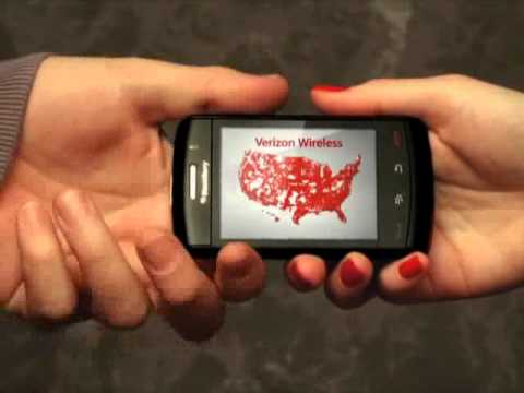
Big Red, as Verizon is affectionately called, is the largest wireless carrier in the U.S. Speaking of the Big Red nickname, for old time's sake, check out the 2011 commercial for Verizon embedded below. Done in the style of ads run by Wrigley for Big Red gum, the spot was a clever satire of Verizon's nickname. With a lot of the red disappearing on the new-look Verizon logo, will the Big Red nickname go away as well?
source: AdAge via AndroidAndMe

Popular stories


Latest News


Things that are NOT allowed:
To help keep our community safe and free from spam, we apply temporary limits to newly created accounts: