We may earn a commission if you make a purchase from the links on this page.
The Galaxy Z Fold 7 has been officially unveiled for – what? – mere 90 minutes now, and here I am, already engaging in the art of nitpicking.
Particular smartphone details can be of significant value, though: so even if I'm being extra pixel-peeping here, some of you might agree with me on what I'm about to say.
Galaxy Z Fold 7: save up to $1,000 at Samsung
$999
99
$1999
99
$1000 off (50%)
The Galaxy Z Fold 7 is now available at a solid discount. Right now, you can get the device for up to $1,000 off when you trade in an eligible phone in good condition. The promo is available on all storage variants, including the 1TB model. You can alternatively save $500 with Samsung Instant Savings.
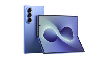
The Galaxy Z Fold 7 is a glorious (design-wise) device – it's the thinnest, sleekest foldable by Samsung so far. In fact, it's as thin (8.9 mm when folded and 4.2 mm when unfolded) as the Oppo Find N5, and that's quite the achievement. The thinnest foldable right now is the Honor Magic V5 at 8.8 mm, but the 0.1 mm difference is more of a show-off move than something that's going to be felt in real life usage.
Of course, the phone isn't perfect. It has its fair share of shortcomings, mainly on the battery and charging speeds fronts, as I've explained here:
Now, it's time to discuss what else is wrong with the brand-new Z Fold 7 – or, to put it more gently – what could've been better.
Amidst its glorious exteriors, there's a hiccup that I'll never be able to unsee. It's like that little scratch on the roof of your mouth "that would heal if only you could stop tonguing it, but you can't", as the Narrator in Fight Club said – and I can't stop tonguing it.
Recommended For You
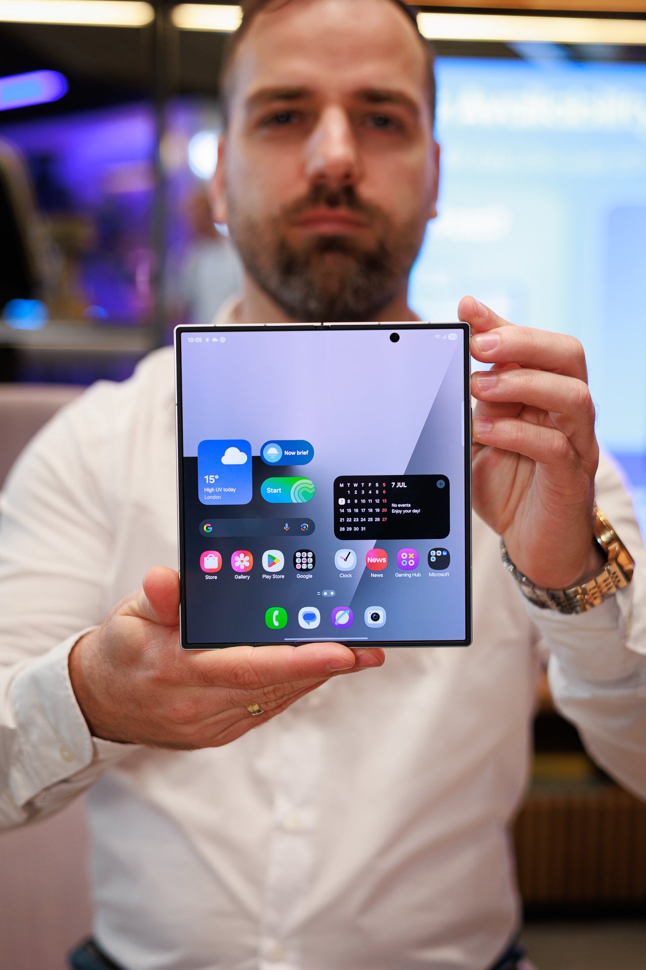
I'm talking about the selfie camera on the inner display and its placement – it's right in the middle of… the right part of the screen.
Image by PhoneArena
Many of you will probably ignore it and will just go on with your lives. But I wish this hole-punch camera was positioned in the upper right corner.
Why? Well, because, if the inner selfie snapper is in the upper right corner, this glorious screen (and it is definitely one glorious panel) will look better. Right now, it screws up my symmetry Feng Shui OCD. Technically, it's in the middle of the right part of the screen, but the inner screen unfolds to a large rectangular canvas. There's a dot that's 25% to the right of the true center… and it shouldn't be there.
Do you care where your selfie camera is positioned?
Yes.
26.99%
No.
57.86%
Haven't thought about it until you brought it up.
15.15%
515 Votes
Of course, this isn't something that'll keep me up at night – it's just a minor misstep that won't hurt your day-to-day experience. That being said, pictures and videos would certainly look better without that black circle intruding like that.
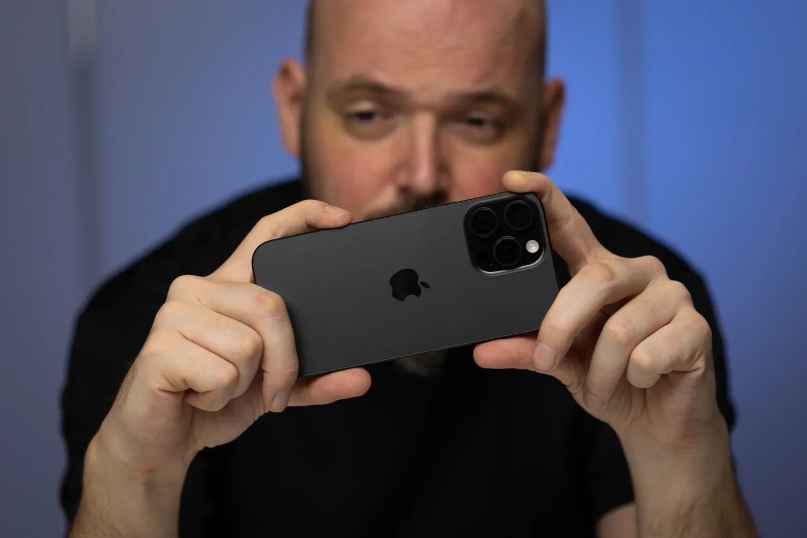
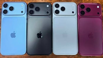
Funny enough, this hiccup made me recall the time the iPhone 16 series – yes, even the iPhone 16 Pro Max variant – got things wrong design-wise.
Image by PhoneArena
It's the Camera Control Button that was introduced with the iPhone 16 that was misplaced as well.
Generally speaking, I like the idea of the Camera Control Button, but it's put at a very inconvenient place, as my colleague Preslav observed:
Why is the Camera Control button so far into the frame? This is already an awkward positioning for the regular-sized iPhone 16, it is a bit too out-of-reach for an iPhone 16 Plus or iPhone 16 Pro Max. You need to grip the phone a bit more awkwardly, because if you cup the bottom, your hand will make full contact with the frame and block the microphone there. And, it doesn’t feel nice to slide over the button with your finger already stretched out.
Yup, it's hard to believe that the Cupertino team overlooked it, so maybe they'll fix things with the iPhone 17. Or the iPhone 18?
Six-month unlimited plan is now 57% off
$90
$210
$120 off (57%)
Mint Mobile is now allowing you to get whichever plan you like for either three, six, or 12 months for just $15/mo. If you go for the six-month unlimited service, for instance, you'll now have to pay just $90 upfront instead of $210.
Sebastian is one of PhoneArena’s senior opinionators. A veteran news writer with almost 20 years of experience in media and technology, he not only covers all the hot news about Galaxies and iPhones, but often provides hot takes on industry trends. He’s fascinated with camera-focused flagships from the likes of Oppo and Vivo, as well as foldable phones.
A discussion is a place, where people can voice their opinion, no matter if it
is positive, neutral or negative. However, when posting, one must stay true to the topic, and not just share some
random thoughts, which are not directly related to the matter.
Things that are NOT allowed:
Off-topic talk - you must stick to the subject of discussion
Offensive, hate speech - if you want to say something, say it politely
Spam/Advertisements - these posts are deleted
Multiple accounts - one person can have only one account
Impersonations and offensive nicknames - these accounts get banned
To help keep our community safe and free from spam, we apply temporary limits to newly created accounts:
New accounts created within the last 24 hours may experience restrictions on how frequently they can
post or comment.
These limits are in place as a precaution and will automatically lift.
Moderation is done by humans. We try to be as objective as possible and moderate with zero bias. If you think a
post should be moderated - please, report it.
Have a question about the rules or why you have been moderated/limited/banned? Please,
contact us.


Things that are NOT allowed:
To help keep our community safe and free from spam, we apply temporary limits to newly created accounts: