Apple today announced that, so far, 200,000 apps for the iPhone Duo have been redesigned since its launch in October. Despite that massive number, however, most popular apps remain unoptimized for the iPhone Duo. The redesigns mostly focus on a single user interface bar on the iPhone Duo.
The catch
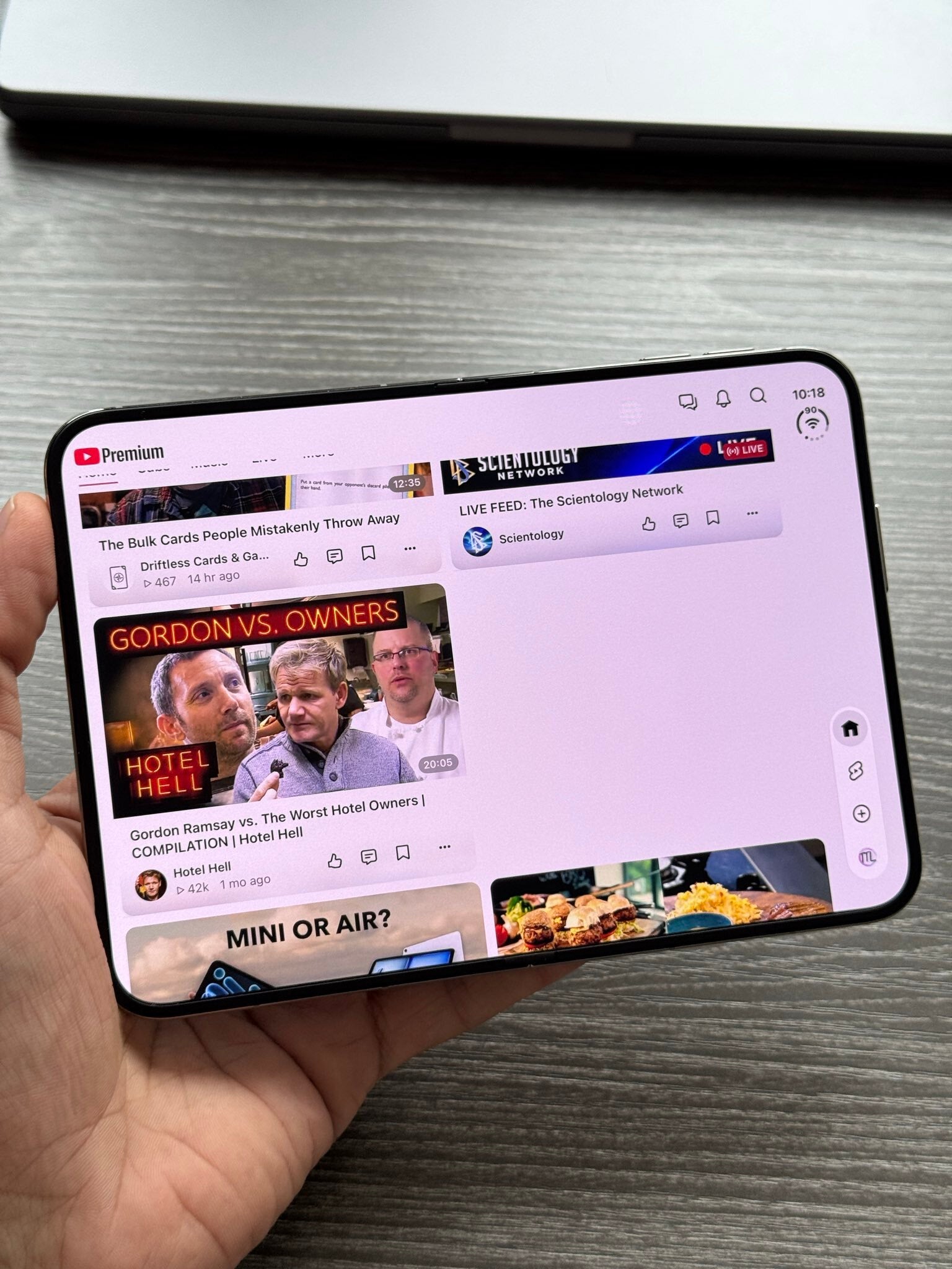
YouTube optimized for the iPhone Duo. | Image by X.com
Greg Joswiak, the senior vice president, tweeted that iOS devs have redesigned about 100,000 apps for the iPhone Duo in just a week for a total of 200,000 apps so far.
Over 200,000 apps are now optimized for iPhone Duo! That number DOUBLED in just over a week.I’m excited by how quickly developers have embraced iPhone Duo, and I can’t wait to see what they build next.
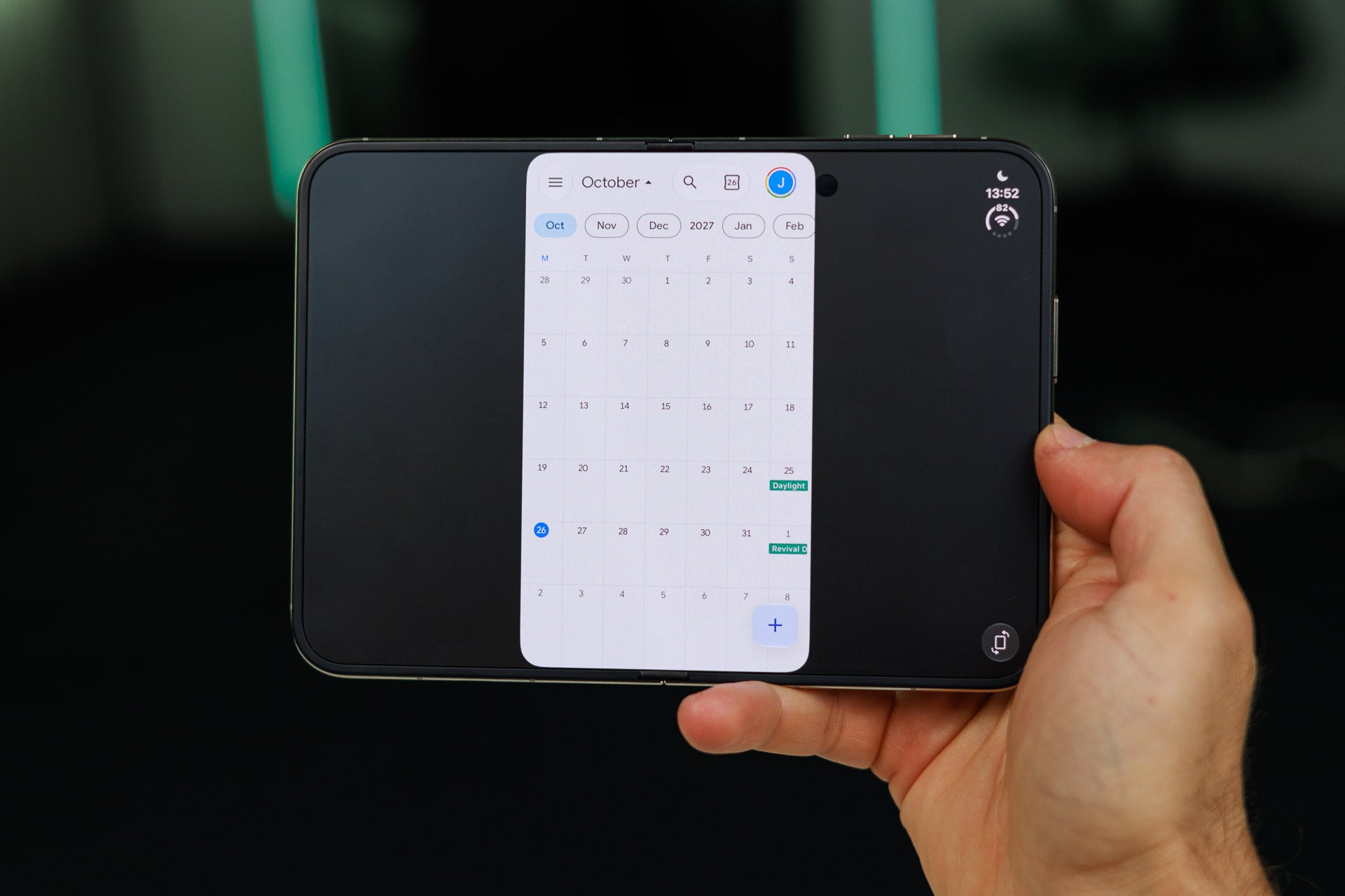
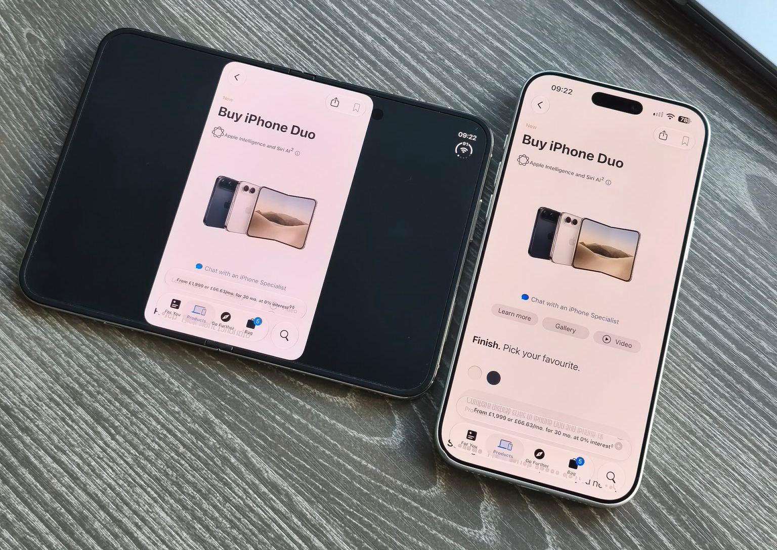
The iPhone Duo first launched with app interfaces designed for the standard iPhone. So most apps could not fit the unfolded screen, leaving behind these black bars on both sides.
An iPhone Duo app interface in unfolded state. | Image by PhoneArena
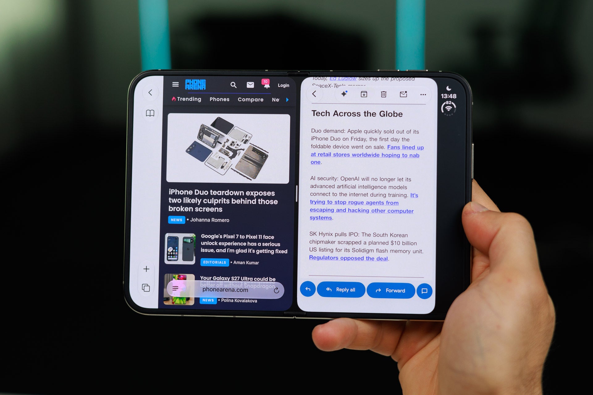
Since updates started rolling in, the content now fills the screen from corner to corner in some apps. But there is still a static black bar on the right for navigation. The latest updates are focused on this particular sidebar.
The black side bar on the iPhone Duo. | Image by PhoneArena
Most heavily used apps, however, still appear in the standard iPhone layout, either vertically with black bars or stretched out over the entire display.
Other than Google Maps and YouTube, no Google app is yet updated to the latest design – including Chrome, Gmail, Calendar, Workspace apps, and so on.
The same is true for most banking, payment, delivery, and ridesharing apps. Many major apps like Amazon are still behind. Ironically, even the App Store itself isn’t updated at the time of this writing.
Recommended For You
The current App Store on the iPhone Duo. | Image by X.com
Poll
0 Votes
Which iPhone Duo optimizations do you want?
The sidebar conundrum
When it first came out, the iPhone Duo had this mostly empty black sidebar, even on Apple apps like Safari.
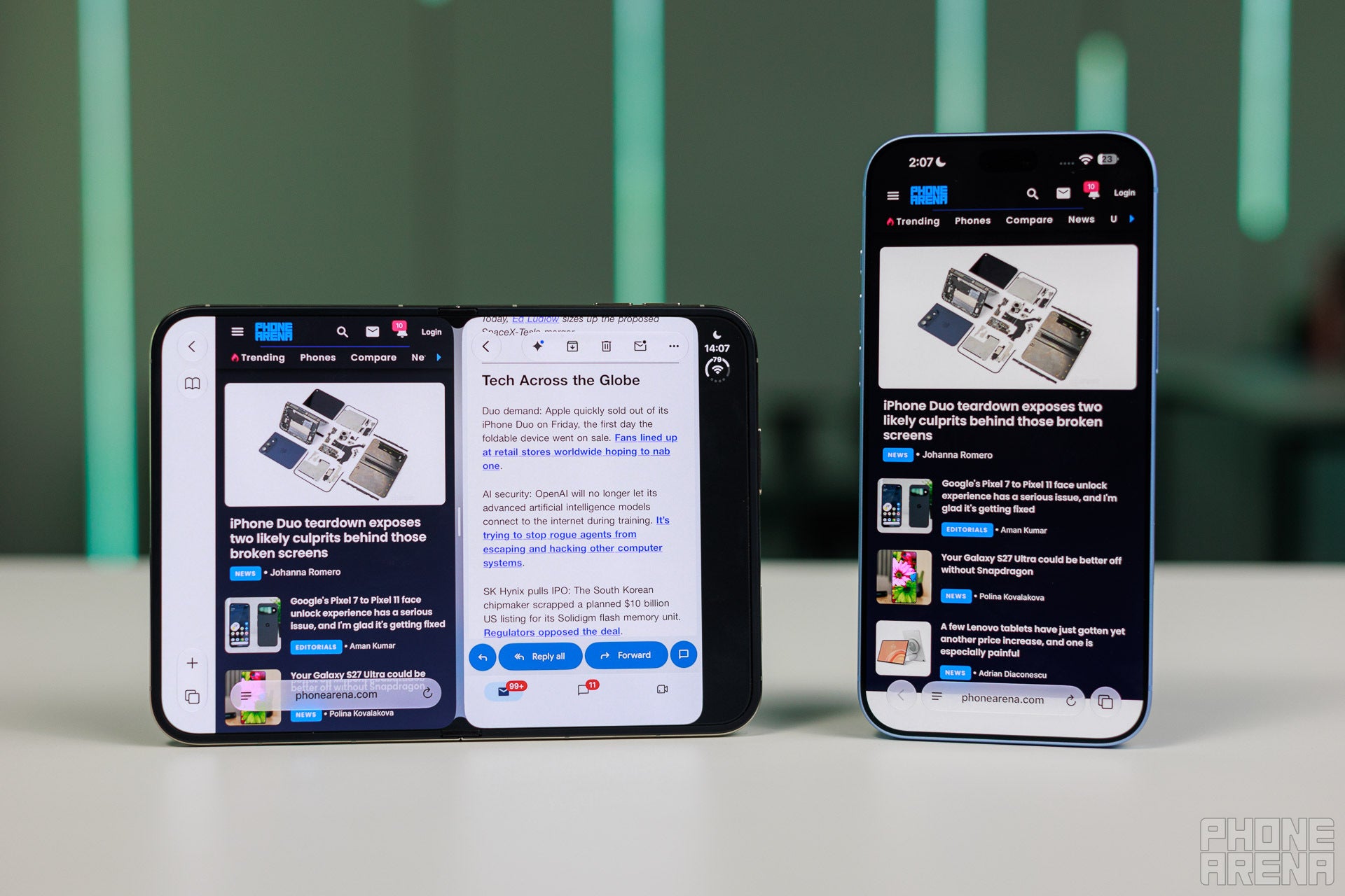
Often, it just had a couple of indicators at the top, with the rest left blank, where navigation buttons occasionally popped up. Using two apps simultaneously may show two of these sidebars.
The double sidebar effect. | Image by PhoneArena
This sidebar bugged people for 3 reasons:
The black bar sticks out like a sore digit
It squeezes the app’s content off center
It wastes screen real estate.
Many optimized versions try to tackle those issues by coloring in the sidebar, so it doesn’t stand out as much. These versions still struggle with the off-center content and wasted screen space. Since the sidebar remains static, some suggest an auto-hide feature or even a dedicated button to summon it.
Other versions just trim the wasted space, leaving the floating buttons and indicators intact. Some are mixing and matching based on which screen you're looking at. The Spotify app has a colored-in sidebar on the outer screen and a trimmed sidebar on the inner screen.
Spotify on the iPhone Duo | Images by Reddit
The trimmed sidebar clears most of the concerns people had with this design, and from what I can tell, it’s what the ideal versions of apps will look like on the iPhone Duo.
As you may have noticed, the sidebar is still heavily optimized for right-handed users. Since I’m right-handed, I can imagine myself getting used to this interface with ease, but I can also imagine left-handed folks disliking it. Love it or hate it, however, it looks like the sidebar is here to stay.
Trade in your old phone for cash at ecoATM!
Recycle your used phone and get instant cash. Find out how at ecoATM!
Faisal Rasool has been writing about mobile tech for the past ten years. His favorite cousin used to be a mobile technician and, as a kid, Faisal learned how to repair and tweak phones in his workshop. Faisal's first phone was the Samsung Galaxy Europa (released 2010). More Android smartphones followed it, including the Samsung Galaxy S4, the Galaxy S6, Huawei P8, and currently the Galaxy A56.
He's a life-long Android guy because he loves other open-source platforms. He's been covering such platforms for websites like How-To Geek, Android Headlines, Android Police, SlashGear, and now PhoneArena.
Faisal has a bachelor's in English literature and he likes to write stories and paint in his free time.
A discussion is a place, where people can voice their opinion, no matter if it
is positive, neutral or negative. However, when posting, one must stay true to the topic, and not just share some
random thoughts, which are not directly related to the matter.
Things that are NOT allowed:
Off-topic talk - you must stick to the subject of discussion
Offensive, hate speech - if you want to say something, say it politely
Spam/Advertisements - these posts are deleted
Multiple accounts - one person can have only one account
Impersonations and offensive nicknames - these accounts get banned
To help keep our community safe and free from spam, we apply temporary limits to newly created accounts:
New accounts created within the last 24 hours may experience restrictions on how frequently they can
post or comment.
These limits are in place as a precaution and will automatically lift.
Moderation is done by humans. We try to be as objective as possible and moderate with zero bias. If you think a
post should be moderated - please, report it.
Have a question about the rules or why you have been moderated/limited/banned? Please,
contact us.











Things that are NOT allowed:
To help keep our community safe and free from spam, we apply temporary limits to newly created accounts: