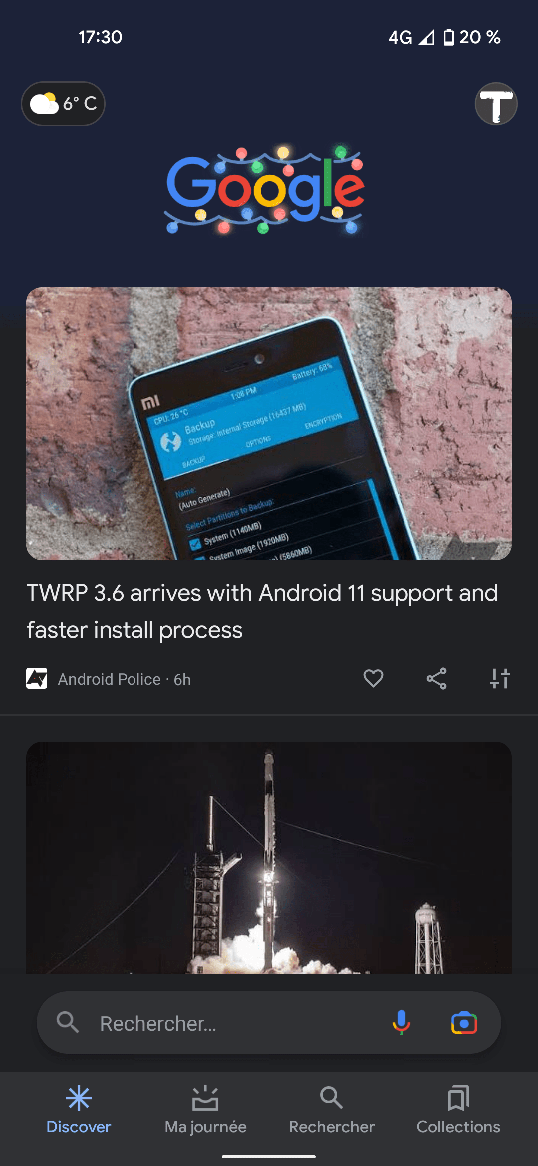
Google has been working on adding loads of new features and new looks to its apps, partly thanks to the Android 12 release. Now, 9to5Google reports about a design for the Google app that the tech giant has been testing, which places the search bar on top of Google's logo in the app.
Google testing search bar designs on Android phones
Recently, Google has tested a search bar positioned at the bottom of the app. Now, the tech giant is also testing a version in which the search bar is at the very top of your screen in the Google app. This look matches other apps by Google; however, it is a bit different than what the Google Search option has looked on mobile devices in the past few years.
This new look is a part of an A/B test, which shows the pill-shaped search field above the Google logo/Doodle. Another aspect of the design has the weather condition and temperature moved at the top left, while your profile pic is now part of that top-field (and indeed matching what other Google apps look like).
The new design also allows you to swipe down on your avatar to switch between your different Google accounts. Additionally, there's a slightly visible line that devices your profile pic from the microphone and Lens icons on the left.
Recommended For You
On the other hand, there's no change to the design of the Search (tab) result pages, which remain as they currently are. There is a compact logo and avatar with the bar coming after.
With this new change, there is now a uniformity feel across Google apps such as Gmail and the Play Store. This change comes to a set of specific Google Accounts (as it seems to be an A/B test), so it is not yet available to all users.
Earlier, Google tested the search bar at the bottom as well
Earlier, Google has performed another design A/B test for the Google app. In this version, the search bar is placed at the bottom of the screen within the app, most likely for accessibility purposes.
Google also tested a search bar at the bottom of the screen
In this tested look, the search bar is visible when you open the app, but disappears when you scroll up. Scrolling down makes it reappear. This seems like a pretty big redesign, as it changes completely the feel users have gotten used to on the Google app, and it may not make it to a final, global release, but instead remain as a tested option.
Apple had something similar introduced with Safari (moving the ULR search bar to the bottom of the screen), a change that remained widely unaccepted by users and ended up being removed with a subsequent beta version (the change itself was in beta).
Google has been changing the looks of its apps with Android 12 Material You
Android 12, the latest operating system for Android phones, has brought an interesting and visually pleasing redesign dubbed Material You, making things appear with more rounded corners and colors of icons and app matching your preferred wallpaper color scheme. With the new look for the OS, Google has also been changing the way its own apps look to better reflect the new design.
Many of Google's app, such as Gmail, the YouTube app, the Google Photos app, and other apps, as well as widgets such as the Google Drive widget, the Google Photos widget, and the YouTube Music widget, have recently gotten redesigns that reflect the looks of Material You. Along with the visual revamp, some of the widgets have been slightly retouched to show more relevant information at a glance, such as, for example, the Google Maps widget which brought navigation options right to your home screen.
Six-month unlimited plan is now 57% off
$90
$210
$120 off (57%)
Mint Mobile is now allowing you to get whichever plan you like for either three, six, or 12 months for just $15/mo. If you go for the six-month unlimited service, for instance, you'll now have to pay just $90 upfront instead of $210.
Iskra Petrova is a news writer at PhoneArena, where she covers mobile tech news and maintains the site’s device hubs with the latest leaked specs, rumors, and official details for upcoming phones. She joined PhoneArena in 2020 after three years in technical support for Microsoft Exchange, giving her practical experience with software infrastructure and troubleshooting. Iskra holds a Master’s Degree in Literature, which helps her translate complex tech details into clear, reader-friendly coverage. She is a daily Apple ecosystem user, while also closely following Sony Xperia’s camera-focused phones and Samsung’s Galaxy Z Flip series.
A discussion is a place, where people can voice their opinion, no matter if it
is positive, neutral or negative. However, when posting, one must stay true to the topic, and not just share some
random thoughts, which are not directly related to the matter.
Things that are NOT allowed:
Off-topic talk - you must stick to the subject of discussion
Offensive, hate speech - if you want to say something, say it politely
Spam/Advertisements - these posts are deleted
Multiple accounts - one person can have only one account
Impersonations and offensive nicknames - these accounts get banned
To help keep our community safe and free from spam, we apply temporary limits to newly created accounts:
New accounts created within the last 24 hours may experience restrictions on how frequently they can
post or comment.
These limits are in place as a precaution and will automatically lift.
Moderation is done by humans. We try to be as objective as possible and moderate with zero bias. If you think a
post should be moderated - please, report it.
Have a question about the rules or why you have been moderated/limited/banned? Please,
contact us.


Things that are NOT allowed:
To help keep our community safe and free from spam, we apply temporary limits to newly created accounts: