Google starts rolling out an improved UI for the Android phone dialer

Google has recently updated the Phone app to streamline the look of the Android dialer. As a beta tester for the Phone app, this writer has had these changes for some time, but they are now rolling out to those who choose not to beta test apps on their phones. Of course, the advantage of being a beta tester is that you get the first crack at new features or new UI designs and more.
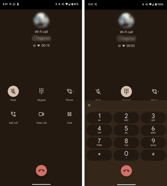
The old UI for the dialer would show the name and number you are calling at the top of the screen with six options in the middle set up in two rows of three icons each. The top row contained Mute, Keypad, and Phone. Right underneath were icons for Add call, Video call, and Hold. At the bottom center of the display was a single button for placing a call or for hanging up on an active call. Pressing the Keypad icon would open the numerical pad on the bottom 40% of the display.
Google cleans up the UI of the Android dialer on the Phone app
After the update, there are only four icons when you make a call and they are all at the bottom third of the screen where they take up one row. In order, these icons are Keypad, Mute, Phone, and More. You see, Google brilliantly took away three of the icons and placed them inside a button called "More" to save some space. Oh, to have been a fly on the wall when they came up with that idea. Tap on More and icons for Hold call, Video call, and Add call appear.
Before the update. Image credit Android Police
And now, when you hit the Keypad button, the numerical pad opens higher up on the screen leaving the original four icons in full view. This should be available now as long as you're using version 98.x of the Phone app. To find out which version your phone has, go to Settings > Apps > See all XXX apps and then scroll down to Phone. Tap on Phone and scroll to the bottom of the screen and you'll see the version number of the app. For the record, my phone is running version 100.0 and is on the public beta.
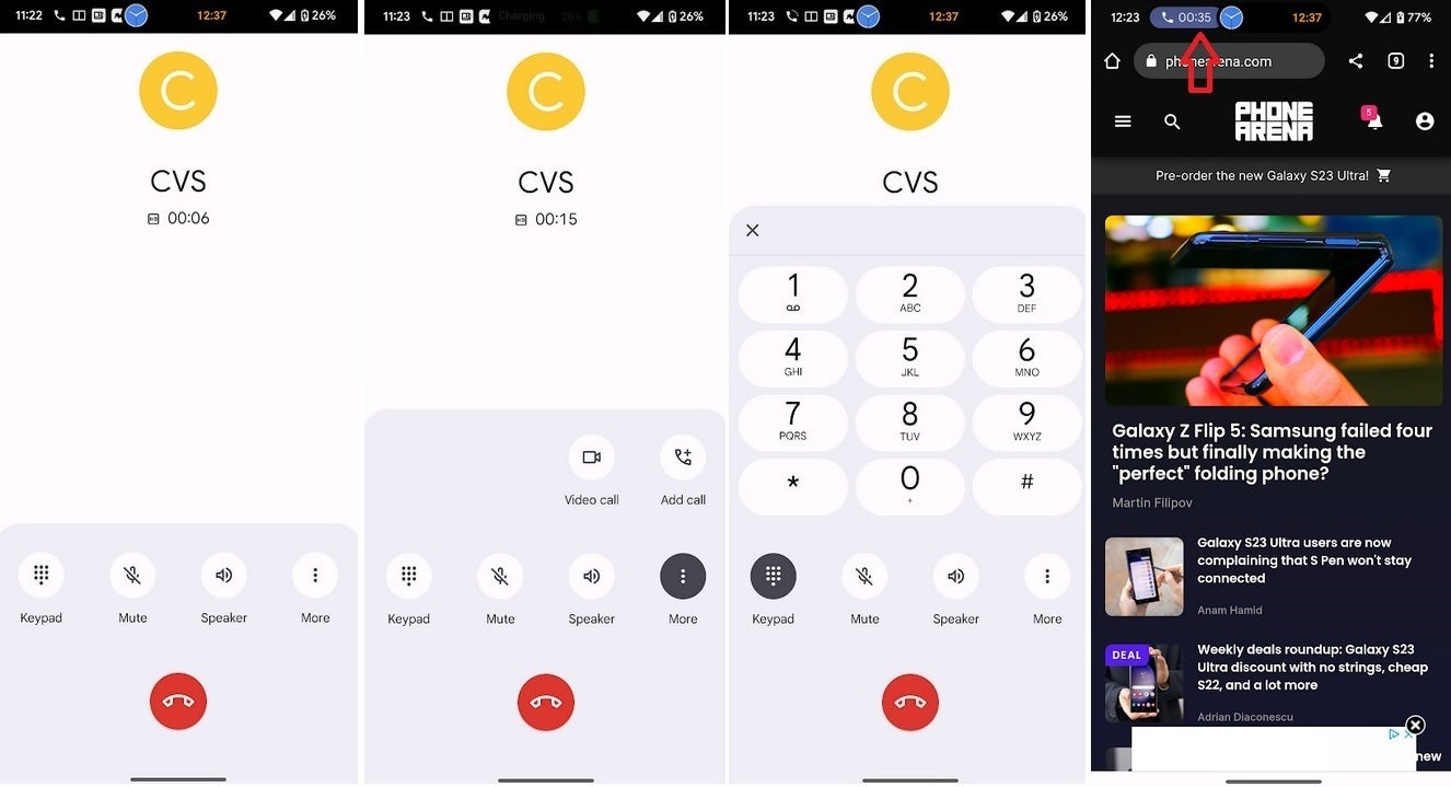
The new and improved dialer gets rid of the floating box that would cover up content on the screen
And there is one more major change. If you're on a call but need to open an app or go online, swiping up from the bottom of the call screen used to take you to your home screen and open a floating box that gave you options like Back to call, which returned you to the call screen; Mute, which is self-explanatory; Phone; and End call. But this floating box got in the way of whatever content you were looking at while on the call. So with the update, once you swipe up from the bottom of the screen during a call, a small pill with a phone icon appears next to the time in the upper left of the display.
The new and improved dialer UI rolling out to Android devices
Inside the pill is a timer that counts how long you've been on the call and if you need to end the call, mute the call, turn on or off the speaker, or add another caller, tap the pill and you will return to the call screen from where you can make the changes to the call that you want. And by placing this pill where it did, Google makes sure that the content you're viewing while on a call is not covered up by a floating box. Sure it floats, but who wants to keep moving it out of the way?
It might not seem like these are earth-shattering changes, but they do save some space on the display, they do make the UI look better, and they might even save you some time.

Popular stories


Latest News

Things that are NOT allowed:
To help keep our community safe and free from spam, we apply temporary limits to newly created accounts: