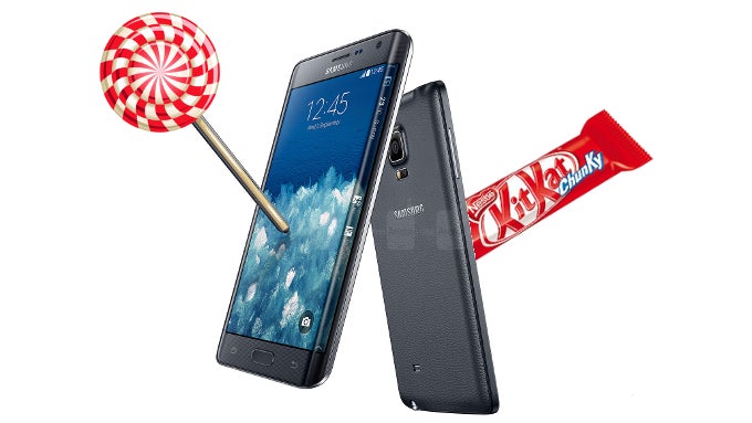
Note Edge with Lollipop vs Note Edge with KitKat: UI comparison
Lock screen, home screen, and app drawer
The lock screen will now, finally, show us a preview of whatever notifications have come through while the display was off. Also, we noticed that, while the lock screen is on display, the clock that can usually be found in the rightmost part of the notifications area is hidden. This is done so that the screen does not display the same information twice over – not an essential thing, but a tasteful design choice.
The home screen and app drawer are, as you can guess, unchanged. Dropping down the notifications tray shows us the second hint of Lollipop – the controls area has much brighter, popping colors, and the notifications are stickied to a transparent background, instead of a solid one.
Home screens and notifications KitKat (left) vs Lollipop (right)
Dialer and Messages
The phone apps definitely show heavy Material Design influence – borders and lines have been erased, and have given way to simplistic separation and bright colors. Combined with a slight reordering and resizing of objects, the user gets the feeling of less clutter on the screen.
The Messages app has received a round “New message” button on the bottom right – a feature that's slowly becoming signature for apps that follow Google's Material Design.
Dialer and Messages KitKat (left) vs Lollipop (right)
Settings
The great wiping of borders has made its way into the settings menu as well – there is not a line to be seen, besides the one, which shows what tab the user is on. As a result, you can see below, the different sub-menus take much less room.
The power saving menu's graphic offers us a prediction of how long the battery will last us for, though, how accurate those predictions are is up for testing.
The Edge panel settings have gained a couple of new options – one allows the user to set a separate timeout for events, when only the Edge screen is on; the second one allows us to turn off notifications for the Edge panel, which automatically redirects them to the notifications tray – the way we are used to seeing them on every other Android phone.
Settings menus, power saving, Edge settings KitKat (left) vs Lollipop (right)
General UI
The app manager, which can be found at the bottom of the settings menu, has also received a slight facelift. The meter at its bottom, which used to show the state of the device's internal memory and RAM memory is gone. Now, a more modern-looking RAM meter can be found under the “Running” tab, while a shortcut to storage usage information can be found in an entirely different place – one you are more likely to frequent and care for – the My Files file manager. That's right – the file browsing app is mostly unchanged, only now it offers an icon, which, when tapped, will present the user with a quick Storage usage graph.
Even the system volumes pop-up did away with its separating lines, however, in order to not look cluttered, it had to be widened a bit.
The recent apps carousel now shows different apps with their own color frame, though, we'd supposed this needs to be set by the developers.
As far as keyboard and writing goes – Sammy didn't change much about its keyboard. Its color is lighter, but the keys appear as much the same, instead of being super-flattened like how Google did with its stock Android. The cursor guide has also been slightly changed – from a large, house-shaped figure, to a smaller, teardrop type.
General UI KitKat (left) vs Lollipop (right)
Organizer
The S Planner (read: Calendar) offers lighter colors and thinned out separators, giving it a more airy look, though, this exact app wasn't suffering much clutter in the first place. It has been given the red “+” button for new event creation on the bottom right – a feature, which can be found in many apps adhering to Material Design.
The Alarm tab in the Clock app, unfortunately, lacks the new plus, and instead keeps to a more conventional layout, though – still brighter and flattened.
Calendar and Clock KitKat (left) vs Lollipop (right)
Camera, gallery, music player
The camera app is pretty much the same. In fact, the only difference we found is in its advanced settings menu, where a couple of options have been moved around. The photo and video galleries, aside from offering a lighter tone of their top bars, also look identical to their old counterparts. The same goes for the music player, however, probably thanks to its bottom pop-up, appears ever so slightly more Lollipop-ified.
Camera, gallery, player KitKat (left) vs Lollipop (right)

Popular stories
Latest News
Things that are NOT allowed:
To help keep our community safe and free from spam, we apply temporary limits to newly created accounts: