This article may contain personal views and opinion from the author.
Google recently unveiled the colorful next chapter in Android aesthetics, dubbed Material 3 Expressive, and it is a return to form for the ultra-popular mobile operating system. After years of Apple stealing headlines by adorning iOS with customization features, Android is finally re-embracing its roots by giving us a fresher new look and more customizability than before.
Material 3 Expressive definitely looks intriguing, borrowing heavily from iOS and many custom Android skins out there, and that's not necessarily a bad thing. Android 16 is getting more blur effects all across the system interface, gets refreshed status bar icons that look very similar to the ones in One UI 7 and iOS, has a new 'Recents' view page, enhanced clock personalization and wallpaper effects, and finally, an overhauled quick settings interface.
The revamped design language is arriving later this year, but might be hitting Pixels first as a beta as soon as early June. So far, so good.
Sadly, it's a bit challenging to get excited about this one, and I have a few particular reasons as to why it's concerning.
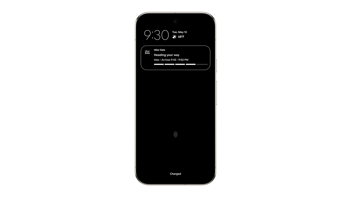
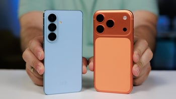
Not bad at all, but not terribly original either (Image Credit––Google)
Reason #1 - A clear step away from independent design
Juggling between the Android 16 promotional images and screenshots of One UI 7 and the latest iOS 18 reveals that Google has borrowed ideas from both of its "frenemies" in terms of aesthetics and general ideas. That's fine, everyone copies these days––Samsung copies Apple, Apple imitates Samsung and Android, Google reaches everywhere for inspiration, and don't get me started on the numerous China-based phone manufacturers that blend everything together in a hodgepodge mess of features, aesthetics, and functionality.
Recommended For You
With Android 16, Google is kind of throwing away some of the uniqueness of its previous Material Design style, which was fairly unique for a while and definitely stood proud with fairly exclusive aesthetics and design language. Now, although the upcoming redesign looks like a logical evolution of this aesthetic, it borrows a bit too much from existing interfaces and loses some of its identity.
I don't know if it's just me, but the promotional images strike me as a bit too childish and colorful, like throwing a packet of Skittles on a kindergarten's floor. It's just a bit too much, and that's slightly concerning, but given that this is Android we're talking here, I'm fairly certain all showcased features would be easily customizable.
Reason #2 - Blink and you might miss it
The main reason I find it challenging to get excited about Android 16 is the fact that few users will see it in its full glory.
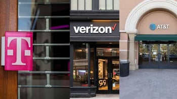
That's because Android 16 as demoed by Google in the promotional videos and screenshots will only arrive on Google's Pixels. What we saw at the Android Show won't be available on your Samsung, or Xiaomi, or Vivo, or Oppo phone, as pretty much any Android manufacturer has its own custom skin that usually doesn't follow Android's stock aesthetics to the T. We've seen time and time again and during previous Android design overhauls that the changes introduced by Google don't necessarily get adopted by the majority of Android vendors out there.
Of course, if you have a Pixel phone, you'd be a happy camper, but with a global market share of 2.03% and US market share of 4.5% as of April 2025, not many consumers will be able to enjoy the new look. Some manufacturers, like Motorola, Asus, and Sony use near-stock iterations of Android, but there's no way of knowing if they will fully adopt Material 3 Expressive themselves.
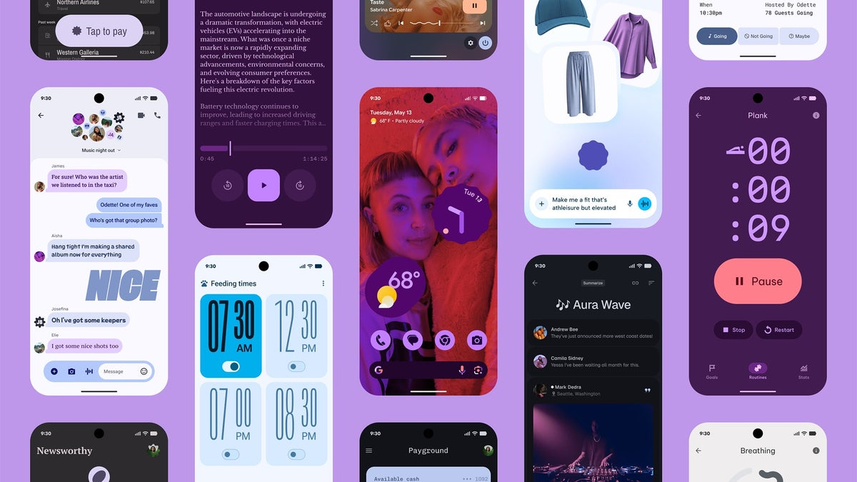
Great if you have a Pixel, irrelevant otherwise| Image credit — Google
Sure, many Google apps that come standard on Android phones will possibly get updated with Material 3 Expressive, but there's no way of knowing where and what elements will get adopted. This would also clash with the custom Android skins of those manufacturers who opt not to use Material 3 Expressive, which would result in an unappealing melting pod of ideas, executions, and clashing aesthetics.
Overall, I think Android 16's new look will be the exception rather than the rule, which is why I'm hardly holding my breath for it.
Six-month unlimited plan is now 57% off
$90
$210
$120 off (57%)
Mint Mobile is now allowing you to get whichever plan you like for either three, six, or 12 months for just $15/mo. If you go for the six-month unlimited service, for instance, you'll now have to pay just $90 upfront instead of $210.
Peter is a skilled writer with over 13 years of experience at PhoneArena. He has published nearly 300 phone reviews and comparisons. This vast experience helps him navigate the mobile tech landscape with ease. He enjoys everything Android but relies on a MacBook Pro daily.
A discussion is a place, where people can voice their opinion, no matter if it
is positive, neutral or negative. However, when posting, one must stay true to the topic, and not just share some
random thoughts, which are not directly related to the matter.
Things that are NOT allowed:
Off-topic talk - you must stick to the subject of discussion
Offensive, hate speech - if you want to say something, say it politely
Spam/Advertisements - these posts are deleted
Multiple accounts - one person can have only one account
Impersonations and offensive nicknames - these accounts get banned
To help keep our community safe and free from spam, we apply temporary limits to newly created accounts:
New accounts created within the last 24 hours may experience restrictions on how frequently they can
post or comment.
These limits are in place as a precaution and will automatically lift.
Moderation is done by humans. We try to be as objective as possible and moderate with zero bias. If you think a
post should be moderated - please, report it.
Have a question about the rules or why you have been moderated/limited/banned? Please,
contact us.


Things that are NOT allowed:
To help keep our community safe and free from spam, we apply temporary limits to newly created accounts: