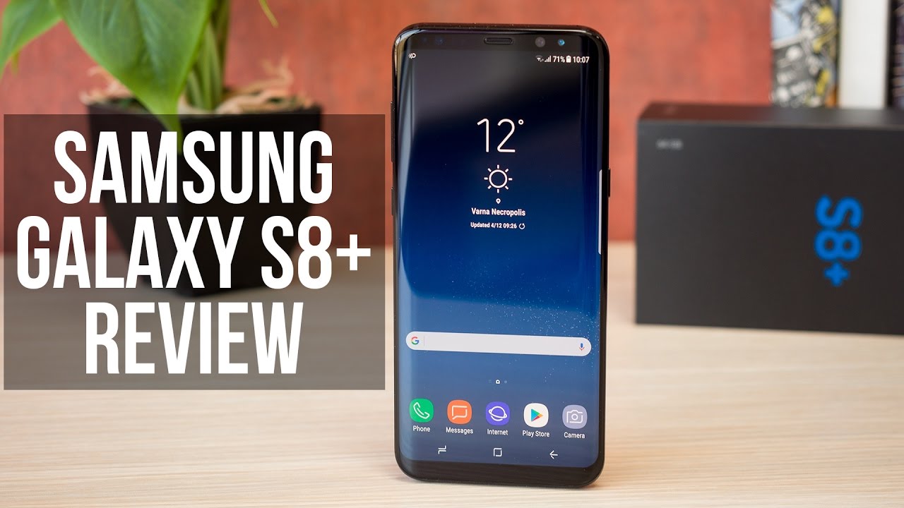
Samsung Galaxy S8+ Review
Update: You can now read our Galaxy S9 and S9+ review!
Introduction
Such a tense moment, isn't it? Up until last year, Samsung was experiencing considerable setbacks due to rising competition from lower-cost Chinese phone vendors, and the fact the Galaxy S5 and S6 weren't exactly the most memorable products ever. The company managed to recover with the successful launch of the Galaxy S7 line, only to be hit again later in 2016 by the blunder the Note 7 turned out to be.
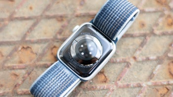
Design
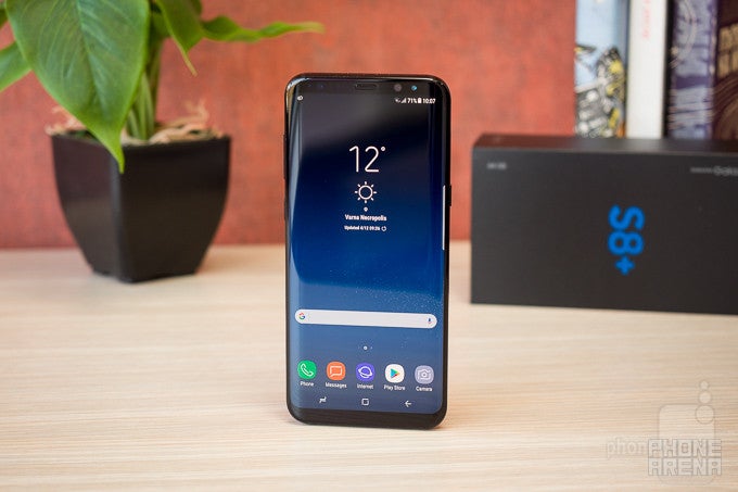
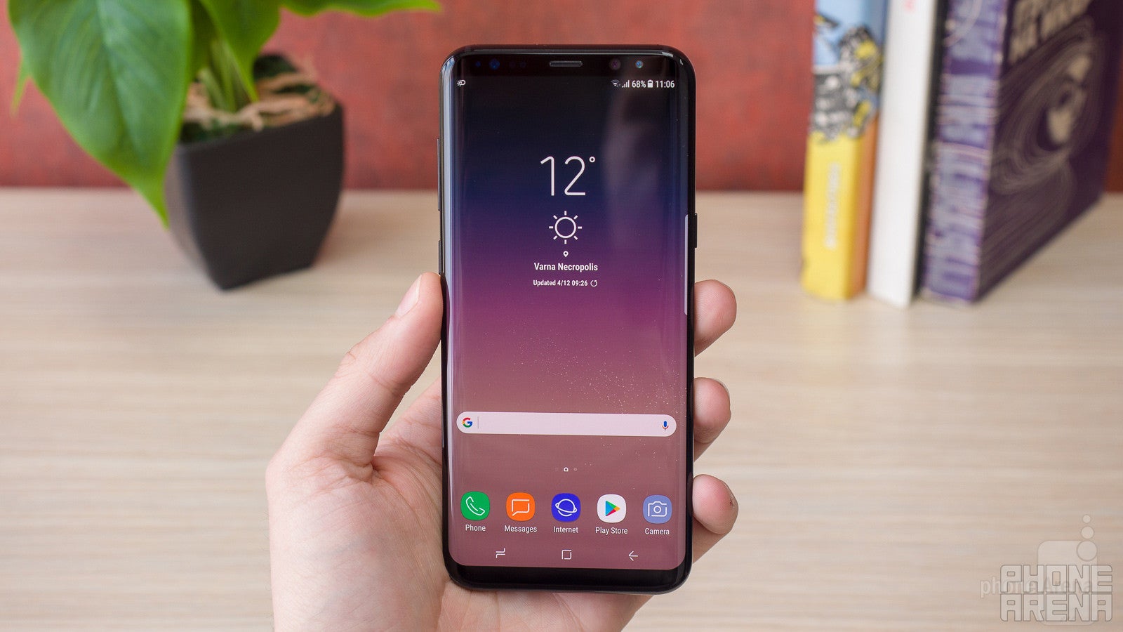
Bezel-less done right
This here is a new breed of Android smartphone. Samsung calls it 'infinity phone', due to the super-slim bezels, but there’s more to it than this. It's not only about the thin bezels, or the elegantly curved screen. It's also about the mature and diverse colors, the way it feels in the hand, and the fresh new software experience. All of this, together, makes the Galaxy S8+’s design stand out from the crowd.
The Samsung Galaxy S8 family comes in 5 wonderful colors: Midnight Black (black), Arctic Silver (gray), Coral Blue (blue), Maple Gold (gold), and Orchid Grey (light violet). All variants feature a black front, and honestly, they all look striking. Previous Galaxy S iterations came in some dazzling hues that were interesting to look at, but kind of eccentric. This new 5-color line-up is fresh, yet mature and easy on the eyes – it's surprisingly well selected. Unfortunately, only the black, gray, and orchid colors will be officially available in the US.
The Galaxy S8+ is IP68 certified for a strong level of dust- and water-resistance – not only is it beautiful, it's also tough! If we had a giant “APPROVED” stamp, we'd plaster it all over the Galaxy S8 Plus right now.

6.28 x 2.89 x 0.32 inches
159.5 x 73.4 x 8.1 mm
6.10 oz (173 g)

5.94 x 2.86 x 0.3 inches
150.9 x 72.6 x 7.7 mm
5.54 oz (157 g)

6.23 x 3.07 x 0.29 inches
158.2 x 77.9 x 7.3 mm
6.63 oz (188 g)
6.09 x 2.98 x 0.34 inches
154.72 x 75.74 x 8.6 mm
5.93 oz (168 g)

6.28 x 2.89 x 0.32 inches
159.5 x 73.4 x 8.1 mm
6.10 oz (173 g)

5.94 x 2.86 x 0.3 inches
150.9 x 72.6 x 7.7 mm
5.54 oz (157 g)

6.23 x 3.07 x 0.29 inches
158.2 x 77.9 x 7.3 mm
6.63 oz (188 g)
6.09 x 2.98 x 0.34 inches
154.72 x 75.74 x 8.6 mm
5.93 oz (168 g)
Compare these and other phones using our Size Comparison tool.
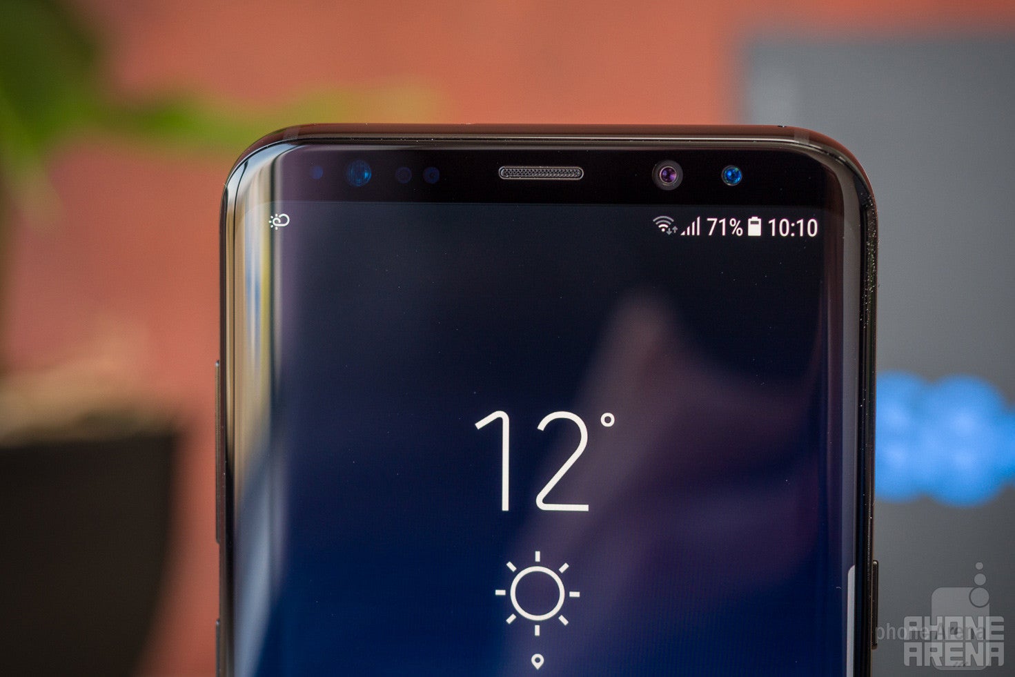
Display
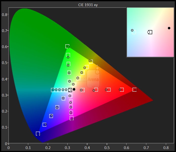
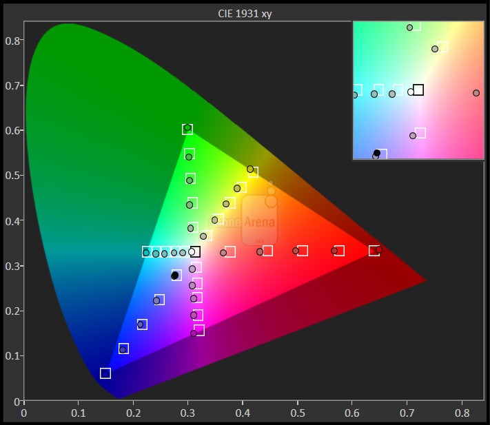
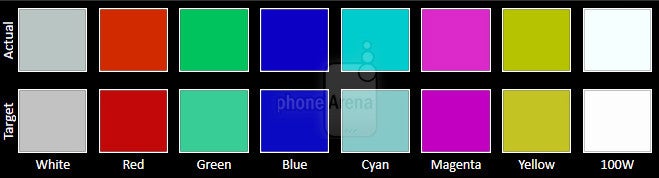
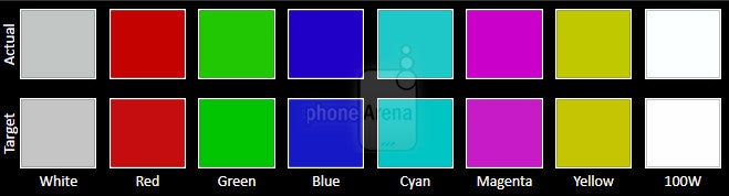
Undoubtedly a quality AMOLED screen, but do we really need the extra-tall aspect ratio?
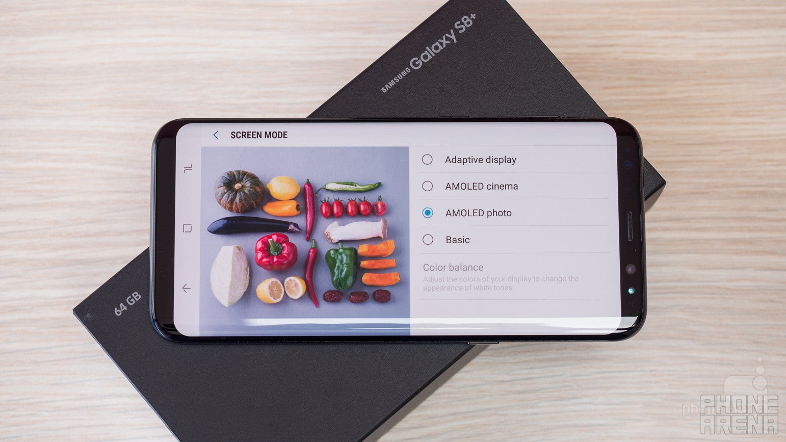
For a device this big, obviously the display is of gigantic importance. And hold onto your seats as we tell you that the Samsung Galaxy S8+ comes with a 6.2” panel! However, there's an important note to make here: the new screen has an aspect ratio of 9:18.5. Up until now, phone screens came in the more widespread 9:16 ratio. The Galaxy S8 Plus' 9:18.5 ratio means its screen is taller than usual. Not necessarily much wider, but considerably taller.
How does that change the user experience? Well, it's actually a double-edged sword. This display format allows software developers to show more content on screen, such as additional information, or some kind of contextual app controls, for example. On the other hand, if this screen format isn't used efficiently, it may lead to inconvenient UI, with some important elements ending up in a very hard to reach corner of the screen. It also means most video content will have black bars on the sides, as it's distributed in 16:9 aspect ratio. The same goes for some games and apps out there.
If we're looking for some magical way in which this 9:18.5 display is supposed to improve everything, the answer is no. Software still works the same exact way it used to, so between the Galaxy S8+ and, say, the S7 edge, there isn't really that much of a difference in the way you'll be doing or viewing things. With the push to reduce bezels, however, and Samsung's reluctance to just make the phone itself smaller/shorter, something has to fill this newly vacated space, and 'more screen' is the obvious answer. There is one major benefit to this tall screen we can think of, and that's the ability to see more content in applications whose purpose is to show you content. Think the web browser, where you read articles and browse through long web pages, or the Kindle app, where you read books (it'll fit more on each page, meaning fewer page turns), or the calendar, where more events will be visible at a time in agenda view. This is where the main benefit of this screen is found.


Interface
Another year, another overhaul of Samsung’s UI, and it’s for the better
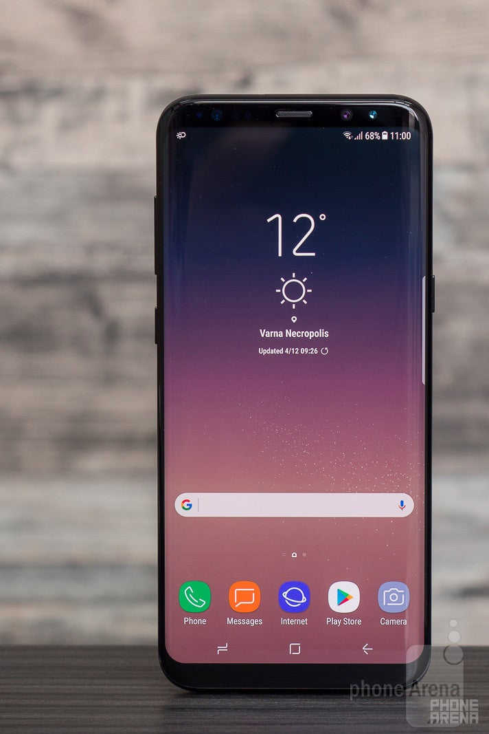
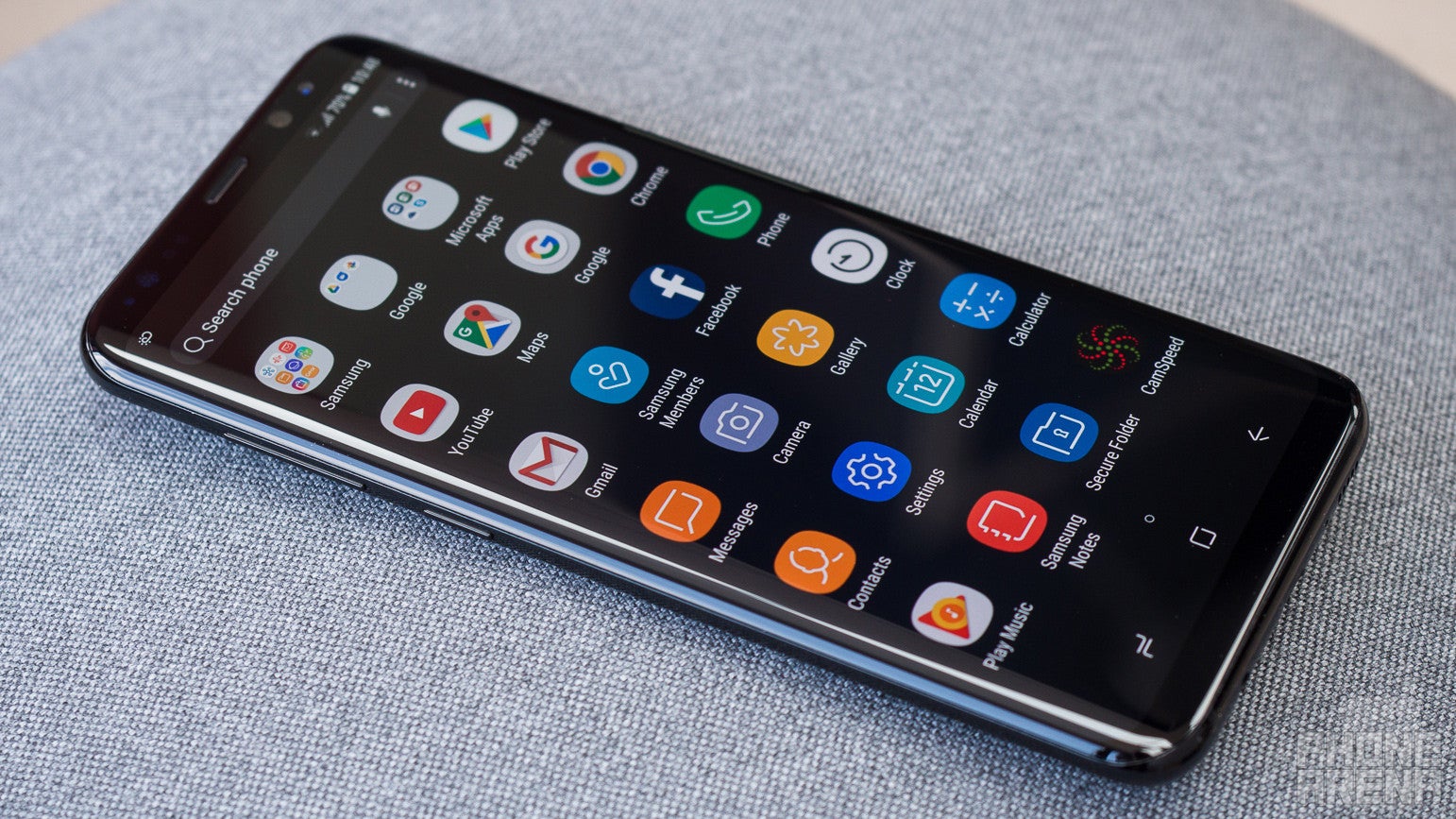
Samsung has, once again!, reworked its take on Android. This time, we're not dealing with major functional shake-ups, but rather a visual rethinking. The operating system that comes pre-installed is Android 7.0, so all the latest Google features will be available, but what makes Samsung phones so enticing for consumers, perhaps equally as strongly as the elegant hardware design, is Samsung's unique software UI, which is now dubbed Samsung Experience (previously, it was called TouchWiz).
Main UI of the Galaxy S8+
The new visual style of the user interface is interesting and unique. The iconography has a simplisic style with clean, yet thoughtful shapes and curves. The new gradient wallpapers with animated ‘stars’ overlay correspond well to this new style, although we can’t say they are exactly attractive. What’s more, these animated wallpapers seem to slow the Galaxy S8 and S8+ down somewhat, which is why we recommend switching to a static image.
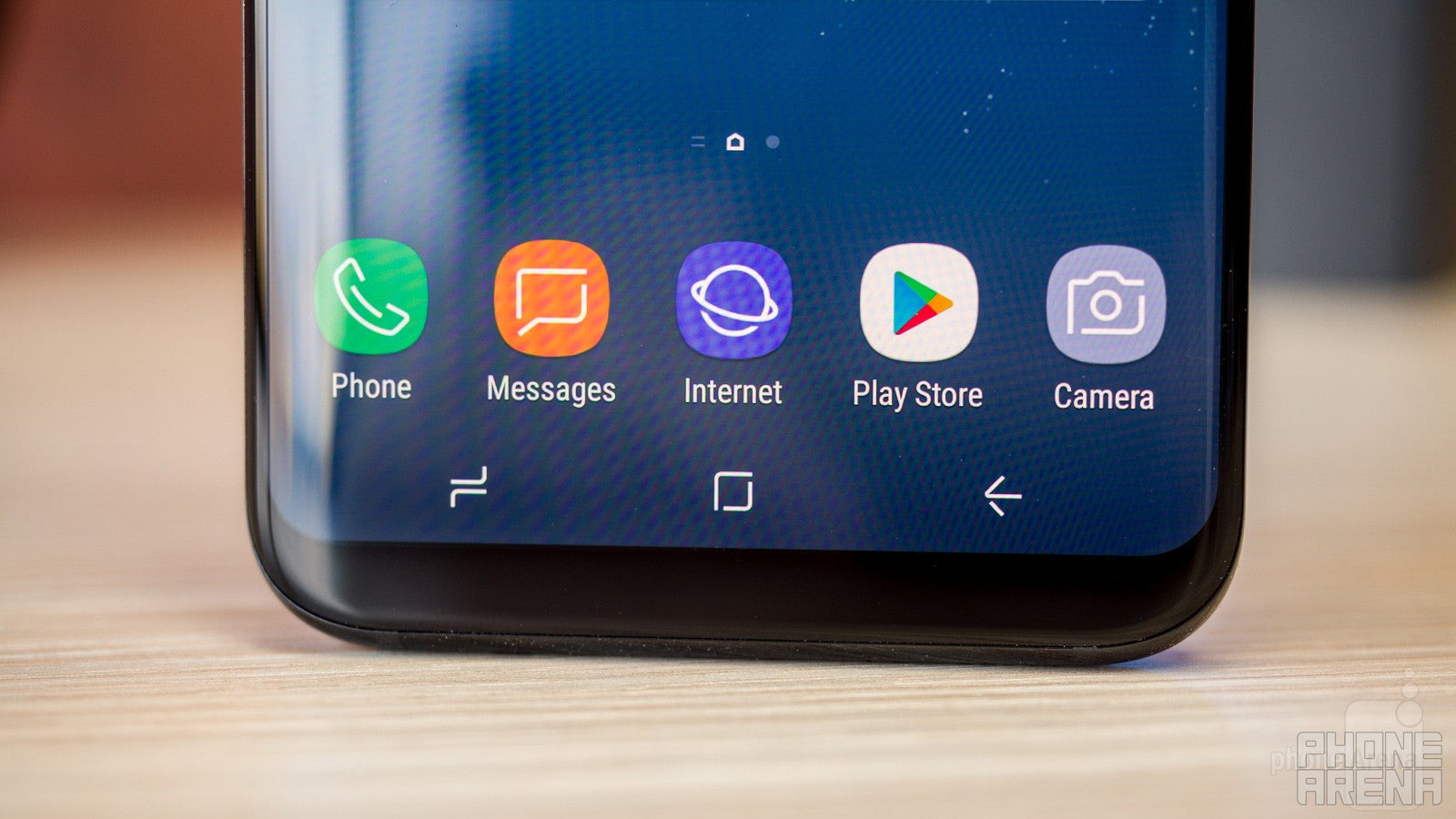
Phone, Messaging, Calendar
The Samsung calendar app is very likeable. It’s quite modern, with nice, soft colors, a convenient week view, and swift appointment creation.
Bixby
Still half-baked, but with a lot of potential
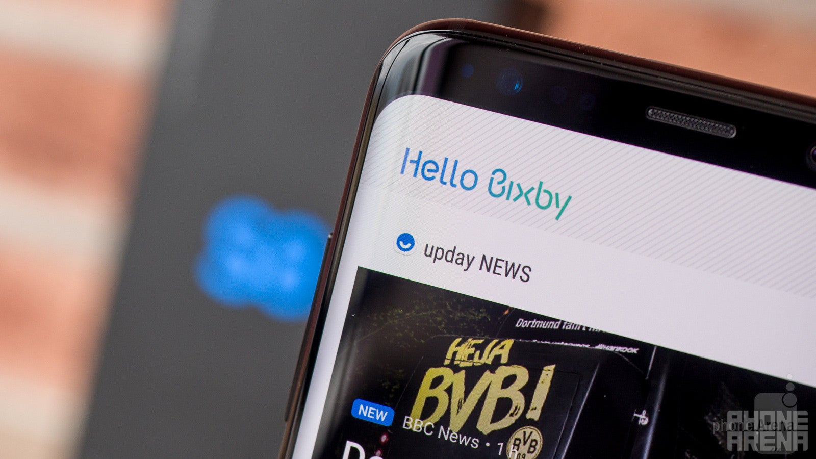
Along with the Galaxy S8 and S8+, Samsung is debuting its own virtual butler, Bixby. It’s ultimate goal is to be a successful Google Assistant alternative/replacement by offering similar, or even richer features. While Samsung has promised to make Bixby capable of operating almost every aspect of the phone for the user, by means of voice, currently its expertise is limited to a number of things: vision, reminders, and homescreen info cards. Notice that voice commands aren’t supported by Bixby at launch – this functionality will be rolled out later, perhaps sometime in May. At the moment, voice commands are handled by Google Assistant.
Bixby
Bixby is a promising Samsung feature, and even though it’s still in its infancy and doesn’t offer anything that isn’t already available on rival platforms, it’s something Samsung should definitely keep developing, because it’ll soon prove to be a valuable competitive asset.
Privacy and Security
This has to be the most versatile phone when it comes to security features! With no ultimate locking method, Samsung has simply chosen to include everything and let the user decide what to use. We're talking a rear-mounted fingerprint scanner, iris scanner, and face detection. While all three can surely be reliable device-securing features, neither is particularly well implemented in the Galaxy S8+.
- Fingerprint scanner: With not enough physical space left on the bottom bezel, Samsung was forced to move the fingerprint scanner to the back of the phone. The exact positioning is controversial: it's placed right next to the camera lens. Having all the stuff neatly lined up there sure looks nice and clean, but it's just not comfortable. Reaching the sensor requires quite a bit of stretch, and depending on which hand you hold the phone with, your experience may range from inconvenient to frustrating. The fingerprint sensor itself is good enough, but its positioning may ultimately make you opt for one of the other unlock methods available.
- Iris scanner: The iris scanner that made its debut on the Note 7 is back, and it suffers from the same issues as before, including failed attempts, long scanning times, and limited optimal position/distance for a successful reading. It's said to be the most secure method of them all, but it just isn't practical enough for everyday use.
- Face recognition: This is the newcomer here. Facial recognition is a way simpler method than iris recognition – it doesn't involve a special IR cameras, lights, etc. It simply uses the front (aka selfie) snapper of the phone, and the rest is software. Facial recognition is much faster than the iris scanner, but it's also not as secure. In fact, we managed to successfully fool it using a picture of the user's Facebook profile. It's not super easy to fool it, but it's absolutely possible. We'd say this unlocking method is just fine for everyday usage, as long as you don't keep any super-private and super-sensitive info on your device. Plus, if you do have such info, but for some reason want to stick with facial recognition, you can always put that info in the special Secure Folder, where it'll be hidden behind a second, tougher layer of protection.
Performance and Memory
No-compromise hardware, but performance is not flawless
In terms of the chipset moving things inside, there are once again two main variants with Samsung’s new flagships. In the US, the Galaxy S8 and S8 Plus are powered by the Qualcomm Snapdragon 835, while in most other markets, it’s Samsung’s own Exynos 8895 chipset doing the computing. Both system-on-chips are extremely powerful and built on the state-of-the-art 10nm process, the main benefit of which is higher power efficiency. The Snapdragon 835 sports an octa-core CPU, running at up to 2450 MHz, and is complemented by the Adreno 540 GPU. Meanwhile, the Exynos 8895 comes with an octa-core CPU of up to 2.5 GHz, and the Mali-G71 MP20 GPU. The in-depth testing for this review has been done with the Exynos version of the phone, but performance and power efficiency are expected to be on par between both variants.
Internet and connectivity
Samsung continues to develop its own web browser
With an immense number of supported LTE bands, the Galaxy S8+ is one well connected handset. Not only that, it’s also future-proof with LTE-A Pro Cat 16 compatibility for theoretical download speeds of up to 1 gigabit/s, and upload of up to 150 megabits/s. There is no cellular network out there that will let you stream data at such speeds, of course, but the radio itself is evidently top notch. All kinds of other communications are also supported, including NFC and MST for easy mobile payments in countries where Samsung Pay is already operational, like US, China, South Korea, Spain, Australia, Singapore, and some others.
Camera
Surely one of the very best cameras in a phone
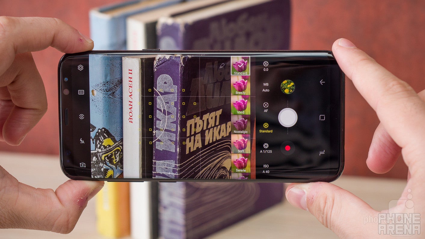
Camera UI of the Galaxy S8+
This year, Samsung isn’t increasing or decreasing the megapixels in the main camera of the Galaxy S8 and S8+. Instead, it’s worked to enhance the image processing aspect of the image capturing process. To be honest, processing was already quite good on Samsung cameras, with probably the only exception being a noticeable oversharpening effect, which could make some pictures look a bit artificial. It’ll be interesting to see in what direction Samsung has taken image processing in the Galaxy S8+.
Hardware-wise, the single rear shooter is a 12 MP unit with aperture of F1.7, 1.4 μm pixel size, and focal length of 26 mm. The camera UI is very cool: the important shutter and video rec buttons are neatly placed on one side, while on the other are the HDR, Flash, and Settings. Speaking of settings, the camera is as versatile as ever, with a plethora of shooting modes and adjustments available. In addition to the standard pinch-to-zoom way of digital zooming, you can now also do so by sliding the shutter button up or down (if in landscape), which is a very natural feature that works surprisingly well.
The pictures coming from the Galaxy S8 and S8+ are fantastic. Detail levels are superb, dynamics are great, and colors are mostly realistic. Very rarely, there would be a slight white balance issue, but in more than 95% of the time, colors are spot on. Unfortunately, theres still some of the oversharpening going on, which may be especially annoying in certain situations – see the pictures with the waterfall for example.
Low-light photography is once again at the highest level imaginable. What separates the Galaxy S8+ / S8 from its rivals is the incredibly high level of detail preserved. Colors also remain remarkably lifelike, which is a quality not unique to the Galaxy S8+, but in combination with the impressive sharpness, it all makes for quite the exemplary night-time and low-light photographs.
Samsung Galaxy S8+ sample images
Samsung Galaxy S8+ Sample Videos
Multimedia
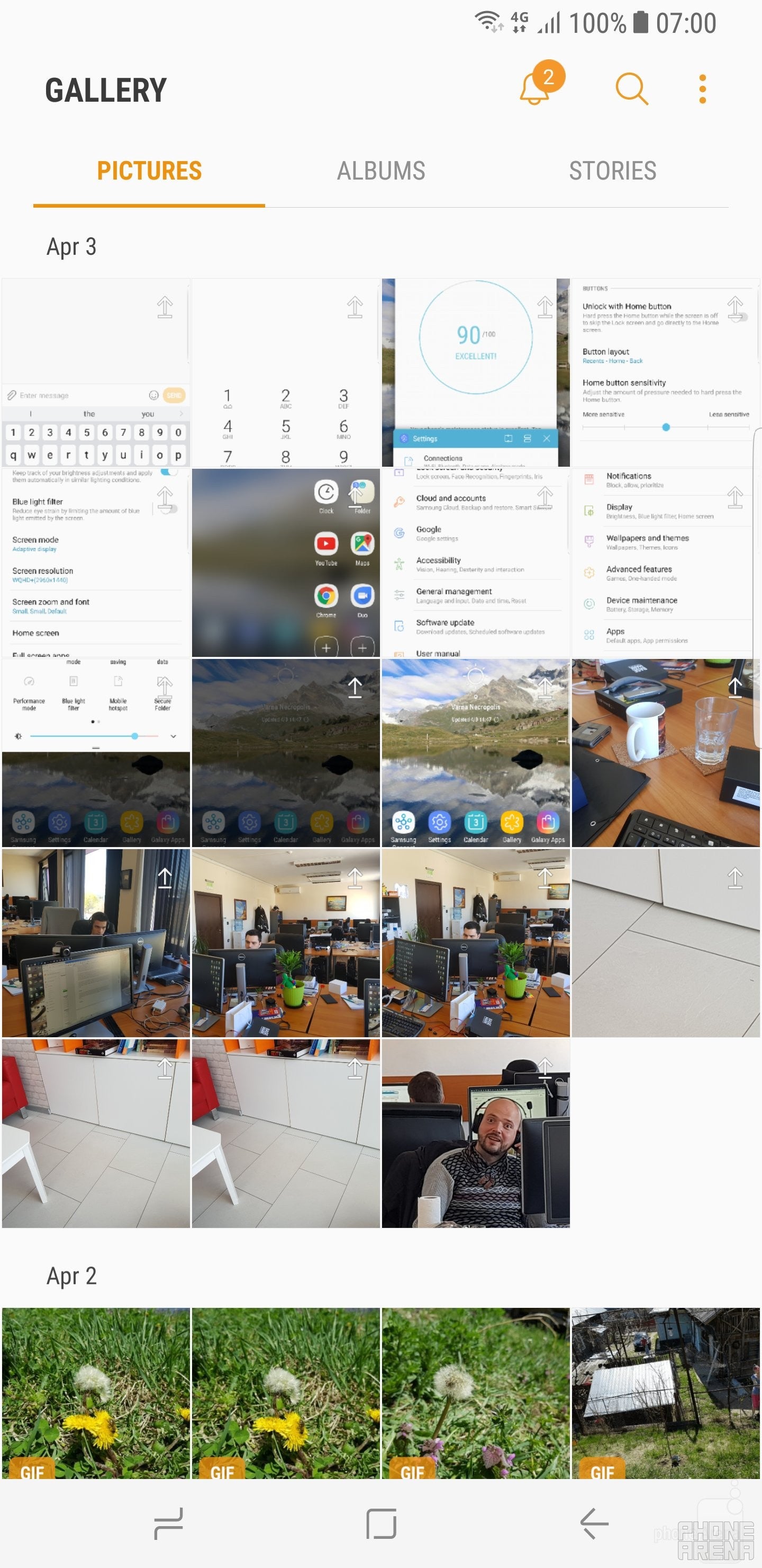
The Gallery app
The loudspeaker of the new Galaxy is very powerful, but also quite substantial. Sure, it can’t deliver bass or anything close, but for a phone speaker, it sounds very well.
Samsung is making a big deal out of the included AKG earphones, and for the most part, they seem to deliver. Somewhat. Depending on whether you manage to get them to stay in your ears. They are of the in-ear type, which is never too comfortable to wear, and some of us had trouble making them stay in their place tightly, resulting in a dramatic loss of low frequencies. If you managed to push them deep enough in your ears, and make them stay there (which the author of this review was unable to do), then you’ll be able to enjoy high-quality sound.
Call quality
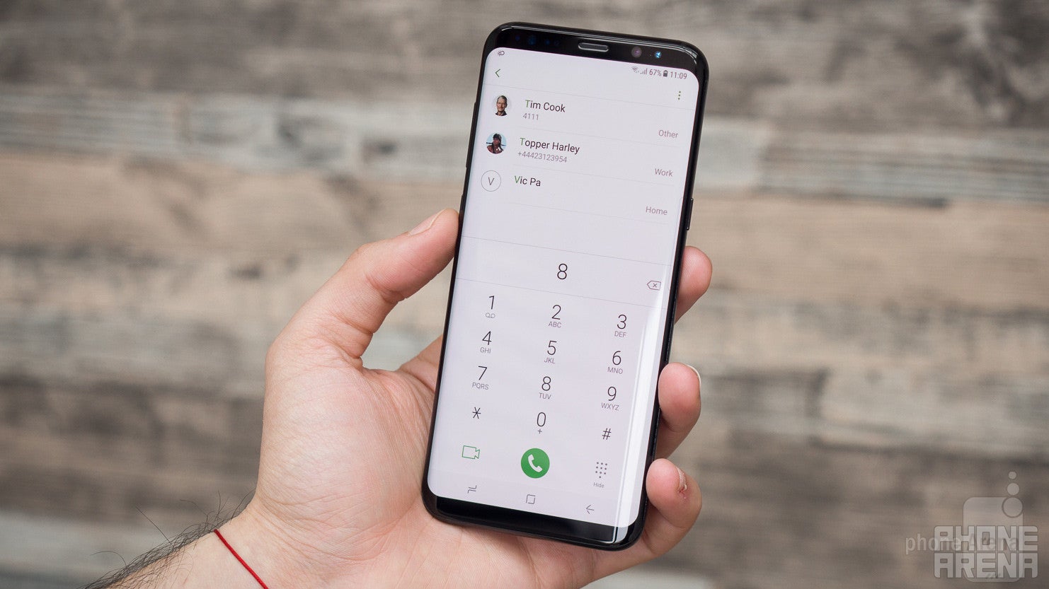
There’s nothing out of the ordinary to say about the calling performance with the Galaxy S8+. There may be just a bit of getting used to, due to the earpiece being situated on such a thin piece of bezel, but it’s by no means an issue.
Voices through the earpiece tend to sound OK, but not pleasing.
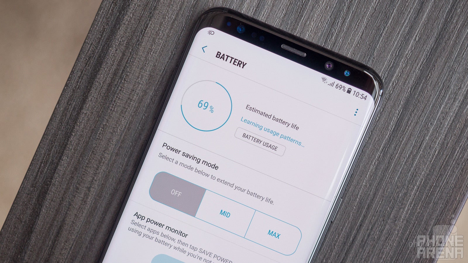
Battery life
Solid performance, but do yourself a favor and turn Always-on Display off
The big, 3500 mAh battery is one of the major things that separate the Galaxy S8+ from the S8. The phone holds up quite well, actually, easily extending in to a day and a half of use. Stand by times don’t seem to be very good, however, which is probably due to the Always-on display feature. Given its limited use, we’d recommend disabling Always-on display, and in turn enjoying the benefits of a very real battery life boost.
Samsung gives us some interesting statistics for this wirelessly chargeable battery: it can go for the awesome 18 hours of continuous video playback, or the cool 78 hours of music playback. Web browsing on Wi-Fi or LTE can last for 15 hours, all of which are slightly better results than those of rival iPhone 7 Plus.
The jumbo Galaxy did pretty decently on our custom battery benchmark, lasting for exactly 8 hours. This is a bit more than last year’s S7 edge (7 h 18 min), as well as the Pixel XL (7 h 19 min), but behind the iPhone 7 Plus’ 9 h 5 mins.
Recharging the battery from 0 to 100% happens quite quickly for the capacity, in just 1 hour and 40 minutes. This is the same time it takes the S7 edge to charge, and slightly quicker than the Pixel XL (1 hour 58 mins). It’s also significantly quicker than the Huawei Mate 9 (2 h 22 mins), and way quicker than the iPhone 7 Plus, which takes 3 h 17 mins.
Conclusion
The Samsung Galaxy S8+ is and isn't a big deal, depending on how you look at it. If you happen to have some degree of sensationalism in you — a quality that many of us tend to exhibit these days — you may be inclined to say that the S8+ is a revolution!, that the Infinity Display is unlike anything you've seen before!, and that overall, it's the best smartphone ever, period!
To the non-sensationalists out there, however, it's clear this isn't exactly the case.
The Galaxy S8+ gets many things right. In fact, it's probably the best Android smartphone for users who need an extra-large display. Not because it's necessarily the best in all that it does, but because it's such a strong all-around package. It's really difficult to find an area where the GS8+ doesn't perform up to standard.
The single most important feature that's supposed to propel the Galaxy S8+ to the top of the charts must be the bezel-less display, because it really is the only significant thing separating the S8+ from the S7 edge. Sure, stuff has gotten slightly better across the board, but not to the point of becoming a meaningful upgrade. The bezel-less screen, however – that's something new! And is it a game changer? In terms of how we use the smartphone – not really, but it works great here on the Galaxy S8+, because it's supposed to be a very large phone. And with such large phones, each and every millimeter counts. That's what Samsung has managed to get right here, as the Galaxy S8+ would have been a humongous handset, were it designed with bigger bezels around the screen. Instead, it almost feels as manageable as a normal 5-something inch phone like the Galaxy S7 or the LG G6. Not quite, but almost. And that's great!
The GS8+ doesn't have to be the best phone in order to be a great phone. There are rivals out there with slightly better cameras, considerably better performance, and more affordable prices, but that's not the point. The point is this: if you want an Android phablet that screams premium, offers almost every possible feature there is, and handles every task with an impressive degree of excellence, you don't need to look elsewhere, because the Galaxy S8+ is right here, and it gives you all that.
Update: You can now read our Galaxy S9 and S9+ review!

Popular stories

Latest News
Things that are NOT allowed:
To help keep our community safe and free from spam, we apply temporary limits to newly created accounts: