Editorials
iPhone X: An Apple User’s Crisis of Identity Pt. 1

This article may contain personal views and opinion from the author.
Chapter 1: The Crisis
As I sit here day-dreaming of what it will be like to use Apple’s most beautiful, advanced iPhone on a daily basis, I can’t help but worry. Will this be enough? Sure. The camera should be the best in its class, right? And it will no doubt be speedy and reliable. But so is my LG V30. Ugh, and that notch. My V30 doesn’t have that, nor does the Galaxy S8. Oof. That’s a really good-looking phone. And the camera’s exquisite. Android’s kind of fun to use too, and so customizable. Wait, why don’t I just use those again? *stares at the MacBook I’m currently typing on* Oh yeah. Come to think of it my car has iDevice integration too. I didn’t choose that! Blame car manufacturers! I do have a jailbroken 2nd Gen Apple TV, but with so many great alternatives, that doesn’t really matter much anymore. Google's Chromecast could be a much more fluid alternative – especially with Google Assistant. Oo, and maybe a Google Home. Agh! iPhone X, look at where you’re making my mind go! Honestly, if you don’t crush it, it may be time for me to rethink my entire ecosystem.
Chapter 2: How We Got Here
Over the years we’ve seen a gradual push and pull between Apple’s iPhone and various Android flagships. Though the iPhone’s hardware had seemingly pulled away long ago, devices like the Galaxy S8, LG V30, and even the Essential Phone make this observation increasingly hard to defend – perhaps even impossible, by some measures. The battle between operating systems, however, has traditionally been more subjective. While Apple may have objectively held the crown in areas like polish, reliability, and app compatibility, that too has become less clear – giving Android another plus on its list of advantages. So, what does the full picture of the Android vs. iPhone battle look like on the latter’s 10-year anniversary?
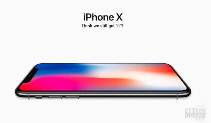
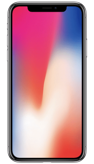
Chapter 3: Like it or Notch, This is Your Salvation
iPhone owners and market watchers like myself were really looking to this year’s iPhone announcement to bring us something spectacular, something beautiful, and something that would place Apple ahead of the competition, as the earliest iPhones did. In many ways, we got that, but a lot remains to be seen. In terms of design, stainless steel and glass are some of the most premium materials we’ve seen in a phone. Following the industry trend of edge-to-edge displays, Apple delivered a gorgeous OLED screen, rounded corners and all. But with all that screen, there’s no longer space for the home button/fingerprint sensor combo, and wait. Why does the screen have a long cut out on the top?
In a mobile landscape where edge-to-edge displays are the new standard for beauty, and even the Essential phone’s diminutive, and mostly inconsequential notch was gazed upon inquisitively, Apple appears to have given over to the fact that other phones will look better. This is a concept that would typically boggle the mind of any observer, but based on Cupertino’s now four-year old iPhone design, it may come as little surprise to some. Apple has fallen behind in design leadership, and unfortunately had to learn this point embarrassingly while making the anniversary edition of its most iconic device. Fortunately, it’s still an iPhone – the much anticipated 10th anniversary edition, at that. As such, it has a lot of other stuff going for it, so it’s unlikely that Apple will see this effecting sales initially. However, designers in Cupertino would have to be delusional to not realize their sliding status.
Chapter 4: Android vs. iOS – A War of Philosophy and Execution
When it comes to the battle of Android vs. iOS, the stakes have never been lower, and personal preference has become the biggest (but still increasingly irrelevant) factor. That’s bad news for Apple. The disparity in support and reliability used to be quite substantial, with Apple traditionally coming out the victor. Now that Android’s nearly on even footing, iOS’s missteps are highlighted against the backdrop of Android’s maturation and its natural strengths. In other words, Apple needs to step its game up.
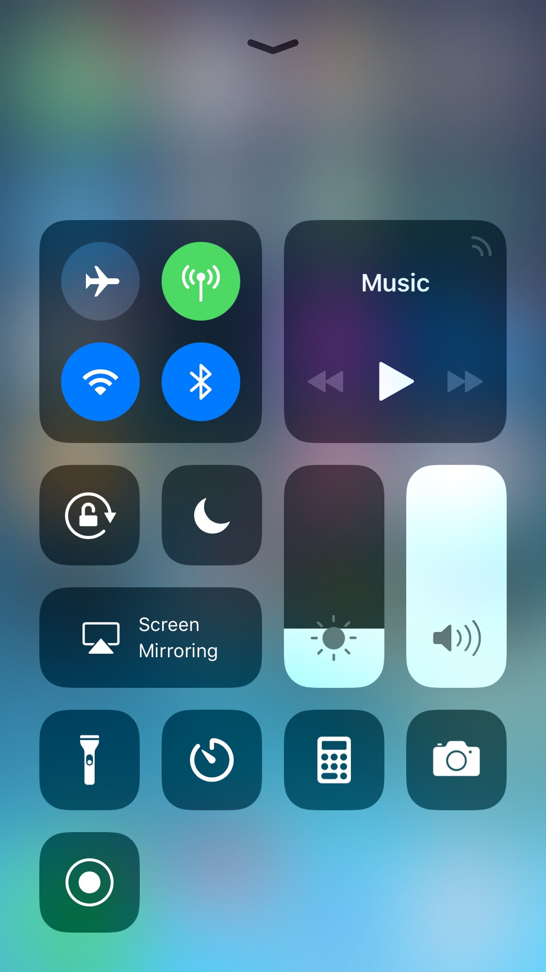
Notification Center is a Mess, and Always Has Been
Notifications may be the most annoying and anxiety-inducing part of owning a phone, but alas, phones would be essentially useless without them. What would you have left, anyway? Something that just makes phone calls? Like I said, useless. As important as they are though, the task of sorting and presenting these alerts can be just as, if not more, critical.
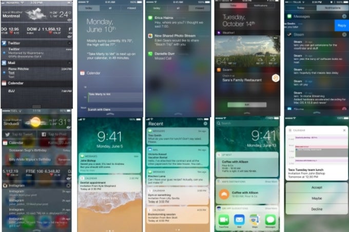
Android’s handling of notifications has long been enviable to the iOS user, beginning first with the simple existence of a notification shade – an addition Apple introduced to iOS years after Android. It seems Apple’s been playing catch up ever since, making major redesigns to its notification center on almost every release of iOS since the feature's debut on iOS 5.
Gross.
Meanwhile, Android and its purveyors have stuck to the notification center delivering notifications and quick toggles – simple as that. “But where’s my today screen?” a fan of the feature on iOS might ask. Swipe right from your homescreen and you’ll find Google Assistant’s dashboard with tailored news and information for your day – all in a format that’s easy to glance, digest, and either scroll past or delve into further. And of course, it’s customizable.
Given the choice between clean and proper notification handling with Google’s tailored home screen, or a three-page notification center comprised of a notifications page, a today screen built entirely from widgets, and a page that inexplicably opens the camera, it would appear obvious what most users would prefer. I never thought I’d be saying this, but Apple, clean it up.
Handling Notifications
The handling of these alerts as they arrive, or build up, is integral to your mobile experience. If you get a lot of emails, or notifications of any kind, it’s absolutely paramount that you’re able to interact with them quickly and efficiently. Similarly, being able to go through numerous old notifications in an accessible and manageable way makes the task quicker, and less stressful. While there was a time that iOS was close to nailing the initial interaction – circa iOS 8 – now, interacting with alerts is clunky and even poorly formatted. The interaction of deleting an email takes a minimum of three gestures on iOS, compared to Android, which can complete the same action in as little as one. Check the GIFs below.
________________________________________________________________________
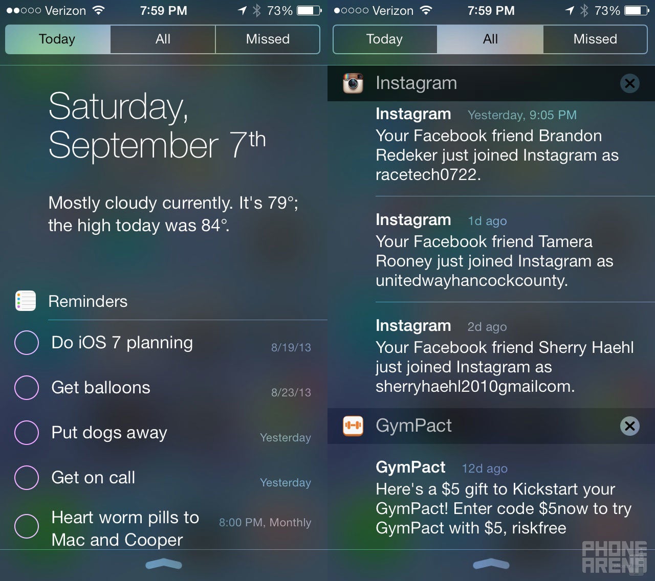
Then there’s the matter of organizing past notifications. For a few years now, Android has minimized multiple notifications (more than three) into a single expandable notification with a number denoting how many alerts from this particular app lie within. Each notification is lined up chronologically by the app with the latest alert. From here, simply tap to expand, and deal with each notification one by one, or swipe the entire notification to clear it. This is a pleasantly simple and efficient approach to sorting and interacting with what can otherwise be a daunting amount of notifications.
iOS, on the other hand, has never had a way to minimize multiple notifications. In fact, iOS 11 can’t even group your alerts by app anymore. Alerts simply form a single-file line from newest to oldest, which, without any sort of grouping or minimization, can take some substantial scrolling to make sure you’ve gotten to the bottom of all of them.
It’s clear that over time, iOS design has become increasingly reproachable, in form and in function, while Android continues to mature gracefully.
Of course, iOS isn’t all bad, and has added some very functional features, such as shrinking pictures and videos to take up half the space they used to. It also remains a generally more reliable OS than Android, with better app support and a more seamless backup and update process.
iOS, on the other hand, has never had a way to minimize multiple notifications. In fact, iOS 11 can’t even group your alerts by app anymore. Alerts simply form a single-file line from newest to oldest, which, without any sort of grouping or minimization, can take some substantial scrolling to make sure you’ve gotten to the bottom of all of them.
It’s clear that over time, iOS design has become increasingly reproachable, in form and in function, while Android continues to mature gracefully.
Chapter 5: The War Continues
Of course, iOS isn’t all bad, and has added some very functional features, such as shrinking pictures and videos to take up half the space they used to. It also remains a generally more reliable OS than Android, with better app support and a more seamless backup and update process.
Updates: Android’s Battle Within
While Google has made some strides in update dissemination, the nature of Android distribution is such that it can almost never be as sweeping and seamless as an iOS update. Pixel phones will provide you the closest experience to that of an iPhone user come update time, but while Google promises three years of major OS updates, Apple averages closer to five – a substantial value proposition. It’s also important to note that this comparison speaks solely to Pixel devices and excludes dozens of Android phones that simply don’t get updates when a new Android version arrives, even if less than a year old. Apple’s advantage of being the sole iPhone and iOS proprietor continues to be unrivaled in this regard.
App Support and Ecosystem
For years the fate of Android wasn’t as clear to everyone as it is today. As such, there was a time when few product manufacturers (cars, TV’s, speakers, etc.) would extend the honor of integration to the little green bot. As Android proved that it wasn’t leaving any time soon, more manufacturers brought on support for the OS, which has closed the gap significantly, but a disparity still exists, with iPhone being the beneficiary. A similar delay exists in third-party apps where, in most instances, Android receives new features later than its iOS-powered counterpart.
Although Google’s been ramping up their hardware production, Apple still has the edge with its first-party device ecosystem. Continuity allows users to pick up a number of apps exactly where they left off between iOS and Mac OS-powered devices. This also includes the super-convenient ability to send texts and make phone calls from your Mac. While third-party apps exist to gain some similar functionalities for Android devices, they’re often unreliable and lack the responsiveness and seamlessness to truly let the user put down their phone. Google has yet to create a software which can mimic any of these capabilities, nor has the company given users an iTunes-esque program to easily backup and update their devices. Given software companies’ increased reliance on the cloud, it’s unlikely that we’ll ever see one either.
Chapter 6: An Unlikely Hero Makes Apple ‘Think Different’ Again
One thing the iPhone X and its questionable notch deserve credit for is making iOS developers think differently than they had for some time. Remember that creed? Unfortunately, it’s not as readily apparent in Apple’s design as it once was. Nevertheless, axing the home button and Touch ID forced Apple to integrate two controversial innovations: Face ID and gestures.
While the True Depth camera system will certainly lead to some fascinating third-party use cases – especially with AR Kit in tow – Apple’s own app “Clips” has shown potentially the most impressive secondary application of the system so far. Leveraging the hyper-specific data pulled in from these sensors, as well as the company’s latest neural networking abilities, Clips skillfully applies complex filters to front-facing video capture while replacing the background with robust 360-degree sceneries. Similar applications have already been seen in Snapchat as well as the most commonly talked about feature, Animojis. Predictably, developers will cast a wide net of support for the notch and the hefty hardware within; it is, after all, an iPhone. Altogether, the notch – while ugly by most conventional standards – will bring some much-needed fun back to iOS’s stagnating profile.
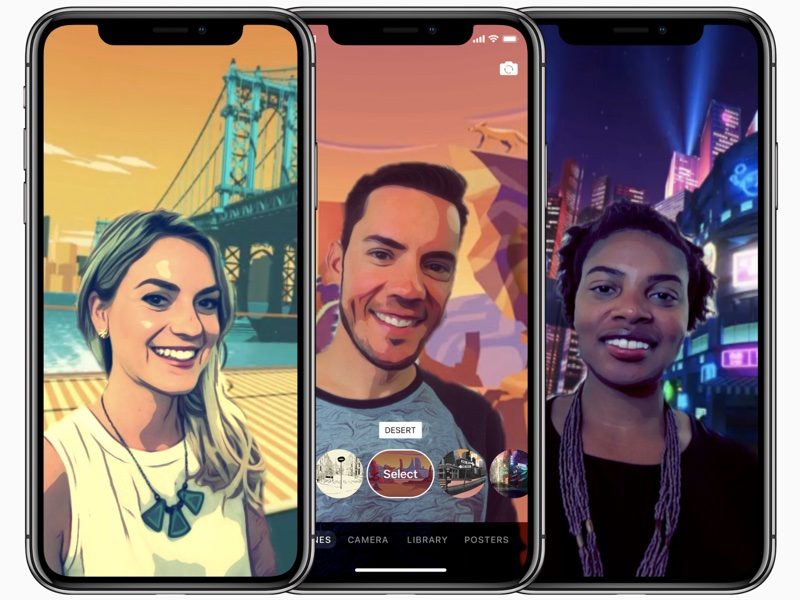
Apple's Clips Software
Gestures on the iPhone X may be another source of fun, functional as they may be. Without the home button, multitasking and app switching are executed in new, seemingly intuitive ways. While the intuitiveness and fluid functionality of these gestures will be examined and better assessed in the coming weeks, the prospect of interacting with the iPhone in any new way at all is one that adds just another small dose of wonder and excitement. The biggest worry here is that over time we find these gestures not to be better than the alternative (a software home button) but rather just a unique way around it. This may be one of the most telling examples of Apple’s prowess in not just software design, but hardware decision making.
Chapter 7: An Uncertain Future
At the end of the day, I want a phone so beautifully crafted that I find myself just examining its fluid curves and admiring its remarkable materials. Give me a camera so exquisite that I can’t help but snap photos of the seemingly mundane, just to witness its sheer power and refinement. When I unlock the device I should be saying, “Damn, that’s smooth” and “look at that gorgeous screen.” Of course, I want reliability and speed in the OS, but it should also be fun to use, or at least so intuitive that I don’t even think about it. A little fun is necessary, though. Make me use my phone in ways I never have before. Show me something I didn’t think I could or would ever do on my phone, and make it better than before. Steve Jobs famously said, “People don’t know what they want until you show it to them.” So, please, show me what I want. Because, honestly iPhone X, if you don’t, I’ll find the device that will – and I mean it this time.
Popular stories


Latest News


Things that are NOT allowed:
To help keep our community safe and free from spam, we apply temporary limits to newly created accounts: