This article may contain personal views and opinion from the author.
As Apple's WWDC 2021 event closes in, here's something that's been on my mind since the last time I visited the App Store on my iPad. I've spoken with plenty of different people about it and it's mostly unanimous – nobody likes the art style most tech giants like Apple use for their marketing materials.
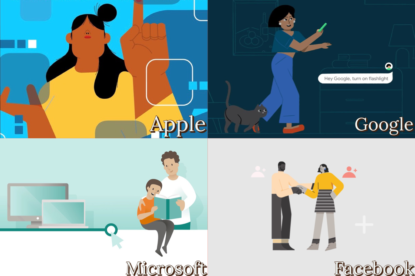
You know when you open the App Store on your iPhone and you see an odd-looking, wildly disproportionate human figure in a featured app block? Or you're just looking up something in Facebook's Help Center and you see the exact same vector-based low detail human figures? Alternatively, you may be interested in checking out what Google's Android YouTube account is all about, and… Yep, you see the exact same low detail disproportionate human figures. Corporate Memphis, they call this art style.
The entire silicon valley uses the same (often unappealing) art style
And we have the exhibits above. The top left image is what I recently saw on Apple's App Store – a person with a tiny face yet huge arms. But what about Google? The image presented above was taken from the Android YouTube channel, although this art style is present in many videos and Android-related pages.
YouTube itself also often uses graphics like that inside the channel dashboard. And what's with Facebook and its surreal figures with tiny heads? Lastly, over at Microsoft's account section we can see a very similar basic art style.
Recommended For You
Wow, all of those tech giants sure do have their unique identities!
It's quite surprising, especially in regards to Google and Apple, since their phone operating systems, for example, are quite different from a visual design standpoint. Apple's iOS uses blur and shadow effects all over the interface, while Google's Android uses flat colors, no shading. You'd think those differences in design language will also apply to the style in which those two companies draw us – their users.
So yeah, it's almost like we can't escape from this art style. And if you never noticed any of this, I bet you won't be able to un-notice it now! (Sorry.)
"But come on, it's kind of cute, simple and universal!"
I don't know about that, this looks nightmarish to me, Apple
Nobody of the people I asked finds Apple or Google's art cute or stylish, and I bet most children would literally be scared by disproportionate human figures like those. In fact, I consulted with my young nieces, who use iPads all the time. They do find what the App Store has to show on occasion to be a bit scary.
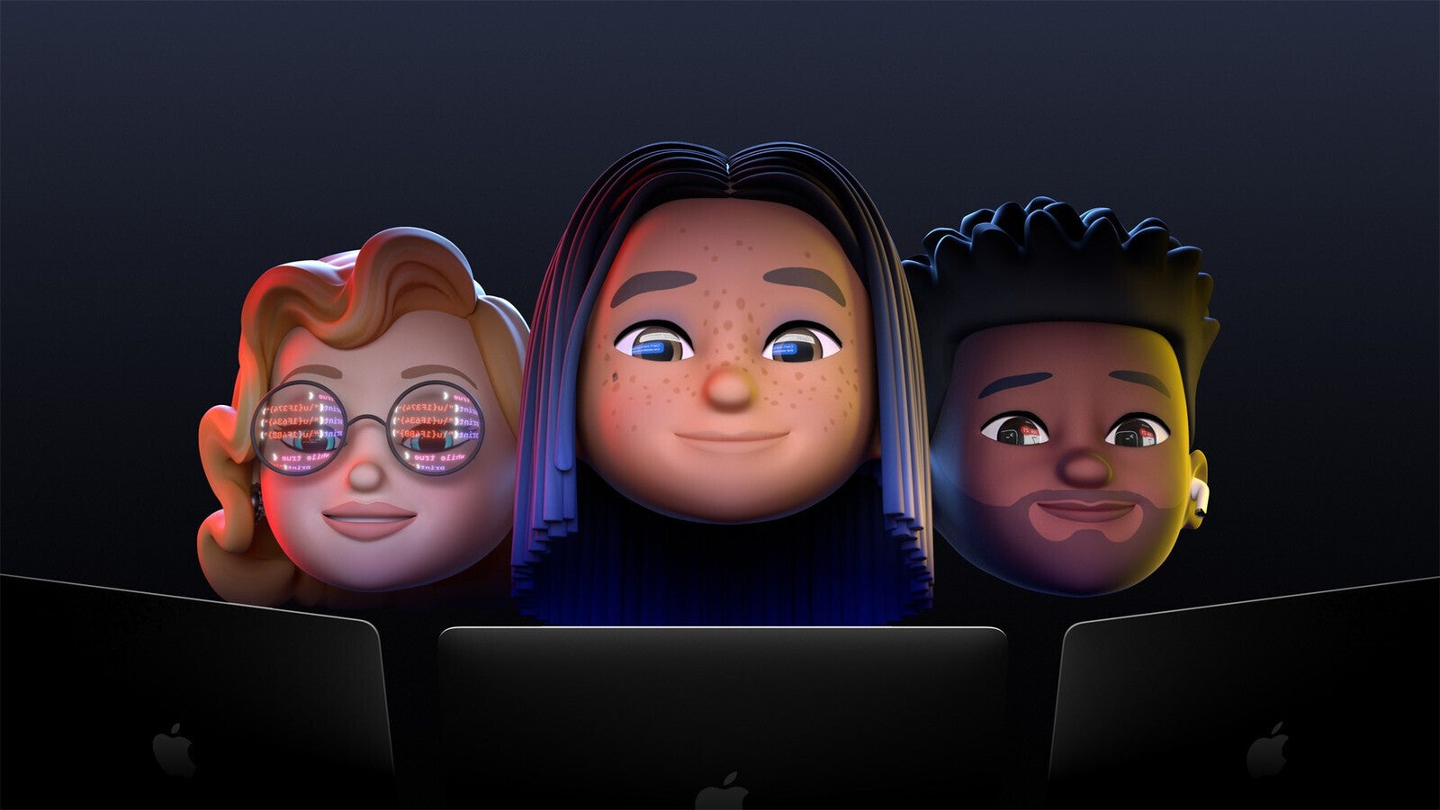
Although to be fair, one of my nieces gets scared by Donkey from Shrek, so big limbs, big teeth, anything like that would be a no-no. Apple is all about being child and family-friendly, right? So what's up with this art direction? Why not go with the Memoji art style which Apple uses for WWDC? It looks way better, check it out:
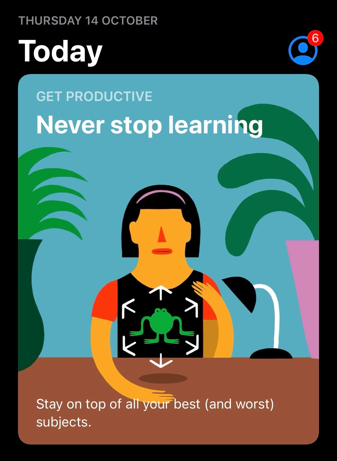
Instead, you go to the App Store and see something like this most of the time:
Be honest, what do you think?
You're a user of those companies' products too. You also see it all the time. Let us know what you think about the simplistic, oddly proportional art style we showed above, used by most tech giants. Do you find it relatable and pleasant, simple and non-threatening, like it's meant to be? Or do you find it off-putting?
How do you feel about this art style?
I like this art style, it's cute and simple
17.75%
I like this art style, it's unique
6.24%
I dislike this art style, it's lazy and uninspired
51.56%
I dislike this art style, it's creepy
24.46%
417 Votes
Six-month unlimited plan is now 57% off
$90
$210
$120 off (57%)
Mint Mobile is now allowing you to get whichever plan you like for either three, six, or 12 months for just $15/mo. If you go for the six-month unlimited service, for instance, you'll now have to pay just $90 upfront instead of $210.
Rado is a former tech writer for PhoneArena. His tech journey began with MP3 players and has evolved to include tinkering with Android tablets and iPads, even running Linux and Windows 95 on them. Beyond tech, Rado is a published author, music producer, and PC game developer. His professional work on iPads, from producing songs to editing videos, showcases his belief in their capabilities. Rado looks forward to the future of mobile tech, particularly in augmented reality and multi-screen smartphones.
COMMENTS (10)
COMMENTS (10)
All comments need to comply with our
Community Guidelines
PhoneArena Community Rules
A discussion is a place, where people can voice their opinion, no matter if it
is positive, neutral or negative. However, when posting, one must stay true to the topic, and not just share some
random thoughts, which are not directly related to the matter.
Things that are NOT allowed:
Off-topic talk - you must stick to the subject of discussion
Offensive, hate speech - if you want to say something, say it politely
Spam/Advertisements - these posts are deleted
Multiple accounts - one person can have only one account
Impersonations and offensive nicknames - these accounts get banned
To help keep our community safe and free from spam, we apply temporary limits to newly created accounts:
New accounts created within the last 24 hours may experience restrictions on how frequently they can
post or comment.
These limits are in place as a precaution and will automatically lift.
Moderation is done by humans. We try to be as objective as possible and moderate with zero bias. If you think a
post should be moderated - please, report it.
Have a question about the rules or why you have been moderated/limited/banned? Please,
contact us.


Things that are NOT allowed:
To help keep our community safe and free from spam, we apply temporary limits to newly created accounts: