We're taking a closer look at LG UX 4.0: a step in the right direction
LG's new flagship, the G4, was chosen as the phone to introduce the manufacturer's newest Android skin - LG UX 4.0. It's based on Android 5.0 Lollipop and as such, gives us a fair share of the latter's Material Design goodness. Apart from adopting the new looks of Google's mobile platform to a certain extent, LG UX 4.0 also offers a pretty impressive handful of added features and functionalities.
But what has changed (and what hasn't) in LG's camp? Last year's LG UX 3.0 was one of the better custom Android skins, offering both a multitude of features as well as a user-friendly interface that was "not in your face". Time flies, however, and one can't sit on its laurels forever - it's time to dive head-on inside LG UX 4.0 and explore it. Is it an evolution or a revolution ? This question is about to get answered.
The subtle changes
The home screen layout also comes with a pretty similar layout - we have a revamped and improved Smart Notice widget up top, which does not only provide weather data, but also has some butler-ish functionalities - Smart Notice provides you with customized suggestions cards based on both your current whereabouts and time of day. For example, it will advise you to take an umbrella with you if rain or precipitation is expected in your area or closing an app that's using precious resources.
A Google search bar, as well as a handful of native apps, complete the homescreen layout. Swiping right will fire up Smart Bulletin, comprising LG Health, an app with fitness and wellness-related data, Calendar, QuickRemote, Music, Smart Settings, and Smart Tips.
All of these can be turned on or off; additional ones can be downloaded from the LG SmartWorld repository. Smart Settings, in particular, is quite interesting as it allows you to perform a handful of Tasker-like actions. For example, LG UX 4.0 allows you to turn off all sounds when you get home or launch the music app when your connect your headphones. Undoubtedly, these are some of the features that LG touted as being smarter and more human-friendly.
The notification/quick settings shade, however, has been slightly revamped and "materialized". In LG UX 3.0, we had a transparent-ish background, while the one in UX 4.0 is pretty much similar with the one in stock Lollipop, employing slightly differing shades of dark grey. The quick toggles have not changed much, which is welcome. It's also not semi-transparent, but much more opaque.
Building on the foundations laid by LG UX 3.0 in the customization department, LG UX 4.0 also allows users to download and apply various system-wide themes that give a whole new look to the UI.
True, certain icons and interface elements won't get changed, but that's mostly a minor nuisance. The abundance of themes in LG SmartWorld should satisfy the needs of most customization-hungry users, though the stock UI theme is pretty good-looking!
The notification/quick settings shade, however, has been slightly revamped and "materialized". In LG UX 3.0, we had a transparent-ish background, while the one in UX 4.0 is pretty much similar with the one in stock Lollipop, employing slightly differing shades of dark grey. The quick toggles have not changed much, which is welcome. It's also not semi-transparent, but much more opaque.
Customization
Building on the foundations laid by LG UX 3.0 in the customization department, LG UX 4.0 also allows users to download and apply various system-wide themes that give a whole new look to the UI.
True, certain icons and interface elements won't get changed, but that's mostly a minor nuisance. The abundance of themes in LG SmartWorld should satisfy the needs of most customization-hungry users, though the stock UI theme is pretty good-looking!
Iconography
Speaking of the stock theme, It's important to mention that unlike UX 3.0, LG UX 4.0 totally does not employ the same level of over-sharpening that is present on LG's older UI. In line with the flat Material Design, LG has updated its iconography for the LG UX 4.0.
The new icons are now even flatter and simpler art-wise, making the previous ones look more skewmorphic in comparison. In our opinion, LG UX 4.0 looks better, mostly due to the lack of over-sharpening - app icons, both native and third-party developed, now look just as their developers intended to.
Most of the default apps, like Settings, Dialer, Contacts, Organizer, and others, have been treated to some Material Design love.
They have been further flattened in comparison with UX 3.0; furthermore, the icons have aged pretty well - the cartoony ones have been replaced with more mature and simple ones, which is a great evolutionary and cosmetic step forward.
Moreover, the interface has been slightly revamped - substituted from rectangular to oval ones, which is a bit more in compliance with Google's Material Design.
Speaking of icons, the ones inside the settings menu have also been revamped to be simpler and more uniform in terms of visuals. They are also slightly smaller and less in your face, which is a welcome change that makes the UI a bit more uniform.
While their functionality has not been improved much (it's just fine where it currently is), the on-board phonebook, calendar, messaging, and dialer apps have been fine-tuned so as to improve the user experience on a fundamental level. There are but a few visual differences, mostly regarding the flatter looks of the native LG UX 4.0 apps.
The hierarchy of the menu itself has not been changed much, apart from the several additions and omissions. Previously existing features like the ability to change the screen-off animation, which was a nice, yet not that important feature. In the meantime, LG has thrown in a few quite handy new features in the mix, most of which can trace their origins back to stock Android.
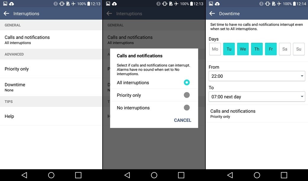
We also have Lollipop's Interruptions menu that allows users to make use of a Do Not Disturb-like feature, preventing their devices from audibly alerting for incoming notifications and calls. This feature has its own quick toggle in the notification shade for easier access. We also have Lollipop's multi-user support on board, which is a great feature, all things considered.
Another new feature allows you to quickly launch the camera app by double-tapping the volume down button at the rear when the screen is off. Sadly, this feature doesn't work when the screen is on, like the Galaxy S6 & S6 edge allow. Game optimizer is another new feature that aims to conserve power when you're gaming by reducing the graphics quality, a welcome addition for those who are often playing games while on the go.
Iconography changes
Stock apps
They have been further flattened in comparison with UX 3.0; furthermore, the icons have aged pretty well - the cartoony ones have been replaced with more mature and simple ones, which is a great evolutionary and cosmetic step forward.
Moreover, the interface has been slightly revamped - substituted from rectangular to oval ones, which is a bit more in compliance with Google's Material Design.
Speaking of icons, the ones inside the settings menu have also been revamped to be simpler and more uniform in terms of visuals. They are also slightly smaller and less in your face, which is a welcome change that makes the UI a bit more uniform.
While their functionality has not been improved much (it's just fine where it currently is), the on-board phonebook, calendar, messaging, and dialer apps have been fine-tuned so as to improve the user experience on a fundamental level. There are but a few visual differences, mostly regarding the flatter looks of the native LG UX 4.0 apps.
New features and functionalities
The hierarchy of the menu itself has not been changed much, apart from the several additions and omissions. Previously existing features like the ability to change the screen-off animation, which was a nice, yet not that important feature. In the meantime, LG has thrown in a few quite handy new features in the mix, most of which can trace their origins back to stock Android.
We also have Lollipop's Interruptions menu that allows users to make use of a Do Not Disturb-like feature, preventing their devices from audibly alerting for incoming notifications and calls. This feature has its own quick toggle in the notification shade for easier access. We also have Lollipop's multi-user support on board, which is a great feature, all things considered.
Another new feature allows you to quickly launch the camera app by double-tapping the volume down button at the rear when the screen is off. Sadly, this feature doesn't work when the screen is on, like the Galaxy S6 & S6 edge allow. Game optimizer is another new feature that aims to conserve power when you're gaming by reducing the graphics quality, a welcome addition for those who are often playing games while on the go.
The camera interface
The G4 camera is great and all, but it wouldn't be much useful if the camera app interface was not as good as LG has made it. Indeed, it's as good as it gets, with a handful of great features that make mobile photography a pleasant ordeal, all things considered.
The camera app now comes with three different modes - simple, which only allows users to tap the shutter button and take a picture, Auto mode, which allows you to choose between different shooting modes, and Manual mode, which gives you access to all adjustable settings of the camera, from shutter speed to exposure and ISO.
The interface is pretty intuitive and does not overwhelm you right from the get-go, though it can be argued that Manual mode could be a bit confusing if you're a novice. Then again, novice users shouldn't be venturing into Manual mode territory: Simple and Auto will take care of all camera settings for you and snap the best picture possible.
On the other hand, those that know the ropes of photography should feel quite comfortable in Manual mode. It even comes with a live histogram, a DSLR-grade feature!
LG's different camera modes
Conclusion
So far in 2015, platform developers only took small, evolutionary steps towards a general refinement of the user experience, and the same certainly applies to LG as well. LG UX 4.0 does not intend to revolutionize the way LG fans interact with their smartphones; instead, it aims to right some wrongs that LG UX 3.0 brought up. It's both more mature and smarter now, which is always an welcome improvement. Definitely one of the best UIs we've seen so far.
LG UX 4.0

Popular stories
Latest News

Things that are NOT allowed:
To help keep our community safe and free from spam, we apply temporary limits to newly created accounts: